Say the word “vintage” and different images come to mind. This week’s Friday Focus shows how the old-era look can differ from one website to another. Which decades are these designs inspired by?
Designs of the Week
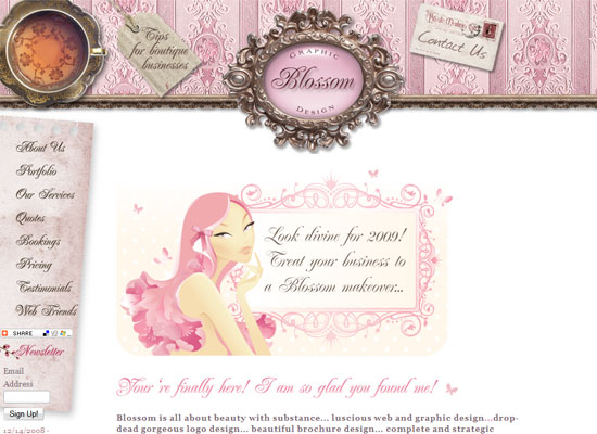
This designer has a specific aesthetic and clientele, and that point gets across right off the bat. Just lovely details all around.
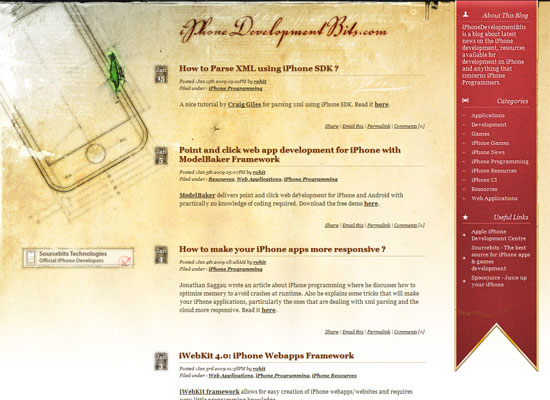
I love the dark mood this site instantly puts you in. And the details, once again, are stunning. No pixel out of place.
Great concept: new technology (the iPhone) meets old-world graphical details. Very steampunk and Leonardo Da Vinci-esque. The red ribbon on the right is a good idea to present a sidebar and add interest with color.
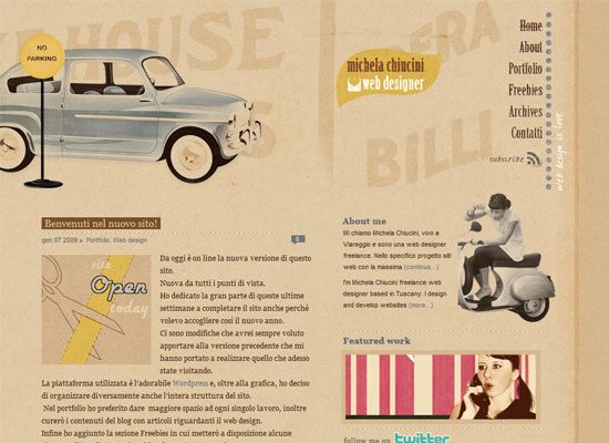
Another vintage look filled to the brim with nostalgia. I love how the portfolio images blend in with the whole design.
Social Media Weekly
Design – 8 Free Design Platforms To Build Your Own Site
8 site builders reviewed.
Programming – Structured process you must know to develop a web application
It’s not all about code.


