This week on Friday Focus, we pay homage to the good old newspaper, whose elegance and practicality ought to transcend the ages. Print isn’t dead; not quite yet.
Designs of the Week
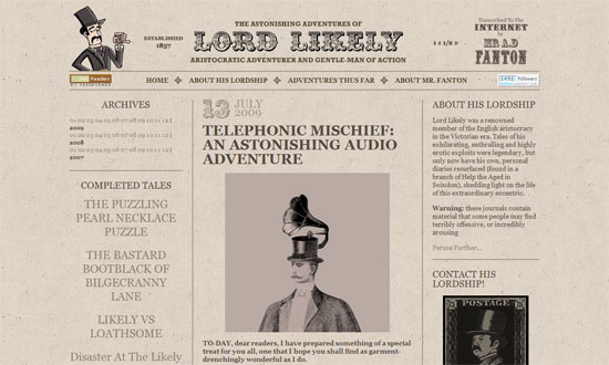
When using newsprint hues, keep things interesting with bold, intricate type. The thing that bothers me here though is the excessive use of uppercase text. Needs more variety and hierarchy in typography—smallcaps, italics, drop caps, etc.
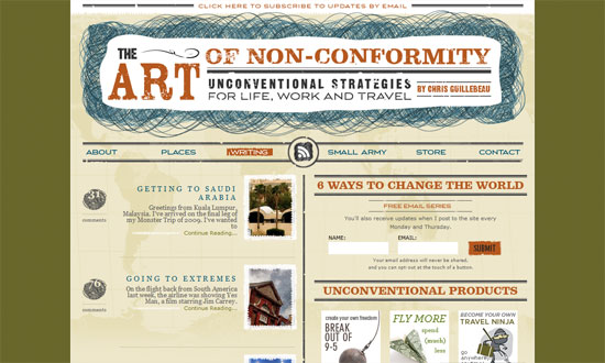
This site has its own flavor of old, publication-like, and grungy, but doesn’t look outdated whatsoever. Perhaps it’s the orange and blue. Or the crazy line scribblings in the header. The only minor letdown here was the footer—a lot more detail could’ve gone into that. Really like the fixed world map background though.
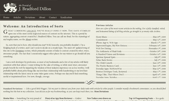
This one also seems lacking in hierarchy—hardly any variation in type sizes, for starters. But kudos for creating a 100% fluid layout. Not to mention the “Table of Contents” style articles list to the right.
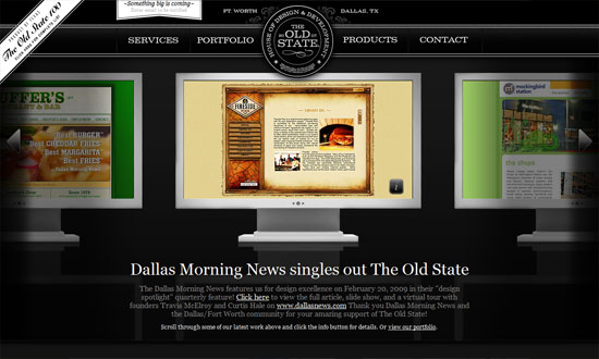
Ignore the use of monitors, gradients, and rounded corners and you’ll enjoy how much of an ancient-looking site this is. Especially their blog. The branding has a lot to do with it, but I also think it’s the bold use of black and white.
Social Media Weekly
Design – Crank Up Your Design Radar
Accessibility – A Designer’s Guide To Accessibility and 508 Compliance


