We have unmistakably girly illustrations here on this week’s Friday Focus! Girl power, baby!
Designs of the Week
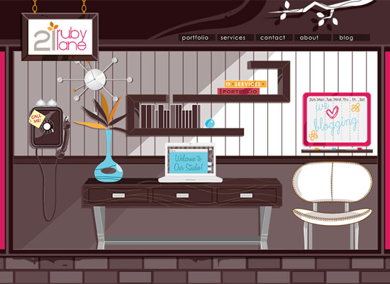
Not only is this site fun to look at, it is fun to explore. Every section is fully integrated into the overall “interface”.
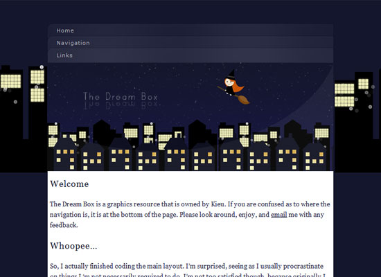
Here’s something simpler but still pretty. It’s always a good idea to come up with a scene that you can apply as a repeating background in your design. The witch is a neat twist!
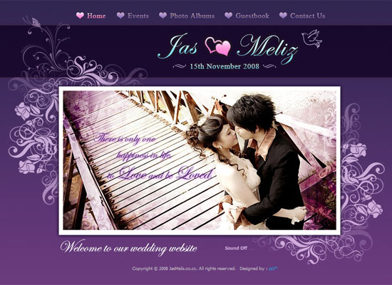
Do all wedding sites have to be girly-looking? Not really. But the colors and graphic elements on this site exude romance, which is apt.
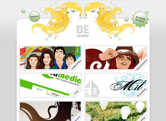
Not really overflowing with femininity here, except for the mirror image girls on the header. But it goes a long way in defining the look of this site.
Social Media Weekly
Design – 30 Brilliant Vector Logo Designs, Deconstructed
Find out they pulled off these smart logos.
Programming – Using jQuery for Background Image Animations
No need for Flash to animate your menus, people! Try Jonathan Snook’s example instead.


