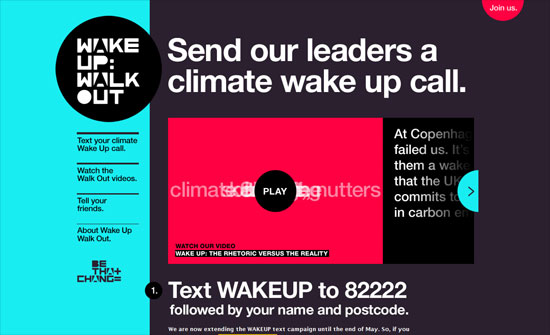
jQuery is one of the best-known development tools available, and since its emergence just 10 years ago, it’s exploded in popularity. In fact, it powers roughly 65 percent of the top 10,000 most popular sites on the Internet. So what exactly is it, and is it worth learning? [Read more…]
12 Old and New CSS Menu Techniques
A navigation menu, something unmissable in all websites, one of the most important factor besides content. You can have a simple navigation or a very intricate one, design and code wise. Once I learned some key navigation techniques I went on to learn how to work around WordPress generated navigation to still be able to use dropdown menus without extra plug-ins. In most cases I rather hardcode the navigation, especially if they require more specific HTML code.
Now that CSS has become mainstream a lot of tutorial focus more on advanced techniques assuming you already know the basics. Same thing goes for books, I’m a book person and I have some of the latest CSS books and more and more writers start their introduction saying that they assume you have basic and working knowledge about CSS.
Not everyone can learn and understand coding right away, myself I am good at CSS and XHTML but with PHP it took some long hours and it still does. My skills becomes rusty very fast if I don’t code regularly. This is where old tutorials come in handy, they might date back a few years but for getting back to basics or if you just started out they are the best tutorials. Most of them have a lot of user comments full of tips, adjustments and bug fixes, so plenty of resources.
I selected 12 navigation techniques from very intricate to simple ones, old and new ones. They are build with CSS, CSS3, jQuery, Javascript and in some cases graphics. Dig in and find out what you have forgotten or what you didn’t know before and freshen up your navigation coding skills!
Create an apple style menu and improve it via jQuery

A flyout menu with breadcrumb trail
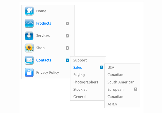
Advanced CSS Menu

Javascritpt Dock Fisheye Menu

Sweet AJAX Tabs With jQuery 1.4 & CSS3
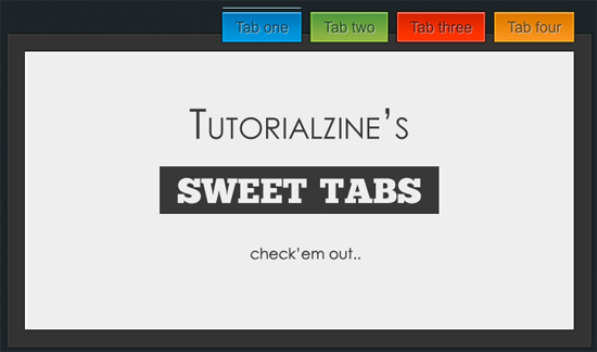
Create a Slick Tabbed Content Area using CSS & jQuery
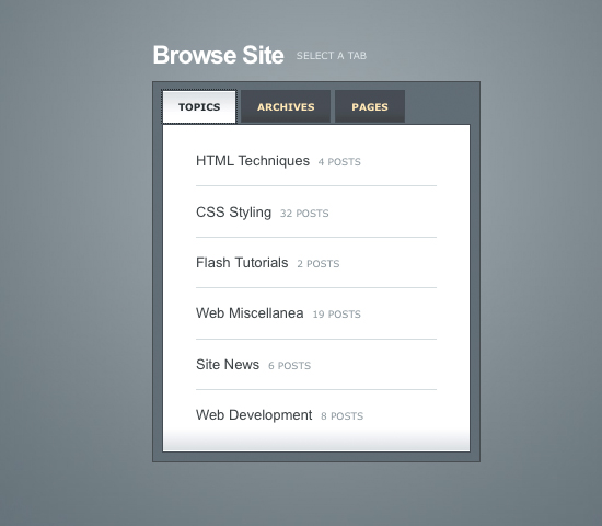
CSS Overlapping Tabs Menu
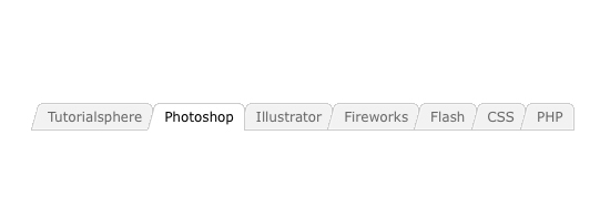
CSS Sprite Navigation Tutorial
![]()
Awesome Cufonized Fly-out Menu with jQuery and CSS3
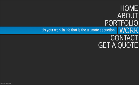
How to Build a Kick-Butt CSS3 Mega Drop-Down Menu
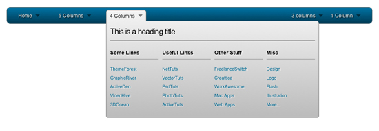
RocketBar – A jQuery And CSS3 Persistent Navigation Menu

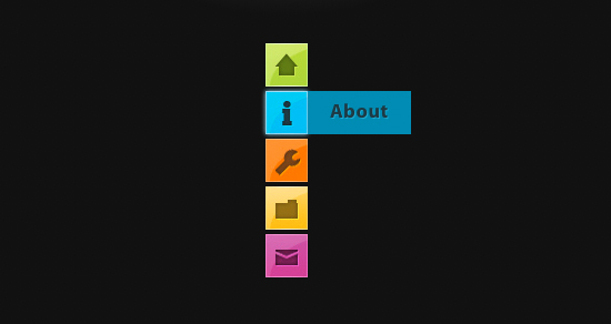
CSS3 Minimalistic Navigation Menu
Friday Focus 08/13/10: Let Your Garden Grow
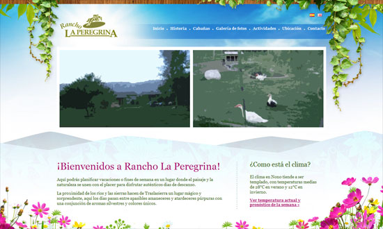
This week on Friday Focus: vines, blooms, and other foliage that do a great job of framing your website.
Designs of the Week
When doing vines on a sky background, it doesn’t make much sense to have drop shadows, does it?
The gradient on the tabs are a little severe but the translucent ones look great. I kind of want more blue in the background though, feels too white.
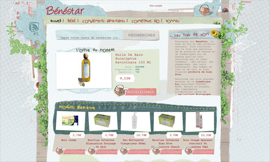
The use of fixed-width type is curious, but I like the mixed textures. The actual photo of a basket for a shopping cart icon is priceless.
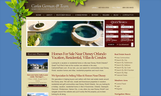
The Quick Search box looks a little cramped; the Map Search could be more accessible.
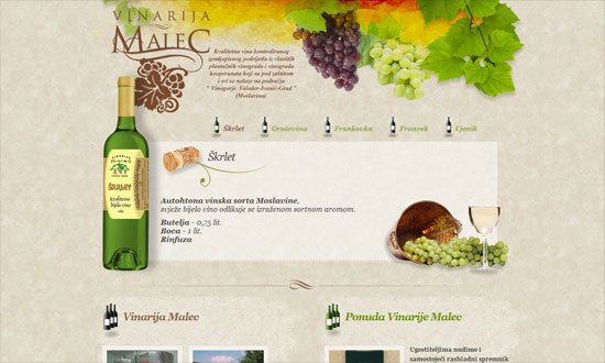
Some nice watercolor textures here although again the shadows get to me. A little bit of a split layout going on below.
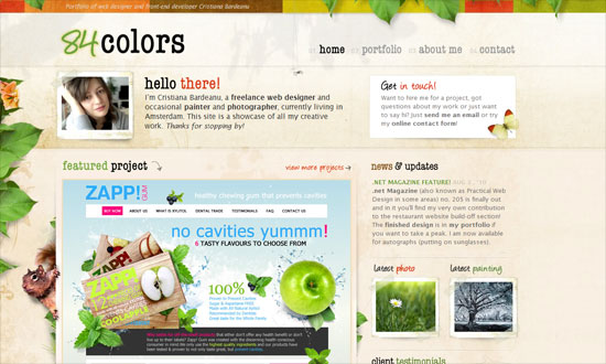
The subtly moving leaves (and the squirrel’s tail) look great—they barely call attention to themselves so when you do notice them, they’re a nice treat. Attention to detail everywhere.
I like how the leaves are behind the large sign up button.
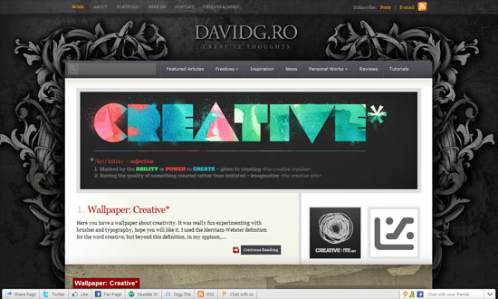
Something more ornate and abstract. I feel a disconnect between the gray-black top and the brown bottom, though.
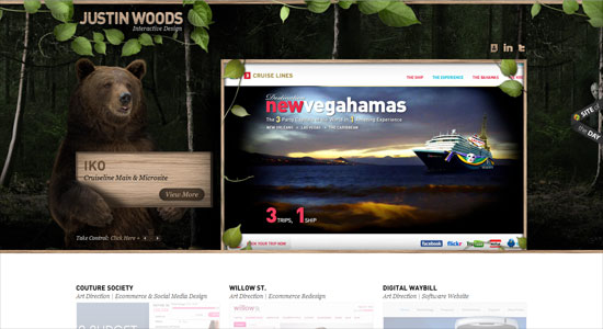
Another disconnect here. The header is awesome—there’s a bear! carrying a sign!—but the bottom is just too light and doesn’t even carry any hint of nature in it.
Beautiful design. Not sure what a music player is doing on a dentist site, but perhaps they thought it would be a fun little touch.
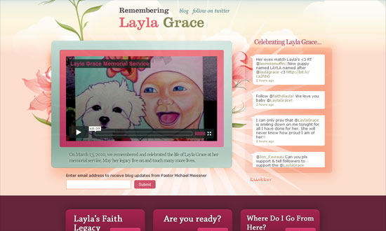
The flowers look so pretty I they weren’t just in the background. The turquoise is a nice contrast to the floral hues of pink and peach.
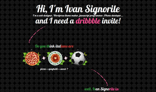
I like how the leaves are used as frames for the circular icons here.
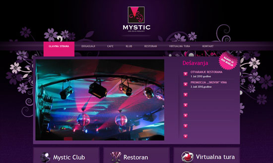
Love the purple and fuchsia, it even matches the club photo on the front page. Centered logo alert!
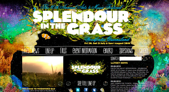
Make sure your eyes are well-rested before you view this site; every color of the rainbow seems to be on here. The content area could have used at least a translucent background to make the text more readable, which is already so small.
Social Media Weekly
UX – Designing with Paper Prototyping
“The basic premise of this method is that a paper prototype of a feature’s UI is crafted and then given to a user who will attempt to complete a task or a scenario. Evaluators record and analyze the results from these sessions, which are then used to create another prototype.”
Accessibility – Misguided accessibility: access keys
“These days, accessibility experts recommend strongly against the use of access keys, instead putting focus on accessibility enhancers such as “skip-to” links and clear navigation and layout, fully tested with assistive technologies like screen-readers.”
Accessibility – What should be the minimum / maximum length of alternate text?
“Putting undue length restrictions on alternate text can undermine the quality of alternate text, limit the amount of information conveyed to readers, and can affect the style of writing in a way that inhibits comprehension.”
Usability – Shlock and Awe: Little Things on Your Website that Drive People Nuts
“No website will ever be perfect (unfortunately), but we’ve compiled a list of little tweaks and changes you can check on your website to make sure you’re not irritating your visitors.”
JavaScript – Commonly Confused Bits Of jQuery
“jQuery brings to the party its own API, featuring a host of functions, methods and syntactical peculiarities. Some are confused or appear similar to each other but actually differ in some way. This article clears up some of these confusions.”
Friday Focus 08/06/10: Sidebar Focus
Where sidebars are not an afterthought, and even steal the show. Happy Friday Focus!
Designs of the Week
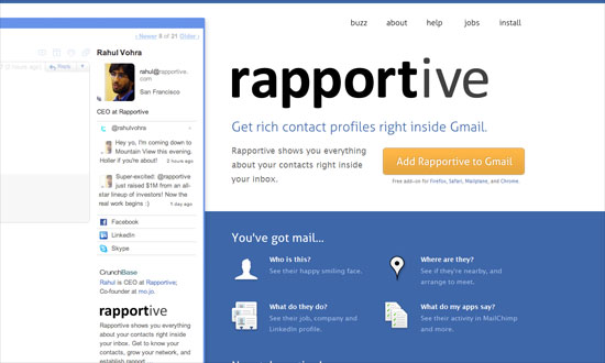
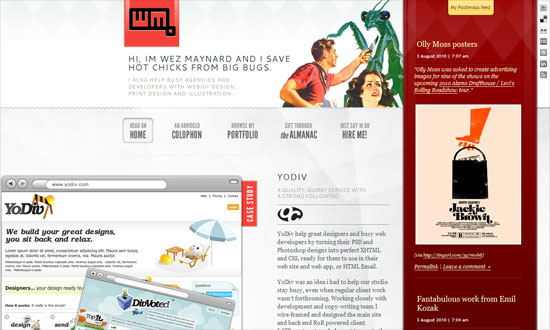
Sometimes your product doesn’t have to be presented in a MacBook, Cinema Display, iPhone, or Safari screen. You can just nudge it to the side of your layout and it will still make quite the impact. The bright shades of blue also help, and bonus points if that’s actually a jab at that “41 shades of blue” incident at Google.
I like everything going on this page. I find it interesting that there are at least four different typefaces used in this design, but blends in nicely. Also check out how the contents of the sidebar change by page.
I enjoy the generous serving of whitespace and the very subtle watermarks slash section dividers.
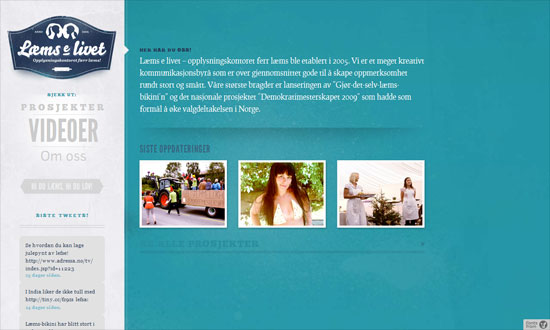
Great treatment on the video thumbnails and makes me wonder why not more people are doing it. Big chunky text, arrows, and buttons for a forceful first impression.
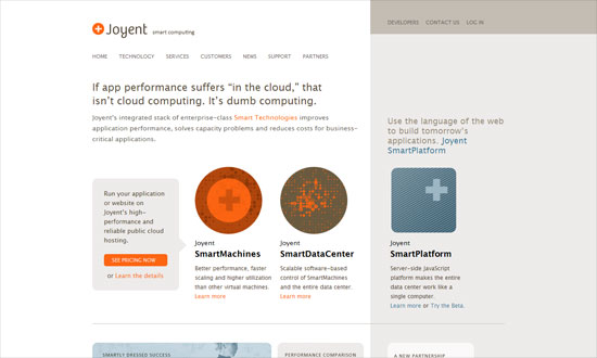
I love how simple this looks, something atypical of technology-focused sites. Brilliant icons, strong grid.
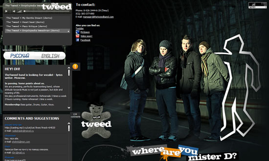
Pretty generic looking, but I like two things here: first, the actual use of tweed; second, the tooltip action on the photographic background.
The photo wall is neat, and so is the folded motif sprinkled around the site. The green “sidebar” behaves like a deconstructed box—get it?
Using cyan and magenta together is like asking for trouble, but I don’t mind it here. This site is trying to be as eyecatching as possible, and it’s using bold fonts, bold hues. I like that you can see swatches of the site’s color scheme spill over to the hand-drawn illustrations in each section.
Social Media Weekly
User Experience – Pagination, a thing of the past?
JavaScript – Showing Off bit.ly Clicks of Your Posts With jQuery
Programming – Will the Real Browser Stats Please Stand Up?
10 Wonderful CSS3 Creations
We have already shown what CSS3 with HTML5 can do for your website. But beside websites CSS3 with jQuery can do a whole lot more. You can make animations with it that could only be done with Flash before and create designs only possible with Photoshop.
Once FireFox and Internet Explorer have finally catch up with WebKit developers and designers will finally have more options to serve data and graphics. Here there are 10 exceptional animations and graphics done with CSS3 mainly and some with jQuery added. All of them are best viewed in Chrome and Safari, only the Star Wars animation is Safari 5 only.
