• Home
  • About
  • Contact
  • Advertise

Devlounge

Design, Develop, and Grow

ateşli sevgilisi fantezisini yaşamak istediğini söyler porno ona arkadaşları varken onunla gizli saklı seks yapmak istediğini sikiş söyleyen kız hafta sonu için gelen arkadaşının görmediği bir sikiş açıdan sakso çekmeye başlayınca adamın yarağını bu altyazılı porno şekilde indiremez ve açık şekilde salonda sikişimeye sex izle başladıklarında misafir kızı da bu sekslerine rokettube konuk ederler seks yapacağını düşünmeyerek onun sex izle oyun oynadığını zanneder sabah olur ve herkes uyanır hd porno bu sırada yanında şişme mankenini de getiren sapık erotik hikayeler genç sınav haftası ders çalışan genç adam üvey annesinin sikiş eve gelmesiyle hayatının şokunu yaşar

  • Home
  • Code
  • Design
  • Design Focus
  • Interviews
  • Publishing
  • Strategy
  • Webapps
  • Extras

Friday Focus 08/06/10: Sidebar Focus

August 6, 2010 By Sophia Lucero

Where sidebars are not an afterthought, and even steal the show. Happy Friday Focus!

Designs of the Week

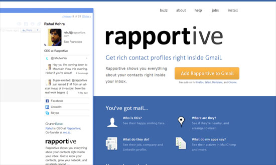
Rapportive

Sometimes your product doesn’t have to be presented in a MacBook, Cinema Display, iPhone, or Safari screen. You can just nudge it to the side of your layout and it will still make quite the impact. The bright shades of blue also help, and bonus points if that’s actually a jab at that “41 shades of blue” incident at Google.

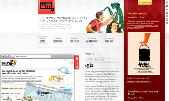
Wez Maynard

I like everything going on this page. I find it interesting that there are at least four different typefaces used in this design, but blends in nicely. Also check out how the contents of the sidebar change by page.

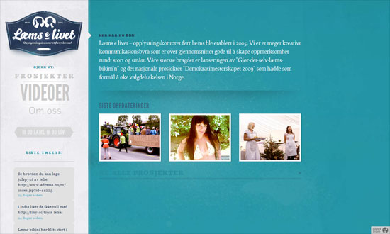
Læms e livet

I enjoy the generous serving of whitespace and the very subtle watermarks slash section dividers.

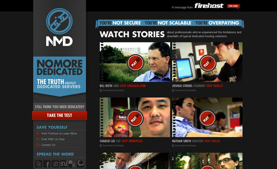
No More Dedicated

Great treatment on the video thumbnails and makes me wonder why not more people are doing it. Big chunky text, arrows, and buttons for a forceful first impression.

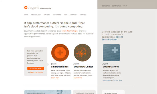
Joyent

I love how simple this looks, something atypical of technology-focused sites. Brilliant icons, strong grid.

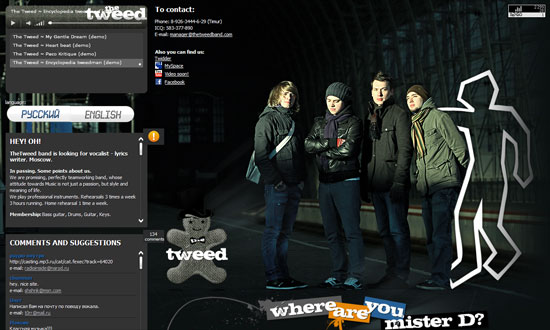
The Tweed Band

Pretty generic looking, but I like two things here: first, the actual use of tweed; second, the tooltip action on the photographic background.

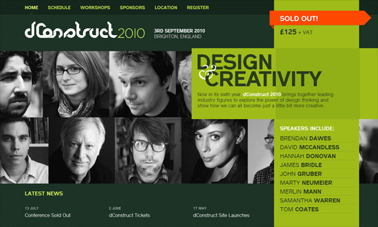
dConstruct 2010

The photo wall is neat, and so is the folded motif sprinkled around the site. The green “sidebar” behaves like a deconstructed box—get it?

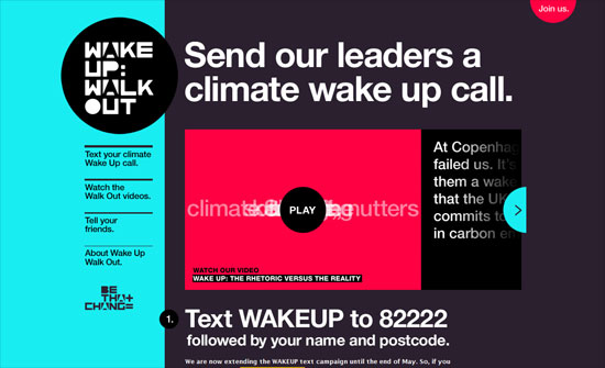
Wake Up Walk Out

Using cyan and magenta together is like asking for trouble, but I don’t mind it here. This site is trying to be as eyecatching as possible, and it’s using bold fonts, bold hues. I like that you can see swatches of the site’s color scheme spill over to the hand-drawn illustrations in each section.

Social Media Weekly

User Experience – Pagination, a thing of the past?

JavaScript – Showing Off bit.ly Clicks of Your Posts With jQuery

Programming – Will the Real Browser Stats Please Stand Up?
Filed Under: Design Focus Tagged With: bit.ly, bold fonts, bright colors, clean, grid, hand-drawn, icons, illustration, jquery, one page sites, pagination, sidebars, typography, user experience, web browsers

Code & Tutorials

Which Front-End Development Languages Will Grow in 2017?

Your Guide to Leveraging APIs as a Developer

Bitcoin Processing Website Integration For Web Developers

Website Security For 2016 That All Developers Need To Know

5 Reasons You Need to Be Using jQuery

About Devlounge

Want to read more about Devlounge, or maybe you want to contact us, or even advertise? Oh, and don't forget to subscribe to updates!

The Best of Devlounge

Design inspiration

21 Fabulous Print Designs To Inspire You This Week

Search