• Home
  • About
  • Contact
  • Advertise

Devlounge

Design, Develop, and Grow

ateşli sevgilisi fantezisini yaşamak istediğini söyler porno ona arkadaşları varken onunla gizli saklı seks yapmak istediğini sikiş söyleyen kız hafta sonu için gelen arkadaşının görmediği bir sikiş açıdan sakso çekmeye başlayınca adamın yarağını bu altyazılı porno şekilde indiremez ve açık şekilde salonda sikişimeye sex izle başladıklarında misafir kızı da bu sekslerine rokettube konuk ederler seks yapacağını düşünmeyerek onun sex izle oyun oynadığını zanneder sabah olur ve herkes uyanır hd porno bu sırada yanında şişme mankenini de getiren sapık erotik hikayeler genç sınav haftası ders çalışan genç adam üvey annesinin sikiş eve gelmesiyle hayatının şokunu yaşar

  • Home
  • Code
  • Design
  • Design Focus
  • Interviews
  • Publishing
  • Strategy
  • Webapps
  • Extras

Design Focus: By The Letter

March 31, 2015 By Sophia Lucero

This week’s websites feature beautiful, iconic letterforms that serve as design anchors to the content.

Designs of the Week

Get solid WordPress themes, plugins, and web design training from iThemes.
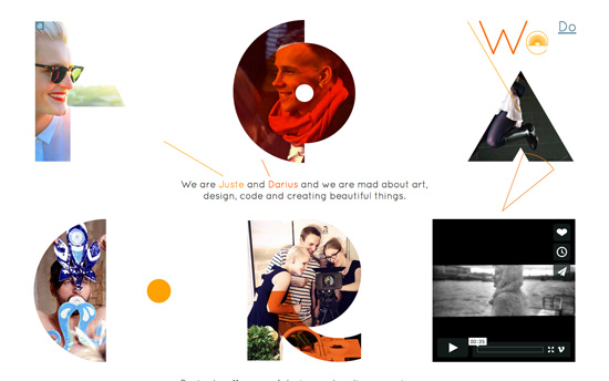
We are Fox Créateur
We are Fox Créateur

Their about page spells out their company name (logo) in an almost abstract way, and these shapes mask and highlight different photos & videos that tell their story.
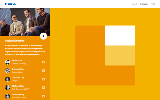
FORM
FORM

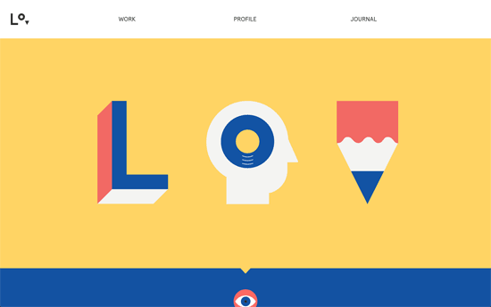
The letters here are inspired by Google’s Material Design language, and the color-coding per section is nifty. There are a lot of sections for the one-pager though, so a menu that lets you skip should’ve been present.
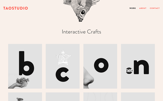
Taostudio
Taostudio

Card-based layouts are all the rage these days and this in particular reminds me of flash cards from childhood, but the twist is how the project images integrate with letters in a minimal, quirky, modern way. The grid ends with a card that says “what letter are you?”, inviting you to contact & contract them for new work, which I find clever. Other details I like: the sea creatures hanging upside down each page, and the submit button on the Contact page that looks like an actual keyboard key. Again, the design goes for quirky, clever things.
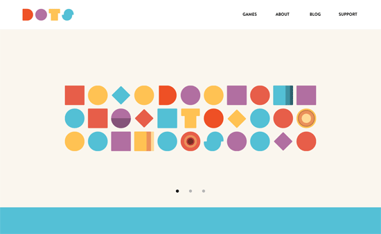
Dots
Dots

With letters that are just a couple of steps evolved from primary shapes, you can see how close their logo design is to the star of their games: the circle (or in their case, the dot).
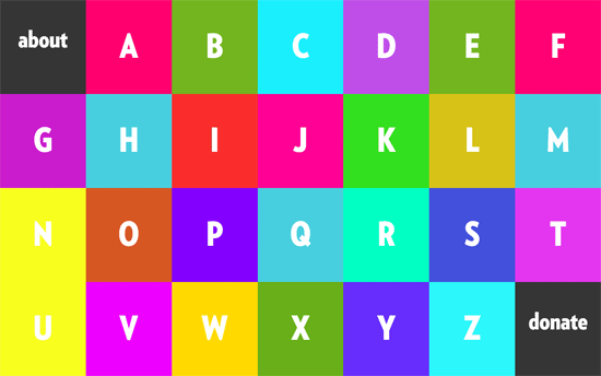
Alphabreast
Alphabreast

Color palette is a bit strong, although it totally works with the enclosed illustrations for each letter. I would like to see more of the comic/drawn look to the letters to tie in with the drawing style more.

Social Media Weekly

Make Headway, make intuitive layouts, make it your WordPress theme of choice!

JavaScript – The JavaScript World Domination
“JavaScript seems to creep into the most unexpected places these days. It’s not too long until your very toaster will be running JavaScript… but why?”

User Experience – Change Blindness: Why People Don’t See What Designers Expect Them To See
“For example, studies have found that people fail to notice that the details of an image have changed.”

Responsive Web Design – Responsive Design with Viewport Control
“To ensure your media queries work on hand-held devices, put this in your <head>!”
Design Focus: Shapely

October 3, 2014 By Sophia Lucero

Here’s a collection of website designs that display excellent use of shapes to style and present content, ranging from the quirky to the stunning.

Designs of the Week

Create unique, extraordinary websites with Squarespace. No experience necessary!

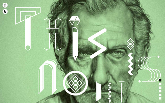
This Is Now
This Is Now

The mix of drawn portraits, bright colors, and shapes is a very interesting combination (parallaxed, of course), although in some places the text (which are all italics) is difficult to read on top of all of that.

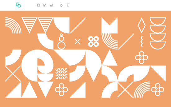
Reform
Reform

This color-changing site is dedicated to the very same topic of exploring shapes. No text except for the about modal and tooltips.

TTMM
TTMM

Like the previous site, it’s an array of icons which happen to be features in the product. Clicking on each reveals an animated verison on the watch and the description in the opposite column, hiding the icons found in that location. The concept seems so simple for a site design, but perhaps the best way too.

Nat-Ant
Nat-Ant

This design shows scattered icons which look to be deconstructed logos of the companies they represent (and similar icons for those who use wordmarks) and has a lot of subtle animation effects, moving both text and icons as you hover and scroll.

Letters, Inc.
Letters, Inc.

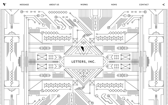
Love the intricacy of these patterns, which also connect to other designs as you scroll down and they draw themselves along the way.

Social Media Weekly

Pagelines lets you build WordPress websites and it’s as easy as drag and drop, go check it out!

User Experience – UX Thought of the Day
“Five UX thoughts a week to inspire you to do something differently in your design work.”

Design – Stop asking design candidates to redesign your product. It’s unfair and (even worse) it’s ineffective.
“You’re not hiring a designer who goes off into a corner to magically create perfect solutions like she can read your mind. You are hiring someone who can work with a team to identify the right problems, create the best solutions, and test the real-world effectiveness of those choices.”

30 Outstanding Progress Illustrations for Icon & Logo Designs

May 28, 2014 By Devlounge

In the past I’ve seen hundreds of progress illustrations related to logos and icons posted onto Dribbble. These are often shared by designers who wish to give some insight towards their creative process. These shots allow us to peek behind the curtain and see how a typical icon is designed from pencil and paper into Photoshop.

I’ve organized a set of 30 brilliant progress illustrations shared by very talented Dribbble members. Each shot may include the finished design or could focus primarily on the illustration work. Drawing out each idea would typically be essential when brainstorming and planning how to move forward on a creative project. Take a peek at these designs to see how much work truly goes into conceptual drafting.

Raspberry Leaf

raspberry leaf logotype sketch artwork

[Read more…]

Design Focus: Hieroglyphic

June 28, 2013 By Sophia Lucero

Our featured sites for the week use design elements in abstract, geometric shapes to represent and accent content. This may fall under icon-focused design, but the treatment of the graphic elements have a specifically distinct look, something could remind one of ancient markings from thousands of years ago.

Designs of the Week

Build on DIYThemes’ Thesis Framework for rock solid SEO and great layout customization options.

Neue Yorke
Neue Yorke

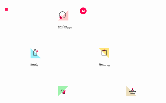
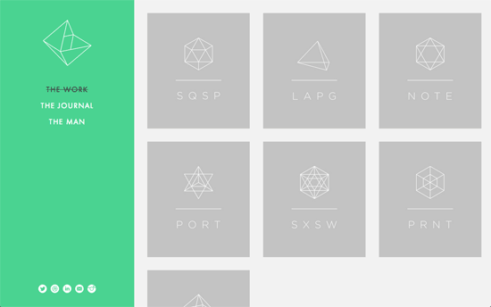
The homepage is basically a spread of cards with different geometric shapes and abbreviated names of the designer’s projects. Clicking on one loads the corresponding project page with an animation that splits open the screen in between the sidebar and the content areas—like sliding doors.

WNDRMNT
WNDRMNT

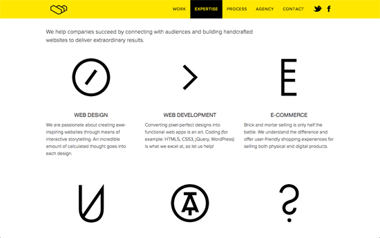
Yellow and black one-pager that uses subtle transitions on hover for several elements. It’s considerate to relegate those CSS awards buttons in the next section of the page, but 3 of them is a bit much especially placed on top of one’s work reel. A nice interactive feature is the invitation for potential clients to type in a word of their choice to score a 15% discount in a new project with the agency with a uniquely generated code.

AÃRK Collective
AÃRK Collective

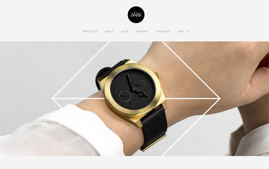
I love the photography on this site especially the ones in the slider: not only are the products creatively laid out, but they mix graphic elements to emphasize and add impact to them. Only one niggle: I find the text size too small, tiny even.

Lorenzo Verzini
Lorenzo Verzini

The coolest part has to be the hover effect on the logo, which I wish could also be applied to the main graphic for more impact.

Social Media Weekly

Make Headway, make intuitive layouts, make it your WordPress theme of choice!

Web Development – Frontend Development

User Experience – UX Spotlight: Behind the scenes of Tumblr’s design process

Web Design – Content-first design ain’t herding cats

Design, Business – On Being A Design Shop

Design Focus: Great Deals

November 23, 2012 By Sophia Lucero

Here’s a treat for the Thanksgiving and the holiday season that’s ramping up: freebies, bundles, and deals to help you create beautiful designs, all showcased on inspiring sites to boot.

Designs of the Week

Need help in promoting your site? INeedHits has been in the search engine marketing since 1996!

James Oconnell x 25 Days of Giving website
James Oconnell x 25 Days of Giving

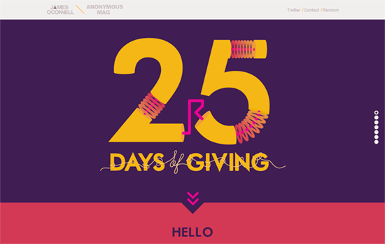
Very bold but still legible color scheme featuring beautiful illustrations (especially the button replacements) and visualizations (especially the animation in the footer).

PSD Super Bundle
PSD Super Bundle

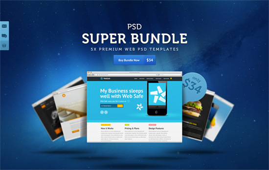
Take note of the blurred layers in the background and the ever-popular outer space theme for the header.

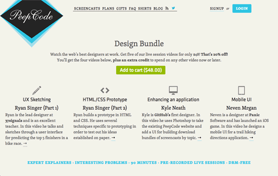
PeepCode Screencasts Design Bundle website
PeepCode Screencasts Design Bundle

Typographic and icon-based, not to mention responsive. The pop of blue from the logo carries over to the pullquote marks, buttons, and borders.

WordPress Themes Bundle website
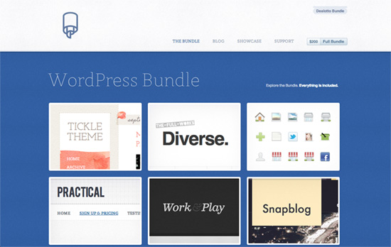
WordPress Themes Bundle

Beautiful subtlety everywhere: mixing different patterns and textures for the background, but also knowing when to inject cheer with solid bright colors and illustrations.

ByPeople website
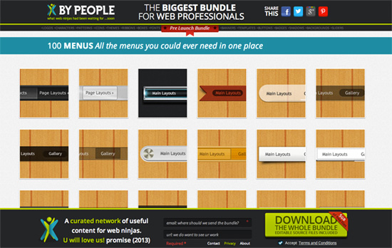
ByPeople

Not as beautifully designed as I’d like, or perhaps it’s taste, but very straightforward at the cost of your internet bandwidth!

DesignShock website
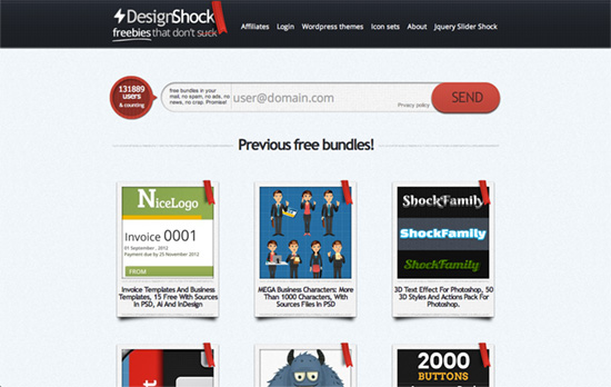
DesignShock

If you’re not exhausted by skeumorphism yet, you gotta enjoy the ribbons and textured cards that appear to defy gravity here. Also, always a good idea to have an attention-getting and accessible sign up form especially for sites such as these.

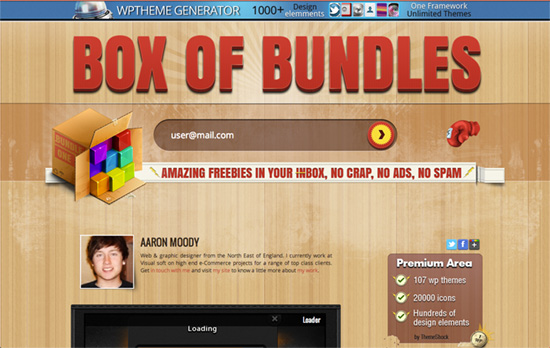
Box of Bundles website
Box of Bundles

This looks a little chaotic at first glance, but it kind of grows on you too, especially when you see all the icons and details as you scroll down, including the “little explosion” animation that happens at the bottom. Very cute idea.

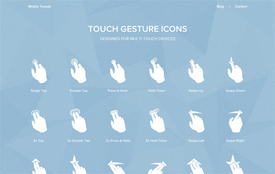
Touch Gesture Icons website
Touch Gesture Icons

I like the geometric background and complementary icy color scheme, although it may be tough to read for some.

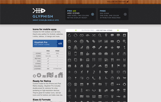
Glyphish website
Glyphish

I like the little info table at the left column but wish it had been actual text. The header containing all the pertinent information also looks great.

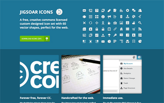
Jigsoar Icons website
Jigsoar Icons

Perhaps there’s a reason this white on blue look is popular with icon sites, and it’s the idea of blueprints and laying down the foundations first.

Social Media Weekly

Want your site to be as good-looking and inspirational as these? Start by choosing a well-designed theme from ThemeForest.

Accessibility – Easy Fixes to Common Accessibility Problems
“Sometimes simple changes can provide the necessary momentum while resulting in significant improvements for users.”

JavaScript – A Few New Things Coming To JavaScript
“The coming year is going to be an exciting time for developers as features proposed or finalised for the next versions of the language start to become more widely available.”

Web Design, Books – The top 50 books for web designers and developers
“The resulting selection is a collection of the very best insight into cutting-edge design and development techniques, inspirational texts, and beautiful volumes to admire.”

Typography – The 50 best free fonts for designers
“Get your hands on the best free fonts, from retro inspired type to slap-you-in-the-face slab serifs!”

Acessibility – Yes, actually, it may be you one day
“When you’re considering whether or not accessibility is important, keep in mind that it could actually be you you’re ensuring accessibility for. If it isn’t you, it will definitely be someone you know, and possibly someone you love.”

Next Page »

Code & Tutorials

Which Front-End Development Languages Will Grow in 2017?

Your Guide to Leveraging APIs as a Developer

Bitcoin Processing Website Integration For Web Developers

Website Security For 2016 That All Developers Need To Know

5 Reasons You Need to Be Using jQuery

About Devlounge

Want to read more about Devlounge, or maybe you want to contact us, or even advertise? Oh, and don't forget to subscribe to updates!

The Best of Devlounge

Fun With Border-Radius

Search