• Home
  • About
  • Contact
  • Advertise

Devlounge

Design, Develop, and Grow

ateşli sevgilisi fantezisini yaşamak istediğini söyler porno ona arkadaşları varken onunla gizli saklı seks yapmak istediğini sikiş söyleyen kız hafta sonu için gelen arkadaşının görmediği bir sikiş açıdan sakso çekmeye başlayınca adamın yarağını bu altyazılı porno şekilde indiremez ve açık şekilde salonda sikişimeye sex izle başladıklarında misafir kızı da bu sekslerine rokettube konuk ederler seks yapacağını düşünmeyerek onun sex izle oyun oynadığını zanneder sabah olur ve herkes uyanır hd porno bu sırada yanında şişme mankenini de getiren sapık erotik hikayeler genç sınav haftası ders çalışan genç adam üvey annesinin sikiş eve gelmesiyle hayatının şokunu yaşar

  • Home
  • Code
  • Design
  • Design Focus
  • Interviews
  • Publishing
  • Strategy
  • Webapps
  • Extras

Friday Focus 04/06/12: By Four

April 6, 2012 By Sophia Lucero

We’re already into the fourth month of the year, and this week we’re featuring designs whose main navigation strictly use that number.

Designs of the Week

Want your site to be as good-looking and inspirational as these? Start by choosing a well-designed theme from ThemeForest.
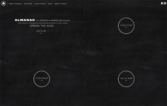
Brand Almanac website
Brand Almanac

There’s a chalkboard look on the homepage, plus circular links that contrast against the four boxes and alternate with slideshow photographs. On the inside it’s a lighter look while still retaining that classic, old school, neutral feel.
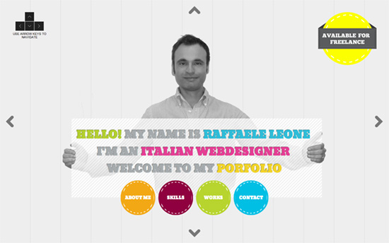
Raffaele Leone's website
Raffaele Leone

I like the keyboard navigation all the way into the deeper sections like the portfolio, but using the bright colors as backgrounds on top of the chunky font in white and black, it’s a bit much.
Planet Propaganda website
Planet Propaganda

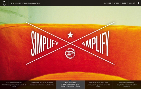
The navigation’s actually on top of the full-screen slideshow, but arranged in a triangular, X-mark fashion, carrying both the studio’s logo and slogan—smart and effective move. The shape is repeated in their about page as well.

Social Media Weekly

Get solid WordPress themes, plugins, and even design training from iThemes.

Web Design – Responsive Web Design: Missing the Point
“Responsive design is the real deal. It is not a fad. It’s a legitimate attempt to address the massive challenge of delivering great experiences to this explosion of devices and browsers. But don’t feel like it’s the end-all be-all of website construction. This aint religion. This is web design.”

Design, Typography – Fontomas – iconic fonts scissors
“Now it’s trivial to customise fonts for your needs with 3 simple step. At first, you select needed symbols on source fonts. Then rearrange those on destination font. After that, you can download SVG font and make webpack via fontsquirrel generator or other services.”

Business – Sell Yourself: A Creative CV Guide
“This guide lends a helping hand to anyone creating a CV aimed at the creative industries. There are hints, tips and insights into how to inject some creativity into your CV and also how”
Friday Focus 01/27/12: Solid Color Coded

January 27, 2012 By Sophia Lucero

Welcome to the last Friday Focus of the month! This week we’re featuring sites employing blocks of color as a dominant part of their designs. Who says we need to use gradients in everything we do? See how it’s done.

Designs of the Week

Get solid WordPress themes, plugins, and web design training from iThemes.

Medis Kök & Bar website
Medis Kök & Bar

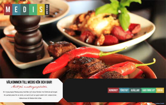
Always a good idea to grab inspiration from your logo and and translate it directly into your design. Here you have a sumptuous photo slideshow on the homepage, but inside it’s all color blocking, with each page title in its own column, and the body copy to the left. It’s only unfortunate that background images had to be used instead of real text, and again, too much all caps.

Camp Luxe website
Camp Luxe

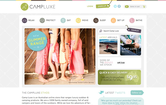
It looks like color coding and icon-based navigation go hand in hand in this trend. Lots of boxed in elements here, but still looks very light and breezy. I particularly like the background pattern made up of the icons you find in the navigation, but arranged in a way that’s both luxe and cozy at the same time.

Favolla Comunicação website
Favolla Comunicação

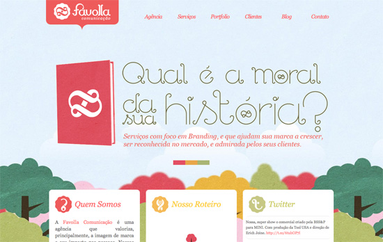
I like the paper-based forest in the background and the icon designs that mesh so well with the logo. What puts me off a little, however, is the uneven alignment of the boxes and the justified text.

Orestis Webdevelopment website
Orestis Webdevelopment

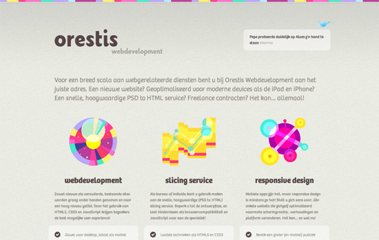
Once again, another icon-focused design, but in this case they’re quite abstract and futuristic looking. The use of very colorful hues is just right and not overwhelming at all.

Maria Helena Cunha's website
Maria Helena Cunha

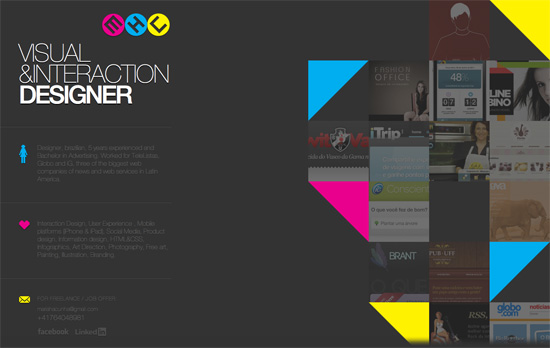
Two more familiar trends here: triangles and the use of CMYK as the color palette. I find the text to the left a little too cramped and dark, and considering each block is pretty lengthy there should have been at least some hover effect that lit them up similar to the one you see to the portfolio on the other half of the page.

Dataveyes website
Dataveyes

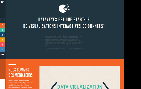
I like how each section literally uses one bold color in its background. The visualizations and and other hover effects are also lovely. Some blocks are cut off though, as if the height isn’t calculated properly, and the typesetting is a little rough.

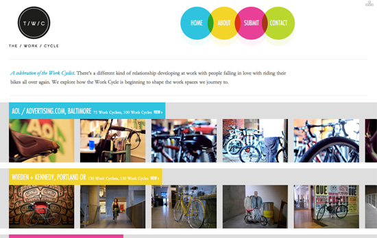
The Work Cycle website
The Work Cycle

Another CMYK (plus green) color scheme here. One good idea I noticed is the hover on each image puts on a slight tint based on the section it’s in. It’s a little confusing, though, that the four colors are used for both locations and the top navigation as seen in the circles above.

Social Media Weekly

Copywriting, User Experience – Not Lorem Ipsum
“We want clients and designers alike to think about their design and how it will work with the web copy, we want you think about how numbers, symbols and bullet points will look.”

Typography – Our Favorite Typefaces of 2011
“The idea is simple: I invite a group of writers, educators, type makers and type users to look back at 2011 and pick the release that excited them most.”

Business – Why I don’t do “mates rates” projects
“It’s almost a certainty that at some point in your career, you’ll be asked by a friend or member of your family to work on a project and feel you should only take a nominal “mates rates” fee. Try not to.”

Typography, Accessibility, Semantics – A better way to use icon fonts
“What do you think about this issue? Is speak:none the Holy Grail of icon fonts? Or could we use SVGs to archive similar things?”

Get solid WordPress themes, plugins, and web design training from iThemes.

Friday Focus 12/09/11: Hello, My Name Is

December 9, 2011 By Sophia Lucero

This week’s featured designs business card websites, some of them looking literally like cards containing contact information of their owners. That means very minimal layouts but still all compelling experiences.

Designs of the Week

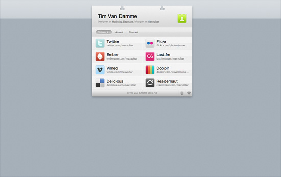
Tim Van Damme's website
Tim Van Damme

First up, the site that started this trend. The design may be over a year old but the graphical details are still all the rage today. One of the most important features for this genre of a site are the vCard download link and the social media links, accompanied of course by the colorful icons for each site. No tabs here, but each section in the menu loads with a vertically sliding animation, while the hover effects use horizontally sliding effects.

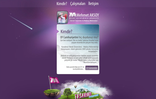
Mehmet Aksoy's website
Mehmet Aksoy

The shooting star in the background is actually animated with Flash. So are the stars which twinkle. There’s a touch of the Aero (Windows Vista/Windows 7) interface in this design (particularly the avatar) but I feel it’s the custom font used on this page that gives a different look to the whole site.

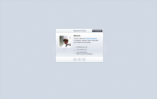
Benjamin De Cock's website
Benjamin De Cock

This site greets you with the owner’s name then displays a closed box, which you click on so it pops open to reveal this card. The animation even contains accompanying smoke effects. Other visual treats to enjoy on this page: an icon-based website tooltip on the text link for “interface designer”, glowing hover effects on the bottom icons, and a slider for his three avatars.

Chris Rowe's website
Chris Rowe

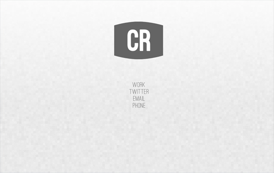
Not the usual boxed in layout but it’s all only contact information in here. Hovering over the initials reveals the full name and occupation. Same goes for the links below it.

Margot Dowleska Dyer's website
Margot Dowleska Dyer

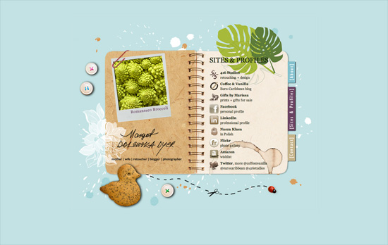
A nice earthy look with icons that blend in and a slideshow running in the polaroid frame to the left. There are some portions though where the graphics make the text a little difficult to read and are competing for attention with the foreground.

Maximilian Schoening's website
Maximilian Schoening

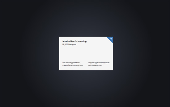
The closest thing to the business card metaphor translated to a webpage, complete with an animated flip done with CSS3 transforms when you click on the top right blue corner. The background uses another CSS3 property, radial gradients. The other side contains nothing but tiny social icons.

Social Media Weekly

CSS – The CSS profilers are coming!
“Back in August I talked about the lack of benchmarks or performance tools for CSS. In the meantime, the fine folk we call browser makers have been working hard on new developer tools to do just that: measure CSS performance.”

CSS – Truncating text using only CSS
“It works in IE 6+, Safari 4+, Firefox 7+, Opera 11+ and Chrome 10+”

Design, Business – Warm Gun: Design for Continuous Deployment
“In his Design for Continuous Deployment presentation at the Warm Gun conference in San Francisco, CA Randy Hunt shared how Etsy’s development process allows designers and developers to collaborate at scale on production code.”

CSS – Knyle Style Sheets
“Inspired by TomDoc, KSS attempts to provide a methodology for writing maintainable, documented CSS within a team.”

Icons and Grunge Fonts

June 2, 2011 By Hyde

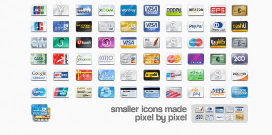
Time again for some fresh icons and fonts. This week you’ll find listed here five different icons; hand drawn, social,, for the cloud, android and credit cards. A couple of them are vector only which gives you more control over the size and color.

For the fonts choice this week we are going grunge. Since I have been following web design almost nine years now, grunge has never gone out of style. Especially grunge brushes are always popular.

I don’t know about you, but since all the excitement about HTML5 and CSS3 have died down, it feels kinda slow in the front-end world. When was the last time there was a new awesome jQuery plug-in that does something no one thought about before?

Meanwhile give a look at these icons and fonts while we wait for the next popular “it”.

247 Hand Drawn Web Icons

Icons

The Cloud Icon Pack

icons

Native Android Icons

icons

Free credit card Icons

icons

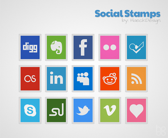
Social Stamps Icon Set

icons

Web Icons Tile-Style

icons

Grunge Fonts

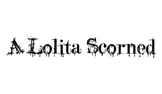
A Lolita Scorned

Grunge Fonts

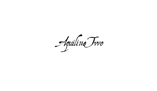
Aquiline Two

Grunge Fonts

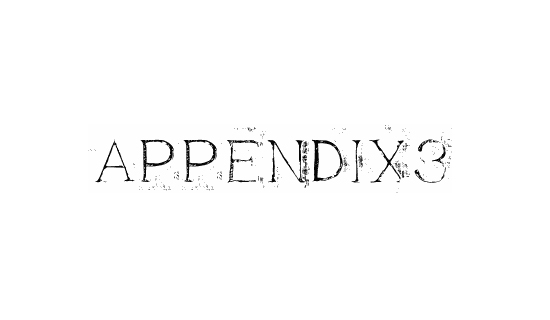
Appendix 3

Grunge Fonts

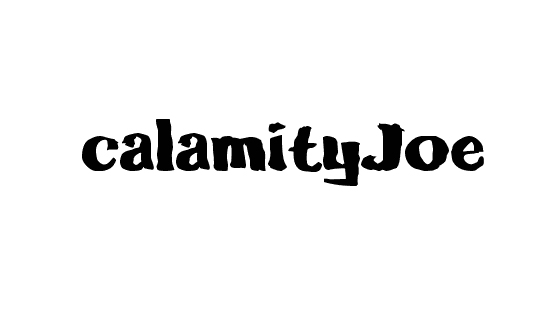
Calamity Joe

Grunge Fonts

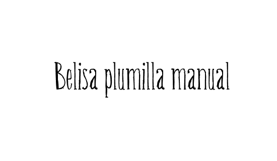
Belisa Plumilla Manual

Grunge Fonts

Friday Focus 05/27/11: Icon-centric

May 27, 2011 By Sophia Lucero

This week on Friday Focus, we’re looking at sites that revolve around iconized representations of their content.

Designs of the Week

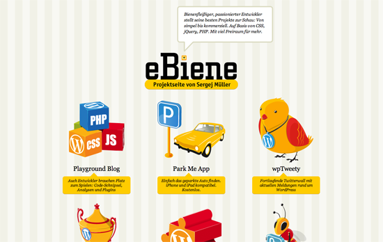
eBiene

This has quite the preschool room feel (down to the background wallpaper), probably because of the primary colors. If icon illustration is your strength, best to flaunt it this way.

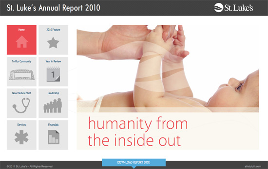
2010 Annual Report - St. Luke's Duluth

Clean, straightforward brochure site with subtle design touches here and there. One advantage of having larger icons for main navigation is a bigger area to click on.

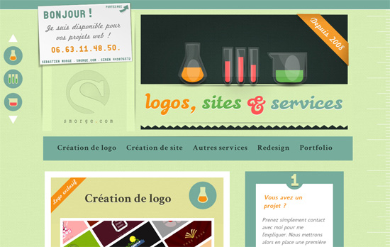
Création de logo et de site web

Love the colors. One has to ask, though, if the choice of laboratory glassware for each content section makes sense (how does a set of beakers relate to site creation, actually?).

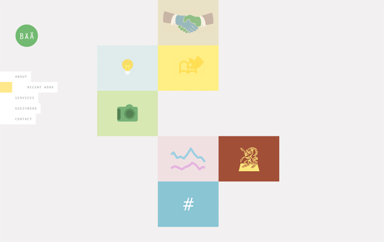
Bärnt & Ärnst

The challenge in using icons at the forefront is keeping the look cohesive. Here, one of the projects in the portfolio sticks out a little bit and could have been a tad more muted, although overall it still looks great. But I’m not a fan of the <br> overuse.

Social Media Weekly

CSS – dom3d: rendering 3d with CSS3
“There are a few benefits to this approach: you get to manipulate the elements with normal CSS, and you can overlay 3d objects onto pages and still let the user interact with the page.”

CSS – Styling ordered list numbers
“The key is using CSS generated content to create and insert the counter numbers after removing the default numbering from the list.”

Web Browsers – In IE, iFrames on Pages in Quirks Mode Also in Quirks Mode
“If you are creating a page using HTML5 and you think there is some reasonable chance that someone may embed this page on another via iframe, you should use the HTML5 shim on it for all version of IE.”

Design – Crash Course: Design for Startups
“I’ve learned why my work nowadays is better than from years past. I am aiming to somehow share some of these thoughts brewing in my head with this post today.”

« Previous Page
Next Page »

Code & Tutorials

Which Front-End Development Languages Will Grow in 2017?

Your Guide to Leveraging APIs as a Developer

Bitcoin Processing Website Integration For Web Developers

Website Security For 2016 That All Developers Need To Know

5 Reasons You Need to Be Using jQuery

About Devlounge

Want to read more about Devlounge, or maybe you want to contact us, or even advertise? Oh, and don't forget to subscribe to updates!

The Best of Devlounge

Going Meta With Circuit-Inspired Design

Search