Welcome to the last Friday Focus of the month! This week we’re featuring sites employing blocks of color as a dominant part of their designs. Who says we need to use gradients in everything we do? See how it’s done.
Designs of the Week
Get solid WordPress themes, plugins, and web design training from iThemes.
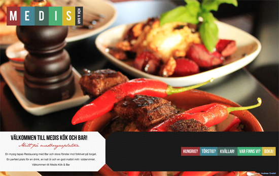
Always a good idea to grab inspiration from your logo and and translate it directly into your design. Here you have a sumptuous photo slideshow on the homepage, but inside it’s all color blocking, with each page title in its own column, and the body copy to the left. It’s only unfortunate that background images had to be used instead of real text, and again, too much all caps.
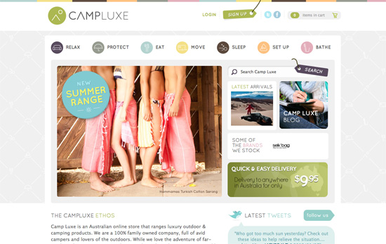
It looks like color coding and icon-based navigation go hand in hand in this trend. Lots of boxed in elements here, but still looks very light and breezy. I particularly like the background pattern made up of the icons you find in the navigation, but arranged in a way that’s both luxe and cozy at the same time.
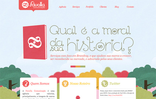
I like the paper-based forest in the background and the icon designs that mesh so well with the logo. What puts me off a little, however, is the uneven alignment of the boxes and the justified text.
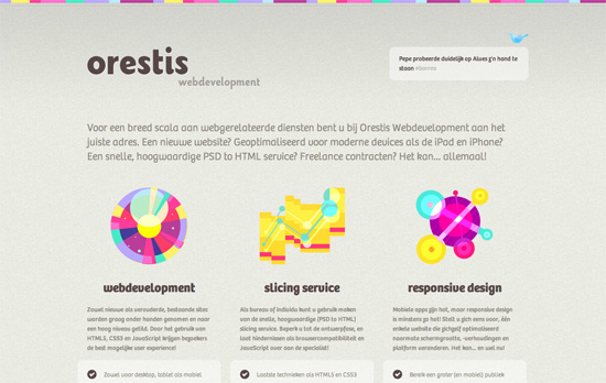
Once again, another icon-focused design, but in this case they’re quite abstract and futuristic looking. The use of very colorful hues is just right and not overwhelming at all.
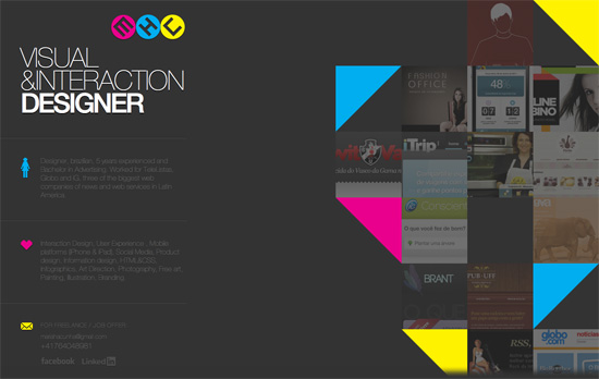
Two more familiar trends here: triangles and the use of CMYK as the color palette. I find the text to the left a little too cramped and dark, and considering each block is pretty lengthy there should have been at least some hover effect that lit them up similar to the one you see to the portfolio on the other half of the page.
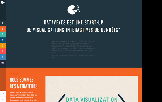
I like how each section literally uses one bold color in its background. The visualizations and and other hover effects are also lovely. Some blocks are cut off though, as if the height isn’t calculated properly, and the typesetting is a little rough.
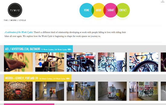
Another CMYK (plus green) color scheme here. One good idea I noticed is the hover on each image puts on a slight tint based on the section it’s in. It’s a little confusing, though, that the four colors are used for both locations and the top navigation as seen in the circles above.
Social Media Weekly
Copywriting, User Experience – Not Lorem Ipsum
“We want clients and designers alike to think about their design and how it will work with the web copy, we want you think about how numbers, symbols and bullet points will look.”
Typography – Our Favorite Typefaces of 2011
“The idea is simple: I invite a group of writers, educators, type makers and type users to look back at 2011 and pick the release that excited them most.”
Business – Why I don’t do “mates rates” projects
“It’s almost a certainty that at some point in your career, you’ll be asked by a friend or member of your family to work on a project and feel you should only take a nominal “mates rates” fee. Try not to.”
Typography, Accessibility, Semantics – A better way to use icon fonts
“What do you think about this issue? Is speak:none the Holy Grail of icon fonts? Or could we use SVGs to archive similar things?”
Get solid WordPress themes, plugins, and web design training from iThemes.
