• Home
  • About
  • Contact
  • Advertise

Devlounge

Design, Develop, and Grow

ateşli sevgilisi fantezisini yaşamak istediğini söyler porno ona arkadaşları varken onunla gizli saklı seks yapmak istediğini sikiş söyleyen kız hafta sonu için gelen arkadaşının görmediği bir sikiş açıdan sakso çekmeye başlayınca adamın yarağını bu altyazılı porno şekilde indiremez ve açık şekilde salonda sikişimeye sex izle başladıklarında misafir kızı da bu sekslerine rokettube konuk ederler seks yapacağını düşünmeyerek onun sex izle oyun oynadığını zanneder sabah olur ve herkes uyanır hd porno bu sırada yanında şişme mankenini de getiren sapık erotik hikayeler genç sınav haftası ders çalışan genç adam üvey annesinin sikiş eve gelmesiyle hayatının şokunu yaşar

  • Home
  • Code
  • Design
  • Design Focus
  • Interviews
  • Publishing
  • Strategy
  • Webapps
  • Extras

Design Focus: Sprinkles on Top

June 7, 2013 By Sophia Lucero

Here’s a fun and colorful trend for this week: icons scattered on the page in ice cream-flavored hues, breaking out of the grid while still looking neat on top of their playfulness.

Designs of the Week

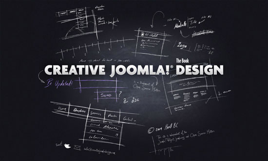
Want your site to be as good-looking and inspirational as these? Start by choosing a well-designed theme from ThemeForest.

Matt Luckhurst
Matt Luckhurst

The letters that spell out the designer’s name look almost random enough to not be noticed. It’s nice that there are squiggles in the spaces between, which add dynamism and quirkiness—further reinforced by the shape in the top right menu. Hovering on it opens the left eye, giving you a wink; it feels tiny bit like a Picasso painting. I think the flyout menus could be spaced a little better, in the stylish way the portfolio images slide out from under the letters.

Days
Days

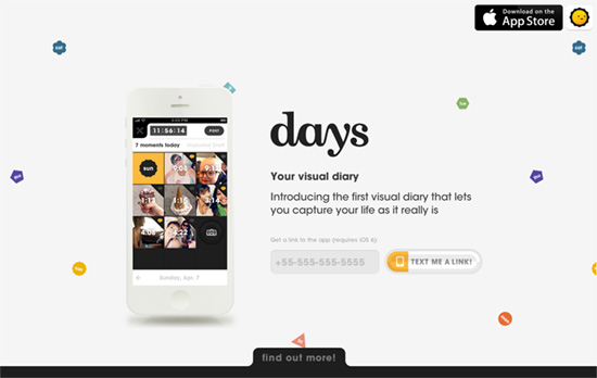
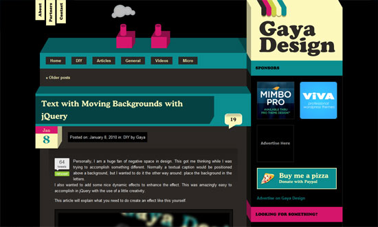
Moving your mouse cursor over the top area shifts the icons in the background accordingly. Interestingly, no hand on the phone here. The cute motif continues and becomes more apparent in the features section, with cartoony characters framing the images.

Mosne
Mosne

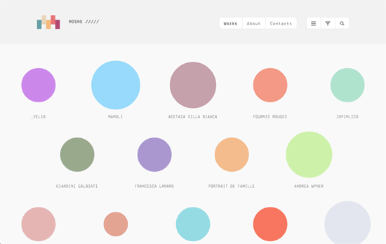
Circles have been insanely popular for the last few years, and in this design they take center stage, jiggling around with a few random animations even! Hovering on them shows the representative icon for each work, colored black (I might have preferred white to keep with that pastel palette). In keeping with the theme there’s an animated rainbow that appears at the top of the screen as the next page loads. That in turn carries the background color of the circle you clicked on. If the arrangement is a little difficult to sift through (they’re not alphabetically arranged, after all), there are controls in the menu: the first arranges them into a compact list, while the next two let you filter and search.

Social Media Weekly

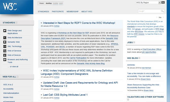
Make Headway, make intuitive layouts, make it your WordPress theme of choice!

User Interface Design – On Scope and Time
“UI excellence is highly dependent on how much space the teams are given to explore different directions and to refine even the smallest details on the final product.”

Typography, User Interface Design – 2013 Tesla Model S Dashboard Display
“Automobile in-dash displays are traditionally the poster children of poor UX design. Tesla’s is the antidote — thoughtfully laid out with intuitive controls inspired by the best iPad apps. And most notably, clean typography.”

Web Design – How to keep up to date on Front-End Technologies
“Hundreds of blog posts and articles are published every day, but there is no way you can read all of them. We think you should have a strategy to keep up to date, so we have created this recipe.”

Friday Focus 12/09/11: Hello, My Name Is

December 9, 2011 By Sophia Lucero

This week’s featured designs business card websites, some of them looking literally like cards containing contact information of their owners. That means very minimal layouts but still all compelling experiences.

Designs of the Week

Tim Van Damme's website
Tim Van Damme

First up, the site that started this trend. The design may be over a year old but the graphical details are still all the rage today. One of the most important features for this genre of a site are the vCard download link and the social media links, accompanied of course by the colorful icons for each site. No tabs here, but each section in the menu loads with a vertically sliding animation, while the hover effects use horizontally sliding effects.

Mehmet Aksoy's website
Mehmet Aksoy

The shooting star in the background is actually animated with Flash. So are the stars which twinkle. There’s a touch of the Aero (Windows Vista/Windows 7) interface in this design (particularly the avatar) but I feel it’s the custom font used on this page that gives a different look to the whole site.

Benjamin De Cock's website
Benjamin De Cock

This site greets you with the owner’s name then displays a closed box, which you click on so it pops open to reveal this card. The animation even contains accompanying smoke effects. Other visual treats to enjoy on this page: an icon-based website tooltip on the text link for “interface designer”, glowing hover effects on the bottom icons, and a slider for his three avatars.

Chris Rowe's website
Chris Rowe

Not the usual boxed in layout but it’s all only contact information in here. Hovering over the initials reveals the full name and occupation. Same goes for the links below it.

Margot Dowleska Dyer's website
Margot Dowleska Dyer

A nice earthy look with icons that blend in and a slideshow running in the polaroid frame to the left. There are some portions though where the graphics make the text a little difficult to read and are competing for attention with the foreground.

Maximilian Schoening's website
Maximilian Schoening

The closest thing to the business card metaphor translated to a webpage, complete with an animated flip done with CSS3 transforms when you click on the top right blue corner. The background uses another CSS3 property, radial gradients. The other side contains nothing but tiny social icons.

Social Media Weekly

CSS – The CSS profilers are coming!
“Back in August I talked about the lack of benchmarks or performance tools for CSS. In the meantime, the fine folk we call browser makers have been working hard on new developer tools to do just that: measure CSS performance.”

CSS – Truncating text using only CSS
“It works in IE 6+, Safari 4+, Firefox 7+, Opera 11+ and Chrome 10+”

Design, Business – Warm Gun: Design for Continuous Deployment
“In his Design for Continuous Deployment presentation at the Warm Gun conference in San Francisco, CA Randy Hunt shared how Etsy’s development process allows designers and developers to collaborate at scale on production code.”

CSS – Knyle Style Sheets
“Inspired by TomDoc, KSS attempts to provide a methodology for writing maintainable, documented CSS within a team.”

Friday Focus 08/06/10: Sidebar Focus

August 6, 2010 By Sophia Lucero

Where sidebars are not an afterthought, and even steal the show. Happy Friday Focus!

Designs of the Week

Rapportive

Sometimes your product doesn’t have to be presented in a MacBook, Cinema Display, iPhone, or Safari screen. You can just nudge it to the side of your layout and it will still make quite the impact. The bright shades of blue also help, and bonus points if that’s actually a jab at that “41 shades of blue” incident at Google.

Wez Maynard

I like everything going on this page. I find it interesting that there are at least four different typefaces used in this design, but blends in nicely. Also check out how the contents of the sidebar change by page.

Læms e livet

I enjoy the generous serving of whitespace and the very subtle watermarks slash section dividers.

No More Dedicated

Great treatment on the video thumbnails and makes me wonder why not more people are doing it. Big chunky text, arrows, and buttons for a forceful first impression.

Joyent

I love how simple this looks, something atypical of technology-focused sites. Brilliant icons, strong grid.

The Tweed Band

Pretty generic looking, but I like two things here: first, the actual use of tweed; second, the tooltip action on the photographic background.

dConstruct 2010

The photo wall is neat, and so is the folded motif sprinkled around the site. The green “sidebar” behaves like a deconstructed box—get it?

Wake Up Walk Out

Using cyan and magenta together is like asking for trouble, but I don’t mind it here. This site is trying to be as eyecatching as possible, and it’s using bold fonts, bold hues. I like that you can see swatches of the site’s color scheme spill over to the hand-drawn illustrations in each section.

Social Media Weekly

User Experience – Pagination, a thing of the past?

JavaScript – Showing Off bit.ly Clicks of Your Posts With jQuery

Programming – Will the Real Browser Stats Please Stand Up?

Friday Focus 01/22/10: Folded Out and 3D

January 22, 2010 By Sophia Lucero

This week on Friday Focus: these folded, boxy 3D-looking designs pose an interesting challenge to the designer in creating perspective and breaking out of boundaries. See how these websites did it!

Designs of the Week

Jóvenes contra la Violencia

Big, colorful, chunky, and grungy. It almost feels wrong to see “normal” sans serif text fonts here and there!

HeadRed

I like the use of the elegant type and wallpaper background against the less elegant ropes, folds, and tears that (which all are done in moderation).

Ian Soper

The shadow is not so believable, but I like the look. It’s quite different from the other folded/blocky/3D ones that focus on adding folded ribbons and boxy-fying things up.

IntuitionHQ

Love the icons and the color palette.

World Wide Web Consortium

The W3C has its own subtle application of the design pattern. Clean, clear, and lovely.

Gaya Design

Cute little chimney effect (that isn’t Flash) going on in the header. The design looks a little busy, but I like it.

Cleverclick

Now for something unbelievably simple, but still striking and attractive. One of those designs where the design practically goes unnoticed because it’s so subtle.

Jailface

This isn’t a particularly attractive site, but there are enough attention to detail and typography that gets the job—of making the stories readable—done.

InstantLoop

It’s been a while since I’ve seen a super shiny, “Web 2.0”-style design. Bring on the pastels!

New Worship Media

I think it makes sense for the design to be so gray and dark because the backgrounds in the gallery are so colorful.

Cube Scripts

When you’ve got products presented in boxes, a boxy-looking design feels like a natural progression, doesn’t it? What I really like is the footer treatment, which looks like a few sheets of paper with two angling out of place. Not necessary but a very nice touch.

Social Media Weekly

Design – Crafting Subtle & Realistic User Interfaces

Design – Unity In Design: Creating Harmony Between Design Elements

Design – Realism in UI Design

Optimization – How to reduce the number of HTTP requests

CSS – How To Create Depth And Nice 3D Ribbons Only Using CSS3

CSS – Keeping Safari (and Chrome) Hacks Out of Your Stylesheets

Friday Focus 12/18/09: Blueprints

December 18, 2009 By Sophia Lucero

Here’s another interesting look that’s being used in websites lately: blueprints. See how they’re translated into this week’s featured websites on Friday Focus.

Designs of the Week

Alex Swanson

I have some issues with the spacing in the footer boxes but other than that, good site.

Blueprint Design Studio

It’s a good idea to add real elements to reinforce the blueprint feel. I also like the animation when you hit the “Next Project” button.

Creative Joomla Design

More of chalkboard doodles than a blueprint imitation, but it fits. I really like that the email subscription form blends in, but it’s a little too blended in. Overall that’s the main issue with this site: everything looks the same, it’s hard to tell that there are actually links and clickable elements in it.

Pat Dryburgh

Here’s one going for the clean, subtle look. With blueprints it usually means white on blue, or light on dark in general, but it doesn’t have to be that way all the time, as this site demonstrates.

Alcomi iPhone Game Development Company

Taking the blueprint look to the third dimension is another great idea. Also, although not shown in full here: I like that the social media icons in the footer are flowing to the left (whooshes and all) instead of lined up side by side.

Social Media Weekly

Project Management – Biz Ladies 09: Project Management
“Today’s Biz Ladies post comes from Tiffani Jones of Second and Park. Tiffani runs a copywriting and content strategy business as well as a web design agency and is here today to share the ins and outs of successful project management.”

Programming – jQuery Masonry
“Masonry is a layout plugin for jQuery. Think of it as the flip side of CSS floats.”

Next Page »

Code & Tutorials

Which Front-End Development Languages Will Grow in 2017?

Your Guide to Leveraging APIs as a Developer

Bitcoin Processing Website Integration For Web Developers

Website Security For 2016 That All Developers Need To Know

5 Reasons You Need to Be Using jQuery

About Devlounge

Want to read more about Devlounge, or maybe you want to contact us, or even advertise? Oh, and don't forget to subscribe to updates!

The Best of Devlounge

Tips to Creating an SEO Friendly Website on a Drupal Platform

Search