• Home
  • About
  • Contact
  • Advertise

Devlounge

Design, Develop, and Grow

ateşli sevgilisi fantezisini yaşamak istediğini söyler porno ona arkadaşları varken onunla gizli saklı seks yapmak istediğini sikiş söyleyen kız hafta sonu için gelen arkadaşının görmediği bir sikiş açıdan sakso çekmeye başlayınca adamın yarağını bu altyazılı porno şekilde indiremez ve açık şekilde salonda sikişimeye sex izle başladıklarında misafir kızı da bu sekslerine rokettube konuk ederler seks yapacağını düşünmeyerek onun sex izle oyun oynadığını zanneder sabah olur ve herkes uyanır hd porno bu sırada yanında şişme mankenini de getiren sapık erotik hikayeler genç sınav haftası ders çalışan genç adam üvey annesinin sikiş eve gelmesiyle hayatının şokunu yaşar

  • Home
  • Code
  • Design
  • Design Focus
  • Interviews
  • Publishing
  • Strategy
  • Webapps
  • Extras

Friday Focus 12/26/08: Attention-Grabbing Headers

December 26, 2008 By Sophia Lucero

Hope you all had a wonderful Christmas celebration! This Friday we’re going to look at whimsical, chaotic, everything-but-the-kitchen-sink headers that will certainly grab your attention.

Designs of the Week

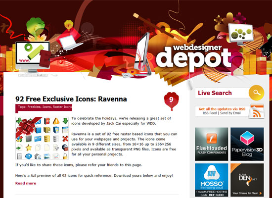
Webdesigner Depot

One of the big questions you have to answer when dealing with more “chaotic” designs is, how do you control the viewer’s eye movement? The site title on the header is pretty easy to find, actually, but I wish the header were a little more useful and contained a navigation menu, for starters.

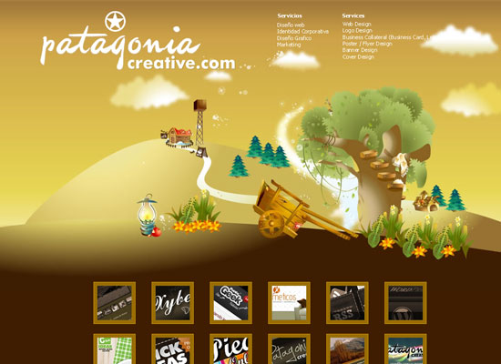
Patagonia Creative

Huge header alert! Again, I wish it had something a little more useful with the amount of space it is taking up. A tagline maybe. The list of services at the upper right could have been a little bigger as well.

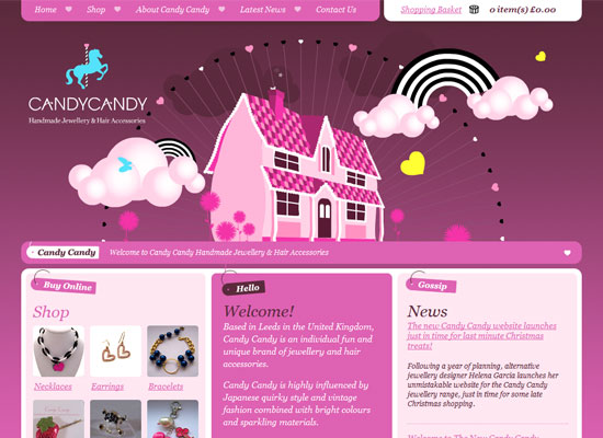
Candy Candy Jewellery

What a cute header—I love the spinning wheel of hearts, it looks like an otherworldly ferris wheel! And it matches the quirky jewelry designs this site is selling. Might have a little too much pink for some people, though. A dash of contrasting colors could make it better.

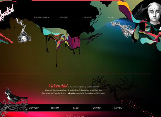
Vakendod

And now for something surreal, bordering on the creepy! I like how unusual this site looks. Unfortunately there’s this empty part in the middle that gets filled only when you select something from the menu. I’m all for whitespace, but the about text is already at the footer.

Social Media Weekly

Design – 5 Inspiring Web Design Conference Speeches you Shouldn’t Have Missed in 2008
You may not have attended these conferences, so here’s your chance to learn from the masters of web design.

Programming – Top 10 Web Platforms of 2008
Which web platform should you be developing for?
Filed Under: Design Focus Tagged With: conference, contrast, header, navigation menu, pink, speech, surreal, web platform, web-design

Code & Tutorials

Which Front-End Development Languages Will Grow in 2017?

Your Guide to Leveraging APIs as a Developer

Bitcoin Processing Website Integration For Web Developers

Website Security For 2016 That All Developers Need To Know

5 Reasons You Need to Be Using jQuery

About Devlounge

Want to read more about Devlounge, or maybe you want to contact us, or even advertise? Oh, and don't forget to subscribe to updates!

The Best of Devlounge

Top 6 Online Resources for Designers and Creative Freelancers

Search