Our featured sites for the week use design elements in abstract, geometric shapes to represent and accent content. This may fall under icon-focused design, but the treatment of the graphic elements have a specifically distinct look, something could remind one of ancient markings from thousands of years ago.
Designs of the Week
Build on DIYThemes’ Thesis Framework for rock solid SEO and great layout customization options.
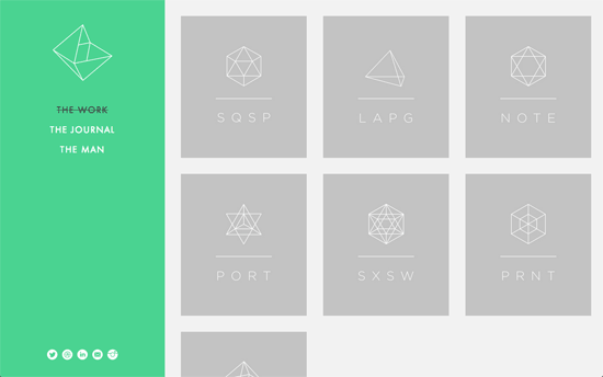
The homepage is basically a spread of cards with different geometric shapes and abbreviated names of the designer’s projects. Clicking on one loads the corresponding project page with an animation that splits open the screen in between the sidebar and the content areas—like sliding doors.
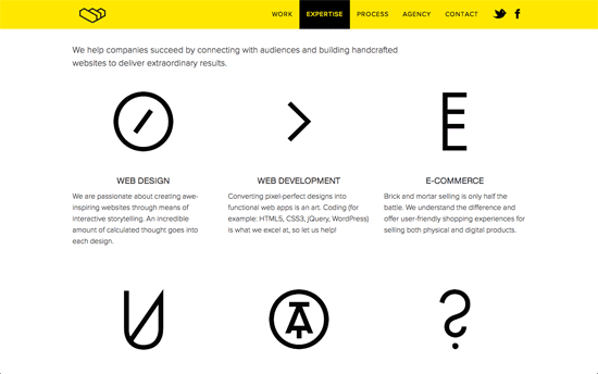
Yellow and black one-pager that uses subtle transitions on hover for several elements. It’s considerate to relegate those CSS awards buttons in the next section of the page, but 3 of them is a bit much especially placed on top of one’s work reel. A nice interactive feature is the invitation for potential clients to type in a word of their choice to score a 15% discount in a new project with the agency with a uniquely generated code.
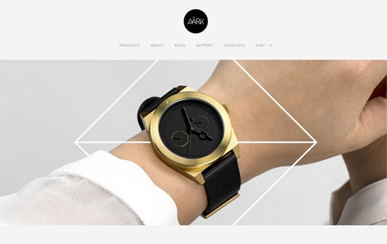
I love the photography on this site especially the ones in the slider: not only are the products creatively laid out, but they mix graphic elements to emphasize and add impact to them. Only one niggle: I find the text size too small, tiny even.
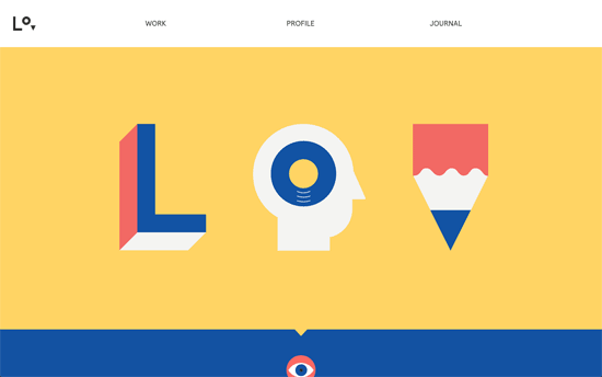
The coolest part has to be the hover effect on the logo, which I wish could also be applied to the main graphic for more impact.
Social Media Weekly
Make Headway, make intuitive layouts, make it your WordPress theme of choice!
Web Development – Frontend Development
User Experience – UX Spotlight: Behind the scenes of Tumblr’s design process
Web Design – Content-first design ain’t herding cats
Design, Business – On Being A Design Shop
