I was just surfing around the net the other day, and I started thinking about the myriad of varied text treatments I was seeing on different banner graphics. I decided that it is more interesting to design your own textured background for text rather than try to find an actual typeface on one of those free font download sites such as Fontgarden.com or Stomp.com, etc. I bring up these “free” font download sites because if you are going to use such a typeface from one of these sites, you usually have to pay for it in the long run if you want to use it on anything that is of a commercial nature, such as your website! It is always a good idea to check into the ramifications of downloading anything that is deemed as “free” anyway, regarding the legal copyright and usage of such elements. So, to get around any usage issues that could arise from finding a distressed typeface on the Net, and incorporating it into your web design, I decided to share this quick and easy Adobe Illustrator tutorial with you.
Step one of this process was to find a typeface on the Net that sported a similar treatment to the “distressed” look I wanted. Although I wanted something a bit more radical as far as the “distressing” part was concerned, I did come across this text treatment on the website of boxer Joe Calzaghe:

You get the idea of “distressed” or “beat up” text from Joe’s name on this banner graphic. While I liked this, and found it unique, I thought it might be interesting to push the envelope a bit, and come up with a considerably more distressed or “textured” look than this, while still making the text legible and eye-catching.
Taking the Steps
Open Adobe Illustrator (I used CS2), and then File>Open an image that has a lot of contrast and would make a good textured background to use as a base for your distressed text. For this, I cropped a section out of a larger photo of ocean and beach to the dimensions of approximately 8 inches wide and 2.5 inches high, and resolution of 150 ppi:

I felt that this photo had a lot of gritty little details that will translate to an interesting, highly textured base for my text treatment.
In Illustrator, select the image with the Selection tool (V) and then Object>Live Trace>Tracing Options. You want to see Tracing Options so you can modify some of the settings, and preview the results before you convert the image. In the dialog, enable the Preview option. The other Presets should be left at their default. This trace you are about to do, will output in black and white, which will be best to work with for this particular effect we want. You will also want to change the Threshold value, which controls the amount of black or white that appears in the image. We want as much detail as we can get, so I suggest using a value of around 75 or 80. But, don’t take my word for it, mess about with this yourself, the values can be adjusted right there in front of your eyes since you have the Preview button checked. Adjust the black and white image to have plenty of small details, and when you are happy with the Threshold value, go ahead and click the Trace button.
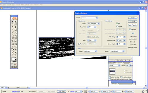
Next, in order to use this tracing, we need to convert it to paths. So, while the tracing is still selected, pick Object>Expand. In the dialog that comes up, click OK. For this project we want to work with the black areas only. Choose the Magic Wand tool (Y), select the white areas, and then press the Delete key (Mac) or the Backspace key (PC).
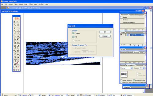
Now we will be placing some text over a portion of your new texture background and thus be able to get an idea of what the distressed text will look like. To accomplish this, click down below your texture somewhere else on the artboard, and choose the Type tool (T) and type something. I used “DIGITAL” for my example. I used a large font size, something like 60 or 72 pt, and chose the plain Arial Black, a font that’s free to use. I also switched my type color to blue in order to view this part of the operation more easily. Once you’ve typed your text, move this text onto the texture background and move it around until it is in a place where you feel the most texture will be applied.

Let’s have a look at what the text will look like once applied to our text by creating a clipping mask that uses the letters as a mask. Click Command+A (Mac) or Ctrl+A (PC) to select both the text and the texture, and choose Object>Clipping Mask>Make. Once you click again outside of your texture area, you’ll see the text revealed on its own, with the texture showing through it. In case you may not like how it looks at first, undo the clipping mask and move the text around to another area of the texture background and repeat this procedure again. Another option is to scale the texture background up or down or rotate it, distort it anyway you want that will help you achieve the texture on the text that looks how you want it. Here is what my text looked like:
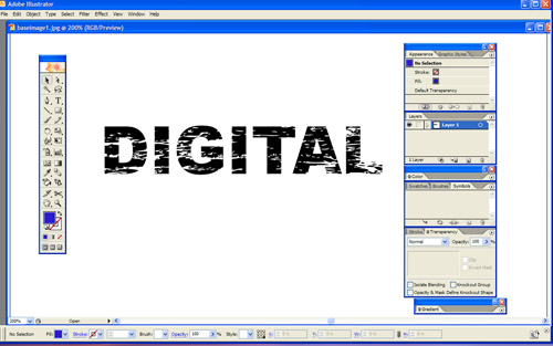
For my purposes, this turned out exactly how I wanted it, a little distressed, but still clear and easy to distinguish the letters.
At this point, we want to delete some of the excess texture background, which we don’t need to keep, as it just is not needed, and makes the file size larger. First, we undo the clipping mask by clicking Edit>Undo Make Clipping Mask. Open the Layers palette and expand the layer by clicking on the arrow next to the Layer 1 thumbnail. Click on the texture Group layer to highlight it in the palette. Option+click (Mac) or Alt+click (PC) the Create New Layer icon, and name this layer “Square” in the Layer Option dialog, then click OK. This positions the new layer between the text and the texture.
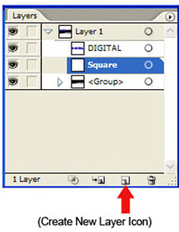
Make sure the new layer called “Square” is highlighted or activated, and select the Rectangle tool (M) and draw a rectangle over the text and texture you want to keep. I suggest keeping the rectangle as close to the text as possible without clipping any of it. Click Command+A (Mac) or Control+A (PC) to select all. Open the Pathfinder palette (Window>Pathfinder) and click the Crop icon. See example:

What happens next, is a Live Paint Group, which is indicated by a grey rectangle around the artwork might appear after you click crop. If this occurs, just use your Selection tool and double click in an empty area of the artboard to disable it. Now you can safely reapply the clipping mask on your newly cropped artwork. Click Command+A (Mac) or Control+A (PC) to select your text and the texture, and then click Object>Clipping Mask>Make. Now you have a very unique piece of text that has a sort of ‘worn out’ or distressed appearance in your arsenal of special effect elements!
At this point you should File>Export and Save As a .jpg or other format file for use in your web designs. This can be opened in Photoshop now, and subjected to some more special effects if you so desire.

Wrapping Up
Although this is a simple enough procedure, it has a few specific steps, and may not be suitable for everyone wanting a text effect solution. This is offered as just one of the many options available to designers in search of interesting text treatments, and it also provides a nice opportunity for those not as comfortable using Adobe Illustrator to advance their creative skills in that program a bit!
