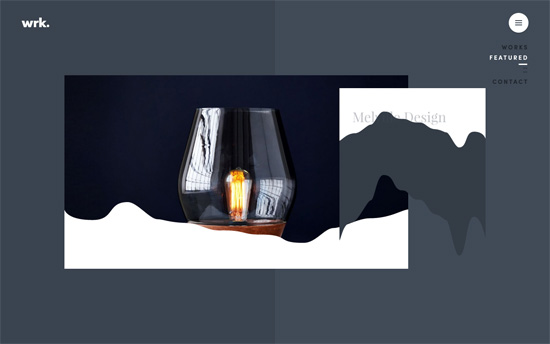
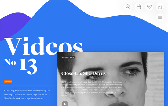
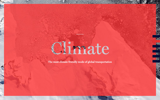
Site layouts are filled with boxes and corners, but not everything has to be so straight-laced. These designs feature touches of something a little more organic: animated waves and curves that soften the look and can even make things more fun.
Designs of the Week
Want your site to be as good-looking and inspirational as these? Start by choosing a well-designed theme from ThemeForest.

Beautiful colors and isometric illustrations, but the best part has to be the transition animations the that sort of spread and drip like paint, and the bouncy curves when you hover on the edges of content blocks.

The white menu bar and the icons on the top right collapse as you scroll down, and in areas with defined backgrounds they make use of large, subtle shadows. The sections are broken from monotony with a liquid-like background animation, and I find it interesting that a hero area is located at the end of the page.

The way the links on the right edge of the page animate into the chapter list before going into the 1st chapter is super neat. So is the animation on the chapter title screen.
Social Media Weekly
Get solid WordPress themes, plugins, and web design training from iThemes.
Web Design – Web Design in 4 minutes
“Let’s say you have a product, a portfolio, or just an idea you want to share with everyone on your own website. Before you publish it on the internet, you want to make it look attractive, professional, or at least decent to look at. What is the first thing you need to work on?”
Design – Peek Inside a Facebook Design Critique
“By showing how design critiques at Facebook typically go, we wanted to highlight what makes for a good critique and what can often get in the way.”
Accessibility – Vox Product Accessibility Guidelines
“Making work accessible creates a better experience across the board. Use this checklist to help build accessibility into your process no matter your role or stage in a project.”
