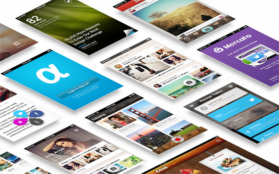
Our featured designs for the week defy the usual perspective and place their elements on an isometric grid. We’ve featured the isometric look before, but none of them were so bold as to display the blueprints on which the elements lay, and it makes you perceive that change in positioning even better.
Designs of the Week
Pagelines lets you build WordPress websites and it’s as easy as drag and drop, go check it out!

I like how their whole laundry list of services is listed vertically and crosses against its larger, bolder summary. I also respect that they didn’t even change the perspective of the images in the portfolio even when you click to inspect them. Even if you select one that is at the edge of the browser viewport, it’ll slide to the center. Another feature on this page I like is the parallaxy company timeline, which is just two layers sliding at different speeds: one for the photos, and one for the zig-zag lines.

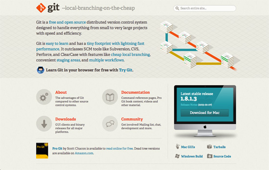
It’s a nice idea to go for a warm, organic, recycled paper feel by way of the subtle background texture and the choice of slab serifs (Adelle). Orange is a popular thing to pair with grays and browns these days, and when you go down that path it’s not surprising to see equally bright pops of color along the way, too.

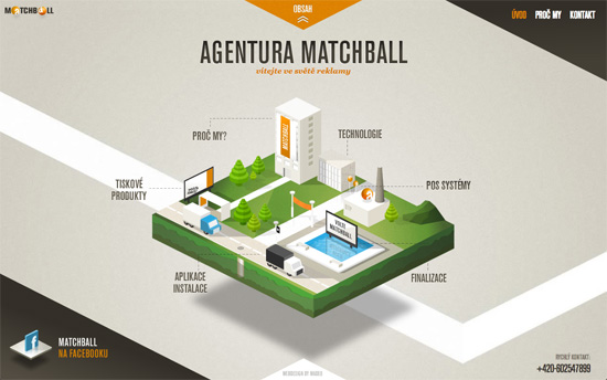
I always enjoy slices of urban zones served up like cake. This site takes it to the next level and cuts up that scene a second pass to produce plots representing subpages, lined up in a row but still on the same plane. I also like that the top right navigation and bottom left facebook link are both in triangles, framing the page nicely.

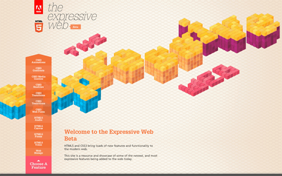
Another design that takes the isometric concept further by deconstructing text into tiny blocks and dropping them one by one, albeit quickly, on the plane. It also creates interesting shapes that come together when you interact with the page (e.g. resizing the browser creates a burger on the media queries page).
Social Media Weekly
Build on DIYThemes’ Thesis Framework for rock solid SEO and great layout customization options.
CSS – Browserhacks
“Browserhacks is an extensive list of browser specific CSS and JavaScript hacks from all over the interwebs.”
Mobile Web Design, User Experience – Solving The Back Button
“Gestures can be intuitive if carefully crafted by understanding how things move and how the brain works.”
CSS – Simple user styles
“User styles that simplify UI and give focus to the content on some of my favorite websites.”
CSS, Typography – Typeplate
“Typeplate is a “typographic starter kit”. We don’t make aesthetic design choices, but define proper markup with extensible styling for common typographic patterns.”
