There are many ways to create effective web graphics, so I thought it would be fun this week to create a colorful, unique web site banner using multiple layers in Photoshop. Contrary to popular belief, manipulating layers in Photoshop is fast and easy, and can allow you to be ultra creative in the designs for web banners either for your own site or for a client project. I will create the banner step-by-step using several different photo elements of mine and show you the basics to help you get started experimenting with the power of multiple layers in Photoshop.
Procedure
First, open your ‘base image.’ In the example below, I used a scenery shot of a field with a hill and lots of green grass and trees, and also a foreground tree overhang for depth. When working with your base image, remember that you are going to be cropping the final image to fit into the constraints of a banner, which will vary depending upon the site you are designing for. In the example I will show you, the final finished banner size will be (in pixels) 600 wide, by 300 high, at 72 ppi. So, with this in mind, mentally select a focal point area in your base image, and after a few adjustments of this base image, and the addition of several graphic elements, we will crop it to the correct size.
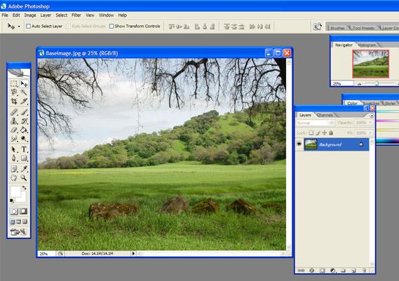
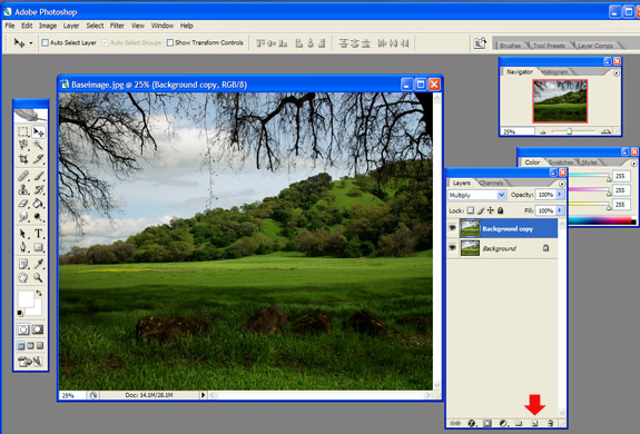
For the next step you will simply go to the Layers Palette and drag this background layer down over the New Layer icon (at the bottom of the Layers Palette next to the Trash Can icon), which will duplicate your base image. At the top of the Layers Palette choose Multiply from the little pull down menu bar. This will darken your base image markedly, so be sure you started with an image that wasn’t dark to begin with, something that is a lighter or medium range in darkness and contrast should do fine. Example of the results of this step below:
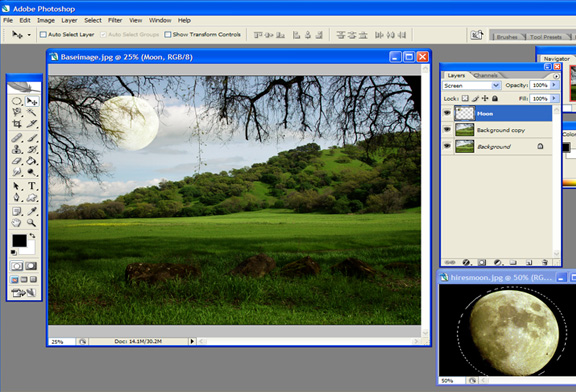
Next, we want to start adding some graphic elements, so I opened up a photo of the Moon that I captured, and selected it with the circle marquee tool up at the very top left side of the vertical toolbar, and copied and pasted it onto my background image using CTRL+C followed by CTRL+V. At the top of the Layers Palette you will now see the Moon layer. I also clicked the pull down menu at the top of the Layers Palette, and selected Screen, which eliminates any of the black background my moon was sitting upon. It also helps it blend into the cloudy background a little, and remains a bit transparent so the tree branches show through it, giving a bit of ‘false depth’ to the image. Here is an example of this part of the procedure:
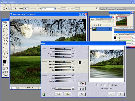
For the next step of our image creation here, we need to click on Layer>Merge Visible (this command is close to the bottom of the Layer drop down menu) so that we basically merge all three of the layers you have so far, in order to be able to apply a special effect from our Plug-ins. Once you have performed the Merge Visible command, you will see that there is now just one layer called Background. At this point, call up your Flood plug-in Filter>Flaming Pear>Flood, or anything else you may have available to make the effect of a glassy lake on your base image. Click OK once the settings of Flood are where you like them, and you should have an image that is like the one below:
Okay, we are getting very close to the end of this exercise, but I felt like this picture was still a bit plain, although it is coming along. I decided that it might look nice to plonk another graphic element in the mix, so I opened up a photo of a boat that I took some time ago, and just simply dragged that onto my nice background image. I made a few minor adjustments of the boat, such as Edit>Transform>Scale, to make it smaller, and I also moved it around until it was in a place that looked good to me. Here is a view of this step:
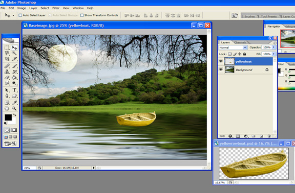
This looks all right, but the boat seems to be floating in space rather than on the lake I just created, so that must be remedied! What is nice about Photoshop, is that it lets you apply effects to each individual layer. In other words, I can add the Flood effect to the boat individually, and make it look like it ‘belongs’ on the water there, blending in. Making sure the boat layer is active or highlighted in the Layers Palette, click on Filter>Flaming Pear>Flood, and try to match up the reflection with the bottom of the boat, so that no space is between the reflection and the bottom of the boat. See the example below:
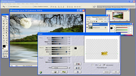
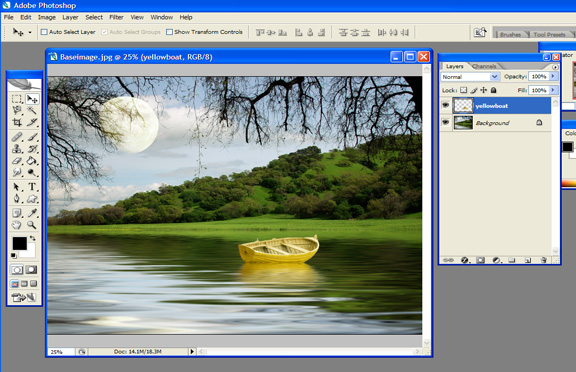
Once you click OK, the effect will apply to the boat, and will make it look like it belongs in the picture as the example:
We are nearly finished, we just need to crop the image to a more ‘banner-appropriate’ size, and then add some text. So, let us begin by cropping this large image to something more manageable for our project banner. First, click Layer>Merge Visible again, so we get all the layers merged together. Now, grab the Rectangular Marquee tool, the top left tool in your vertical toolbar, and drag it inside your picture taking a chunk of your image that includes the main elements like the Moon and the rowboat, plus some of the water. You will want to then click Image>Crop, and take a look at what your markedly more banner-sized image looks like now. See the image example:
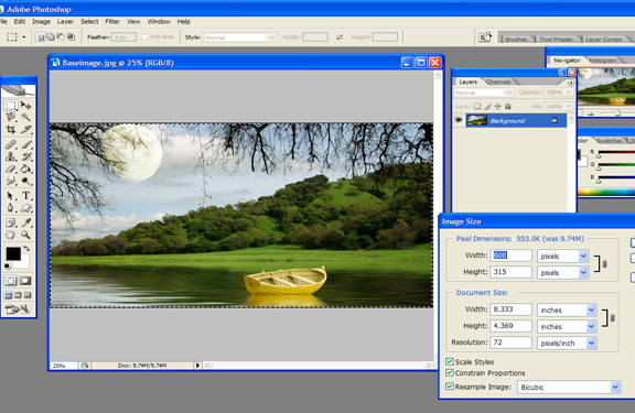
My image turned out to be about 600 pixels wide by 315 pixels high. This size is fine for my Blogger format sites. You may need to experiment with the size for your particular application. Next we will add some text, and then you will be finished with a very nice, creative, and unique banner for your blog or for a web site.
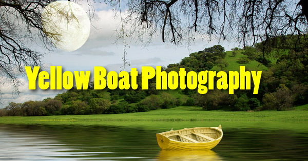
To complete this process, Click on your Text Tool in your vertical Toolbar. I chose a font called Poplar Std. which is a tall, blocky typeface. Type your title in the color you desire, and then apply a drop shadow effect to that type using the effects button located at the bottom of your Layers Palette, second from the left (looks like a black circle with a scripted “f” in it), and choose Drop Shadow. Click OK. The example turned out like this:

Now it is time to click Layer>Flatten Image to merge this new type layer with the rest of your design. Once you flatten the image, be sure to save it as a .jpg, and you are ready to upload it to your site. Here is the example of my final flattened image:
Wrapping Up
This might seem like a rather involved process just to design a web banner, but if you are interested in experimenting and working with layers in Photoshop, and creating something that is unique to your design elements and creativity, this is a very quick, fun little exercise to try out. This tutorial required the use of the Flaming Pear plug-in for Photoshop called Flood. However, you can do just as well without that step, and create any kind of composite layer image you like. The creativity part is literally at your fingertips!
