All of us made mistakes. It is natural and inevitable. However, it would be best if we take note of our mistakes, learn from them and never do them again. On the other hand, we can minimize committing a mistake if we are just pro-active enough to know how we can avoid them.
In creating a corporate website design, novice and experienced alike make mistakes. Listed below are few of the dos and don’ts for corporate website design.
Website Page Structure
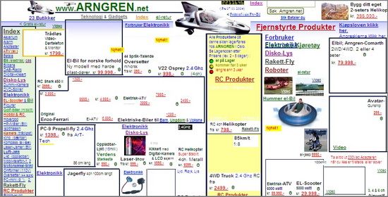
In structuring your corporate website, do not just place boxes everywhere. Boxes of different sizes that are not lined up properly will actually grab the attention of your visitors because it simply creates a whirlwind of craziness. What you need to do is to keep your page properly structured. You can follow the structure and balance of a great magazine or newspaper as they have the grid systems in a structure and format that are easy to follow.
Color Scheme

The right color scheme alone will help your website look more professional representing the company behind the elegant design. Consider your prospected visitors and the niche that you are going to compete in, and choose colors accordingly. Brighter color schemes, e.g. CMYK (cyan, magenta, yellow, and key/black) color model would work with entertainment sites, while financial or medical sites look better with lighter and more open color schemes. Palettes for sites with e-commerce platforms will also differ from those offering services rather than products.
A good idea might be to study the effects that colors are known to produce and select the ones fitting your theme accordingly.
With all that in mind, avoid overdoing your website with more than 20 different colors. It will not only make your website look unprofessional but is likely to annoy your readers, too. Make sure to have chosen colors that blend and do not clash.
Company Logo
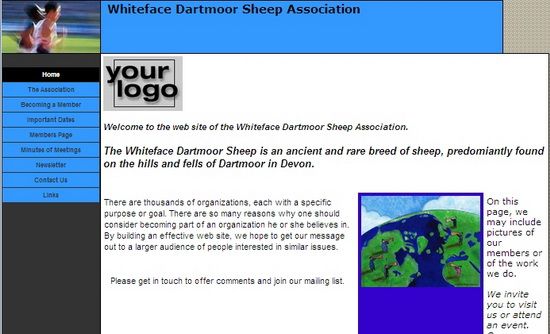
Branding requires a good corporate logo that you can incorporate to your website. Designing a logo is crucial. If you already have chosen a company name, you can search for your competitors’ company logos to get an idea of what is already in the market and make use of their good (and bad) ideas.
Keep your logo simple and straight. Make sure that it communicates and clearly states your company’s message and identity. You can get some idea from known brands like FedEx, Disney, Starbucks, Virgin, Toyota, ABC, Coca Cola, and more.
Fonts and Sizes
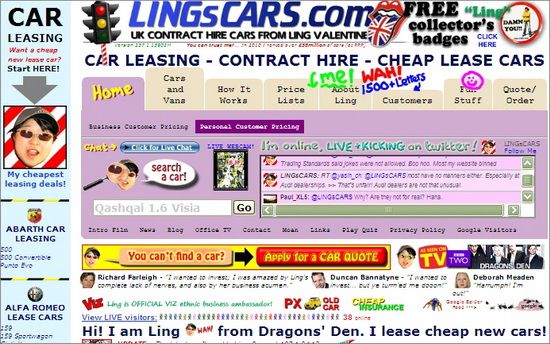
If you have observed, every company or brand has its own unique font for their logo, slogan as well as content on their websites. Make sure you have selected a font that will affect the reading experience of your visitors. You can use a different font and size for your title and another for your content. You can even make a step further and have your own custom font designed for you to make sure that it corresponds perfectly to your needs.
Avoid using over five different fonts in 10 different sizes. It will not only make your site look ugly, but it will also ruin your visitor’s reading experience.
Website Content and Copywriting
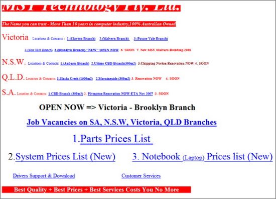
Though not exactly in the realm of web design, this is another crucial component of any website that wants to be successful. Make sure that you focus on your website content and place only what is important. For example, if you are designing a website for a company that sells a certain product then make sure that the product is the focus on the website’s homepage. There must be a space on the page that calls to action for the specific product you want to outline. Avoid placing irrelevant ads across your page. Having nice pictures on your website is great, but too many of them comblined with excessive advertisements can make your visitors stay away and never come back.
Make sure you fill your page with copy using words that are short, simple and straight to the point. You can hire an expert if you are not good at writing copy. Choose the right words for your sign-up buttons, page headings, navigation items, and see that they not only look good, but also call to action.
Avoid keyword stuffing in your website. You cannot outsmart Google and your readers are not dumb at all to have it unnoticed. Your site will not only look and read worse than it could but you will definitely be penalized. Keep your website content writing flow naturally and mention keywords in areas needed and in places where they fit.
Conclusion
Designing a website is not only all about SEO and keywords. Make sure you have made excellent choices of color combination, font, and content as these will represent your company. Learn from your competitors’ mistakes and use the limitless Internet resources to your advantage.
Olivia blogs for PsPrint, an online printing company specializing in custom sticker printing among other popular services. Follow PsPrint on Twitter and Facebook
