Two fundamental rules of web design eagerly taught by most experts until not so long ago were: a) web design doesn’t work the same as print design, and b) when designing a web page, be mindful of prevailing conventions. Both rules are still valid to a certain extent, but not absolutely.
Print design doesn’t suffer from the limitations of low screen resolution or from the unpredictability of users’ browser size and rendering capabilities, which are just a few differences between print and web design. Also, web designers traditionally couldn’t get too caught up in the creative side of design. If they did, they could lose sight of the fact that web site visitors need familiar landmarks and clues to navigate a site. Without these visual clues, they could end up feeling lost in a maze of images – the meaning of which remains hidden to them.
Thankfully, internet speeds are faster now and the higher screen resolution monitors are often used. One fantastic way to draw inspiration from print design, thereby keeping the creative juices going while remaining faithful to good web design principles at the same time, is the use of large photographic images as web page background. This represents the very latest trend in web design; the tiled background image that so suited the good old dial-up internet connection has ceased to be the best option. Both static sites and blogs are increasing the use of large images as a basis for the design.
But why has the large background image caught on with web designers and their clients?
The seduction of print design
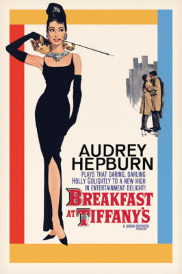
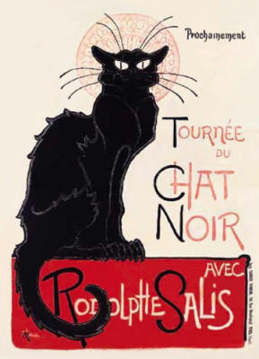
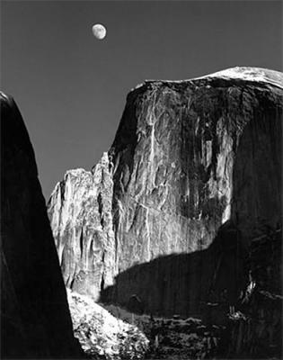
A stunning web site grabs people’s attention, stops them in their tracks and conveys a concise, direct message. There’s one familiar object that succeeds in doing this in print design: the poster. I’m talking about the same one that you or I used to have in our room as teen-agers picturing our favorite rock star.
Let’s have a look at some inspirational samples from World Gallery
What transpires is style, an eye-catching visual and emotional experience and a core message either coming straight from the image or aided by text.
Be inspired by the big picture
Let’s now explore how some clever web designers have exploited the potentialities of the print design and beautiful photography in their work.
Culinaria Food and Wine
Future Management and Marketing
Go to China
Noel Design
Each of the web sites featured above are excellent examples of a successful marriage of the best web design practices and the eye-catching, attention-grabbing force of large photography. All the information is easily accessible and effectively communicated through a highly appealing visual experience.
Want to learn? Here’s where you can go
We can all fall for the splendid effects of the large background image, but is it hard to put into practice from the point of view of the web professional? One potential problem that easily springs to mind when thinking to apply a large photo as background for a web page has got to do with changing browser size. Web users do this a lot. They enlarge or shrink their browser’s size according to their needs. Is there an easy technique that can come to the rescue in this scenario? I’ve made a quick web search and come up with this excellent and easy-to-follow tutorial on CSS-Tricks: “How To: Resizeable Background Image”.
Another awesome tutorial is “How to: CSS Large Background” on Web Designer Wall.
Check them out and let me know what you think.
Veronica Davis is a freelance writer and internet business columnist for Examiner. She works with a variety of design and SEO businesses online, including a specialty Orlando web design firm.


