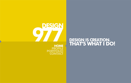
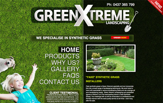
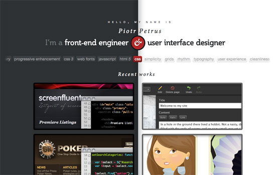
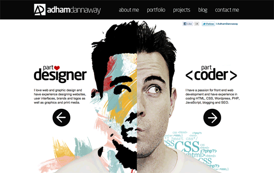
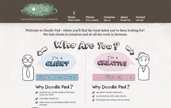
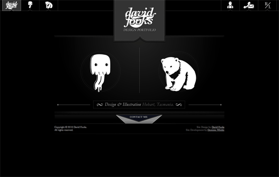
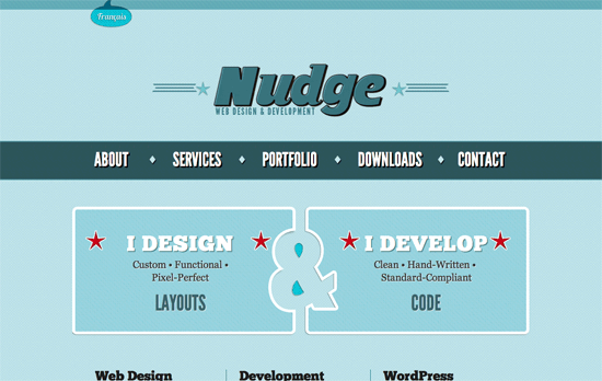
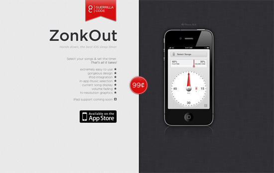
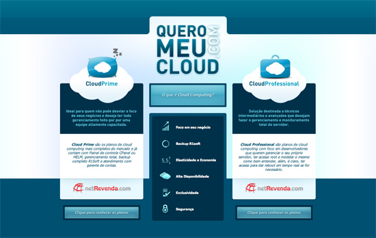
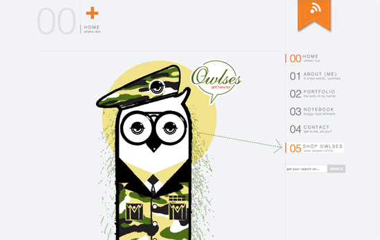
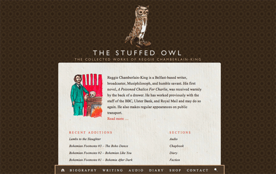
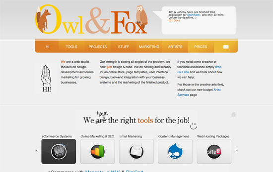
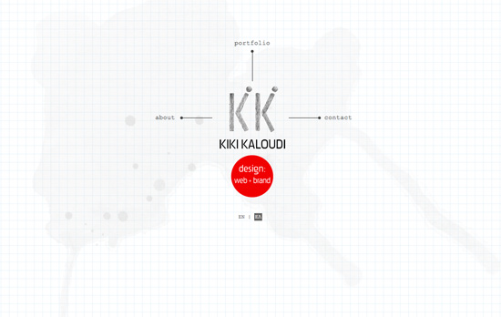
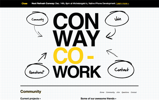
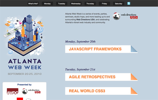
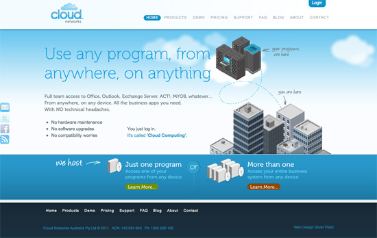
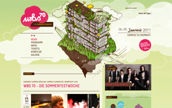
We’re curating a short list of sites celebrating this lovely date. Happy 11-11-11 Friday Focus!
Designs of the Week
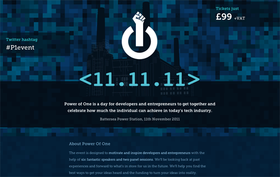
It’s interesting how the most important information on this page form this triangle: the hashtag, the ticket price, and the date/venue. What’s really great in this design is how the illustrated portraits have transparent areas so the pixelated background shows through as you scroll. The logo, of course, is also brilliant.
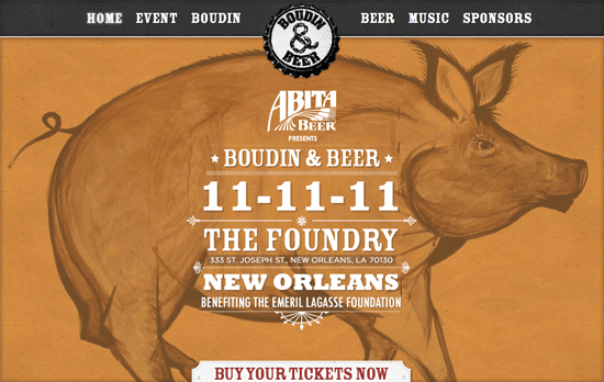
Beautiful typography and layout per section on this one-page site, although it sometimes gets to the point where the centered logo (which rotates when you hover on it) seems a little too large for the page. The fixed background effect is no parallax, but it’s quite attractive just the same.
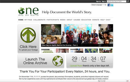
I wish we could see more of the textures in the graphic elements elsewhere on the page. Using that particular shade of green as hyperlinks should only be done in moderation, and not everywhere.
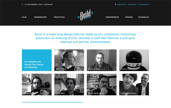
Very clean and seemingly website that just puts everywhere in the right place. What will grab your attention are the “video avatars” of the conference speakers, which play on repeat. I’m a little surprised these weren’t displayed in the Workshops page.
Social Media Weekly
CSS – Centering in the Unknown
“When it comes to centering things in web design, the more information you have about the element being centered and its parent element, the easier it is. So what if you don’t know anything? It’s still kinda doable.”
Accessibility – A common accessibility platform
“There needs to be more of a balance in favor of resources directed towards accessibility, and it is up to us in the community of web professionals to champion web accessibility to browser vendors.”
