• Home
  • About
  • Contact
  • Advertise

Devlounge

Design, Develop, and Grow

  • Home
  • Code
  • Design
  • Design Focus
  • Interviews
  • Publishing
  • Strategy
  • Webapps
  • Extras

Friday Focus 05/06/11: Group Shots

May 6, 2011 By Sophia Lucero

In a previous Friday Focus we featured portfolios with self-portraits of designers that own them. This week we’re looking at agency websites that also feature the people behind them.

Designs of the Week

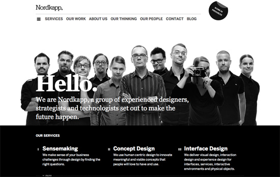
Nordkapp

What’s great about this design is that it doesn’t just slap on a photo of the company; it actually tells you who does what. That may not seem ideal when you want to promote your brand as a single entity, but to me it gives a more interactive, personal touch. Another interesting decision: making the fixed menu navigation appear only after the first two sections.

Varnion

Not sure what the point is of making the illustration/banner move sideways when you hover over it, since it’s very jittery, but I love the casual shot. The logo is also a little too light for the background.

Krillbite

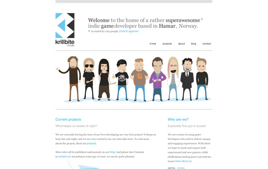
My favorite part has to be the About page and the form input design. I also like that when you hover on a character on the homepage, it loads that person’s latest tweet.

The Squad

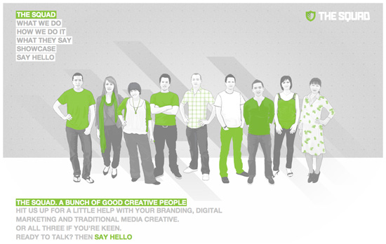
Love the execution of this design, every page is catchy layout on its own. Note how the logo is in the top right and how there aren’t any portfolio work, just representative illustrations for each category.

Social Media Weekly

CSS, JavaScript, Accessibility – Now You See Me
“When building custom JavaScript-based widgets, it’s quite easy to fully control the hiding mechanism, but when you begin working with animation libraries like jQuery or Scriptaculous, the hiding mechanism is typically dictated by the library, leaving you little control over the accessibility of your content. And that’s a problem.”

CSS – Font sizing with rem
“CSS3 introduces a few new units, including the rem unit, which stands for “root em”. If this hasn’t put you to sleep yet, then let’s look at how rem works.”

HTML – Do we need three ways to describe images?
“We need three types of image descriptions: a textual replacement, a textual description, and a textual glance.”

Mobile – Mobile Design and Development
“Even though mobile is one of the fastest growing industries on the planet with things changing every day, I spent a considerable amount of thought and time to try to fill the book with timeless advice that isn’t specific to a particular platform or en vogue device.”

Typography – Web font services – An Overview
“This is just a personal driven overview of web font services and should not be understood as an authoritative attempt to classify the services – as it was mentioned to me.”
Friday Focus 03/25/11: Sassy Sliders

March 25, 2011 By Sophia Lucero

This week’s Friday Focus features designs that use smart, stunning slideshow techniques that are sure to inspire you. Take some notes!

Designs of the Week

Get Satisfaction

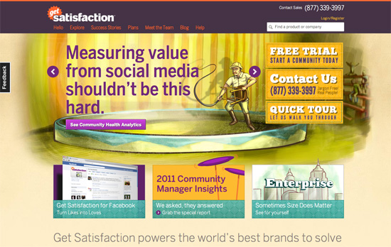
The circus theme combined with the sketchy, painted feel looks great. Everything’s bright and cheerful.

Büro Maisengasse

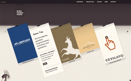
Minimal but packs a punch with the clothesline effect. Nice integration of Google Translate for language localization, and the header matches each project color/pattern.

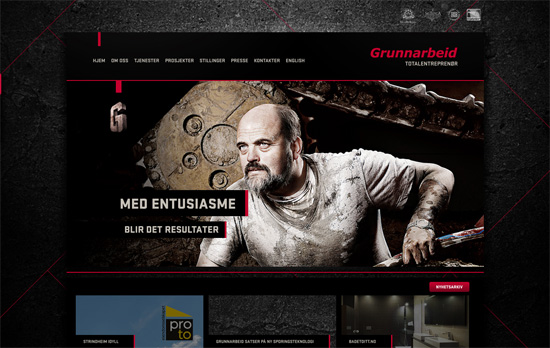
Grunnarbeid

Nice little thumbnail tabs to the right for navigating through the slides, and a nice dark overlay to the left for blending into the background.
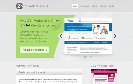
Zbyšek Nádeník

A more conventional look, but I like how the text and image areas are separated with a nice curvy cut, breaking the typical rectangular silhouette of carousels.

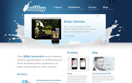
Milky Interactive

The splash of milk makes all the difference. This site’s filled with content but it still feels light and nicely organized.

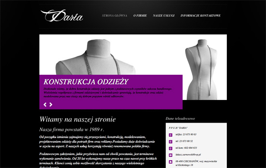
Daria Zakład Krawiecki w Ciechanowie

Keeping the color scheme in grayscale to let the purple pop is an interesting technique. Although using black text on it isn’t very readable. So is using italics for majority of the site.

Lega-lega

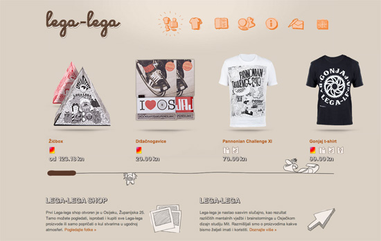
Fun sketchy illustrations everywhere—even the icons for meta information are custom. It also helps that there are tooltips in case they look a little vague. I like the treatment to the scrollbar although maybe some arrows or a change in cursor type would help more.

Bluecadet Interactive

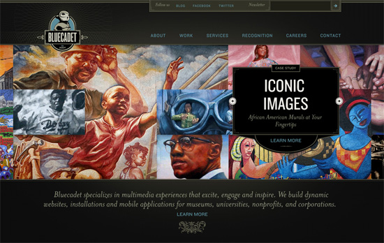
Love or hate the vintage, classical look, the details on this site are to die for. But really, it’s the main slideshow that’s the best part, which comes together in such a pleasant way.

Social Media Weekly

Accessibility – Web Accessibility Toolbar
“In honour of Jim Thatchers important and continuing contribution to making the web a more accessible medium, I have worked on an update to the Web Accessibility Toolbar for Internet Explorer, which includes new features that he has developed.”

HTML – New HTML elements and surrogate <div>s
“What else can we do to move forward without polluting our documents with non semantic wrappers?”

User Experience – Effective Developer Experience
“Platform product owners must be concerned with assisting developers in accomplishing this if end users are to have a good user experience overall. Attention to these details is called developer experience (DX), and enabling app developers to be successful through better DX will create a more successful UX for the platform product.”

Friday Focus 02/25/11: Yellow & Black

February 25, 2011 By Sophia Lucero

Here’s another popular color combination making the rounds: it’s yellow and black on this week’s Friday Focus.

Designs of the Week

Postmark

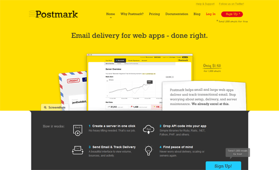
I don’t know if the average user can handle using a web app with a yellow background but it seems to be used relatively sparingly. The scrolling list of customers in the footer isn’t a groundbreaking idea but a nice touch.

Jess King

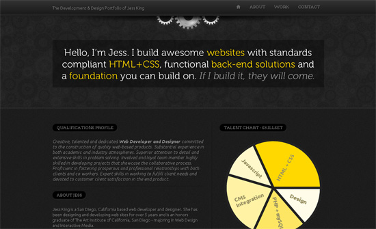
The line spacing is a little too tight. I would also say that the qualifications profile is one huge wall of text that could be broken up into more digestible chunks. I really like the helper text in the contact form section.

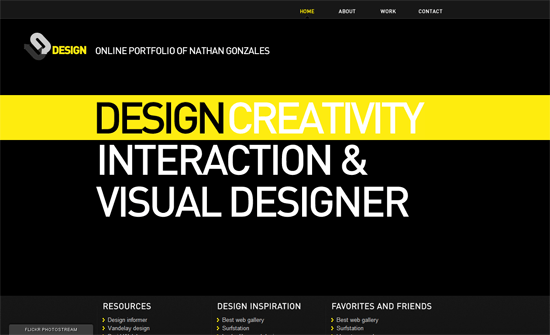
Nathan Gonzales

Simple but makes quite the impact. My only concern is using images for text, which is almost a non-issue with the prevalence of font embedding.

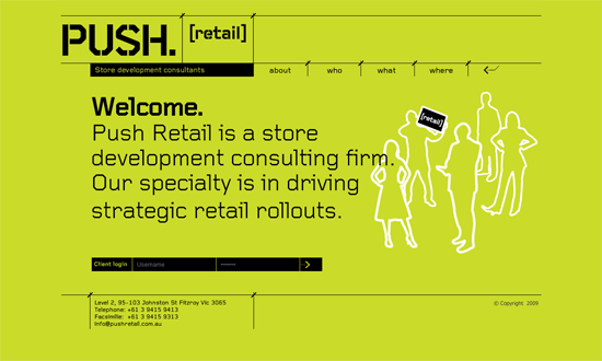
push retail

Old-school web techniques here, post-tables / pre-sprites era. Interesting choice to put the client login at the bottom instead of the usual top of the page, but the eye does wanter over there as well.

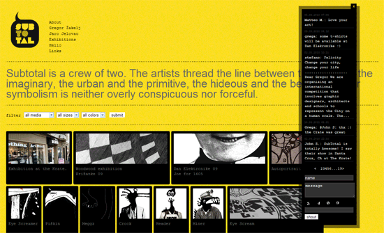
Subtotal

A little too fluid, monospace, and animated. The last one is interesting though: you don’t see GIFs used to display portfolios too often, and this method becomes a live exhibition of sorts,

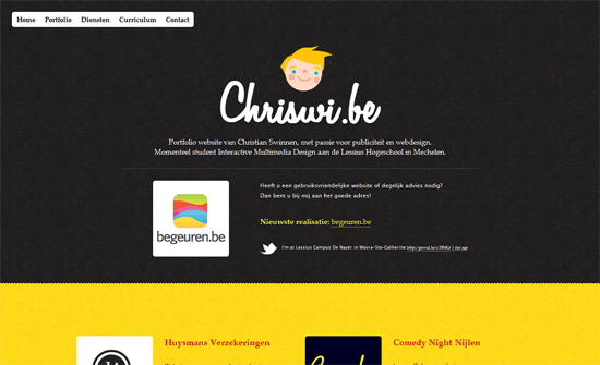
Christian Swinnen

I may be turning into an old fart but the text is a bit small. I do like the youthful illustrations and paper texture.

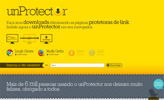
unProtector

The logo is real text except for the second letter “o”—good idea!

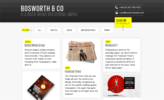
Bosworth & Co

Two things. This agency website puts the spotlight on their blog, while their particulars are tucked away in the header. Second, there’s surprisingly no footer. The question is, does it need one?

Giuseppe Scappaticcio

Now the use of yellow against black here is more subtle and only with the illustrations. The black on pink tooltips are a little too bold but I like how they’re styled.

Social Media Weekly

Design – Five and a Half Habits of Highly Effective Designers
“This article is about practice. It’s about five and a half — yes, half — habits that highly effective designers tend to share and which I’ve observed first-hand in the complicated, non-theoretical, absolutely real world. If practice is your thing, keep reading.”

Programming – Case Study: Page Flip Effect from 20thingsilearned.com
“Since the contents of the book is very much about open web technologies we felt it was important to stay true to that by making the container itself an example of what these technologies allow us to accomplish today.”

Accessibility – HTML5 Accessibility Chops: the placeholder attribute
“The HTML5 specification says “placeholder should not be used as an alternative to a label.” But it stops short of saying it MUST NOT be used, so it is conforming to use it as an alternative in HTML5 and will be used as a label.”

Friday Focus 11/19/10: Shelf Love

November 19, 2010 By Sophia Lucero

Last week I mentioned a site that uses a shelf as a nice metaphor for holding content, so let’s look at several more in this week’s Friday Focus.

Designs of the Week

Iconshelf

Big, bright, and shiny. This is a flawless design basically. My favorite part is the Twitter icon also getting the same tag treatment.

Sweet Design

Love the contrast between the old style glass jars and the new media stickers and trinkets inside them. I think the only missing part here is better typography.

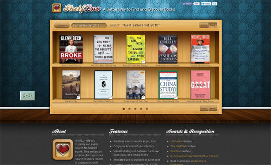
ShelfLuv

The book titles and shelf height could be bigger. I like the addition of the electrical outlet to the side even if it doesn’t really add much to the design. The browsing and sorting animations look great.

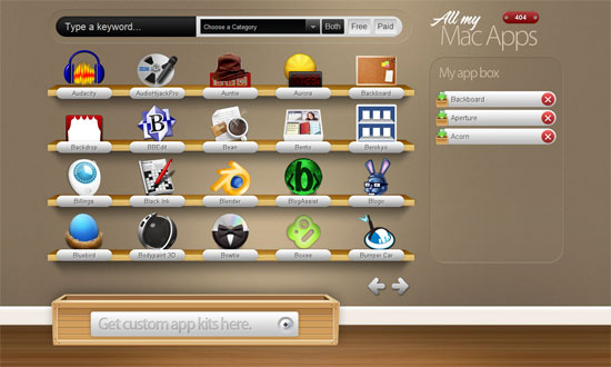
All My Mac Apps

I would really love it if sites using the shelf metaphor take it all the way and support drag-and-drop, and other AJAX interactions.

Diddybears

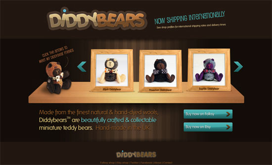
The colors and details here are great, but I have to wonder if a kids-oriented site should use a lighter color palette. What’s stopping shelf designs from being pastel-colored instead of literally brown because of the wood? Is it the lighting?

Shelfari

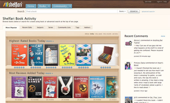
It’s nice to see shelves on a more popular site such as Shelfari (the name begs that I guess). It’s probably the most well-done too: no skimping on features and the look blends well with the rest of the interface elements (tabs, buttons).

Social Media Weekly

HTML – Exploring Markup for Breadcrumbs
“So where are we at on this? I’d say that there is no super-ultimate best-possible-way to handle breadcrumb markup yet.”

Design – The Three Threats to Creativity
“Creativity depends on the right people working in the right environment. Too often these days, the people come ill-equipped, and their work environments stink.”

Accessibility – Accessibility myths in 2010
” Early this year, Ian Pouncey posted a few other Web accessibility myths. Here is a quick roundup of the myths from these two articles.”

HTML5 – HTML5 Outliner

Friday Focus 10/15/10: Book Sites

October 15, 2010 By Sophia Lucero

Check out how these designs brought printed books to life online on this week’s Friday Focus.

Designs of the Week

Speak Human

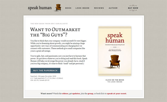
Love the chair illustration on the book appearing in the header. It’s also a good idea to include faces of the people giving testimonials and to make sure they look great in those pictures.

Making Money is Killing Your Business

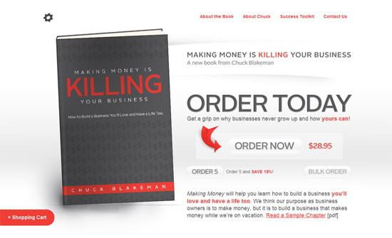
The Order Now button is a little too light to be the focal point of this page, even if the red arrow should draw your eye to it. I do like the subtlety of the gradients though. Also, the book could be a little higher; it looks like the logo is missing in the top left area.

Love Leadership Book

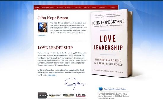
The background effect feels a little dated (Mac OS X wallpaper) although I think the vivid colors work well.

Rockstar Business

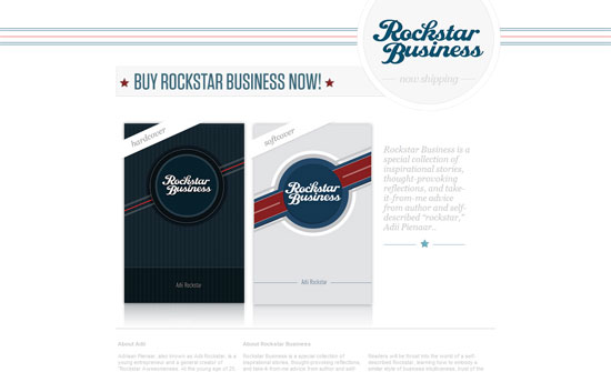
It’s interesting to find the logo at the top right instead of the usual left, or even center. The teasers at the bottom is a great idea although I would have preferred them to appear higher on the page.

Think Unstuck

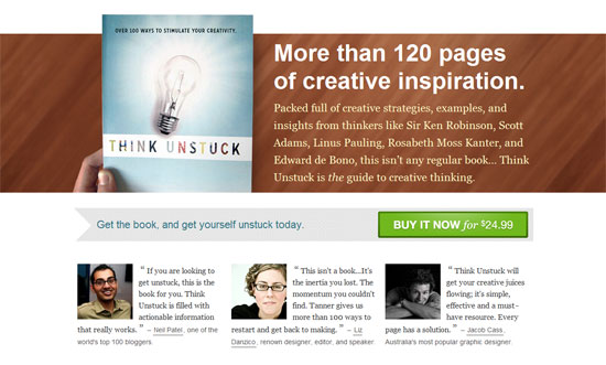
The design feels a little generic considering the subject of the book. I like the big bold text and intro though, as well as the bright Buy Now button.

The Wisdom of Bees

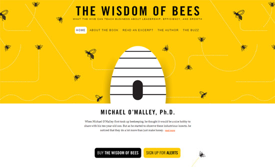
You don’t have to put a literal image of the book on the website, you can integrate the book cover design like this, even add a touch of animation.

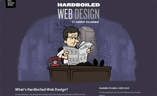
Hardboiled Web Design

All I have to say is: CSS animations and SVG for the win!

Social Media Weekly

Accessibility – The accesskey attribute – do we still need it?
“The accesskey’s uptake within web development has been almost non-existent for three main reasons; differing shortcut values, browser and screenreader conflicts and discoverability.”

HTML5 – Facebook: Using HTML5 Today
“We are excited about HTML5 and wanted to share with you some of the things we’re already using it for!”

« Previous Page
Next Page »

Code & Tutorials

Which Front-End Development Languages Will Grow in 2017?

Your Guide to Leveraging APIs as a Developer

Bitcoin Processing Website Integration For Web Developers

Website Security For 2016 That All Developers Need To Know

5 Reasons You Need to Be Using jQuery

About Devlounge

Want to read more about Devlounge, or maybe you want to contact us, or even advertise? Oh, and don't forget to subscribe to updates!

The Best of Devlounge

Web Designers: How Consistent Are Your Light Sources?

Search