We have some pumpkin-colored sites this week on Friday Focus, just in time for All Hallows’ Eve. Enjoy!
Designs of the Week
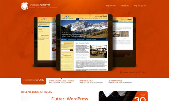
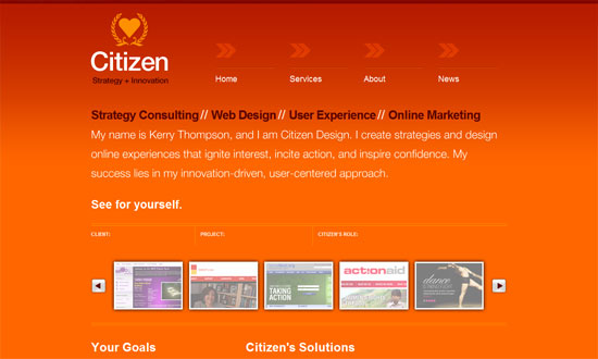
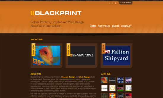
The top half is all about the work, while the bottom half contains supporting information from other sections of the site.
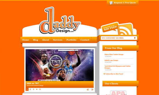
I never tire of this blocky, 3-dimensional style. The “request a free quote” tab at the top is a nice touch.
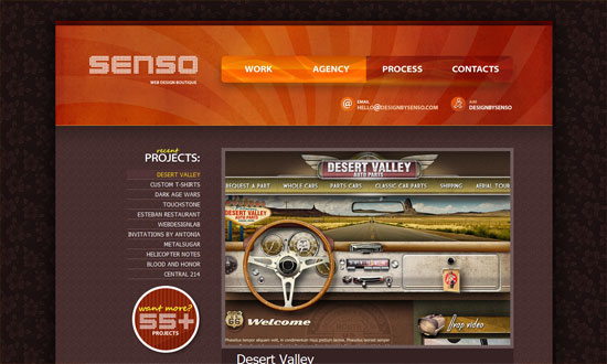
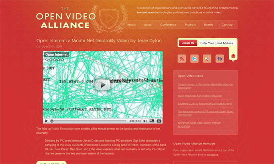
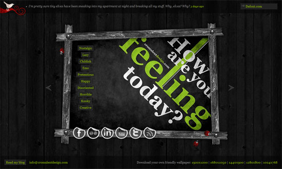
I love the navigation buttons in the header. The dark flowery wallpaper background is a bit weird though. But overall, I like the ample use of textures here.
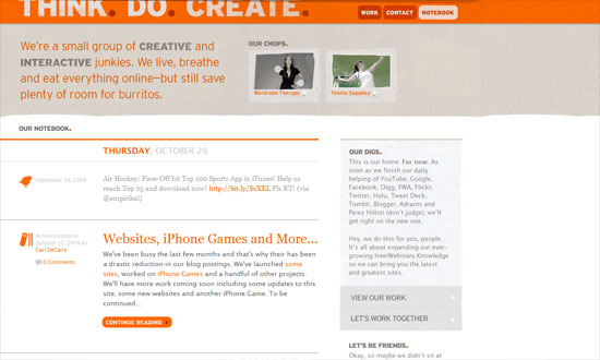
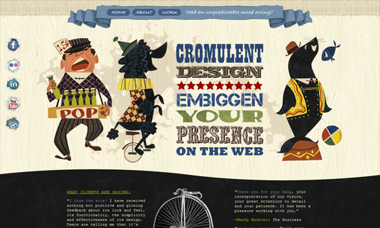
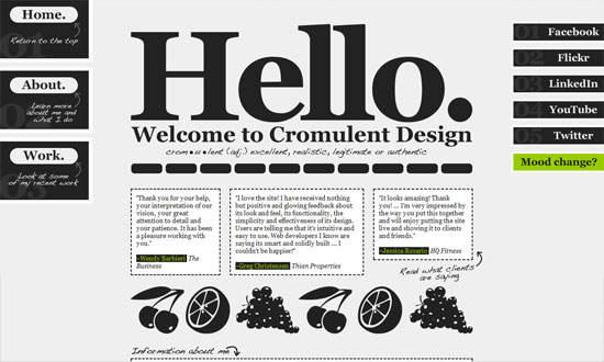
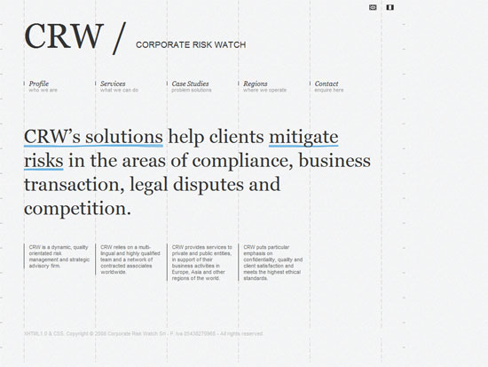
Clean and light with just a touch of grungy textures. Lovely.
The use of hovers to switch between different chunks of text in the portfolio carousel was confusing at first, but it’s all good.
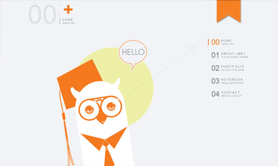
I enjoyed this website. Modern and airy with a touch of warmth thanks to the orange and the owl. The text only needs to be a notch larger.
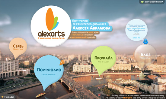
I really like this color scheme! Plus the whole translucent and outlined graphics.
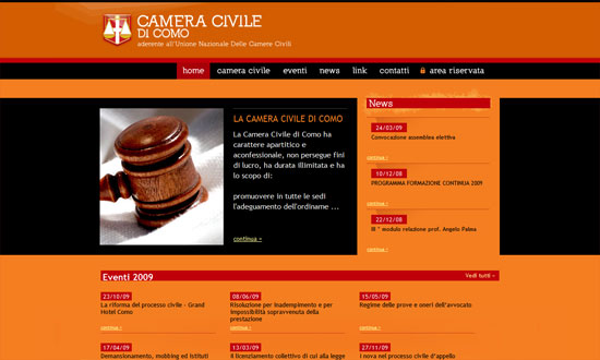
Orange, red, and black—I don’t think there’s any stronger color combination than that! Since it looks like this is a legal site, it’s great that the designers made sure the text is easy to read.
The best part of this site is that you can actually rate each item in the portfolio. Then in the client panel at the top, they’ve got the top rated designs and some great articles for resources.
Social Media Weekly
Design – Happy Haunting: Halloween Hits On the Web of Design
