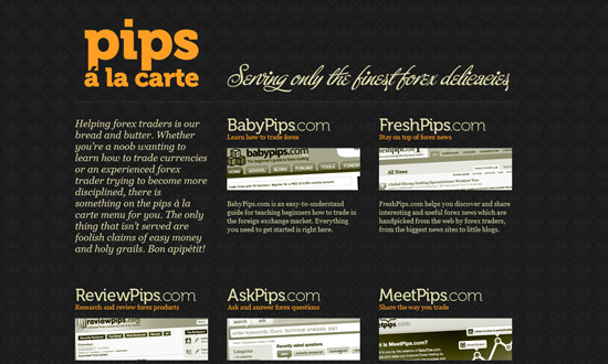
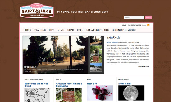
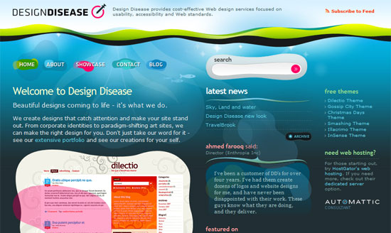
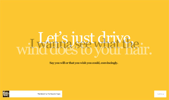
What is it about clouds that instantly transports us to a happy place? This week on Friday Focus, we’re featuring designs with white, fluffy clumps of water vapor in them.
Designs of the Week
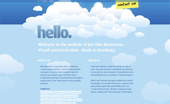
Love or hate the abundance of illustrated clouds on this site, it certainly makes a lot of impact. The moving clouds aren’t distracting at all, and are a nice touch. Cute footer too.
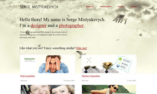
I’m disappointed that the clouds graphic on the homepage don’t show up in the inner pages, because it does change the atmostphere of the site, especially the hands peeking out! Makes it a little quirky and fun. The background becomes bare as you scroll down, also making me wish the background was fixed.
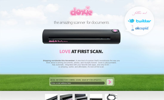
Simple, clean, to the point. If there were any more content in here the center aligned effect would have been a bit much, but here it’s just the right amount for a teaser.
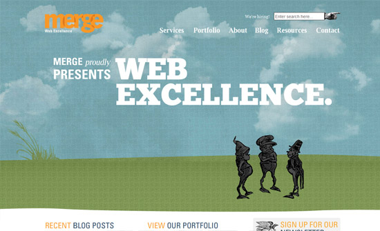
Here’s another moving clouds effect. I like that the background changes colors according to different times of the day (I think). And the old style illustrations too, like the manicule (the pointing hand) in the search bar. I don’t know about you but it’s hilarious! Gives the site a lot of personality.
Several details I love here: first, the 3D slash folded paper effect going on in the portfolio items. Makes repeated elements a lot less dull. Second, the footer graphic where there’s a man looking up at the clouds from what looks like a rooftop. Third, the colorful ribbons in the logo and copyright text—I’ve seen it before, but it’s a nice break in color and it does look like ribbons floating in the sky on a windy day.
Social Media Weekly
CSS – 3 Easy and Fast CSS Techniques for Faux Image Cropping
