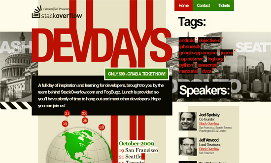
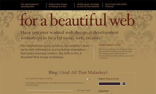
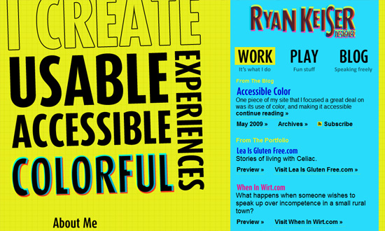
Typography on the Web is growing bigger and bigger—literally! That is this week’s theme on Friday Focus.
Designs of the Week
I like the boxy look. Particularly, that there are all these boxes of content in strong contrasting colors all on top of each other on a fixed background. Which happens to be a CSS parallax effect, by the way.
Huge type can be elegant too. It’s interesting how the inner pages of this site are white on dark gray, while the frontpage is brown on light brown (with a bit of maroon in the footer). And CSS text shadows all over!
I love how bright and bold this site is, apart from the type treatments. It’s very much a study in the colors C, M, Y, K. And this designers loves colors so much he’s got a daily color inspiration (including a downloadable color palette file) section as footer. Good idea!
Social Media Weekly
Design – When the Design Doesn’t Match the Messaging
Programming – JavaScript Debugging Techniques in IE 6
