This week on Friday Focus: websites featuring maps in their designs.
Designs of the Week
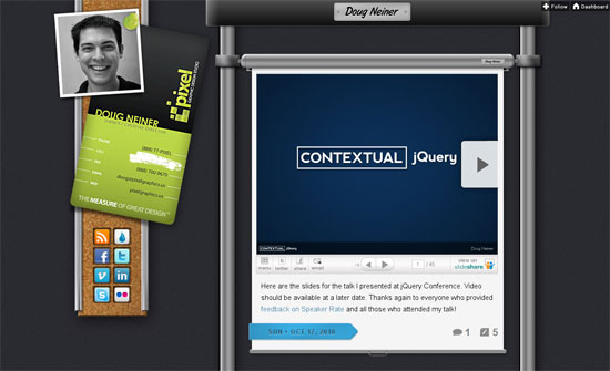
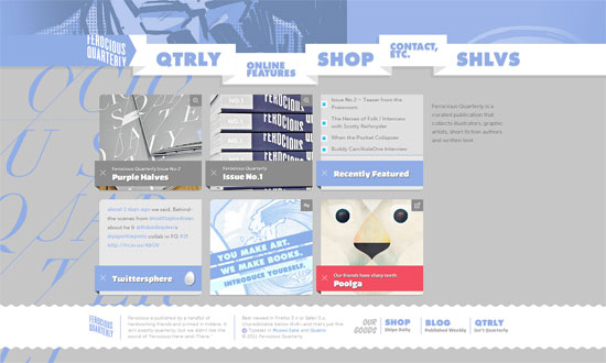
I just love everything on this page, but one little detail that caught my eye was how in the navigation, the highlight for the current section matches the design of the current screen. All the content is playful and freeform yet nicely laid out.
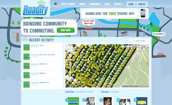
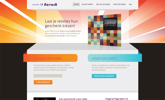
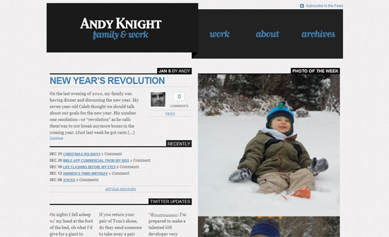
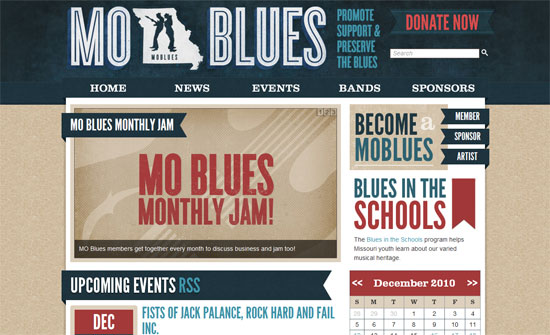
This one’s kind of an “almost there” design. The overall look is fun and and warm but don’t translate completely to some of the interface elements.
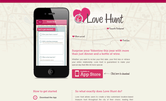
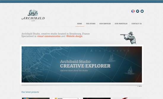
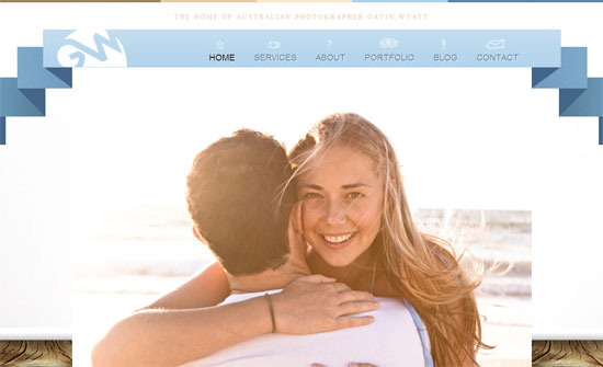
Simple, clean, straightforward; I think it’s just the justified text that throws me off and makes the site look less…romantic?
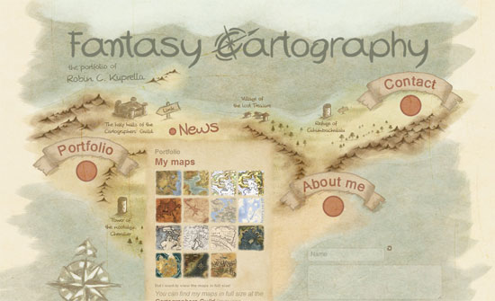
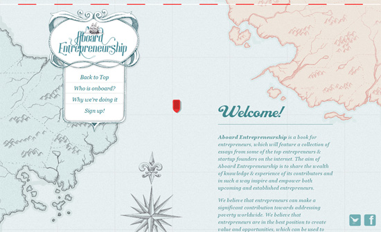
I like the almost hazy pastel feel to this design. Clickable areas are designated by the red circles so that helps quite a bit. Using a sans-serif font in the content area, though, kind of breaks the spell of the old world feel.
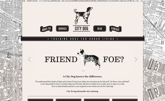
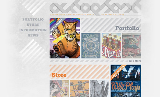
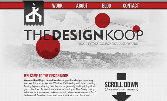
So many interesting design choices on this black and white site: how the navigation items differ in design from one another, how the introductory section is center aligned, how the four link boxes are styled, etc.
The aviation theme looks great, but there’s no hint whatsoever that the site is about a web company (except for a description in the title).
One thing I noticed on this page: you can have a short description of your company (or product) at the top, and place a more detailed one in the footer, like the fineprint of a contract.
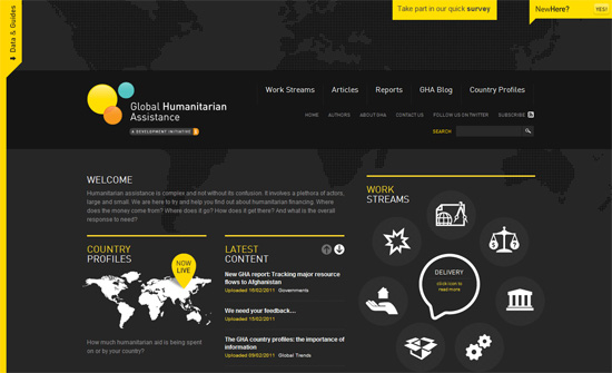
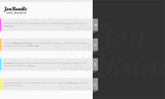
Lots of nice details here too. Aside from the Work Streams section, the yellow pull-outs on the left and top areas are quite nifty.
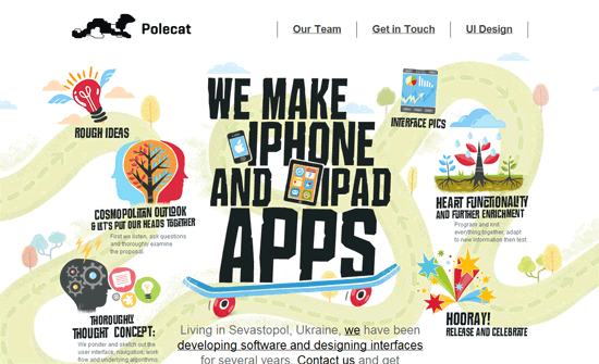
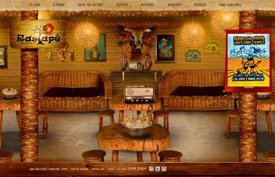
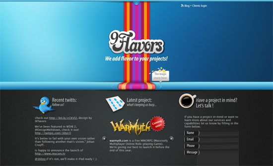
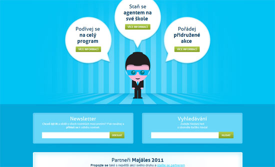
Stand-out illustrations on this site—you’ll love the contact form at the bottom. The only issue I see is that the layout is built for a wide screen.
Social Media Weekly
Design – Better grids: Lessons learned from Design for Developers
“The next Design for Developers workshop is just a few weeks away, and I thought it would be interesting to highlight some common problems our first group of students had while working on their projects, specifically around grids.”
Programming – Broken Links
“It dawns on me that a word of explanation might be in order for those who normally don’t worry about all the bits and pieces lurking inside a Web address.”
CSS – The Bright (Near) Future of CSS
CSS – CSS3 Tests
CSS – The practicalities of CSS Media Queries, lessons learned.
