With Internet Explorer 9 Public Beta just released we are a step closer to being able to use more functionality from HTML5 and CSS3. More and more developers and designers are taking the steps and creating their sites with HTML5 and CSS3 leaving the option to the user to switch to the most modern browser to fully experience the website.
Friday Focus 09/10/10: Light Streaks
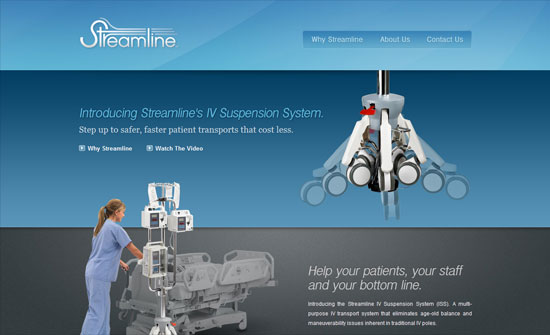
They’re a bit more abstract than sunbursts and are often used to break the horizontal and vertical lines that run throughout the design. Enjoy some subtle light streaks this week on Friday Focus.
Designs of the Week
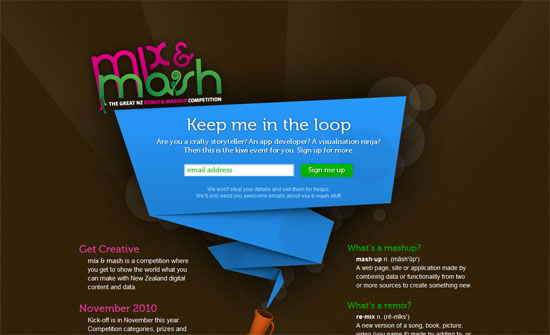
Light streaks go well with the bokeh effect, of course, which in here is subtly animated with CSS3 animation properties. I love the folded paper effect as always, and the way it’s done here is even more exciting.
This approach of blocking out image areas where large text appears is something you don’t see often and while it obviates the blockiness, I say it makes the eyes wander a bit further.
I like a slideshow effect that isn’t boxed in. Black and white and minimal design here.
It’s great how the streaks in the header actually show up in the carousel—which slides vertically, and then horizontally for the Speakers block. Also interesting: the two-row header menu.
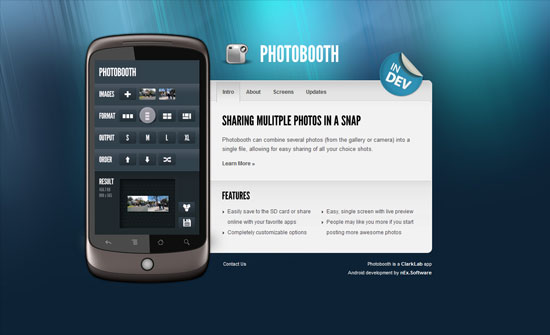
For such a flashy video and lighting effect, I expected an equally flashy transition animation for the tabbed navigation. And the way the layout isn’t center aligned perfectly just throws me off. On another note, I find it interesting that Vimeo actually has portrait-style video dimensions, which is what was used to demo the app inside that Nexus One graphic.
I love how all the rectangles on this design were slashed away with diagonal lines, from the buttons in the header navigation to the fancy layered slideshow (look at those wood slabs), to the hanging portraits, to the footer.
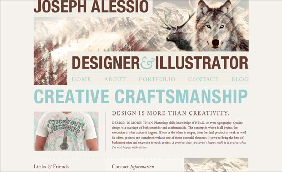
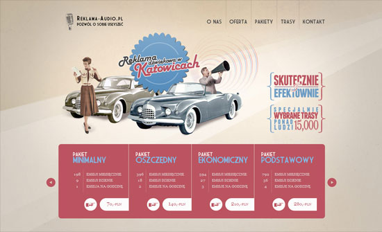
The pink and blue does feel vintage but still cheerfully modern. I really like the way the data is arranged in the bottom part, but I wonder if it should have been written in tables, tabular data and all that.
I think the headings don’t match so well, but I like how clean this is.
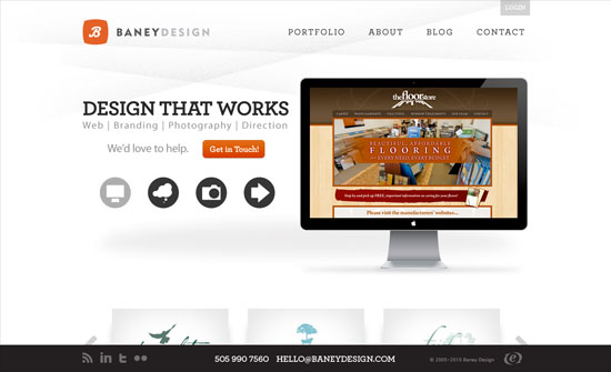
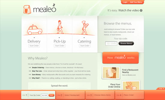
Big, bright buttons everywhere and the colors look lovely (and appetizing, of course).
Social Media Weekly
Design – 8 Minutes with Type Designers
“Each interviewee discusses their proudest achievements, favorite typefaces, sources of inspiration, web fonts and the future of typography.”
Programming – 20 Snippets You should be using from HTML5 Boilerplate
“It is absolutely packed full of fantastic snippets of code that are still very much worth using even if you don’t want to start using html5 boilerplate as your base template.”
CSS – Ordering CSS3 Properties
“We are at a crucial juncture in browser history where some browsers are supporting both the vendor prefixed version and the actual CSS3 property.”
Friday Focus 09/03/10: Ribbons
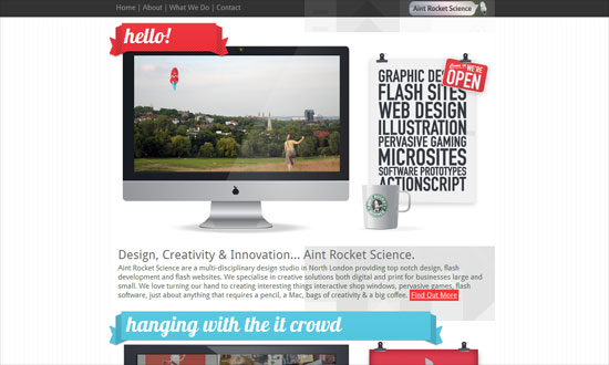
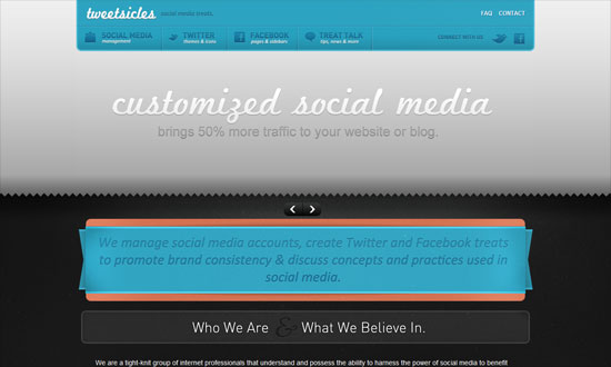
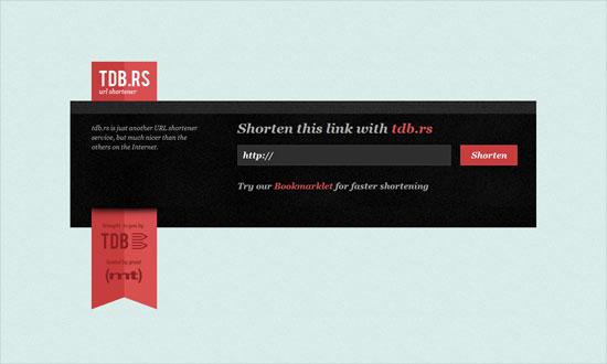
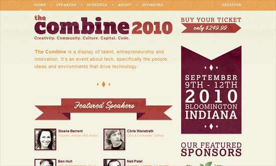
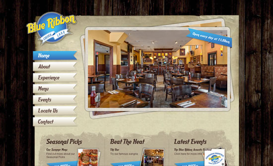
Using ribbons is really big these days, bringing both sophistication and a hint of nostalgia to this week’s designs.
Designs of the Week
The Work section slider is great. What I really like is the lightbox contact form—go all out when customizing it.
I find the gray shapes in the background an interesting touch, but needs better spacing, better association by proximity.
The details on this design are really fun but the colors—mostly the gray—seem to dampen the overall mood.
Doesn’t make much sense for the entire space beside the top left logo to be a hyperlink. I think the submit button could echo the glossiness of the ribbon.
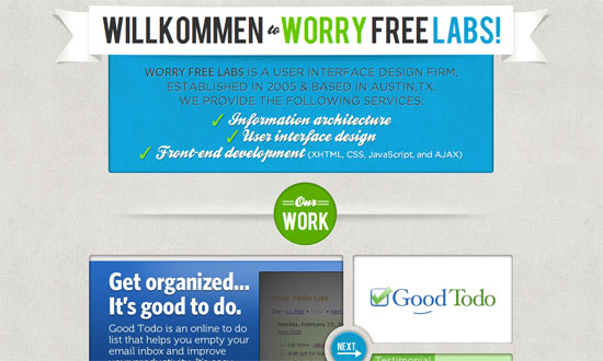
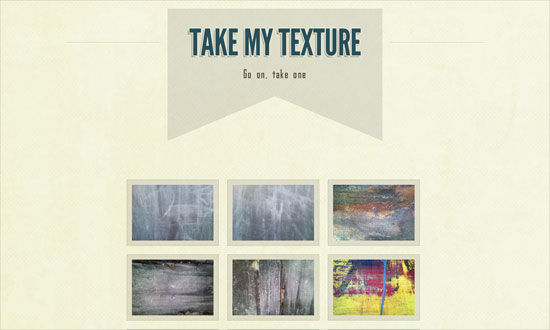
Love the use of textures on both the ribbons and the headings. I also like the diamonds, which do match with the angles of the ribbons.
This site needs a description of what it’s about. What exactly is the place? Where exactly can you find it? Always reach out to your visitors.
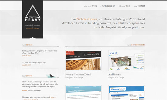
Put your logo on a ribbon like that, hanging like a flag, and you get elegance for cheap! Some texts are too small due to the delicate nature of Garamond, but don’t you just love the bird silhouette and that watercolor smudge behind it? Social media intergration at its finest.
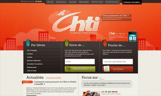
Header navigation is excellent but the “Connexion / Inscription” link should have been styled in a similar way. Other than that, really cohesive design.
Straight to the point! And does away with default browser fonts.
I like every single detail on this front page. So imagine my disappointment with the membership request page.
The dropdown menu shape is neat, and it’s just the Times New Roman text that throws me off, but more or less fits the design anyway.
Social Media Weekly
CSS – BonBon Buttons – Sweet CSS3 Buttons
“There was a goal: Create CSS buttons that are sexy looking, really flexible, but with the most minimalistic markup as possible.”
HTML – WebKit HTML5 Search Inputs
“It just behaves like a text input. This isn’t a problem. The spec doesn’t require it to do anything special. WebKit browsers do treat it a bit differently though, primarily with styling.”
User Experience – How Choice Impairs Your Visitors
“Many sites provide an array of methods to interact with their offerings, but excesses in decision-making pressure can render less empowered visitors into a cyclone of stress from the barrage of questions being asked. As an industry, we place a great deal of emphasis on getting visitors to make decisions, but are we turning a straightforward path into a labyrinth with our need to know?”
Friday Focus 07/30/10: Centered Seals
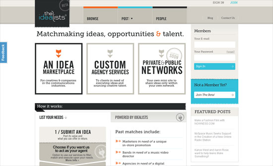
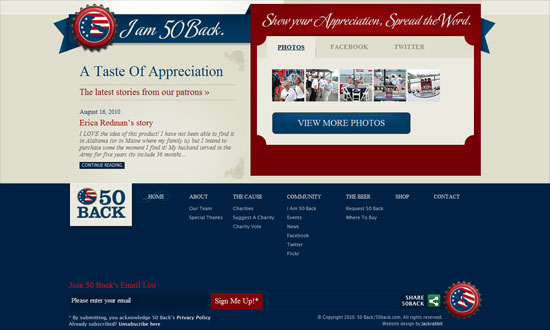
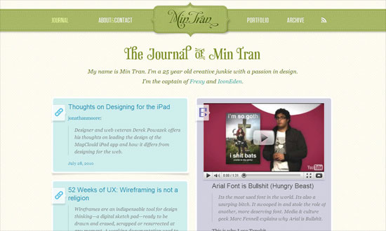
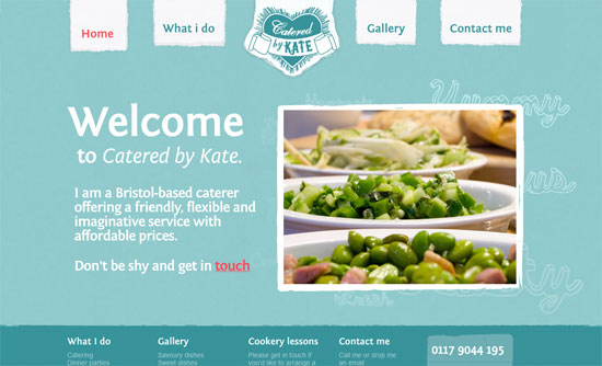
Sites usually place logos at the top left corner of the page, but nudge them to the center and it makes quite an impact, as a red wax seal does on a white letter envelope. Let’s check out sites with centered logos on this week’s Friday Focus.
Designs of the Week
Love all the patterns and pastels.
Nice torn effect on the navigation and echoed throughout the rest of the site. I also like the subtle adjectives in the background.
There’s some weird layering going on when you scroll up and down, but I like the impact of this look.
The text length in the inner pages is too wide, and the script feels a bit much. Still, I like the textures and the old style illustrations.
I like the curved header navigation coupled with an ornate background pattern. The boxes of text are nicely framed, and the buttons are equally elegant.
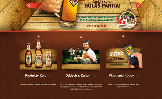
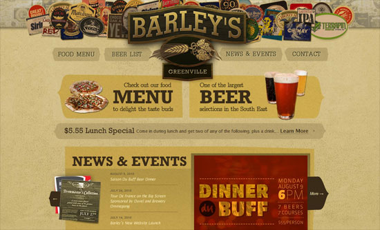
Interesting idea to put all the beer labels as a collage for the header. There’s also a bit of a split design going on, and the use of curly braces as arrows.
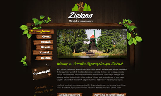
Not-too-distracting animations above the logo in the footer, and not-too-overwhelming use of wood including menu items and buttons.
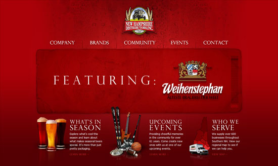
I find the “featuring” slideshow highly effective. The use of red, on the other hand, may need more tints and shades. What I really like is the glowing hover effect especially in the three boxes below the slideshow—simple idea but it works.
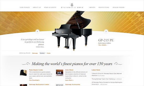
Two things that grab me: seamlessly elegant carousel of featured pianos, and the use of piano strings in the background as a stylized sunburst effect.
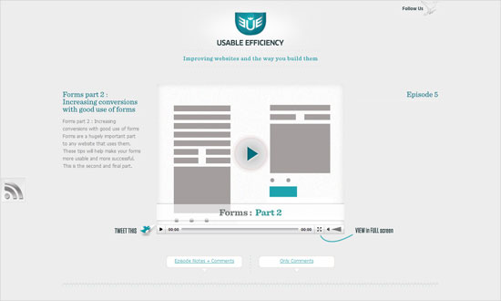
I wish for a little more polish on the RSS and collapse/expand buttons, but I like the openness of this layout.
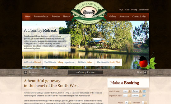
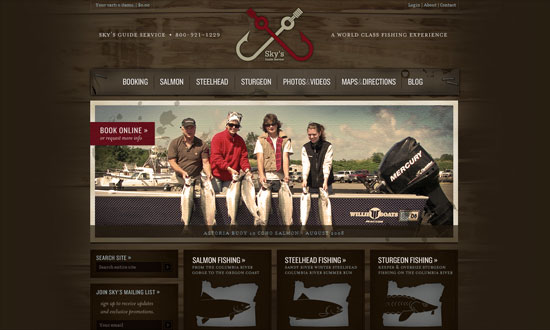
It’s great that the wood texture isn’t your typical bright brown but one that actually fits the theme of the site. The form elements in the booking box is excellent.
I really love the stylized buttons in the header navigation, and I wish it were applied to every other button on the site. Old style illustrations also used here, but what’s great with this site is that it explains (in a collapsible area) what the they symbolize.
I think the wood could be a little lighter to distinguish the red on the logo, but overall this site has an excellent design from typography to illustrations to form elements.
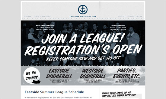
Using a wave pattern as divider is both whimsical and smart. I love the splashy sea photograph background in the footer navigation.
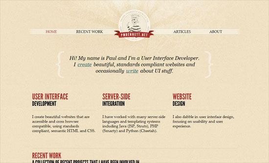
Subtly textured, clean, yet feels perky.
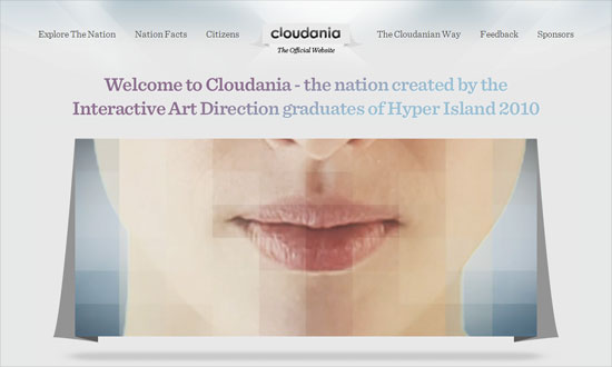
Nice gradient on the main blurb, which breaks the blockiness of the text and gives an ethereal effect. The floating folded paper background on the video, which is an echo from the logo, is a nice touch too.
Social Media Weekly
Accessibility – Ten Common Accessibility Problems
“This document outlines ten common accessibility issues I have encountered which could result in a site’s failure to fully comply with WCAG 2.0. The document includes links to some of the WCAG 2 advisory Sufficient Techniques provided by the W3C for addressing each issue.”
Design – Create Stunning 3D Text Free With SketchUp
“Today I’ll teach you how to create some awesome 3D text using only Photoshop and a free app from Google.”
Design – Tips for Designing for Colorblind Users
“We’ll take a look at what colorblindness really means and how you can tweak your designs based on a few simple principles.”
CSS – Start Experimenting With CSS3 Keyframe Animations
“For this reason they’re used sparingly, in a lot of cases for experimental purposes or as ‘hidden gems’, but that doesn’t mean you should shy away from getting stuck in.”
Programming –
10 Wonderful CSS3 Creations
We have already shown what CSS3 with HTML5 can do for your website. But beside websites CSS3 with jQuery can do a whole lot more. You can make animations with it that could only be done with Flash before and create designs only possible with Photoshop.
Once FireFox and Internet Explorer have finally catch up with WebKit developers and designers will finally have more options to serve data and graphics. Here there are 10 exceptional animations and graphics done with CSS3 mainly and some with jQuery added. All of them are best viewed in Chrome and Safari, only the Star Wars animation is Safari 5 only.
