As developers, we currently have access to technology that’s incredibly advanced and secure. However, the threat of data loss is always present. Whether it’s a cyber attack, natural disaster, or system error, files have a way of disappearing without much notice. When you’re working with clients and spending hundreds of hours on projects, you can’t afford to lose data. [Read more…]
Web Developers: Stop Implicitly Trusting Data to Guide Your Hand
User experience experts and web developers have a tough course; not only do they have to work together to create an aesthetically pleasing, functional site, they also have to dig deep into user psychologies to develop experiences that leave a lasting—and positive—impression of the brand. It requires both careful precision and a bit of guesswork, but the recent emergence and development of data trends is making the process more accessible.
Unfortunately, there are also some downsides and risks associated with this reliance on data. [Read more…]
Data Storage Done Right: How Developers Can Avoid Downtime
One of the most important concerns developers should have when dealing with data storage and migration is server downtime. Server downtime prevents internal productivity and cuts off user access to your sites. Overall, downtime is bad for everyone.
In order to prevent major losses to server downtime, developers need to take a number of systematic precautions. Here’s what you’ll need to know when crafting your server system to prevent future productivity losses. [Read more…]
Friday Focus 10/22/10: Beautiful Data
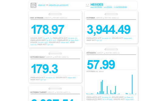
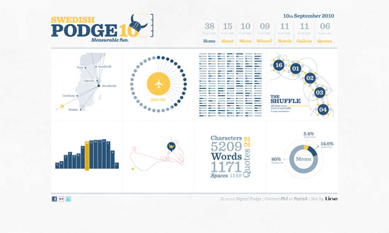
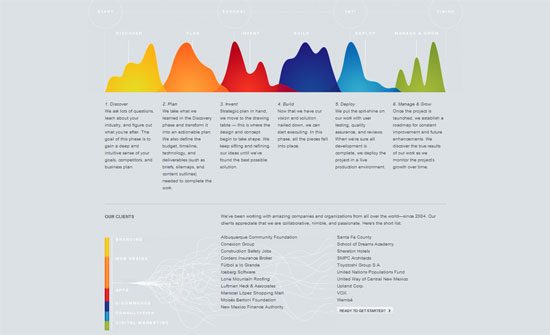
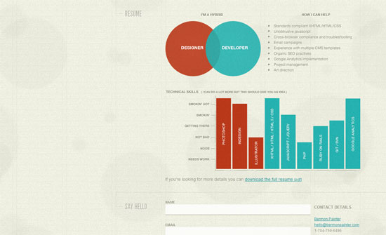
Pie charts and graphs have never looked sexier with their integration into these websites. It’s beautiful data visualizations on this week’s Friday Focus.
Designs of the Week
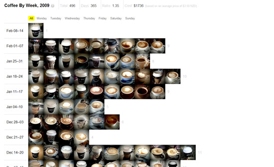
This could look a little light for some but I think it’s got enough contrast and keeps the jumble of numbers and figures pristine. The notecard style boxes looks great, and it’s also the logo of the site.
Pure eyecandy. The only way this site could get any better is if the charts were interactive.
The gray against the white text is hard to read, but it’s effective with the rainbow graphs.
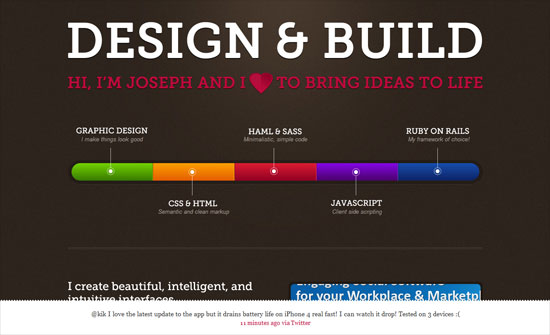
A little disappointed that even the text is part of the image, but it’s clear that more designers are translating summaries of their resumes and skill sets into graphs like this.
Barely designed, but the concept of using pictures to illustrate the bar graph is great.
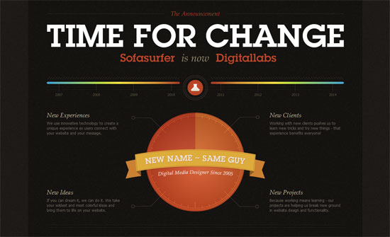
Another rainbow chart, but looks more decorative than a real graph, which isn’t really an issue if that’s the goal anyway.
Similar look, similarly decorative, but great inspiration for developing a particular style in data visualization.
Social Media Weekly
Design – Welcome to the Era of Creative Meritocracy
“Without creative meritocracy, we suffer because our talent and hard work aren’t enough to land the job. Clients suffer because they receive inferior work. Moreover, our industries and society suffer from mediocrity.”
CSS – Why we don’t have a parent selector
“On a seemingly regular basis, I see this discussion come up as to whether CSS should have a particular feature like the parent selector and while I haven’t worked on a browser engine, I have my theories.”
HTML, JavaScript Semantic Markup or Death? Part I
“Despite the title, this post is actually mostly about JavaScript, or more specifically, the relationship between JavaScript and HTML.”
