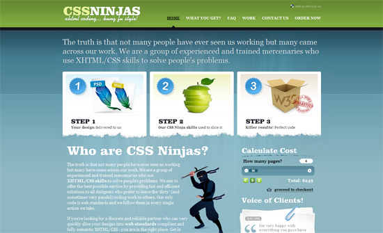
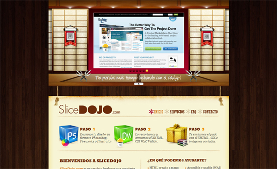
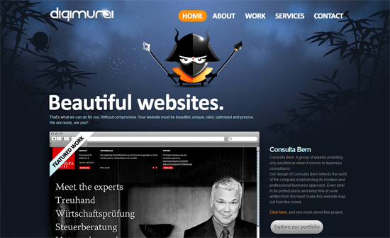
This week on Friday Focus, robots are taking over Devlounge!
Designs of the Week
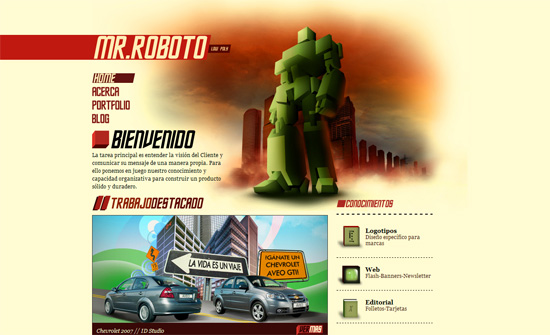
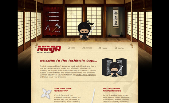
Love the coloring but I’m not sure why the robot has to disappear in the inner pages, it becomes more obvious that there’s something missing. The contact form uses a circular button (reminiscent of real life pushbuttons).
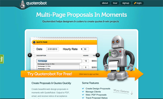
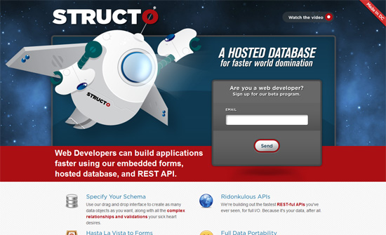
Everything fits and lines up nicely, I just wish the signup form looked more like the design (at least some bit of the color palette).
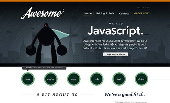
This one, on the other hand, has an extremely captivating signup form on top of an already lovely design. The process flowchart is succinct but still informative.
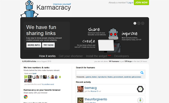
The robot have great personality but that doesn’t seem to translate into other aspects of the design.
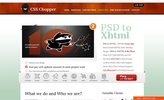
The grouping of the icons and placement of the buttons just work. Everything blends in neatly.
Robot-focused designs seem to call for bold fonts and relatively bright colors. Although I think the text on the inner pages look underdesigned.
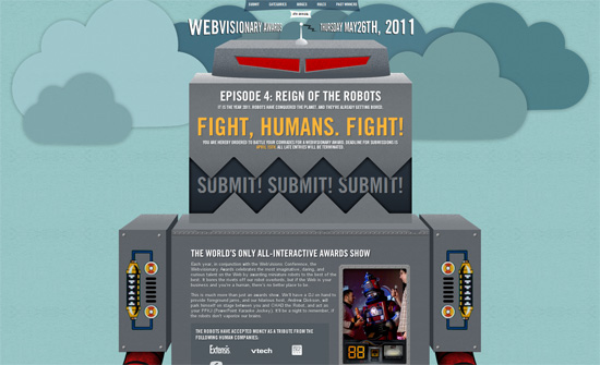
Making a huge robot as the design for a long, one-page site is a great idea, you’ll probably want to zoom out to see the whole thing.
Social Media Weekly
Typography – Type on your email
“Newsletters that drop in my inbox rarely excite me. Those that do come from type foundries. Not only is the carefully crafted composition of new, updated and popular fonts fun eye candy, it’s also a great way to keep modern typefaces top of mind.”
JavaScript – How to get all the browsers playing ball
“What if you could include a single JavaScript library, and it automatically detected the state of the browser support for the latest technology, and where the browser is lacking, the JavaScript library plugs the missing gaps.”
Product Design – Product design at GitHub
“When I talk about product design I’m referring to the process by which you decide what your product does and does not do. I happen to think we do a pretty good job of this at GitHub, and I’d like to give you a bit of an insight into our process and hopefully shed some light on why it works so well.”
Typography – A Crash Course in Typography: Paragraphs and Special Characters
“Body copy makes up the majority of many websites. Headlines and other bits of typography are often considered more fun to design, or more artistic, but without a good design for your body copy, your overall project will suffer.”
