Continuing on last week’s success, I figured I would give the Friday Focus another go, and will hopefully be continuing until told otherwise.
I hope you enjoy my picks of the week.
Designs of the Week
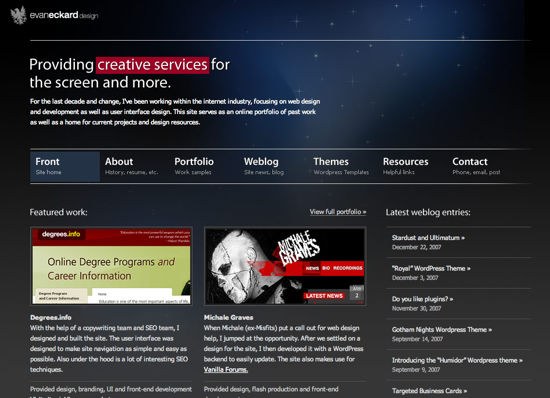
Lately, I have been seeing many designs implementing space or star images to their designs. The design is darker than I usually like, but for some reason the contrast seems really strong, and I love the use of red and blue to make certain elements “pop”. This is my favourite of the week.
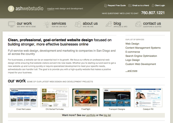
I am really enjoying sites that use green effectively, and ashwebstudio integrates the colour nicely. The content area is really nice and clean. Everything looks fairly balanced and the design is not overstated. I wish the navigation hover effect was stronger, but I love the little icons they used to emphasize their items.
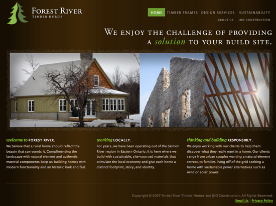
I had a really hard time finding a third design that I enjoyed. I wanted something that was pleasing to the eye, and interesting to look at. I wanted something that wasn’t blue and orange, and the Forest River Timber Homes site fit the bill. I don’t really like their sub-pages as much as their main page, but overall the style is interesting, and the strong contrast of the green on the dark brown works really well.
Digg Weekly
Design – 8 Web Design Mistakes That Developers Make
I have made more than one of the mistakes mentioned in the Wake Up Later post, but I continually hope that others will wise up and deal with their design and usability mistakes. Hopefully they will all read the post.
Design – Old Websites Sure Are Funny and Internet ’96
On the same line of thinking, there are some great articles on what the web was like twelve years ago now. It is funny to look at what corporate budgets bought online back then. Apple, McDonald’s and others all looking really ugly by todays standards.
