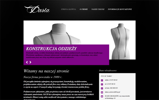
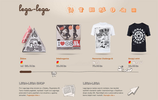
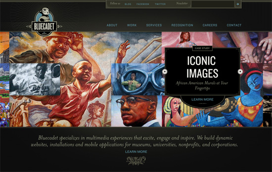
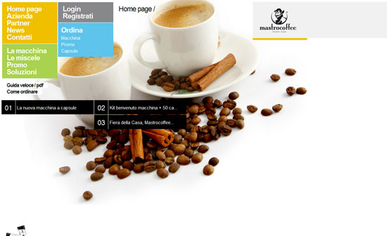
Your company website is the front door to all of your interactions with visitors. There are sources all over the internet that will tell you the same thing, and that is to make sure your website is as sleek and cutting edge as possible. If your website is still displaying clip art from word art as the only graphics viewable –it really is time to get your internet act together.
4 Tips to Personalize E-Commerce Websites
It takes a lot of work and an aesthetic eye to create a well-designed Web site. It also takes expertise to present your e-Commerce story in a way that will attract customers and traffic to your website. With quality images, a simple but transparent check-out process, customer service options and a user-friendly navigation mechanism, personalizing e-Commerce sites with today’s tips is a way to become more competitive in your field of business.
First impressions
For a new e-Commerce site, it’s important to put your best foot forward. This means that everything you do in design should not only be pleasing to the eye, but functional. Web designer have to constantly code a brand’s website with the customer in mind. The site should be hassle-free. Any confusion caused by an ill-thought-out design could cause you to lose customers. There are too many options and too much competition to even lose one customer. It’s the Web designer’s obligation to never create any doubt in the customer’s mind as to how to navigate properly, or, more importantly, how to complete a transaction.
Social integration
By adding the brand’s social network icons to the page, you’re telling customers that you are not only current with today’s Web 2.0 technology, but also that you would like to engage them. Facebook, Twitter, Google+ and Pinterest are mainstays for customers who want to provide brands with feedback on an ongoing basis. Additionally if the e-Commerce site also features a blog page, it shows they are thought-leaders in their field.
Search Engine Optimization
If an e-Commerce site has a large number of products that frequently change, it’s important that the Web designers adhere to the “white hat” search engine optimization rules. These include targeted page titles and meta descriptions. According to SEO experts, “One of the fundamental rules of SEO for an e-Commerce site is you should treat every page on your website as a landing page focused around performing for a single SEO search term and converting the resulting traffic.”
Fastest route between two points
Everyone knows that the fastest route between two points is a straight line. This applies to e-Commerce sites as well. It’s a fact that the quicker a website can get the customer from the landing page to a completed order, the more likely it is to keep the customer. Well-designed e-Commerce Web sites always have that goal in mind.
Personalized e-Commerce
Personalized gift shops are a sub-set of e-Commerce websites. While some of the products these sites sell can be purchased elsewhere, their unique advantage to the customer is that they can personalize all orders in accordance with the customer’s preferences. Personalised Gifts Shop in the UK is well-designed website that provided their web designers with a lot inspiration to not only create an aesthetically pleasing design but one that prompts buyers to proceed through the personalization process in a quick and efficient manner. [Read more…]
Friday Focus 09/02/11: Over the Moon
This week’s Friday Focus features designs that incorporate the moon in them.
Designs of the Week
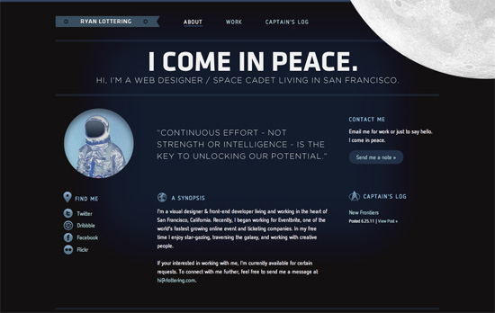
Let’s talk about the moon and how it’s in the top right, in the foreground, spinning oh so slowly—just enough for people to notice it’s moving. Overall look seems simple, but I think it’s effective and still makes an impact. I think it’s interesting that the site labels the homepage as the About page at the same time. One nit to pick, while not visual, is that there are two different email addresses being used in three email links.
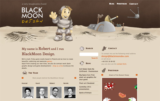
It’s funny how this site also uses the Star Trek logo as one of its icons in keeping with the outer space theme. I love the illustrated, painted look in the header, including the word “design” in the logo (which doesn’t look like just another handwritten typeface). It’d be nice to have the headings as real web fonts now instead of images, but then I discovered that the whole design—and I mean every graphic you see on the page—is one big sprite, so kudos to that!
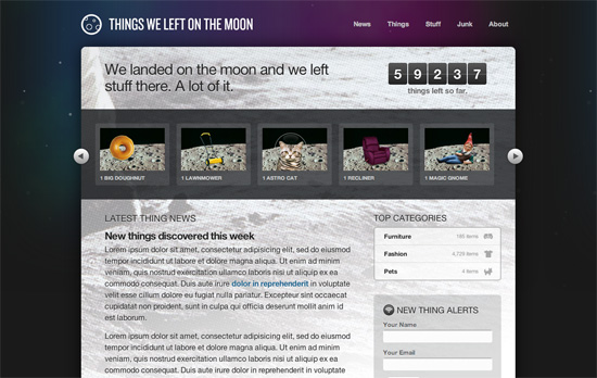
This is just a demo site created by Dan Cederholm for An Event Apart Seattle 2010, but there are a lot of neat things to be inspired by here, particularly CSS3 features in the hover effects and typography. Love the idea of the halftoned moon landing picture as a background. The use of purple is also a nice touch, since it’s easy to just reach out for midnight blue when depicting skies and space.
Social Media Weekly
Mobile Web Design, E-Commerce – Add to Cart: 5 Ways to Improve Shopping on the Mobile Web
Five steps to optimizing online shopping on mobile devices.
HTML5 – The Current State of HTML5 Forms
Check out the latest browser support and techniques for using form attributes in HTML5.
CSS3 – Sizing with CSS3′s vw and vh units
Another set of measuring units included in CSS3, this time based on viewport dimensions.
CSS – The Minimum Page Project
Another iteration on the CSS resets out there. The idea is to avoid redundancy due to broad-sweeping resets.
Design, CSS – Adapted
Reflections on the challenges and options in adapative, responsive web design.
Design, User Experience – Thoughts On Communicating Design
“Communicating design, in general, needs to be less about documentation and more about clear, concise and ongoing two-way communication.”
Friday Focus 03/25/11: Sassy Sliders
This week’s Friday Focus features designs that use smart, stunning slideshow techniques that are sure to inspire you. Take some notes!
Designs of the Week
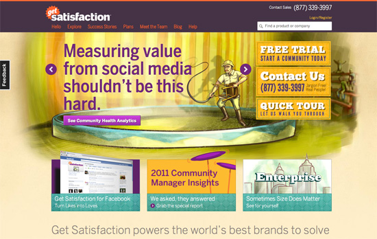
The circus theme combined with the sketchy, painted feel looks great. Everything’s bright and cheerful.
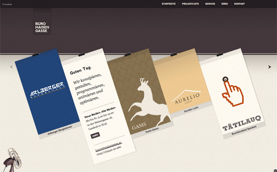
Minimal but packs a punch with the clothesline effect. Nice integration of Google Translate for language localization, and the header matches each project color/pattern.
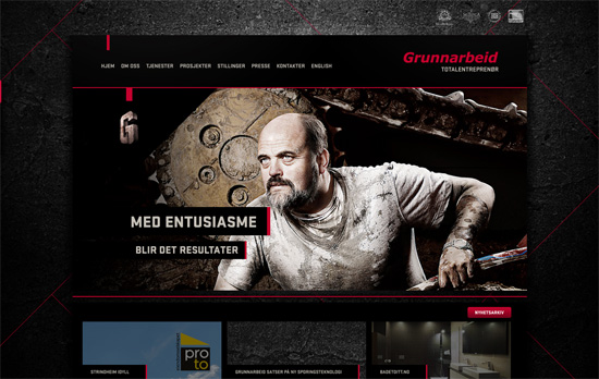
Nice little thumbnail tabs to the right for navigating through the slides, and a nice dark overlay to the left for blending into the background.
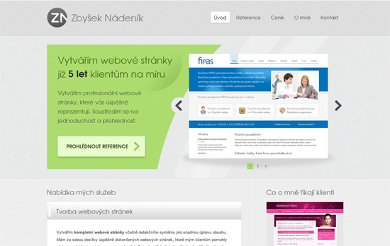
A more conventional look, but I like how the text and image areas are separated with a nice curvy cut, breaking the typical rectangular silhouette of carousels.
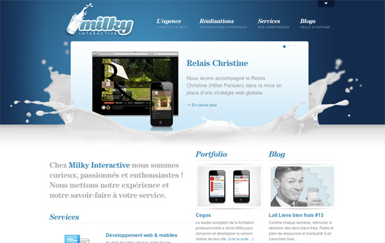
The splash of milk makes all the difference. This site’s filled with content but it still feels light and nicely organized.
Keeping the color scheme in grayscale to let the purple pop is an interesting technique. Although using black text on it isn’t very readable. So is using italics for majority of the site.
Fun sketchy illustrations everywhere—even the icons for meta information are custom. It also helps that there are tooltips in case they look a little vague. I like the treatment to the scrollbar although maybe some arrows or a change in cursor type would help more.
Love or hate the vintage, classical look, the details on this site are to die for. But really, it’s the main slideshow that’s the best part, which comes together in such a pleasant way.
Social Media Weekly
Accessibility – Web Accessibility Toolbar
“In honour of Jim Thatchers important and continuing contribution to making the web a more accessible medium, I have worked on an update to the Web Accessibility Toolbar for Internet Explorer, which includes new features that he has developed.”
HTML – New HTML elements and surrogate <div>s
“What else can we do to move forward without polluting our documents with non semantic wrappers?”
User Experience – Effective Developer Experience
“Platform product owners must be concerned with assisting developers in accomplishing this if end users are to have a good user experience overall. Attention to these details is called developer experience (DX), and enabling app developers to be successful through better DX will create a more successful UX for the platform product.”
Friday Focus 01/14/11: Coffee Break
It’s all about coffee this week on Friday Focus!
Designs of the Week
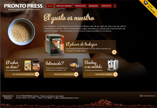
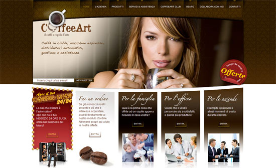
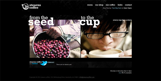
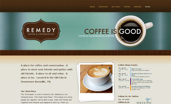
Great modern look. Interesting how the logo is at the top right (instead of the usual left). I like the idea of grouping menu items into related blocks so it’s not just one long list.
It’s quite predictable that coffee sites will adapt brown color schemes. What I like here is the fancy script type and the transparency effects. No solid text backgrounds here, probably to make it feel lighter with the already dark color scheme.
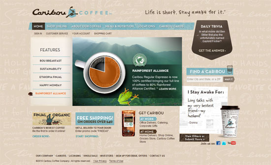
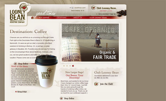
Smart idea for a coffee bean to become the arrow in the slideshow. The use of light blue here is a nice contrast to the browns and neutrals. The background pattern and the “I Stay Awake For” section are also nice ideas.
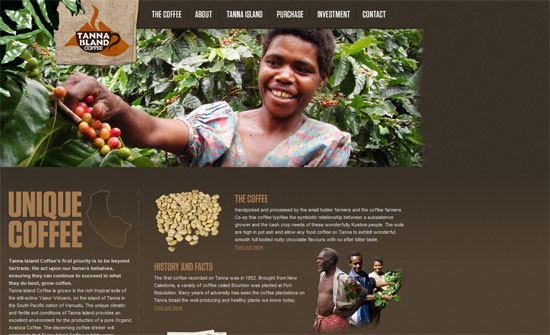
This one puts in more than one contrasting color. I like the raw feel to it although I’m still not comfortable with all the uppercase text everywhere.
I’m surprised how spartan the homepage is, considering the inside pages have large header pictures while this has none. I also find it a little weird that the slideshow boxes stretch only to the width of the headers, so there’s whitespace to the right at times. I do like text styles used though.
The Flash animations are good and warranted, the details are polished, but I think the photos in the 3 right columns could be less cliche.
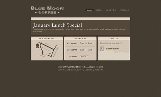
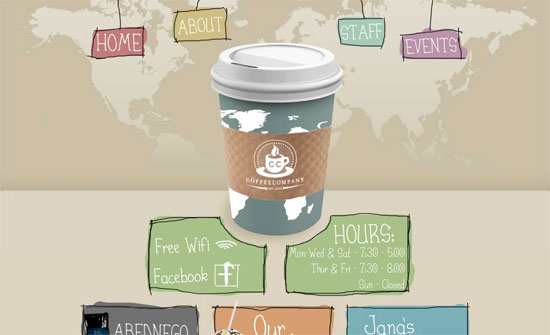
Again, beautiful design with one glaring problem: the hosting banner at the top. I like the split approach on the front page, and it’s very useful to add store hours (and even Wi-Fi availability) info at an accessible spot.
The logo box blends well with all the picture headers. I also love the woven mat pattern in the footer.
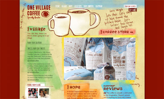
Love the rough, hand-drawn edges everywhere and the giant cup of coffee right down the middle. However, the world map background is a little odd and I’m not sure if you should be so dependent on Flash for menu navigation.
I like the overall look but I noticed that the logo is the same image as the rest of the header. Not sure if it’s such a big issue but the general practice is to have it separately and link back to the the index.
Reuse of the logo everywhere is great. All the design touches here look great. I think the only issue I have is the left alignment.
Social Media Weekly
User Experience – How to Make Your Shopping Cart Suck Less
(Note: I wouldn’t call The Oatmeal an authoritative source for web design but from a consumer perspective, it’s insightful enough.)
Web Standards – Seven things I want to see on the web in 2011
“As I’ve been particularly nice all year, I think I deserve to be allowed to have a wish list of things that should change on the web in 2011.”
Web Standards – Ultimate Guide to Microformats: Reference and Examples
“While HTML has a whole bunch of awesome elements by which to convey meaning, a slew of purpose-built microformats (conventions) have been created to better represent the kind of content that exists on the page. This guide discusses popular microformats that can enhance the semantics and interoperability of your website.”
Design – The Photoshop Etiquette Manifesto for Web Designers
“Helpful and *subtle* suggestions for the process of web design in Photoshop, and making the transfer of PSD’s less painful.”
Business – Should I work for free?
(Start in the middle)

