• Home
  • About
  • Contact
  • Advertise

Devlounge

Design, Develop, and Grow

ateşli sevgilisi fantezisini yaşamak istediğini söyler porno ona arkadaşları varken onunla gizli saklı seks yapmak istediğini sikiş söyleyen kız hafta sonu için gelen arkadaşının görmediği bir sikiş açıdan sakso çekmeye başlayınca adamın yarağını bu altyazılı porno şekilde indiremez ve açık şekilde salonda sikişimeye sex izle başladıklarında misafir kızı da bu sekslerine rokettube konuk ederler seks yapacağını düşünmeyerek onun sex izle oyun oynadığını zanneder sabah olur ve herkes uyanır hd porno bu sırada yanında şişme mankenini de getiren sapık erotik hikayeler genç sınav haftası ders çalışan genç adam üvey annesinin sikiş eve gelmesiyle hayatının şokunu yaşar

  • Home
  • Code
  • Design
  • Design Focus
  • Interviews
  • Publishing
  • Strategy
  • Webapps
  • Extras

Design Focus: Art of Paper Folding

September 21, 2012 By Sophia Lucero

If last week was all about uncovering and unfolding, this we’re looking at designs featuring actual folded objects a.k.a origami.

Designs of the Week

Pagelines lets you build WordPress websites and it’s as easy as drag and drop, go check it out!
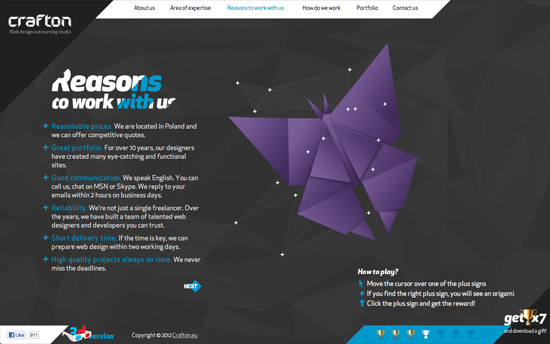
Crafton website
Crafton

Letting this site’s visitors play an origami puzzle for each page and giving them a prize at the end if they succeed is very clever. I guess my only question is if it distracts too much from the content and message of their page. I do like all the geometric shapes that come into play in the design, and it’s especially striking in the small portfolio slideshow, which uses triangles and diamonds for navigation and framing. Even cooler is how they built a 3D version too!
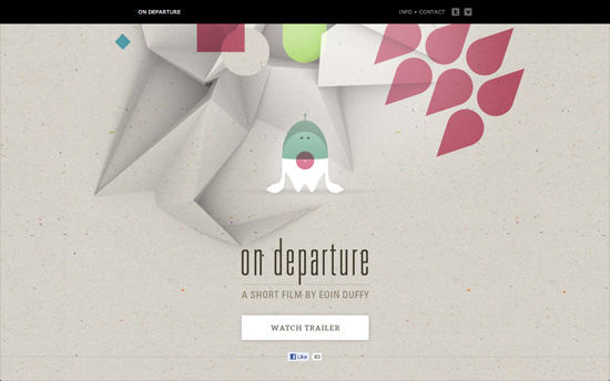
On Departure website
On Departure

Extremely simple site but the colors, which hail from the film it’s featuring, are lovely. I also like the very textured background where the paper folds come forth.
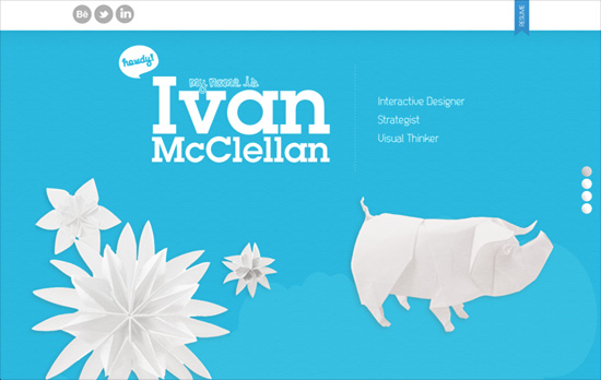
Ivan McClellan's website
Ivan McClellan

Love all the origami on this page and the white on blue color scheme. Wish he’d use true web fonts instead of Cufon, and the navigation for the portfolio images could blend in a little better, like the way the screen-by-screen navigation on the right hand side does.

Social Media Weekly

Ready to go out and design your next website? Try building with the Catalyst Framework.

Responsive Web Design – Rundown of Handling Flexible Media
“When you take the responsive web design route, part of the deal is fluid grids. That is, container elements set in percentage widths.”

Typography, JavaScript – Responsive Measure
“Responsive Measure is a simple script that allows you to pass in a selector (ideally the container where your primary content will go) which generates the ideal font size needed to produce the ideal measure for your text.”

E-commerce, User Experience – Accordion Style Checkouts – the Holy Grail of Checkout Usability?
“An accordion checkout can be truly great, but just redesigning your existing checkout in an accordion style won’t make it particularly easy to use in and of itself (although it might look good). It’s what the customer is required to do at each step that makes or breaks the checkout experience.”
Design Focus: Uncover

September 14, 2012 By Sophia Lucero

Our featured designs this week have a nice little effect where you uncover content that seems to be under another.

Designs of the Week

Search Optimized, Turn-Key Designs, Unlimited Everything. Start building with the Genesis Framework today.

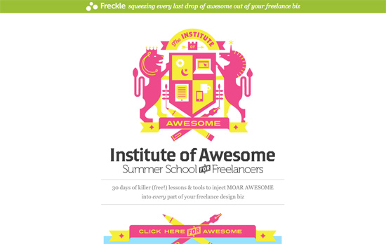
Summer School for Freelancers : The Institute of Awesome website
Summer School for Freelancers : The Institute of Awesome

I like the brightly colored twist on the traditional coat of arms and other elements like the arrows.

rtraction website
rtraction

Another growing trend: combining vertical scrolling with horizontal scrolling or sliders to maximize the amount of information you can consume in a screenful. The changing fixed backgrounds is also a simple but eye-catching effect especially if you switch between light and dark colors.

Suit Up or Die Magazine #1 website
Suit Up or Die Magazine #1

This one does the vertical then horizontal browsing thing too, but it instead of for slider items it’s for each article in the magazine. I also like how each section layered under the previous one don’t have the same heights, they all stretch according to the requirements of the content.

Social Media Weekly

Create unique, extraordinary websites with Squarespace. No experience necessary!

Typography – Web Fonts Performance: Making Pretty, Fast
“To discuss this, and more, we sat down with David Kuettel from the Google Web Fonts team, for an in-depth look at web fonts.”

User Experience – 5 Things to Consider Whilst Sketching
“Sketching isn’t about nuance. It’s about emotion, direction, and ideas. Broad gestures.”

Responsive Web Design – Responsive Patterns
“A collection of patterns and modules for responsive designs.”

Friday Focus 04/20/12: Unfolded

April 20, 2012 By Sophia Lucero

Our featured designs on this week’s Friday Focus put the paper motif to good use once more, focusing on its creases and folds. Not just in the corners and as borders, but as a way to demarcate sections of content at a time.

Designs of the Week

Wing Cheng's website
Wing Cheng

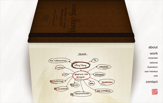
The entire site, except for the fixed navigation on the bottom right, is presented in an accordion-type notebook with all the text and graphics done in the designer’s own handwriting, contact form included. It’s only when you click on the images that you get the actual version of the logos. There are tradeoffs of course: legibility, seeing the real logos without having to click anything, accessibility, and so on.

3D Polystyren website
3D Polystyren

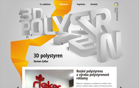
I always enjoy a good “power line” and this one, although yellow and chunky looking against the huge 3D header, is not distracting but a welcome trail all the way down. The text blocks are a bit long and heavy though.

Granville Island website
Granville Island

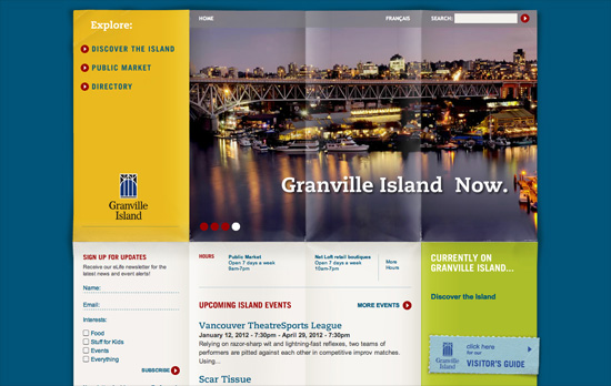
Love the worn quality to the background paper, like an opened and laid out map. Color block is also hot right now! Also, in the top left menu there’s a small “you are here” sign, again reinforcing the travel theme.

Spreads for iPad website
Spreads for iPad

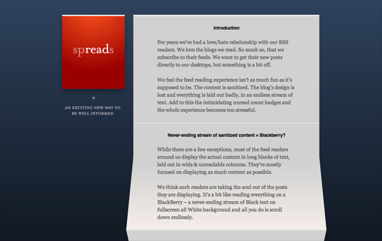
Another accordion sheet of paper, except this time the folds aren’t equal heights. Love the pop of read against the blue, which gradients into pitch black when you reach the bottom of the page. Also interesting is the decision to put a screenshot of the app nowhere above the fold, with introductory paragraphs coming first.

Build on DIYThemes’ Thesis Framework for rock solid SEO and great layout customization options.

Social Media Weekly

Programming – Light Table – a new IDE concept
“We need to be able to move things around, keep clutter down, and bring information to the foreground in the places we need it most.”

Design – Startups, this is how design works.
“This handy guide will help you understand design and provide resources to help you find awesome design talent.”

CSS, Tables – A #CSS grid system for tables, for you
“A neat way of aligning the columns in tables up with each other — a table grid system of sorts.”

Pagelines lets you build WordPress websites and it’s as easy as drag and drop, go check it out!

Friday Focus 01/28/11: Site Origami

January 28, 2011 By Sophia Lucero

The folded look on websites is still a strong trend. Let’s take a look at a new batch of sites that put it to good use on this week’s Friday Focus.

Designs of the Week

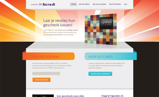
Joyful Giftcard

The introductory content stays on each page but automatically scrolls down to the main content on inner pages. Good solution if you want to keep things on every page but still give the user the option of scrolling back up instead of going back.

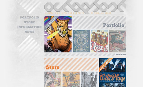
Octophant

Love the type, the repeating diagonal stripes, and the arrangement of the images. The logo is barely readable but it’s certainly catchy.

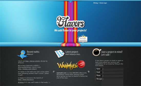
NineFlavors.com

The rainbow stripe thing makes this feel dated but I really like the design of the carousel.

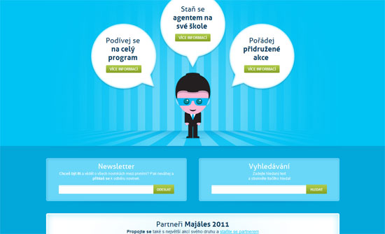
Pražský Majáles

Very cute illustrations, and everything’s neatly arranged.

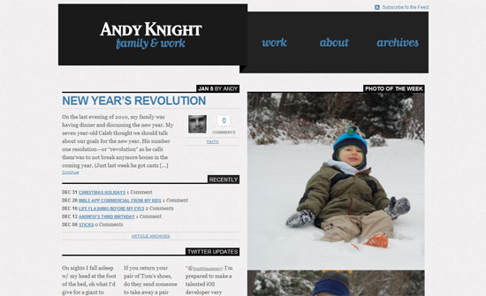
Andy Knight

The script font softens the chunky blocks a bit. The way the layout is split right down the middle, with text on the left and photos on the right, is effective.

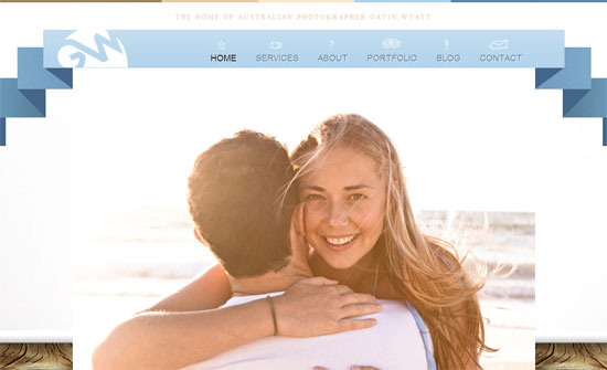
Gavin Wyatt

The navigation looks like a welcome banner here! Not a fan of the justified text and the type could be more refined.

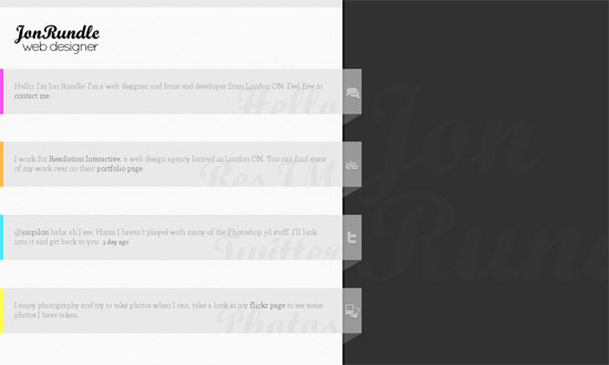
Jon Rundle

The content seems almost too narrow for it to be flushed left, but good idea to put the name in the background on the right. I wish the whole rows of text were clickable, or at least the icons.

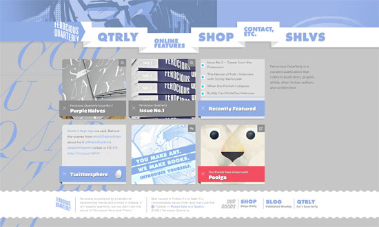
Ferocious Quarterly

Sometimes illustration- or portfolio-focused sites tend to keep things minimal to focus on the work being presented, but I love this site for the way it seems to tell its own story through the design. Beautiful details everywhere.

Social Media Weekly

Mobile – Designing Mobile Experiences

CSS – Case Study: Getting Hardboiled with CSS3 2D Transforms
“In this example we’ll use CSS3 two-dimensional transforms to add realism to a row of hardboiled private detectives’ business cards.”

Typography – Web fonts via 2010
“Web fonts got a lot of sensational press last year. I urge you to look past the (obligatory?) handful of web font services that are routinely mentioned, and rather at last year’s extraordinary feats of professionalism that have catalyzed the growth of typography and web design right under our noses.”

Design – Web Design 2011: Normal No Longer Exists
“Web design has come a long way in the last three years. We’re (hopefully) dropping the idea of dogmatic solutions. We’re starting to realise that we need to think on our feet about business cases and target markets. We know that we have zero control over the viewer’s context and environment.”

User Experience – humans.txt
“It’s a TXT file that contains information about the different people who have contributed to building the website.”

HTML – HTML(5) and text-level semantics
“As an absolute type nut and militant web standards advocate, one of the most exciting things that HTML5 brings for me is not the new structural elements like <header>, <aside> et al (although they are pretty awesome) but rather the text-level semantics it brings with the addition and redefinition of certain elements.

Friday Focus 09/03/10: Ribbons

September 3, 2010 By Sophia Lucero

Using ribbons is really big these days, bringing both sophistication and a hint of nostalgia to this week’s designs.

Designs of the Week

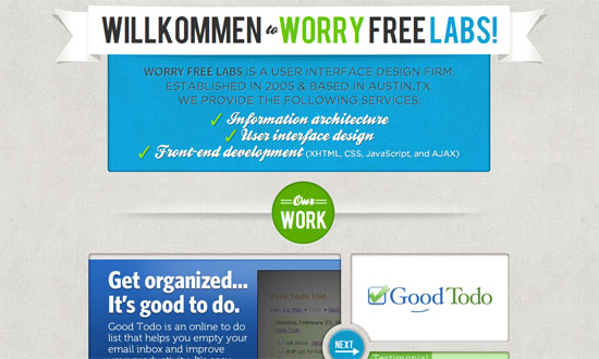
Worry Free Labs

The Work section slider is great. What I really like is the lightbox contact form—go all out when customizing it.

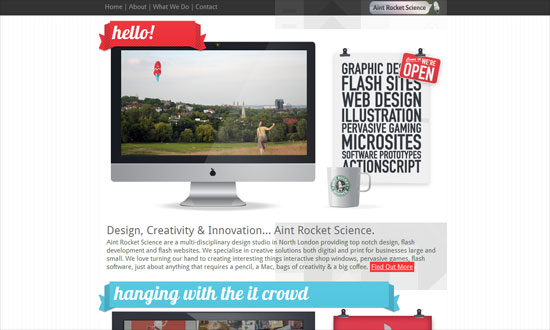
Aint Rocket Science

I find the gray shapes in the background an interesting touch, but needs better spacing, better association by proximity.

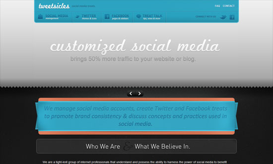
Tweetsicles

The details on this design are really fun but the colors—mostly the gray—seem to dampen the overall mood.

TDB.RS

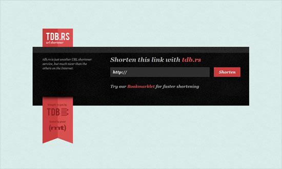
Doesn’t make much sense for the entire space beside the top left logo to be a hyperlink. I think the submit button could echo the glossiness of the ribbon.

The Combine

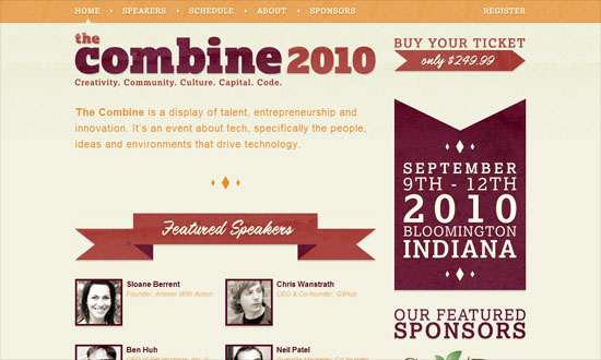
Love the use of textures on both the ribbons and the headings. I also like the diamonds, which do match with the angles of the ribbons.

Blue Ribbon

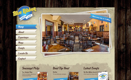
This site needs a description of what it’s about. What exactly is the place? Where exactly can you find it? Always reach out to your visitors.

Forever Heavy

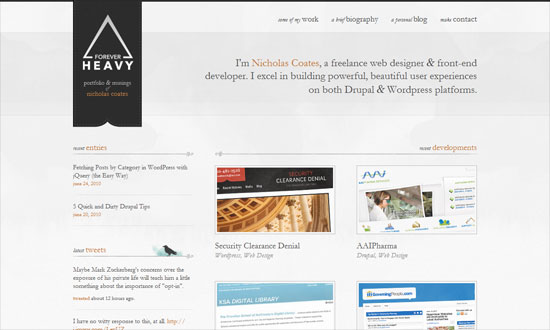
Put your logo on a ribbon like that, hanging like a flag, and you get elegance for cheap! Some texts are too small due to the delicate nature of Garamond, but don’t you just love the bird silhouette and that watercolor smudge behind it? Social media intergration at its finest.

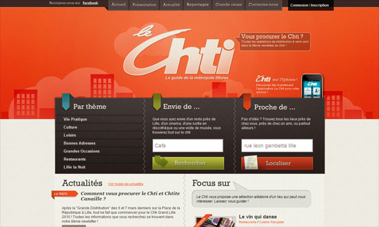
Le Chti

Header navigation is excellent but the “Connexion / Inscription” link should have been styled in a similar way. Other than that, really cohesive design.

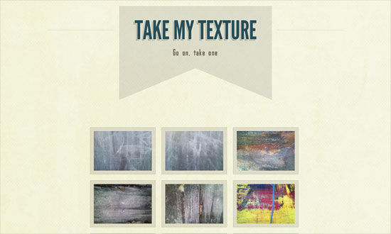
Take My Texture

Straight to the point! And does away with default browser fonts.

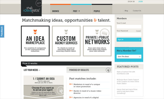
theIdeaLists.com

I like every single detail on this front page. So imagine my disappointment with the membership request page.

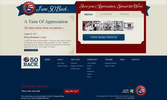
50 Back

The dropdown menu shape is neat, and it’s just the Times New Roman text that throws me off, but more or less fits the design anyway.

Social Media Weekly

CSS – BonBon Buttons – Sweet CSS3 Buttons
“There was a goal: Create CSS buttons that are sexy looking, really flexible, but with the most minimalistic markup as possible.”

HTML – WebKit HTML5 Search Inputs
“It just behaves like a text input. This isn’t a problem. The spec doesn’t require it to do anything special. WebKit browsers do treat it a bit differently though, primarily with styling.”

User Experience – How Choice Impairs Your Visitors
“Many sites provide an array of methods to interact with their offerings, but excesses in decision-making pressure can render less empowered visitors into a cyclone of stress from the barrage of questions being asked. As an industry, we place a great deal of emphasis on getting visitors to make decisions, but are we turning a straightforward path into a labyrinth with our need to know?”

Next Page »

Code & Tutorials

Which Front-End Development Languages Will Grow in 2017?

Your Guide to Leveraging APIs as a Developer

Bitcoin Processing Website Integration For Web Developers

Website Security For 2016 That All Developers Need To Know

5 Reasons You Need to Be Using jQuery

About Devlounge

Want to read more about Devlounge, or maybe you want to contact us, or even advertise? Oh, and don't forget to subscribe to updates!

The Best of Devlounge

Vectr: a free graphics editor on your desktop and in the browser

Search