When designing websites and apps, user experience should be the primary concern. If your product isn’t user-friendly your audience is going to move on and find something easier to use. It’s as simple as that. [Read more…]
Design Focus: Sign Up Now
-
Check out these website designs that don’t may not contain much at the moment, but grab your attention with a beautifully crafted sign up page.
Designs of the Week
Create unique, extraordinary websites with Squarespace. No experience necessary!

Love the subtle moving clouds and the masked effect on the photograph. The form steps slide up inside the black circle, and you’re led to a confirmation page with the same transition, the only difference is that the beautiful view had disappeared.
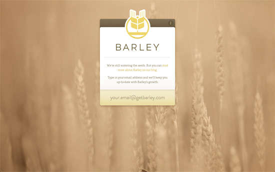
Like the previous site a beautiful background photograph with sites like these make a huge difference for setting the mood. Besides the attention to detail in the interface elements, the interaction is also a beautiful experience: all you have to do is type in your email and it’ll send the form right along, no need to hit Enter or push any button.
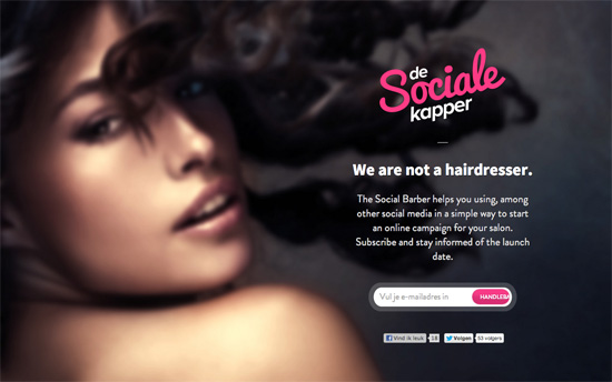
Not sure how a sultry face translates to social media campaigns but I’m curious to see how it all fits into the full site.
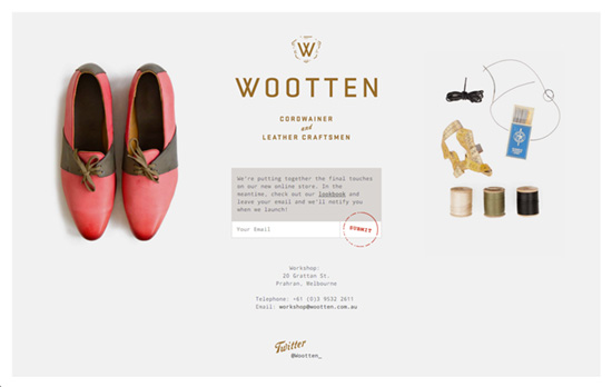
I’d have loved to include this in Excellent E-commerce Photography but let’s enjoy the sneak peeks, the warm copy, and that clever stamp-like submit button. This one’s framed, too.
Social Media Weekly
Ready to go out and design your next website? Try building with the Catalyst Framework.
User Experience – Your Website has Two Faces
“But whether or not our job titles include the phrase “user experience,” we must advocate at least as much for the people who use our software as we do for computer systems.”
Responsive Web Design – REMux: An Experimental Approach to Responsive Web Design
“This concept would solve the biggest challenge: layouts scale almost perfectly within their boundaries.”
User Experience – Stop Designing for “Users”
“Instead of analyzing specific goals and tasks, ACD focuses on the analysis of meaningful, goal-directed actions supported by tools and artifacts in a social world.”
Friday Focus 09/02/11: Over the Moon
This week’s Friday Focus features designs that incorporate the moon in them.
Designs of the Week
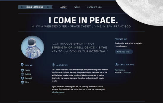
Let’s talk about the moon and how it’s in the top right, in the foreground, spinning oh so slowly—just enough for people to notice it’s moving. Overall look seems simple, but I think it’s effective and still makes an impact. I think it’s interesting that the site labels the homepage as the About page at the same time. One nit to pick, while not visual, is that there are two different email addresses being used in three email links.
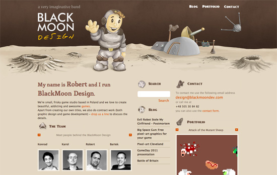
It’s funny how this site also uses the Star Trek logo as one of its icons in keeping with the outer space theme. I love the illustrated, painted look in the header, including the word “design” in the logo (which doesn’t look like just another handwritten typeface). It’d be nice to have the headings as real web fonts now instead of images, but then I discovered that the whole design—and I mean every graphic you see on the page—is one big sprite, so kudos to that!
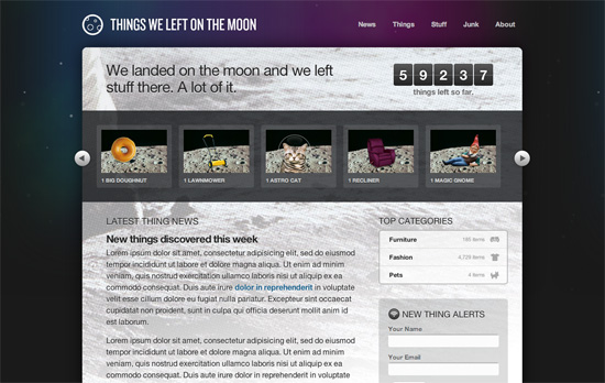
This is just a demo site created by Dan Cederholm for An Event Apart Seattle 2010, but there are a lot of neat things to be inspired by here, particularly CSS3 features in the hover effects and typography. Love the idea of the halftoned moon landing picture as a background. The use of purple is also a nice touch, since it’s easy to just reach out for midnight blue when depicting skies and space.
Social Media Weekly
Mobile Web Design, E-Commerce – Add to Cart: 5 Ways to Improve Shopping on the Mobile Web
Five steps to optimizing online shopping on mobile devices.
HTML5 – The Current State of HTML5 Forms
Check out the latest browser support and techniques for using form attributes in HTML5.
CSS3 – Sizing with CSS3′s vw and vh units
Another set of measuring units included in CSS3, this time based on viewport dimensions.
CSS – The Minimum Page Project
Another iteration on the CSS resets out there. The idea is to avoid redundancy due to broad-sweeping resets.
Design, CSS – Adapted
Reflections on the challenges and options in adapative, responsive web design.
Design, User Experience – Thoughts On Communicating Design
“Communicating design, in general, needs to be less about documentation and more about clear, concise and ongoing two-way communication.”
Friday Focus 07/22/11: Over and Under
The featured designs on this week’s Friday Focus take out the bore of having to scroll through several thousands of pixels as you’re rewarded with cool animations, layer effects, and the information you need presented in an appealing and compelling way.
Designs of the Week
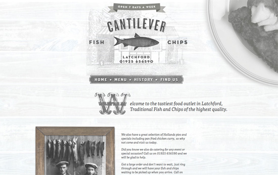
What really caught my eye here is the chalkboard-style menu, complete with the yellow piece of chalk at the left side and the black textured background. The drop caps in each section are also quite lovely!
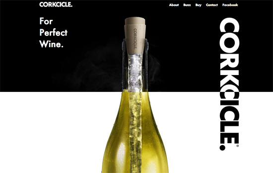
I have some screen flickering issues at the top half of the page, but as you get to the bottom of the page you’ll find something really neat: a wine-pouring effect to the right (completely with the translucent effect), and and a grape vine stem to the left—both of which are in the foreground.
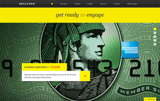
I like that the portfolio “slideshow” is vertical, takes up the whole screen, and yes, supports keyboard navigation. Diagonal stripes in both directions are used everywhere and of course there’s tons of yellow in this design.
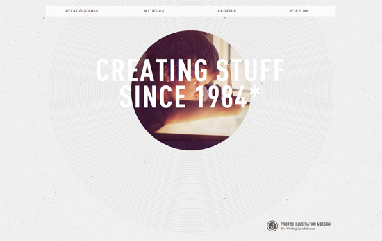
I like the really subtle use of a backslash as a marker on the menu for which section you’re currently at. Of course my favorite has to be the peekaboo picture of the artist when he was still a kid, surrounded by thin concentric cirlces.
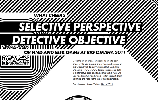
This looks comes on a little too strong for my taste, but I appreciate the optical illusions at work here. You can simulate movement by simply moving over a striped background.
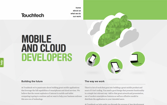
I like the photo masking effect you see on the green cloud, which also appears in the What We Do section. It’s a nice twist when you need to add icons to your design.
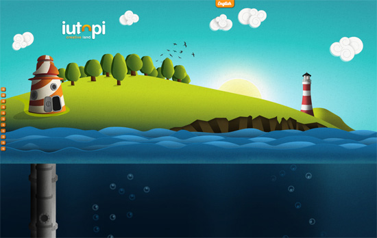
I’ve lost count of how many sites look like this, but it’s still interesting to see the illustration styles and addressing the usual issues. I really like how the clouds look. I like the sea level indicator and the gauge at the right. In those screens, however, the body text looks really small and could fill up the screen better. I also think the left-side navigation arrows could use variation and retain the hover per screenful.
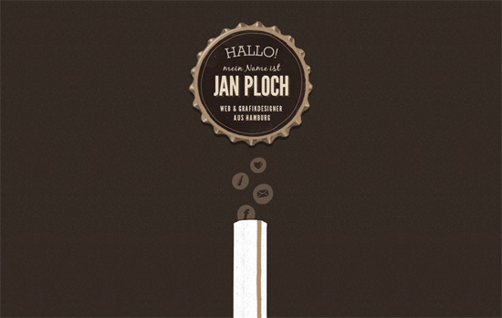
This site is basically a fun ride down a beer bottle! Bonus points for the quick links as bubbles atop the straw and a translucent texture for the lightbox background. I just wish the contact link weren’t a mere mailto: because I would have liked to see how the designer would integrate a contact form into the beer motif.
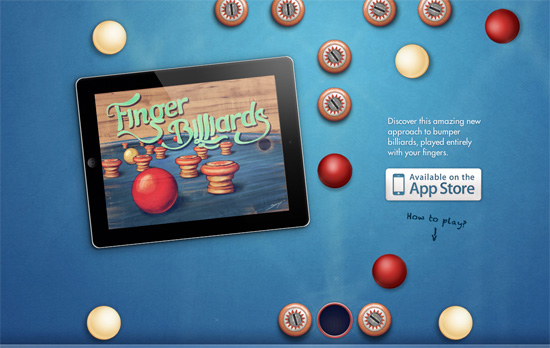
Here’s another clever concept: by scrolling the page the red ball in the middle reaches and sinks into the hole and plays a sound. A live demo of the app they’re selling, no video needed! As you scroll even further, you get a description of the game and instructions in the same vintage feel the game has. No unncessary content here.
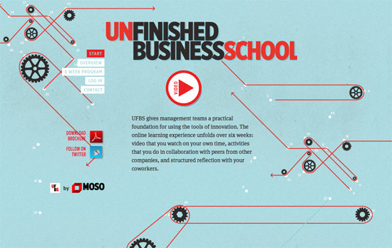
I think the background illustrations are teetering on the brink of being distracting, but I do like every single one, especially the overview section explaining their process with infographics.
Social Media Weekly
CSS – Responsive images right now
Gist: hide the small image from desktop users and hide the big background image from mobile users.
HTML – The New and Improved Way to Create Forms with HTML5
HTML5 is chock full of new form elements and attributes; use them wisely!
CSS – CSS3 Radial Gradients
Mastering linear gradients is one thing, but radial gradients are whole other beast.
Friday Focus 07/08/11: This or That?
You might remember a feature on split designs over a year ago. The look is alive and kicking in 2011, and this week we’re taking another look. Happy Friday Focus!
Designs of the Week
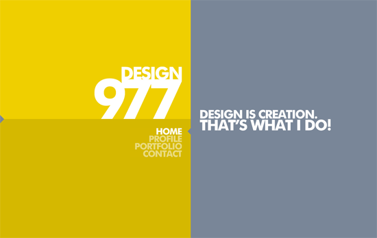
This is actually a completely fluid site, and that’s one feature you can take advantage of when dividing your layout 50-50. Using a custom scrollbar is quite useful in this case as well although I wish it weren’t the only one that got such a treatment—the form elements could be tweaked a little bit more. The Facebook/Twitter/validator links are tucked away on the small arrow at the leftmost side of the site, which randomly turns into a plug icon.
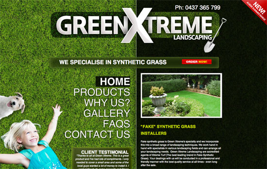
Bold look, big logo, but at the cost of what could have been a better experience. The split layout forces the products to be listed only on one half and after a screenful of scrolling because of the narrow space for the intro text. Not to mention, the photoshopping of the kid and puppy to the lower left isn’t so realistic.
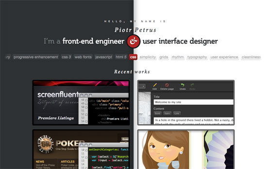
Who said split designs had to keep their division in one place? On this site, clicking on one of the portfolio images pushes and squeezes the other half of the layout to make way for a large tooltip description of the project, written in a playful tone. I also like the idea of putting keywords relevant to his work.
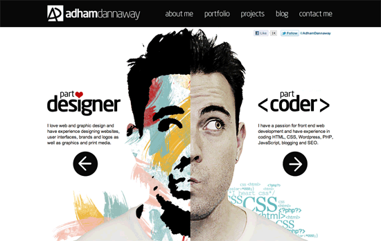
Love both the artistic and comedic headshots. The color palette used in the painted side also echoes in the circular links found in the footer as well as the skills/tasks required in each item of his portfolio and the bar chart in the about page. Other than that, this is a very black and white design, and you could say the look is split in that regard as well.
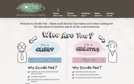
I like all the fun illustrations in this design, but the only thing that throws me off here is whitespace at the top right due to the tall logo; makes me with the menu were vertically aligned instead.
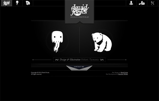
Like the previous site, only the homepage is split in two, but the execution here is striking: elegant and fun (I could even say cute) at the same time. The fixed, icon-based top navigation is also a nice touch.
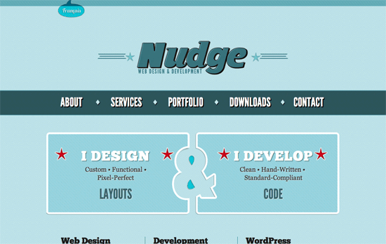
Great retro look on the logo and the rest of the design. The best part has to be the negative space ampersand right in the middle!
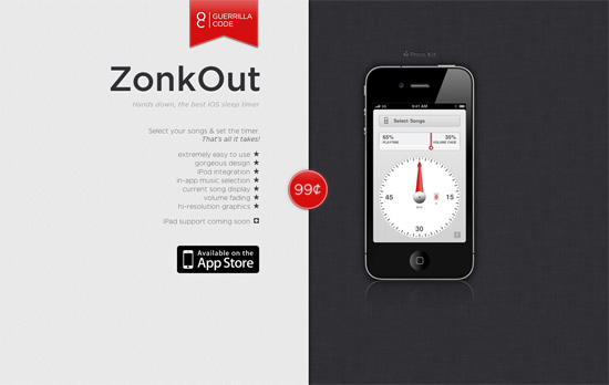
I find it interesting that the bullet points and the left-hand text are right-aligned. Another thing I like is the use of red as accent on exactly three areas: the logo, the price, and the hands on the app. Not too sure about the reflections and shadows on the iPhone illustration though, is it standing up or lying down?
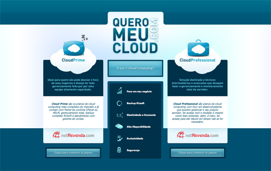
This one looks less obvious but it still is a split design, with a third column halving the design. Almost predictably, there are animated clouds in the background.
Social Media Weekly
Typography – Free HTML / CSS for type & palette proposals
Mobile, iOS – The iOS Design Cheat Sheet
Usability – Top 7 split testing blunders you must avoid
HTML5, Accessibility – HTML5 Accessibility Chops: form control labeling
CSS – Pseudo Spriting
