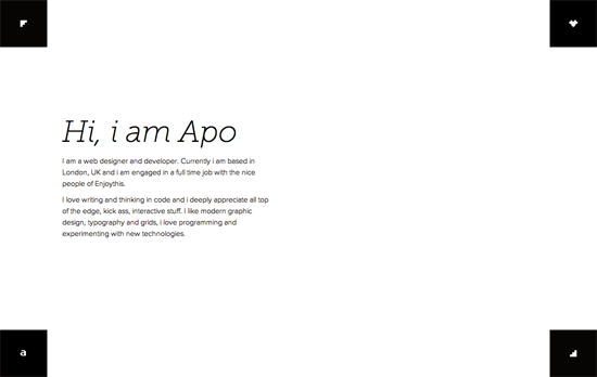
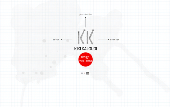
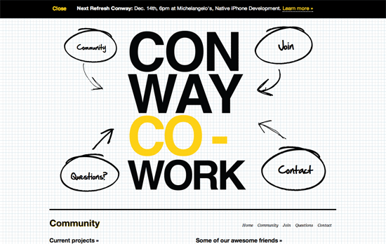
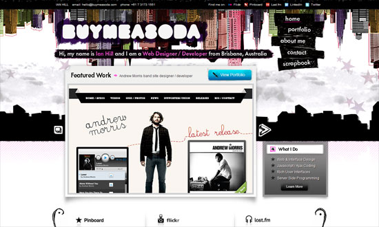
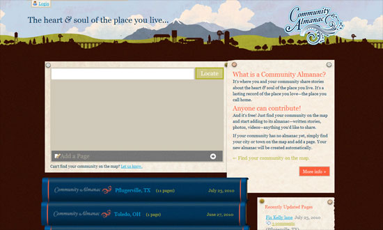
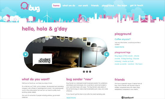
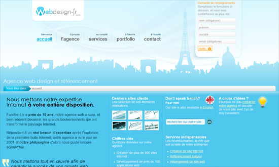
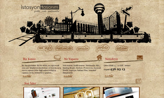
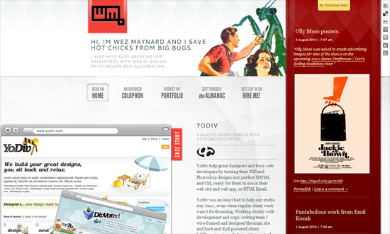
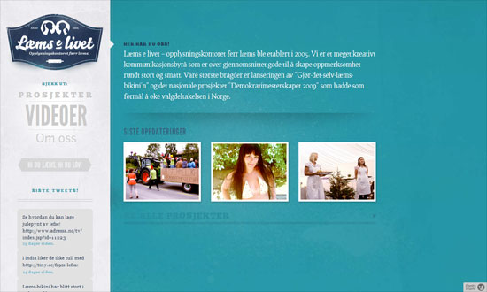
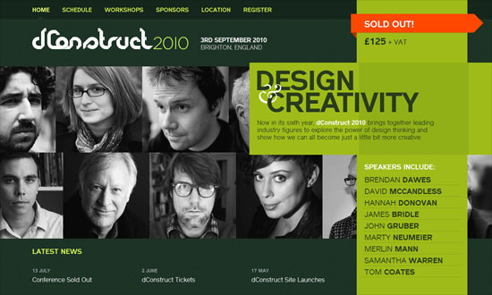
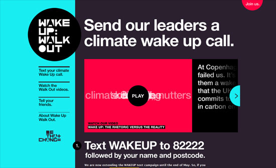
These featured websites want you to drag their interfaces to navigate. Is it a better design decision or not? Let’s find out, shall we?
Designs of the Week
Need help in promoting your site? INeedHits has been in the search engine marketing since 1996!
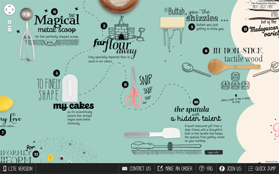
Clever combination of animated drawings and photos of cooking utensils to present a recipe-format website. It’s actually built on top of the Google Maps engine hence the dragging mechanism, although it has keyboard navigation as well.
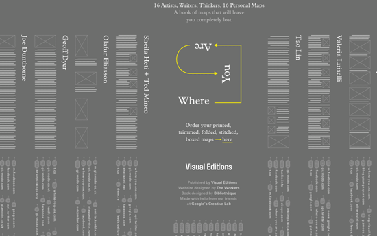
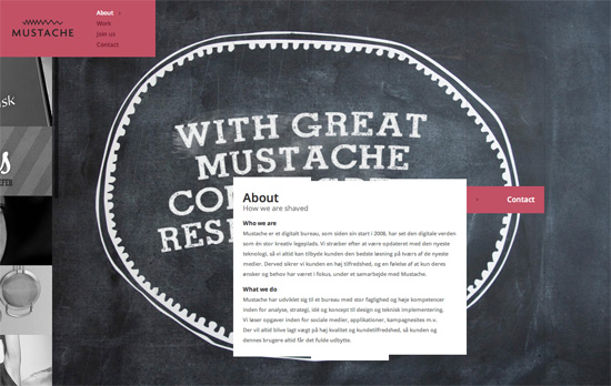
The dark gray homepage features abstract lines and boxes representing paragraphs and images for the stories you’ll read as you click on each name. Most of the text links are arranged vertically, and the overall layout & content are similar to the book.

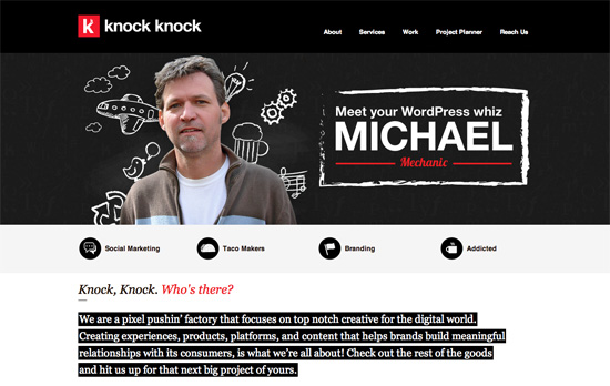
There’s a nice touch of making the borders slide in when you hover over the clickable media. Also interesting is how the whole wall repeats no matter how far you scroll, making it like an infinite screen although also possibly confusing.

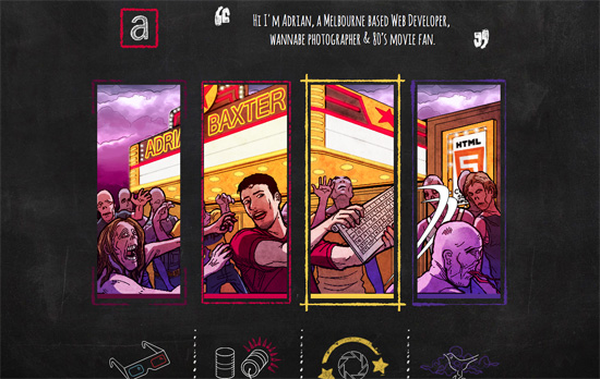
The key to these draggable screens is giving options, like in this page where you can get to the different sections from the navigation. The whimsical quality of these illustrations are excellent.
Social Media Weekly
Ready to go out and design your next website? Try building with the Catalyst Framework.
Optimization – We spent a week making Trello boards load extremely fast. Here’s how we did it.
“I wanted to improve board rendering performance by 10% every day for a week. It was bold. It was crazy. Somebody might have said it was impossible. But I proved that theoretical person wrong.”
JavaScript – A Dive Into Plain JavaScript
“With jQuery, adding, removing and checking if an element has certain classes is really simple. It’s a bit more complex with plain JavaScript, but not too much so.”
