• Home
  • About
  • Contact
  • Advertise

Devlounge

Design, Develop, and Grow

ateşli sevgilisi fantezisini yaşamak istediğini söyler porno ona arkadaşları varken onunla gizli saklı seks yapmak istediğini sikiş söyleyen kız hafta sonu için gelen arkadaşının görmediği bir sikiş açıdan sakso çekmeye başlayınca adamın yarağını bu altyazılı porno şekilde indiremez ve açık şekilde salonda sikişimeye sex izle başladıklarında misafir kızı da bu sekslerine rokettube konuk ederler seks yapacağını düşünmeyerek onun sex izle oyun oynadığını zanneder sabah olur ve herkes uyanır hd porno bu sırada yanında şişme mankenini de getiren sapık erotik hikayeler genç sınav haftası ders çalışan genç adam üvey annesinin sikiş eve gelmesiyle hayatının şokunu yaşar

  • Home
  • Code
  • Design
  • Design Focus
  • Interviews
  • Publishing
  • Strategy
  • Webapps
  • Extras

Friday Focus 11/25/11: Diamonds

November 25, 2011 By Sophia Lucero

Hope everyone had a lovely Thanksgiving! This week’s (black) Friday Focus shines the spotlight on sites that use diamonds (or rhombuses) as a major graphic element in their designs.

Designs of the Week
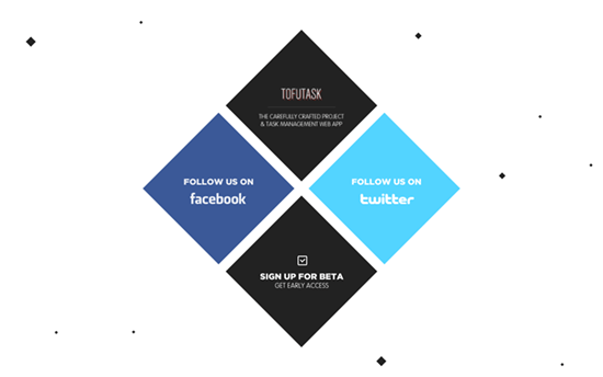
Tofutask website
Tofutask

There are only a few elements on this page because it’s still in “coming soon” status, but it looks pretty compelling nonetheless. There are floating diamond particles moving upwards in the background, then the two blue blocks link out to Facebook and Twitter respectively. Clicking on the bottom diamond expands it and hides the other three. I still wish there were a preview of the product somehow though.
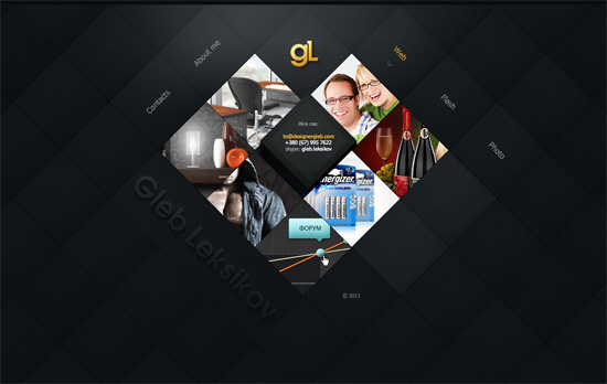
Gleb Leksikov's website
Gleb Leksikov

What I really like about the diamond trend is that it appears to turn websites on a 45-degree angle and lets you play with some cool views. Here though the use of a slideshow is still necessary for displaying the portfolio images. There’s an interesting interaction going on where each slide scrolls to a particular section of each image instead of just statically letting it appear. I’m just a little iffy about the semantics though, cause nav items and portfolio items are all wrapped in paragraph tags, so there’s a lack of hierarchy there.
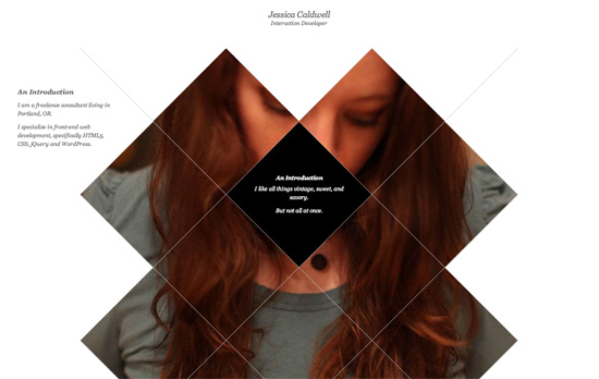
Jessica Caldwell's website
Jessica Caldwell

The initial state of this site is actually much more sparse, just the outlines are visible. Hovering over them displays different items from her portfolio in a sliding door animation. Clicking then loads a larger view of the work, but still masked inside the boundaries of the diamond “fence”. Simple but stunning effect, a far cry from the carousels and lightboxes of yore!
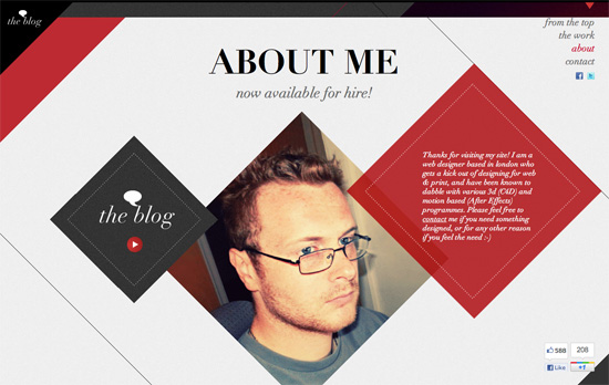
Mark Lawrence's website
Mark Lawrence

Another enjoyable parallax ride at play here, but there are a couple of things that take away from it: first is the Like and +1 buttons that are just randomly sitting at the bottom right corner, and the Blog link that goes to a blank page (some styling even for an non-existent site would be nice).
ResumePower website
ResumePower

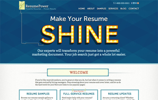
Like Designer Gleb there’s a diamond pattern on this page. I like how the word “shine” lights up when you hover over, and that it’s connected by wire to the top left logo. The double border continues in several other elements for this formal, plated effect, although the “most popular” label in one of the boxes looks a little oddly placed.
Manca Gracar's website
Manca Gracar

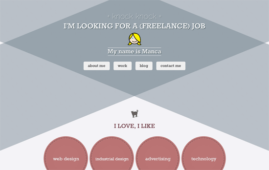
Not too sure about the use of gray when there are a few cute, vintage elements on the page but I love how the QR code was turned into a Pac-Man maze.
Kikki Festival 2011 website
Kikki Festival 2011

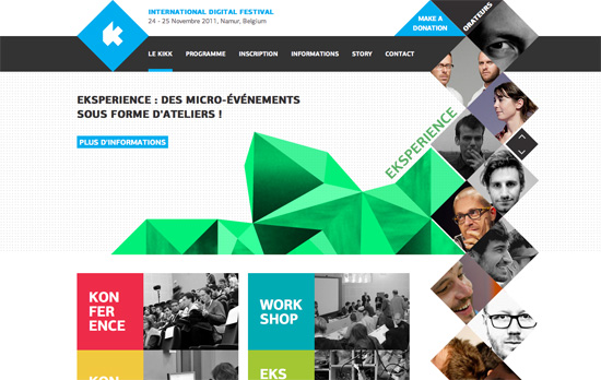
It’s not a completely crazy looking layout but one little step out of the box does a world of difference. The slideshow is not a rectangular affair but this geometric mountain that changes color while the list of speakers is a vertical strip to the right. The purpose becomes more apparent (and amazing) when you go to the Programme page: hovering on an item in the schedule highlights which speakers figure in the talk, appearing in the same row as the location in the table.

Social Media Weekly

CSS – Simple Styles for Horizontal Rules
“You could get a lot fancier with an element like a <div> that can hold content, but I like the semantics of a horizontal rule. It’s an emphatic break between two sections of content.”

CSS – Image Tint With CSS
“In this post, I’ll offer a few solutions for mimicking a CSS image tint or semi-transparent color overlay.”

CSS, Typography – Icon Fonts are Awesome
“I’ve created this page to attempt to convince you. It shows examples and lists six reasons why it’s a good idea and three common arguments against them (some of which I refute).”

HTML – Pattern primer
“That’s the way I’ve been starting most of my projects lately: beginning with the atomic units of content and styling them first before even thinking about layout.”

Web Design – The ALA 2011 Web Design Survey
“Set aside ten or fifteen minutes and take the survey!”
Friday Focus 08/20/10: Skylines

August 20, 2010 By Sophia Lucero

This week on Friday Focus: designs that feature artistic renderings of skyscrapers and other features of a long landscape. See how they’re incorporated below.

Designs of the Week

Ian Hill

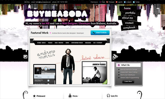
Great grungy attitude all over, even the shiny buttons have a bit of smudge on them. Nice little detail: I like how the carousel’s right arrow changes into a square block to indicate there are no images left to view.

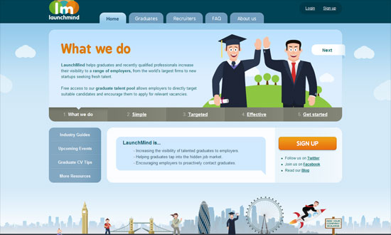
LaunchMind

Love the easy feel from the pastels, gradients, rounded corners, and happy illustrations. The “add your company building” feature is also a great concept for the purpose of this website.
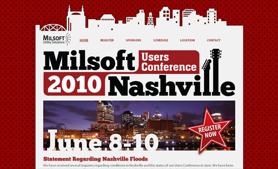
Milsoft Users Conference

Bold and high contrast. Even the borders and background patterns are rugged and chunky.

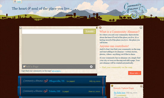
Community Almanac

The animated stack of books is really clever, and clicking loads a page where the books is opened.

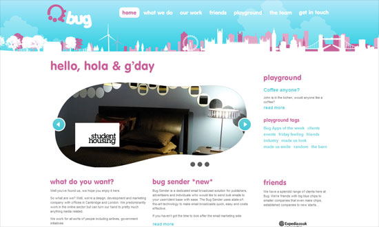
Bug Interactive

Love the non-rectangular frame for the carousel—I’m seeing more of these lately. Body text is a little to small though.

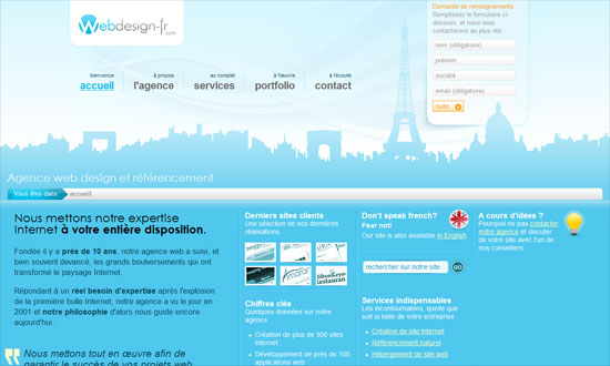
Web Agency France

The open, airy header area looks great. This is also a rare gem of a liquid layout.

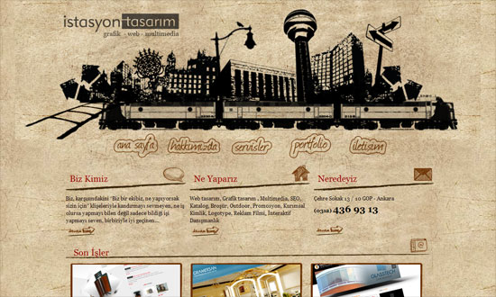
İstasyon Tasarım

Interesting fisheye (a.k.a. OS X dock) hover effect on the navigation, though I can see not-so-seamless texture tiling!

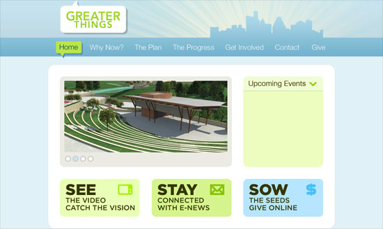
Lake Hills Church | Greater Things

I like how all the clickables are so big yet still look minimal and refined. It’s all in the type and colors, right?

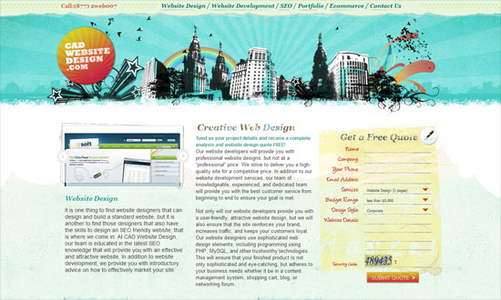
CAD Website Design .com

Great treatment on the contact form and the image frames. Textures all over!

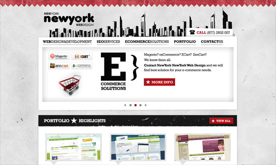
New York New York Web Design

I seem to have a lot of grungy designs this week, and I’m not complaining! Love the way the sections are divided, with blocky headers and thick borders of stars.

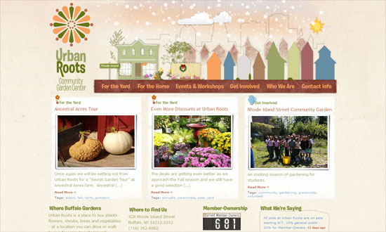
Urban Roots

Spacing needs a little work in the featured images area, but the header navigation animations are adorable. This site is so warm and friendly.

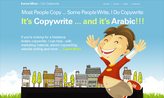
Kamal Mirza

Good idea to use the neightborhood skyline as a divider for the different sections in this one-page site. Although I think the black background is a big disconnect from the light blue one at the top.

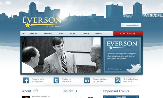
Jeff Everson

Not a fan of the lens flare, and the featured image could have been a slideshow/carousel instead.

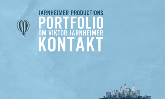
Jarnheimer Productions

Lovely animations, and I like the way the skyline is in a corner instead occupying the whole width of the screen.

BigDeal.si

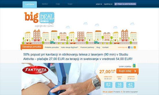
I wish the quirkiness of the header illustration and logo carried over to the rest of the design.

Mospromstroy Group of Companies

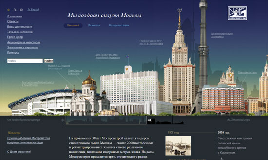
Beautiful, beautiful illustrations of the Moscow skyline. The scrollbar navigation for the image works well too. I wish they were a little more interactive though, with tooltips or links. And hooray for another liquid layout.

Main Line Restaurant Week

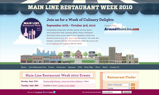
The header canopy is a nifty touch to the header design. Love the mix of patterns too.

Social Media Weekly

Design – Perception and the design of forms – Part 4: Figure/ground
“In this article we are going to explain the principle of figure/ground, which is surprisingly central to how forms work. More often than not this principle is—unintentionally—applied well. But we’ll also show you a few examples of when it isn’t.”

Programming – Semantics and sensibility
“For a while now, sensible naming conventions and semantics have been confused.”

Mobile – HOW TO: Make Your Mobile Websites Act More Like Native Apps
“Fortunately, a number of different frameworks are making it easier and easier for developers to create mobile web applications that look and feel more like native apps. Here are six examples.”

Friday Focus 04/09/10: User-Generated Galleries

April 9, 2010 By Sophia Lucero

This week on Friday Focus: designs that prominently feature user-submitted content, particularly images. How do you prevent monotony and preserve quality on these sites? Let’s find out.

Designs of the Week

Art in My Coffee

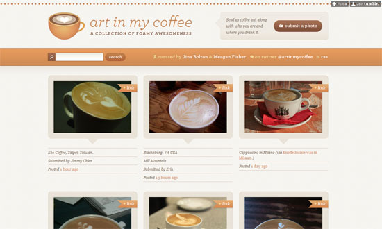
Very homey, and it’s all in the details. Just… look at it.

Dribbble

This look is a bit more understated compared to the previous one, but again it’s all in the details giving way to focus on the content. The overlay of info on hover, the color swatches on the sidebar, the visualization of tags by popularity, the use of thin borders for tabbed navigation, and so on.

Yumit

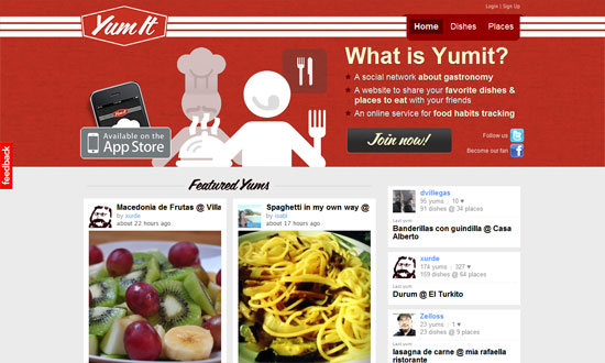
I feel like the scripty, retro look could be reinforced more, especially in the blurb text, which seems a bit cramped.

Poolga

I like the layout here. The All / iPhone / iPad filter is a little too small and up there, but other than that, all the non-gallery stuff are on the right. I also like that the four most recent images are larger than the rest, which breaks the rhythm and calls attention.

PopScreen

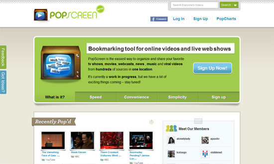
I think the middle area could be a little more refined, but I like that even the video player has the paper-like look around it.

The Book Cover Archive

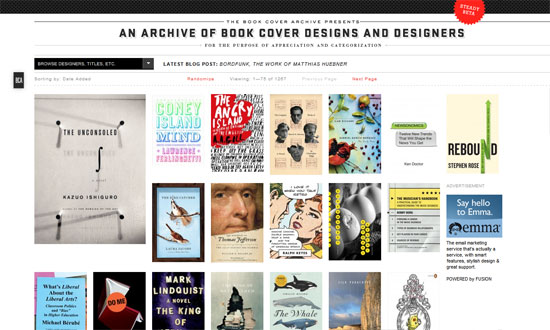
Very underdesigned and I don’t mind one bit. It’s not so obvious but as you browse further, the site is left-aligned, not sure why. I find it interesting that the pixel-style footer, a repeat of the header, is very tall.

They Make Apps

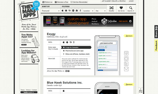
Looks extremely busy but the features are fantastic. The image containers swap according to the type of mobile device being developed for, and practically everything is in black and white so the apps stand out.

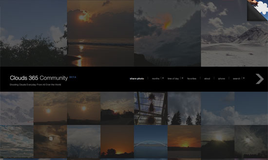
Clouds 365 Community

This is actually running on the Fullscreen premium WordPress theme, but I decided to use a live example where it works as a user-submitted community. I love that the layout is unconventional but still effective.

Social Media Weekly

Design – Know When to Stop Designing, Quantitatively
“Efficiency lets you know when you can stop looking for a better design.”

Usability – Horizontal Attention Leans Left
“Web users spend 69% of their time viewing the left half of the page and 30% viewing the right half. A conventional layout is thus more likely to make sites profitable.”

Usability How to Win Friends and Influence People Remotely
“Once remotely located a designers ability to interact with other team members and effect change are funneled through the telecommunication mediums that the team uses to communicate. This article lists the available mediums and analyzes their respective strengths and weaknesses and provides suggestions for their effective use.”

User Experience – Designing with the Elements of Play
“The elements of play, such as points, levels, and challenges, are powerful for application development beyond games.”

Friday Focus 03/26/10: Full Bloom

March 26, 2010 By Sophia Lucero

Let’s celebrate the new season with stunning designs that display the best nature has to offer. Happy Friday Focus!

Designs of the Week

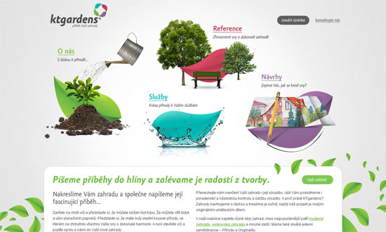
ktgardens.cz - příběh vaší zahrady

Wonderful design. The hover effects are brilliant. I also like how the layout is open and flowing. Both the photographs and the inner page designs are full of personality.

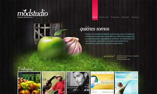
Modstudio

The integration of nature here is simple and limited but the effect is still eye-catching.

Solace Beeswax Candles

I can’t stop looking at this site. The art is topnotch. It’s warm and relaxing but still a strong color palette; I want to put it on my desktop or hang it on my wall. The animated candles are a nice, subtle touch.

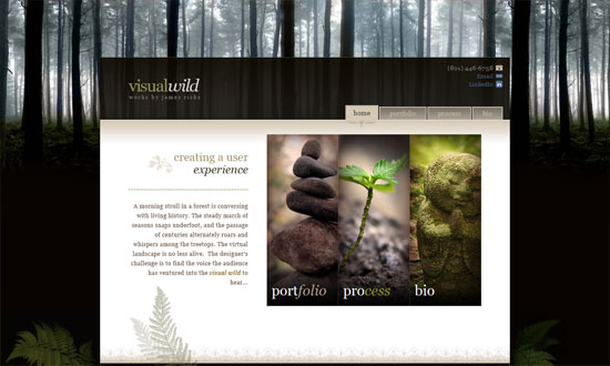
Visualwild.com :: Portfolio for James Ricks

Despite its darkness, the has the same effect on me as the previous one—the design has a great scene that puts you in a certain mood. The typography and other graphic details are also excellent. Tiny gripe: the contact icons and CSS awards could have been blended in better.

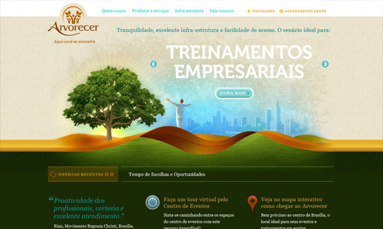
Arvorecer

Despite some cliche elements (the man with outstretched arms and the glowing tree), there are some great graphic details on this site. My favorite would have to be the borders turned twisting ribbons turned hills, with leaf-like patterns—how do you even describe this? The brown, orange, gold, and green colors blending into one another is just great.

Social Media Weekly

User Experience – Five User Experience Trends I’ll be Watching in 2010
“Today I’m sharing five trends I’ll be watching over the coming year (and beyond) along with some thoughts about how they might change our industry. And even if I’m wrong about some of these, I’ll be interested to see where they go.”

CSS – 11 CSS3 Code Generators to make CSS3 development a breeze
“CSS3 is awesome, but the new syntax is sometimes hard to get your head around. Thankfully though, a few kind souls have created some very useful tools to generate the code for you.”

CSS – A Killer Collection of Global CSS Reset Styles
“I have used each of these resets on various occasions with great success, and have even managed to scrape together a customized hybrid that cannibalizes key aspects of various others. For each reset, I provide as much information as possible concerning the source of the reset, key effects, and other essential information.”

jQuery – jQuery Presentation Plugin: Say NO to Keynote!
“I wrote this small jQuery plugin that gives you an interface in a browser to give a presentation. If you are getting antsy, take a look at a demo or download it from github.”

Design – 7 Steps To A More Effective And Productive Web-Design Process
“The tips and tricks below are my personal experience. It has worked for me and I’ve learned many of them from working with other designers, too. They’re little insights into my own design process. I hope you find it useful.”

Friday Focus 02/05/10: Lightly Textured

February 5, 2010 By Sophia Lucero

Subtlety is the name of the game this week on Friday Focus. We’re featuring designs with light hues and textures for a relaxing, elegant feel overall.

Designs of the Week

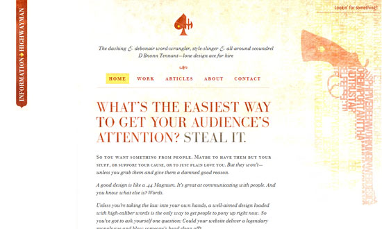
Information Highwayman

Love the texture on the blurb itself, not just in the background. And the use of rotated spades as bullets? Lovely.

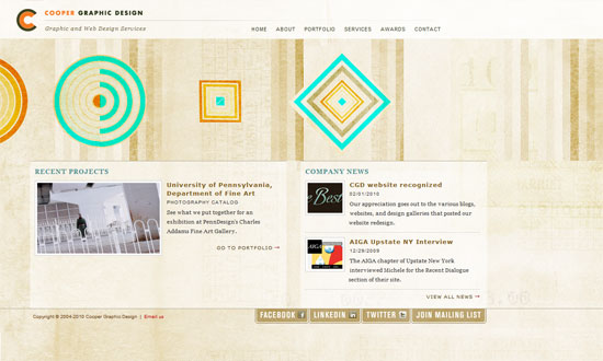
Cooper Graphic Design

I really like the asymmetrical elements in this design. And it feels organic and warm as opposed to loud and bold—a different take on what design firm websites typically look like.

The Croquis

Airy, open design. What I could call a “pretty much perfect”!

Design Shack

I’m not sure what the reasoning behind a left-aligned design is, but it’s interesting to see that isn’t completely extinct. Also interesting: the ad placement on the left side.

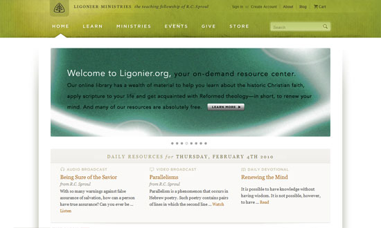
Ligonier Ministries

Everything’s so nice and wide, including the neat dropdown menus.

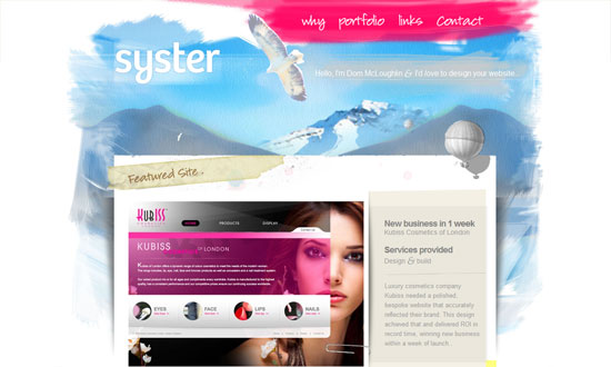
Syster

I really like the way the edges of the “paper” layout have thumbprints on them, aside from the shadows and watercolor paint below.

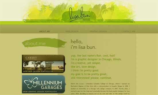
Lisa Bun

The repeated use of the curly brace as a design element is a great touch.

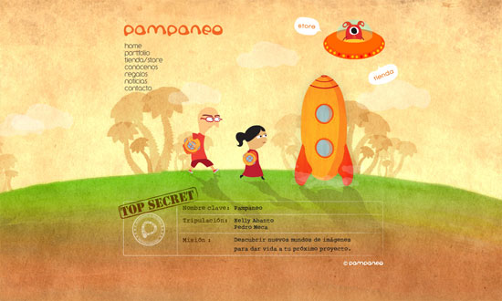
Pampaneo

Animated elements in headers are getting more popular too. I just think I want the navigation to have bit detail to it.

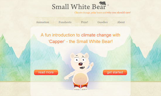
Small White Bear

The only thing that bothers me is the way the button is designed. It’s very striking, yes, but I think it could be done better.

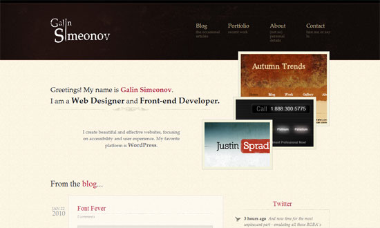
Galin Simeonov

Love the stack of images that each comes to the front upon hovering.

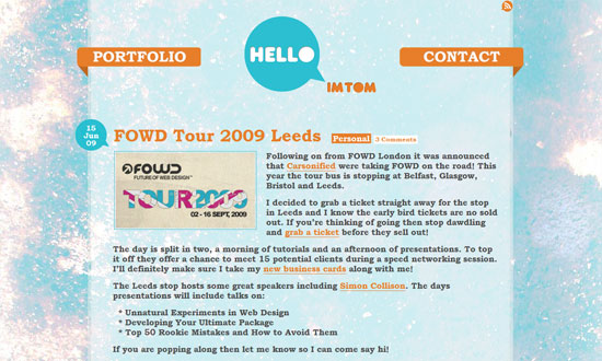
Hello I'm Tom

Note how there’s not a whole lot of links in the header, and that they’re all big clickable things, which makes the visitor’s browsing choices dead simple.

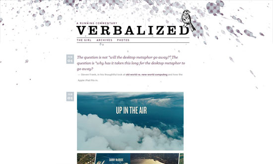
Verbalized

A straightforward enough layout (it’s a tumblelog) but the background at the top makes all the difference.

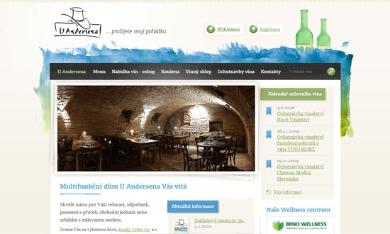
U Andersena

Another watercolor-y approach, but you won’t tire of the details all over.

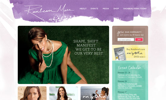
Rainbeau Mars

I think my favorite part here is the sidebar!

Social Media Weekly

Accessibility – Is Web accessibility a human right?

CSS – 47 Amazing CSS3 Animation Demos

Design – 5 Well Designed Icon Tutorials

Next Page »

Code & Tutorials

Which Front-End Development Languages Will Grow in 2017?

Your Guide to Leveraging APIs as a Developer

Bitcoin Processing Website Integration For Web Developers

Website Security For 2016 That All Developers Need To Know

5 Reasons You Need to Be Using jQuery

About Devlounge

Want to read more about Devlounge, or maybe you want to contact us, or even advertise? Oh, and don't forget to subscribe to updates!

The Best of Devlounge

Should You Start a Business or Remain Independent?

Search