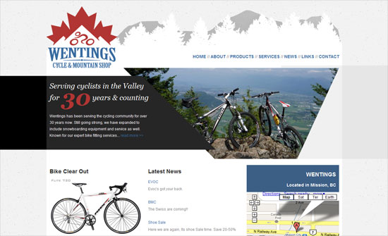
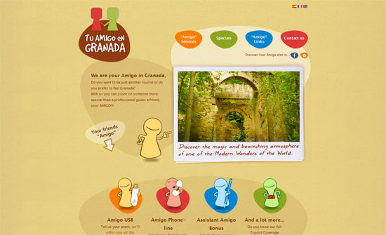
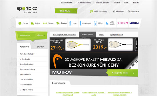
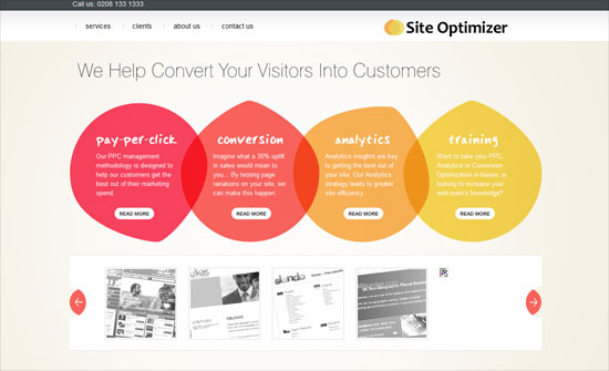
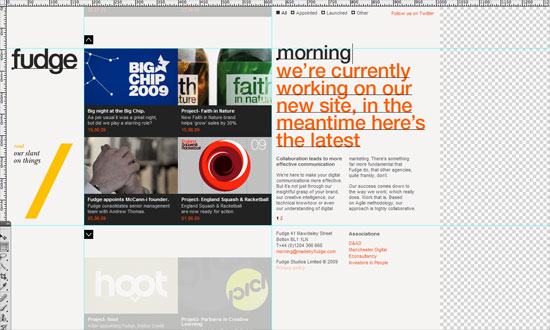
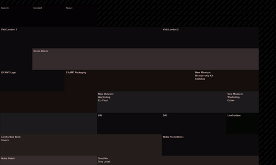
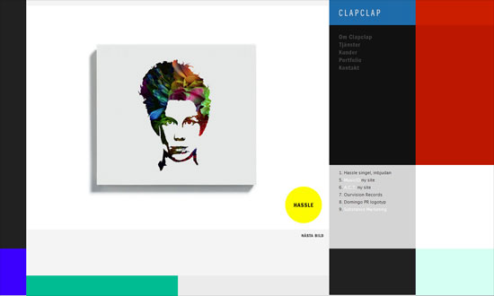
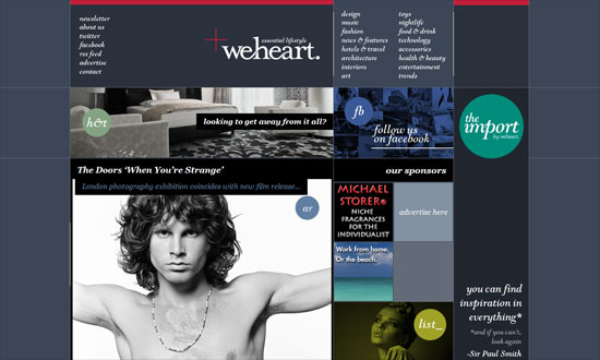
It’s all about coffee this week on Friday Focus!
Designs of the Week
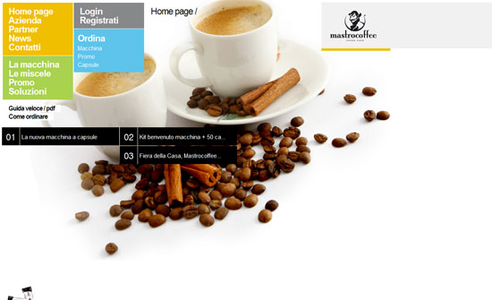
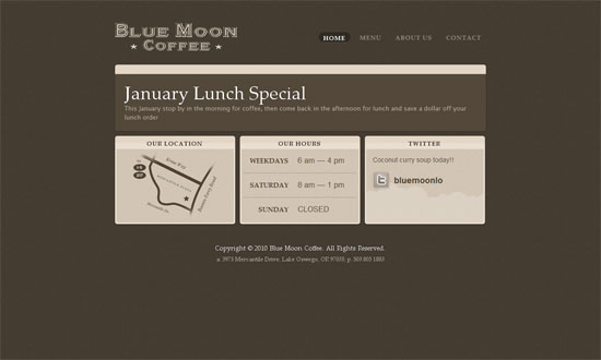
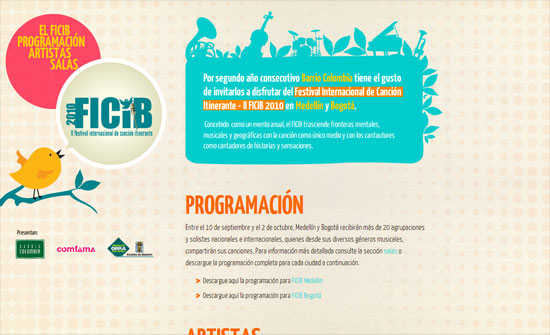
Great modern look. Interesting how the logo is at the top right (instead of the usual left). I like the idea of grouping menu items into related blocks so it’s not just one long list.
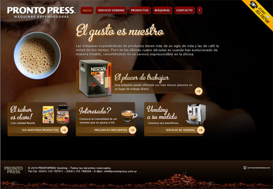
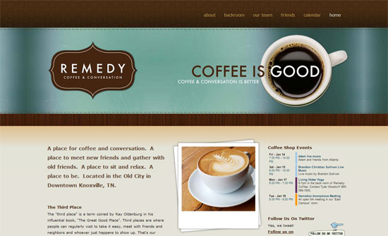
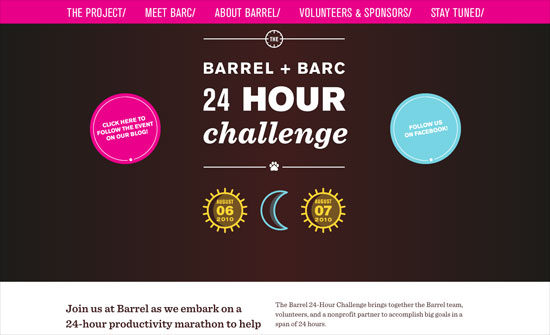
It’s quite predictable that coffee sites will adapt brown color schemes. What I like here is the fancy script type and the transparency effects. No solid text backgrounds here, probably to make it feel lighter with the already dark color scheme.
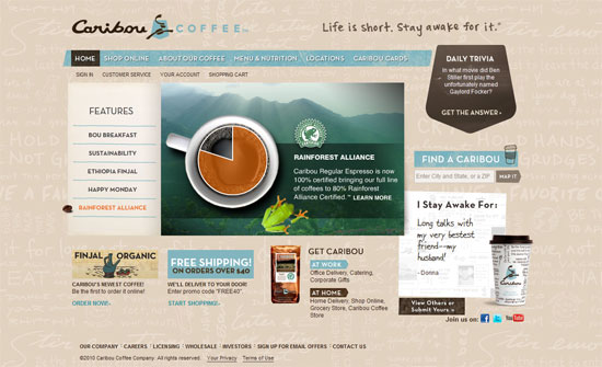
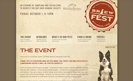
Smart idea for a coffee bean to become the arrow in the slideshow. The use of light blue here is a nice contrast to the browns and neutrals. The background pattern and the “I Stay Awake For” section are also nice ideas.
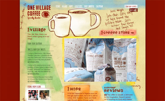
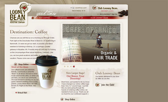
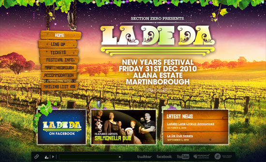
This one puts in more than one contrasting color. I like the raw feel to it although I’m still not comfortable with all the uppercase text everywhere.
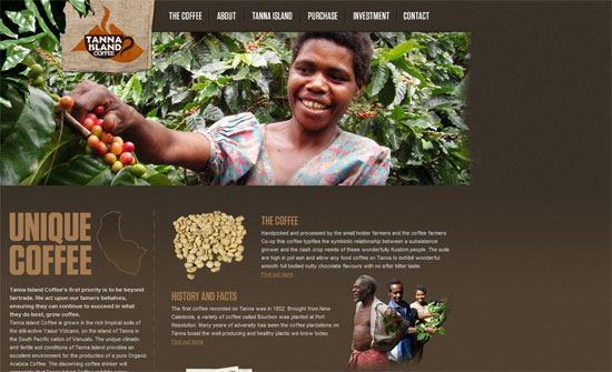
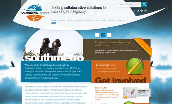
I’m surprised how spartan the homepage is, considering the inside pages have large header pictures while this has none. I also find it a little weird that the slideshow boxes stretch only to the width of the headers, so there’s whitespace to the right at times. I do like text styles used though.
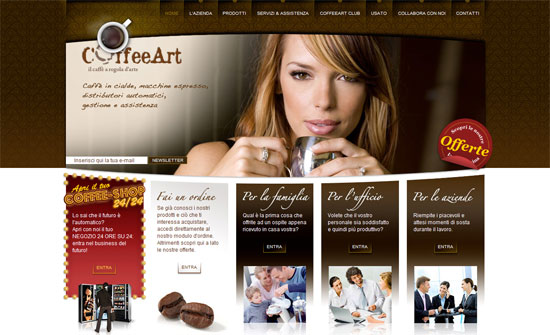
The Flash animations are good and warranted, the details are polished, but I think the photos in the 3 right columns could be less cliche.
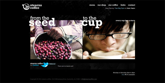
Again, beautiful design with one glaring problem: the hosting banner at the top. I like the split approach on the front page, and it’s very useful to add store hours (and even Wi-Fi availability) info at an accessible spot.
The logo box blends well with all the picture headers. I also love the woven mat pattern in the footer.
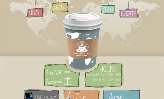
Love the rough, hand-drawn edges everywhere and the giant cup of coffee right down the middle. However, the world map background is a little odd and I’m not sure if you should be so dependent on Flash for menu navigation.
I like the overall look but I noticed that the logo is the same image as the rest of the header. Not sure if it’s such a big issue but the general practice is to have it separately and link back to the the index.
Reuse of the logo everywhere is great. All the design touches here look great. I think the only issue I have is the left alignment.
Social Media Weekly
User Experience – How to Make Your Shopping Cart Suck Less
(Note: I wouldn’t call The Oatmeal an authoritative source for web design but from a consumer perspective, it’s insightful enough.)
Web Standards – Seven things I want to see on the web in 2011
“As I’ve been particularly nice all year, I think I deserve to be allowed to have a wish list of things that should change on the web in 2011.”
Web Standards – Ultimate Guide to Microformats: Reference and Examples
“While HTML has a whole bunch of awesome elements by which to convey meaning, a slew of purpose-built microformats (conventions) have been created to better represent the kind of content that exists on the page. This guide discusses popular microformats that can enhance the semantics and interoperability of your website.”
Design – The Photoshop Etiquette Manifesto for Web Designers
“Helpful and *subtle* suggestions for the process of web design in Photoshop, and making the transfer of PSD’s less painful.”
Business – Should I work for free?
(Start in the middle)
