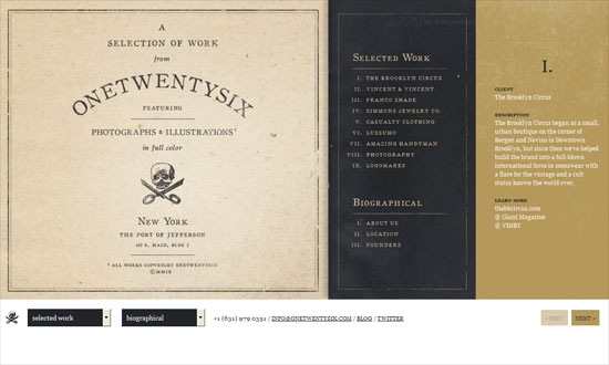
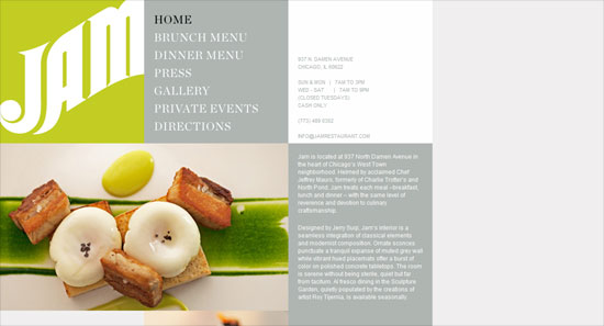
This week on Friday Focus: websites whose content are arranged into boxes like those cute bento meals. This time, you must think inside the box!
Designs of the Week
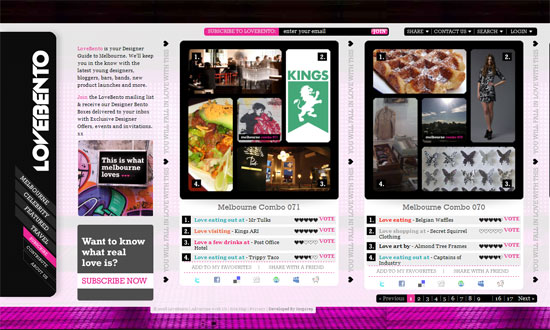
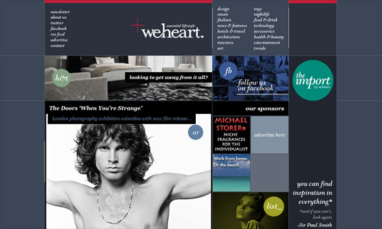
Let’s start with the poster child of this week’s collection. A little too busy for me, perhaps the other columns that aren’t at the center of the page can be faded out? I do like the vertical approach here though, as the header becomes the leftmost sidebar.
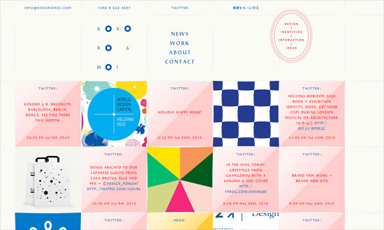
For a design like this, you always need to pay attention to what you’re publishing. Here everything blends in nicely and looks like a happy quilt!
Love the horizontal and vertical scrolling, which makes total sense for a grid-based design like this. The experience feels great and makes you want to browse more stuff.
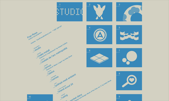
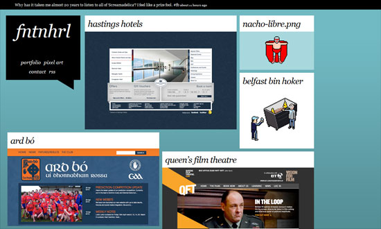
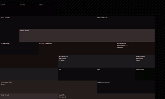
Disappointingly unusable site—it uses one big image map—but I like the concept.
Looking at this site quickly, it looks okay, but eventually you’ll have to wonder why the boxes aren’t lined up properly. I know that it’s a trend to let the floating behavior determine where they’ll land, but in some ways it feels lazy as well.
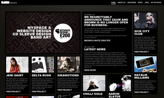
Better example. The stark black and white plus the bold titles make for a striking look, no doubt.
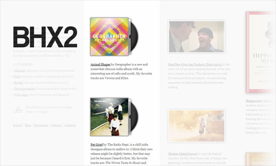
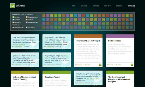
I like this fairly colorful look as well as the controls for filtering the content, although I’m not happy with the “myster meat” collection of boxes beside it. Of course the footer provides a more useful version of that.
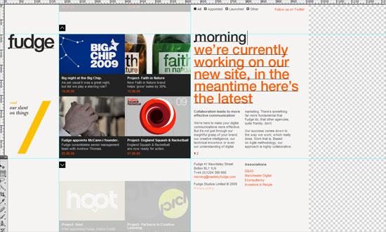
Interface imitation is a growing trend, and here it’s still pretty subtle but memorable (click on the “slant” box, you get a marching ants effect, then of course the blinking cursor). Love the navigation effect.
One of the most peculiar implementations I’ve seen; the images appear only on hover, using pretty dated JavaScript techniques.
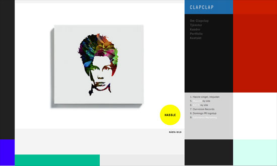
I like the use of primary (and secondary) colors for a “designy” feel. But this one doesn’t know how to use semantic HTML either.
I like the boxes and circles used all over, although I wish the sidebars were a little less distracting from the main content area.
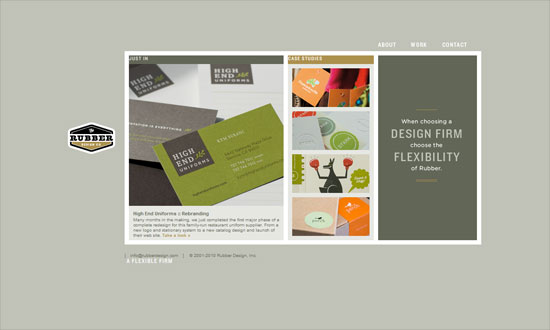
I had a pleasant time browsing this site; it looks warmly welcoming and elegant.
Very nifty concept!
Boxy designs don’t just mean you have to put content in boxes, follow the grid rhythm, be done with it. See how this site played with its logo and the placement of its text and photos.
Love the use of the browser’s full width and height.
Really elegant looking, and I admire the fact that even the menus are typed out in HTML even when they could have just used a full image.
Social Media Weekly
JavaScript – JavaScript Minification Part II
“This article emphasizes what you should do to take advantage of YUI Compressor’s best feature for minification: local variable name replacement.”
JavaScript – Say No to noscript
“Despite early accessibility advice advocating use of the noscript element, best practice is to use unobtrusive JavaScript for progressive enhancement, rather than relying on fallback content.”
CSS – Bulletproof CSS3 media queries
“I tried to resolve this problem by providing pure CSS solution for 95% of market share PC browsers and JavaScript solution for the rest of the browsers.”
