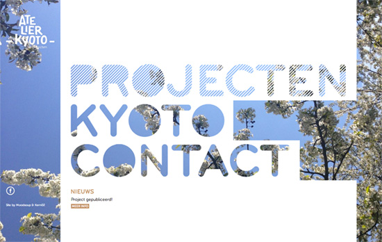
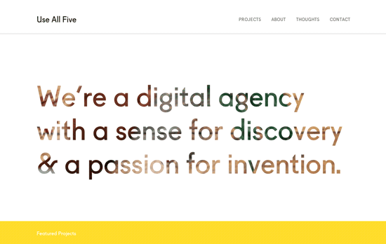
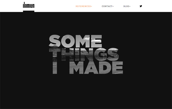
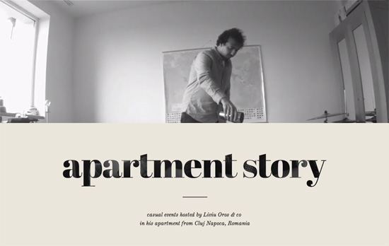
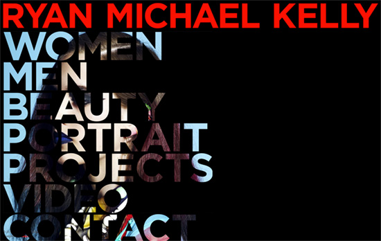
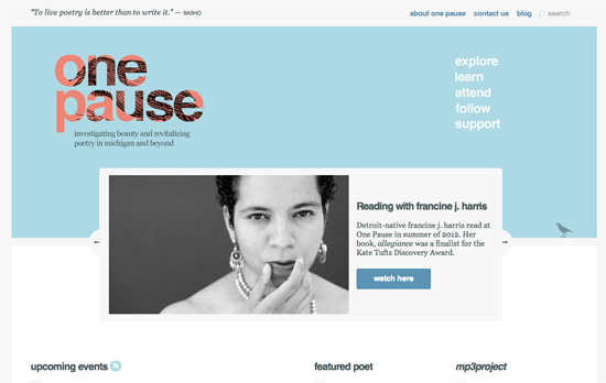
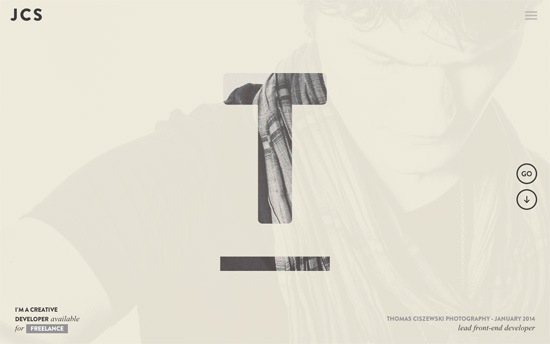
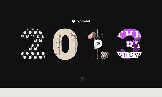
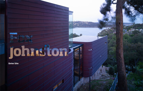
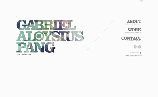
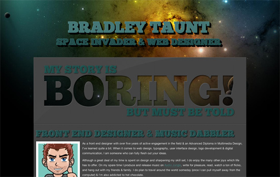
It’s always nice to welcome back this familiar graphic treatment, executed in fresh new ways. Check out how these websites use masked text in their designs.
Designs of the Week
Build on DIYThemes’ Thesis Framework for rock solid SEO and great layout customization options.
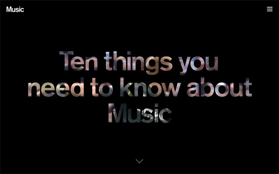
The links in the hamburger menu are the headers of the 10 sections on the one-pager, color-coded with a nice hover animation. Besides the masked title, there’s lots of video on this site, with boxes of content laid out in interesting ways.
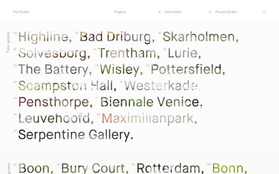
Almost completely text-based, except for the wonderful background images that appear when you hover on the large texts. As you switch between pages there’s a gray screen with white text telling you what’s loading, another nice alternative to the usual loading GIF.
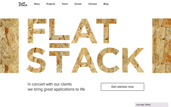
The title matches the wood texture in the back, then hovering on each letter shows snippets of the company’s work. There’s also a cool implementation on their team page.
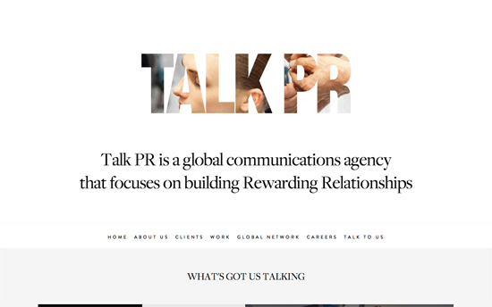
This also falls under an animated logo, while lower on the page there’s a wall of social media updates, blog posts, and case studies all tiled together.
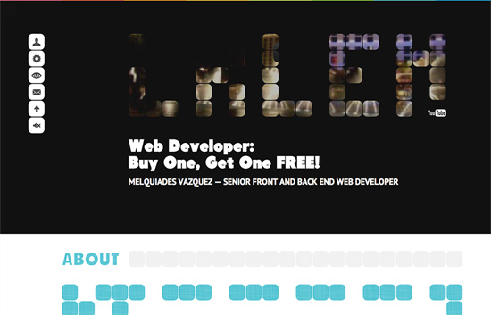
More tiled rounded squares here, under which does the masking happens not just with letters but various shapes formed. Sections are also color-coded, with fixed navigation markers on the left.
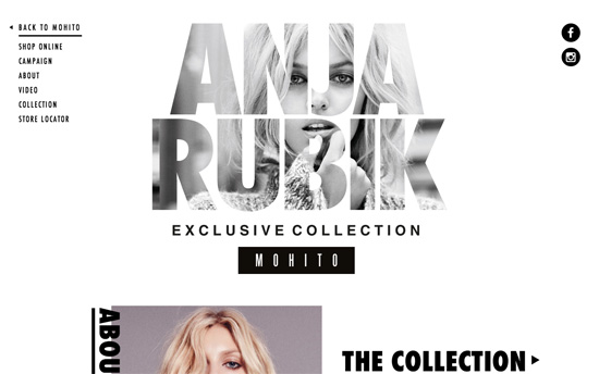
I like the idea of a the big animated logo becoming a fixed background watermark as the rest of the content scrolls over it. Also at play here is a free-form layout with bold text and large photographs.
Social Media Weekly
Get solid WordPress themes, plugins, and web design training from iThemes.
Design – Making the switch from graphic to UX/UI design
Typography – Typography in Email
User Experience – Hypothesis driven UX design
