In case you’ve been absent for the past five years, there’s something you need to know: We’re in the midst of the greatest technological revolution in history. Specifically, we’re witnessing a mobile revolution where devices are getting smaller and more personal. From a designer’s perspective, this means you need to adopt a mobile first strategy. [Read more…]
Weblog Design Inspiration To Start 2011
With a new year it is time to give my personal weblog an update. First I just wanted to re-align my current design, but once I opened Photoshop I decided to start from scratch. I bought Pictos font a while ago and I downloaded a free font from The League of Movable Type. If you follow my postings you know I’m a fan of minimalism.
I decided to check out current weblog designs to get some ideas on what to design. I almost never visit the websites, I read their entries in my feed reader. But once in a while I will check out all the weblogs just for the design.
I appreciate simple designs and intricate ones. Personally I prefer a simple and clean look for websites I have to look at everyday. I think if Facebook was heavy on graphics I would get a headache, no matter how well designed. In any case, people don’t visit the actual weblog everyday, only when there is new content, so going all out with the design isn’t an issue.
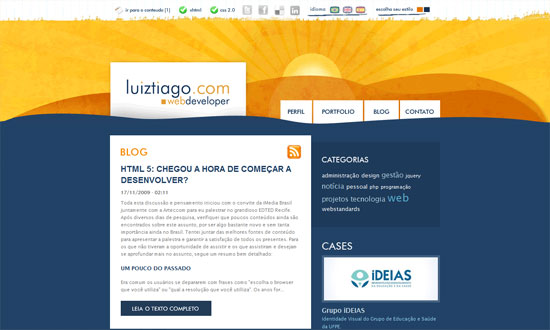
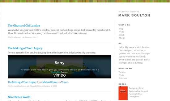
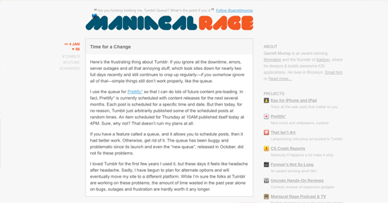
From the mass of weblogs I chose nine, four minimalist and five with graphics. You’ll see Mr. Boulton’s website, which is very minimalist but makes good use of typography, which is what he is known for. I have always been a fan of Garret Murray’s minimalist designs for his weblog and he also makes killer iPhone apps.
If you know beautiful designed weblogs that aren’t mainstream, especially minimalist ones, do share with us!
Minimalist
Mark Boulton
Garrett Murray
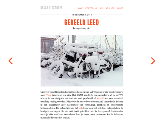
Oscar Alexander
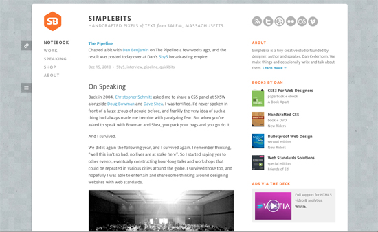
Dan Cederholm
Graphic Galore
Lukes Beard
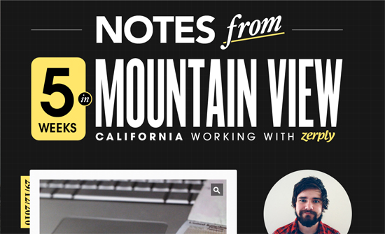
Nishant Kothary
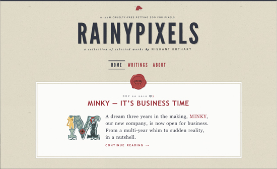
Meagan Fisher
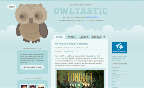
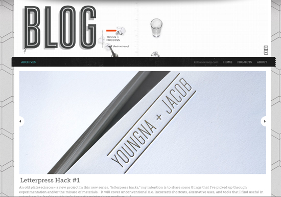
Kelli Anderson
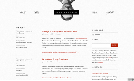
Jake Przespo
Friday Focus 03/05/10: Narrow
Just because monitors have gotten bigger doesn’t mean we should jump into wide layouts all the time. See how these designs make use of narrower widths effectively.
Designs of the Week
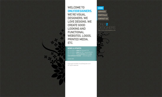
Even several years ago this could be one of the narrowest sites out there, and it stands out because of that. Yet the content isn’t sacrificed.
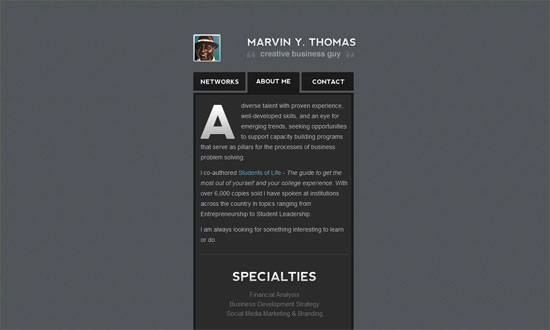
Needs a bit more refined type, but the overall look is quite pleasant.
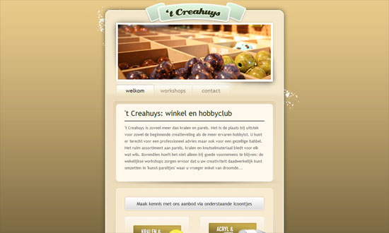
This one, on the other hand, mixes a lot of different typefaces and shades of yellow to brown. It may be a bit glaring to some but the detalis are lovely.
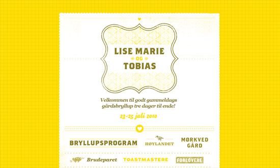
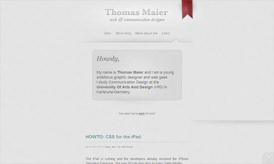
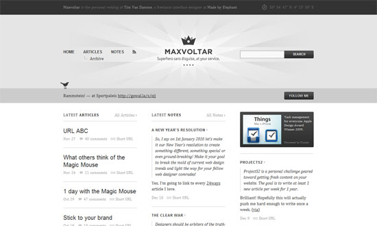
This business card-type site looks almost underdesigned but still looks crisp and clean. Again, it’s all in the custom type.
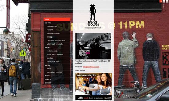
A narrow layout lets striking photo backgrounds define the look of the site. I like that the menu on the left shows the subpages for each link, not just the top-level navigation: instant sitemap.
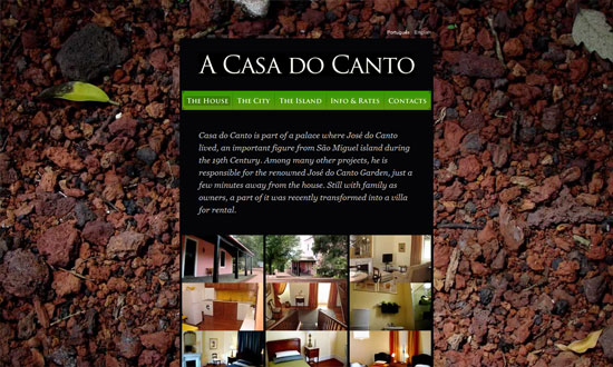
Same photo background treatment, except it doesn’t change per page.
Great graphic details everywhere, and a very restrained use of color.
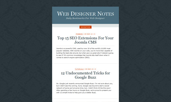
Narrow designs seem to have minimalist tendencies too. This one hides away the clutter with a sliding box for the navigation.
A narrow layout can also influence you to do a one-column, one-page site that makes reading and browsing more convenient.
Social Media Weekly
Design – 4 Pixels or Less
“Having too much choice is one of the main obstacles for 21st century designers. With virtually unlimited tools and possibilities at our fingertips in the digital age, our creativity can become clouded very easily. Being inundated with thousands of photoshop brushes or fonts can push the very concept of a design from the forefront of your mind.”
Typography – The Future Of CSS Typography
“In this article, we’ll look at some useful techniques and clever effects that use the power of style sheets and some features of the upcoming CSS Text Level 3 specification, which should give Web designers finer control over text.”
CSS – !important is Actually Useful (in Print Style Sheets)
“So what you need is a way of specifying print styles that can override the inline styles. There’s only one way to do that: !important.”
CSS – Flexible Color Schemes in Layouts with RGBa
“This will be an experiment in transparency. CSS has come a long way over the years, and one of the biggest advancements is the integrated use of transparency.”
Friday Focus 02/12/10: For Your Wedding!
In the spirit of Valentine’s Day, let’s try our hand at wedding planning with these nicely designed websites. Whether your status is “single”, “in a relationship”, or “it’s complicated”, there’s no hurt in dreaming up the perfect wedding just like the kids used to do in their notebooks, and what better season than now? Have a lovely Friday Focus, everyone!
Designs of the Week
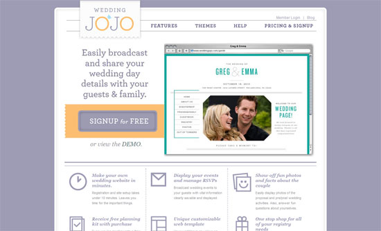
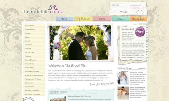
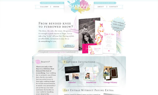
Wedding sites tend to be filled with flowers and scripty type. This look is a sort of middle ground that doesn’t overwhelm: a more delicate slab serif and purple hues instead of pink.
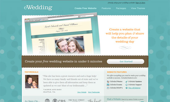
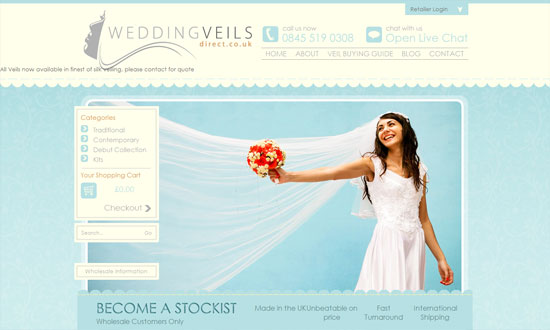
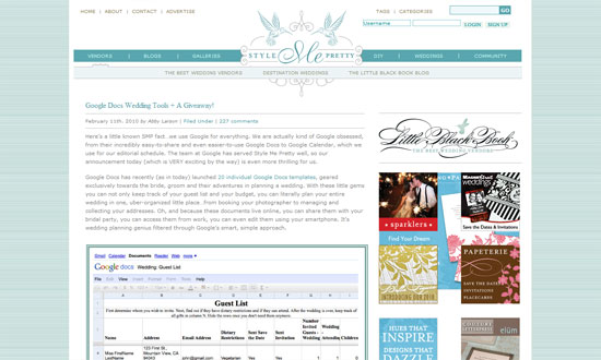
Here’s a similar look, this time with a shade of Tiffany blue, often associated with weddings. The scalloped edges also seem to be a popular touch for that cozy and romantic feel. And when in doubt, serifs also seem to up the romance factor a bit!
The design gets out of the way, but doesn’t forget to make the browsing experience better with the drop-down menu and the share buttons.
Despite a positioning problem for one line of text in the header, this site looks pretty good. And it needs a bit more contrast with the smaller text below.
Interesting how the header area isn’t very big but attracts attention nonetheless with the floral vines, which is pretty much the only decoration on the site. And by the looks of the screenshot for registered users, the UI looks well done.
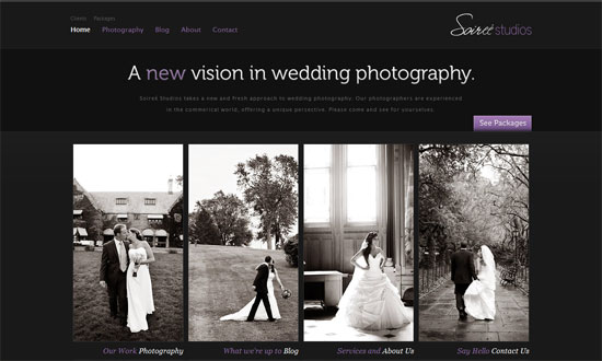
Here’s another typical scenario: if it’s a wedding photography site, it’s probably dark. That usually makes the photos pop. You’ll want the design minimal as well.
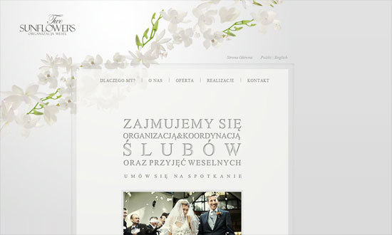
Or you can go light, remembering to stay neutral. The flowers used here are really pretty; they look almost as transparent as the main box. Love the whitespace.
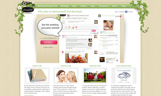
I think the paragraph text should be darker and bigger. Other than that, I like that lots of elements on the site carry the scrapbook theme well, even the forum icons and calendar dates.
Has the feel of wedding invitation, but doesn’t go overboard. I love the second-level menu.
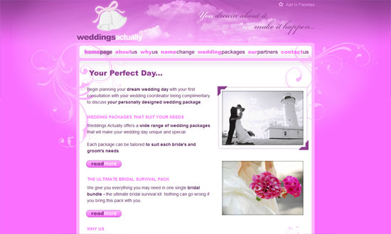
This one’s definitely a girly look. My problem with this site is it looks somewhat juvenile instead of elegant. Perhaps too sugary?
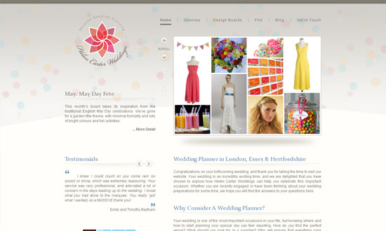
It looks almost underdesigned. But the fantastic part of this site is this: clicking on the arrows scrolls two panes (one for the images and one for the description) and changes the background to match what’s in the panes. Subtle but brilliant! (Tiny issue though: when you change pages, the default background flashes before it is replaced by the contextual one.)
Love the 3D effect going on below the blurbs, although it looks a little too light.
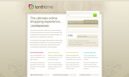
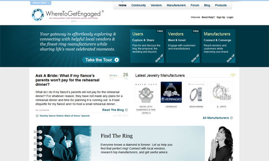
The odd one out of the group, with a completely different look that doesn’t really scream “wedding”. Looks quite savvy though, which does seem to match the feel of luxurious jewelry. I like how the buttons have a subtle background pattern to them. Then the logo reappears as a large watermark background in the bottom navigation, another nice touch.
Social Media Weekly
Design – Overcoming Creative Block
Accessibility – Social Inclusion for the Web
Programming – Explaining what YQL is to non-technical people
Friday Focus 12/11/09: Sunbursts
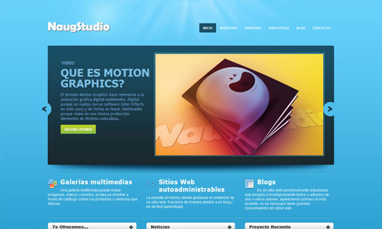
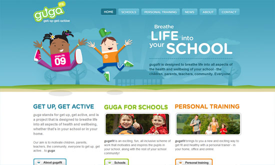
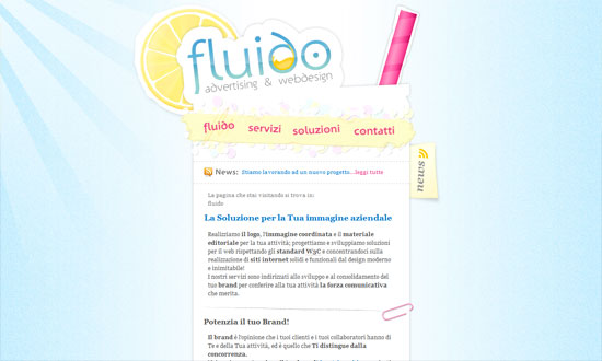
This week, I’ve come across a lot of sites with sunbursts, a specific type of lighting that’s popular with not just the Web 2.0 look anymore. You decide if they’re crucial to the design or not.
Designs of the Week
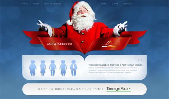
Love the way the shape of the ribbon creates a similar cut for the rounded box below it. Everything in here is so chic, but it makes me wonder if to the ordinary visitor it’s Christmas-y enough.
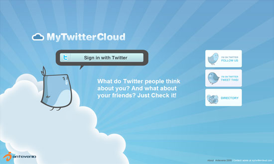
I don’t get tired of seeing 3rd-party bird mascots for Twitter apps, but people could be a little more creative with their “cute” typefaces.
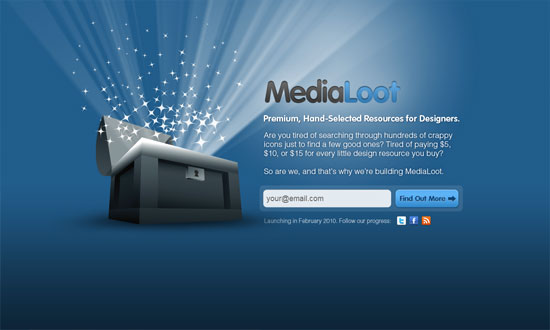
Overall, it’s a good look. But the treasure chest could’ve been more refined, and I’m not too keen about the inner shadow effect on the logo.
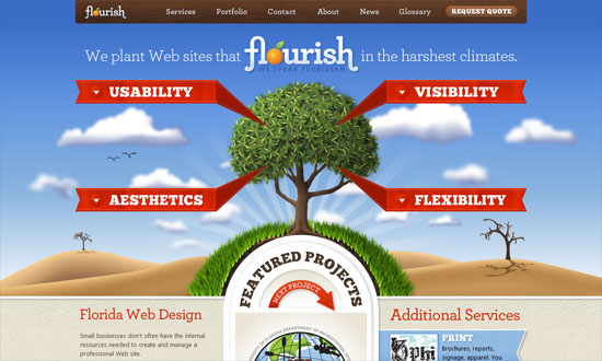
I could waste so much time telling you every bit of awesomeness on this site, or I could just tell you to go visit it and see for yourself. Perhaps the one worth mentioning here is the Featured Projects section, which looks pretty different compared to the other carousel designs we see. Also: respect to the tree!
The way the polaroid-style photos shuffle from front to back is topnotch.
The only thing that disappoints me here is that the blog is not as well designed as this site!
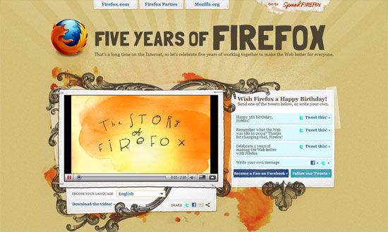
The sunburst is so subtle you’ll barely miss it. It’s practically design with the rest of the design. Lots of icons!
Excellent details here, from the illustrations to the framed photos to the type—the rounded font works so well here.
Sometimes a narrow, low-contrast site is the way to go, and that doesn’t mean you have to skimp on the details. I’m not sure the graphics are at the footer, but it definitely reinforces the scrapbook/collage look but doesn’t look heavy at all.
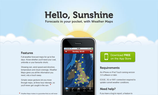
The last thing that appears on the page is the sun, which rises from behind the clouds. Good morning to you too!
Love the rainbow-colored navigation bar at the very top. The subdued blending is like the color palette for the whole site.
People should be more creative with the shape of their sunbursts, like this one. Love the fixed navigation on the rightmost column.
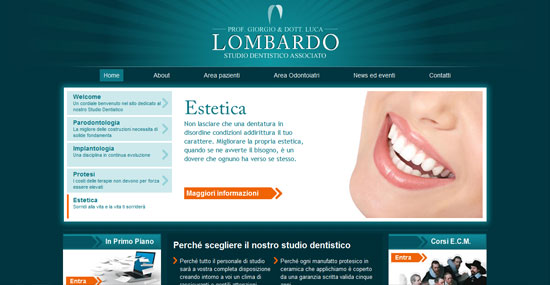
The color matches the dentists scrubs! I also like the arrow treatment—a great way to build to your branding, although I’m not sure if it does match theirs.
A nicely textured sunburst.
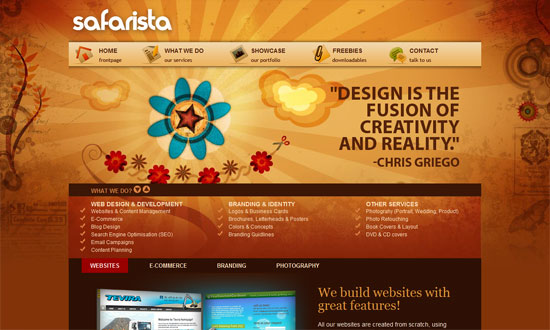
I love the splashes of orange watercolor mixed with the ornamental line art. But most of all, I love how all the user-generated photos are laid out on the page.
Some things need to be tweaked to work better but overall, the warm and playful nature-loving look is a welcome one.
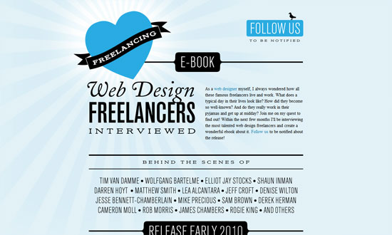
The stark type in black combined with the two shades of blue is a nice departure from typographic sites that are usually black and white.
Needs a bit more color below the fold, but this site has its type and graphic details down pat.
I like the boxiness against the painterly header.
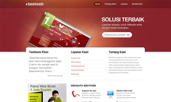
The amount of shine on this site is staggering, you’d think it were the set of Twilight (so I hear). But I like it. The links have large clickable areas, custom fonts are used everywhere, and they know their whitespace (though in this case it’s bluespace).
Social Media Weekly
Design – When Minimalism Backfires: When Too Little Is Not Enough
“This article explores some of the potentially negative side-effects of minimalist designs and the consequences of implementing one incorrectly.”
Typography – The Rhetoric Of Typography
“A functioning message is one that succeeds in connecting with the habits and expectations of its audience.”
Web Design – 10 short ‘n’ sweet tips on how to design for web
“This article will quickly run you through some of the greatest issues with design for web and hopefully give you something to think about when you start your next web design.”
