Today we’re looking at designs that don’t shy away from a broad color palette and completely embrace the rainbow. Happy Friday Focus!
Designs of the Week
Make Headway, make intuitive layouts, make it your WordPress theme of choice!
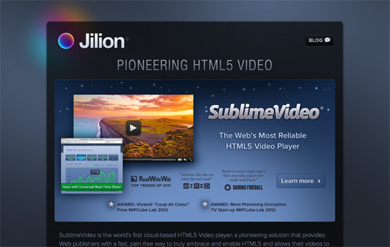
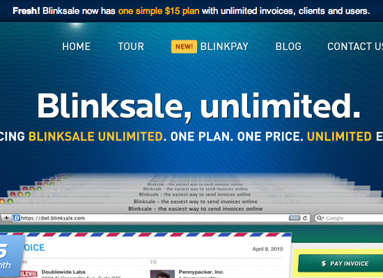
The top section is a little confusing, it doesn’t quite say that the video player graphic is just a product of the company by the way it appears, and it takes a little longer for you to make that conclusion (even if it’s milliseconds in your brain). The form elements and icons are lovely, and especially so for the logo, which even casts a rainbow glow behind it. The site’s got a nice dark, but not intimidating feel.
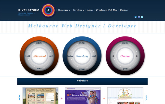
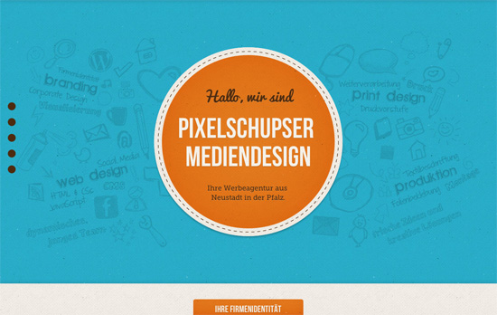
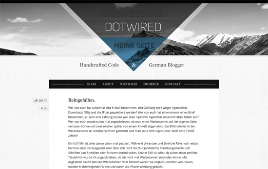
This site is far from perfect but I like a few of the concepts that went into it, like the circular elements and the reuse of patterns.
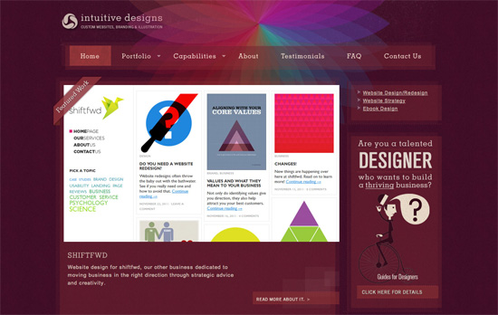
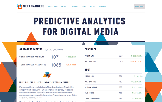
I enjoy the background graphic, the color scheme, and the little detail of texture that appears when you hover over the menu links. I also like the layers of translucent boxes that don’t line up. It was also a good idea to space out the letters given the dark background for better readability.
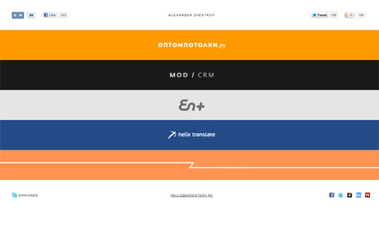
Each strip represents the dominant hue in the project, with the logo on it. Clicking on it expands to display the sample work on it with matching background color, so it’s like you’re completely transported to that “world” every time. A very simple accordion style one page portfolio that’s all about the content.
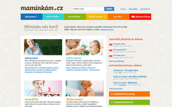
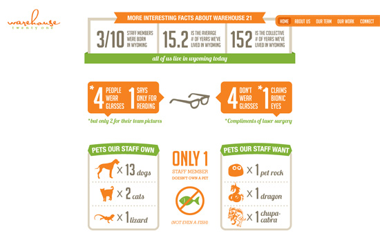
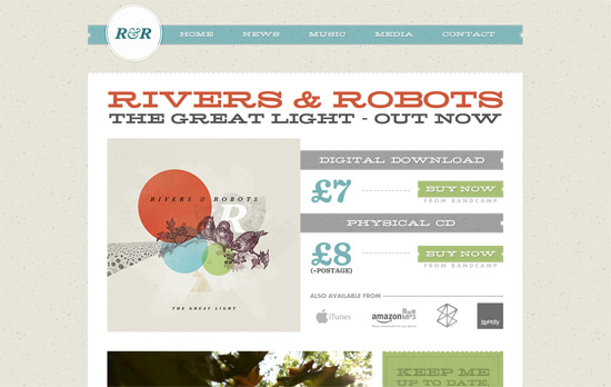
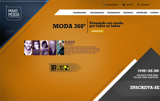
It’s always a challenge to use bright colors as text backgrounds, so I’m concerned it may be difficult to read for certain people. But I like the non-dominating amount of it used in the design. Everything else is warm and cozy, from the illustrated background pattern to the perforated borders in between content blocks and around images.
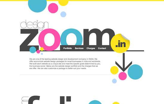
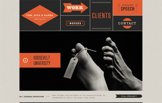
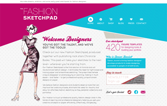
Very mod, color-blocked, and designy! Everything seems to be in the right place. Very bold move to use yellow for the form fields.
Social Media Weekly
HTML – How to Safeguard Your Site with HTML5 Sandbox
“Today’s web applications are mash ups of new experiences into one experience. Think Twitter widgets showing the latest tweets about a product. Or Facebook comments discussing an article. Or even just integrated web pages through an iframe element. These experiences can increase security breaches to your site. Don’t stress … there’s a new kid on the block to help you out: the HTML5 sandbox. But before I get to that, let’s quickly review iframe element issues.”
Mobile Web Design, Debugging – Ringmark
“Ringmark is a web-based test suite that measures how well a mobile browser supports the capabilities that modern mobile web apps require.”
Design – Modularity and Style Guides
“It’s one of many techniques I use in front-end website development. Below I’ll introduce a few more and how I link them together for the ultimate Power Up ★”
User Experience – Principles of User Interface Design
Create unique, extraordinary websites with Squarespace. No experience necessary!
