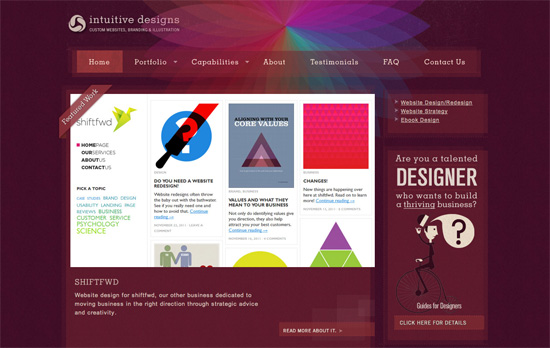
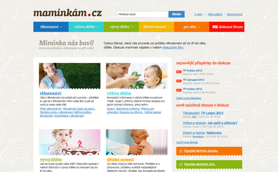
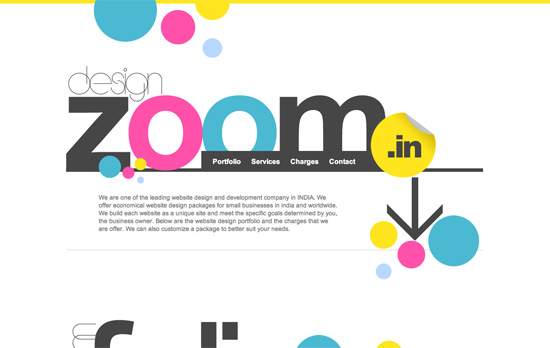
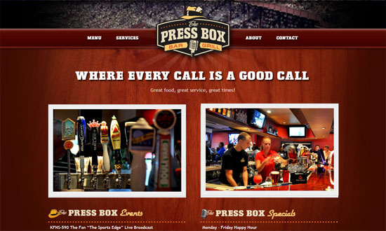
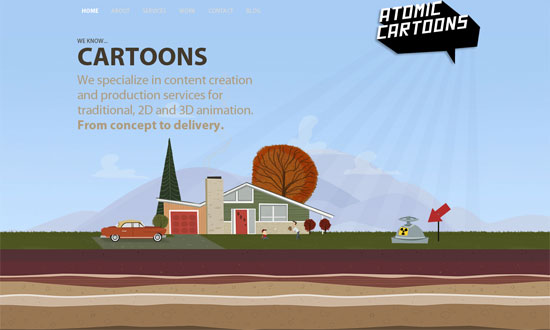
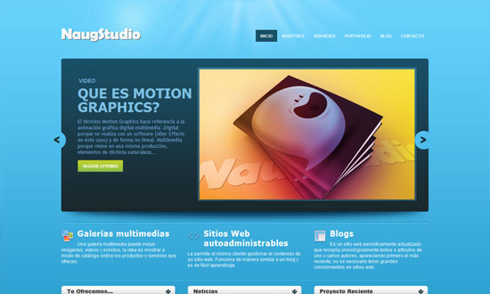
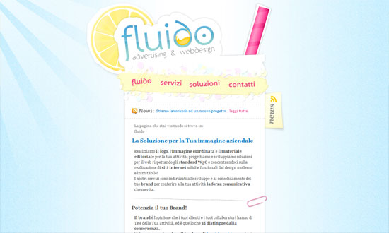
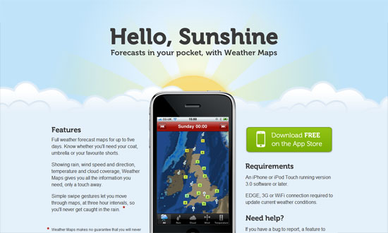
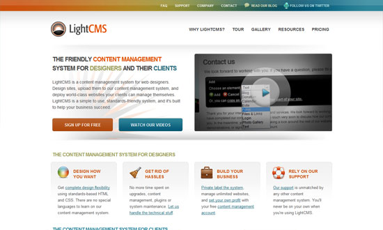
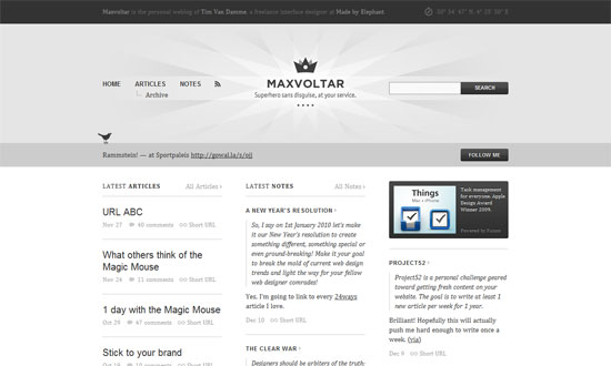
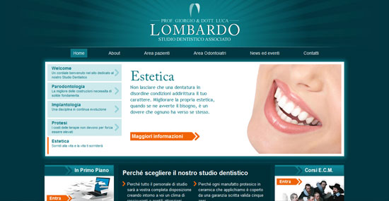
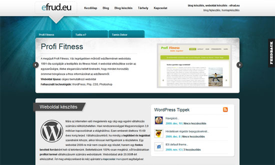
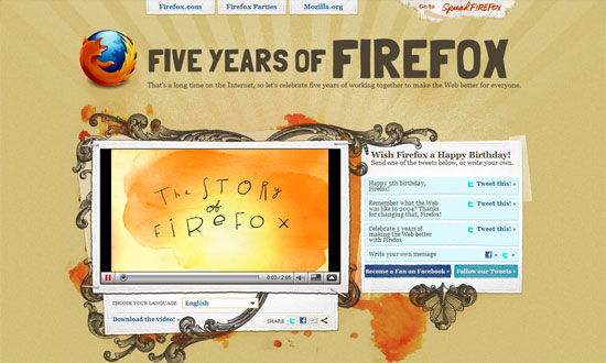
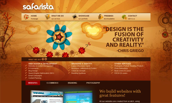
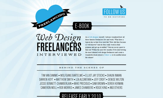
Bright colors are in, and not just any kind of bright, but neon. Are these site designs over the top or on the mark?
Designs of the Week
Want your site to be as good-looking and inspirational as these? Start by choosing a well-designed theme from ThemeForest.
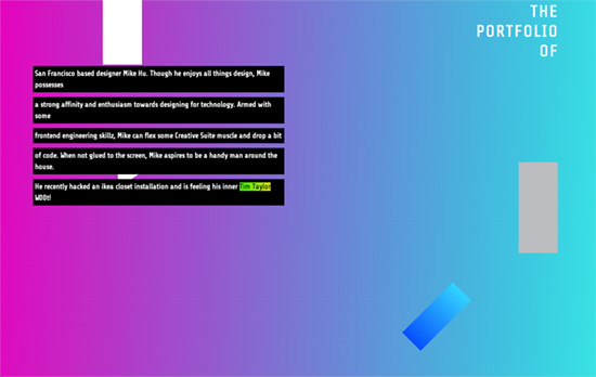
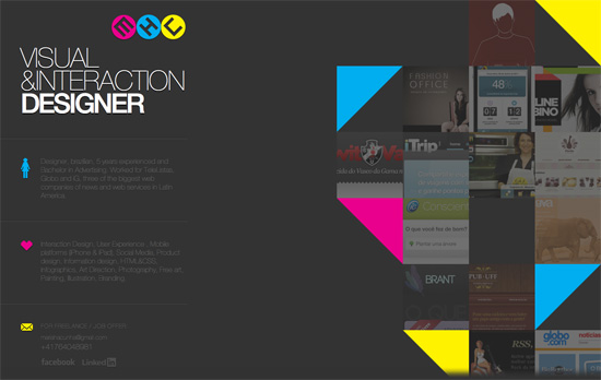
I like how the header text, with an “origami” styling, breaks into pieces when you start scrolling down; some of which changed colors. The dark background also fades into brighter gradients until you reach the portfolio grid below. Clicking on one item loads a page where the images have neon green placeholder backgrounds—a little painful to the eyes if they take a while for the actual content to load.
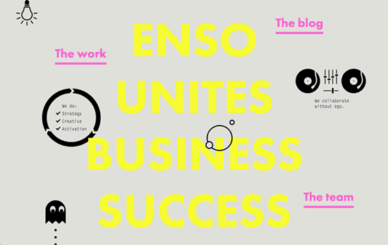
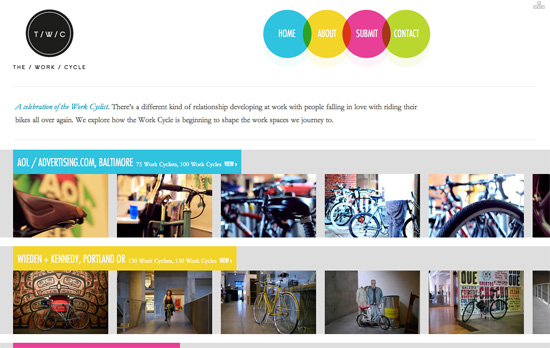
There’s something increasingly familiar and common about black text and graphic elements on light gray/tan backgrounds, like it’s the new style for design studio sites. In the header, the logo is a circle that rolls out its full word mark on hover. The navigation links are not isolated in one place but are scattered throughout the whole height of the homepage, and a number of them contain blocky drop down menus in a fixed-width typeface.
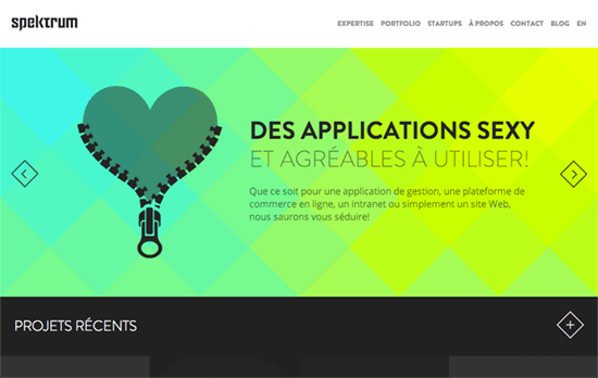
Cute animations for the slider and a nice diamond shape for the buttons. An interesting pattern I’ve noticed with these designs is they like to keep the portfolio images in grayscale until the accent colors come in for hover.
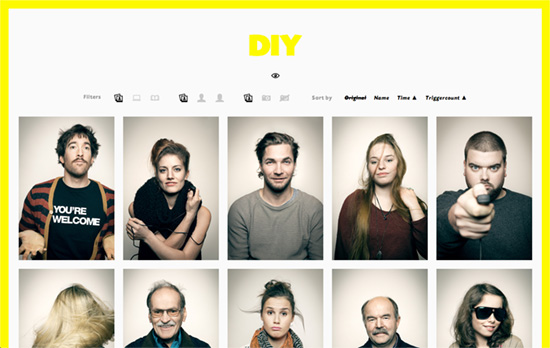
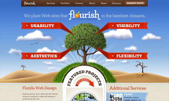
There’s the framed design pattern as well. Apparently the logo and the border only gain color (for inner pages it’s orange) once a certain amount of the page is loaded and the styles are injected inline, not exactly sure why.
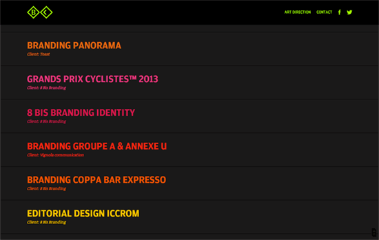
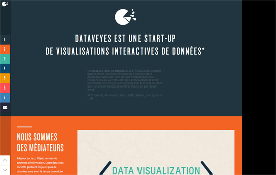
The homepage layout is an accordion style navigation that expands on hover to show a wide thumbnail of the work in focus. The mouse cursor becomes a circle matching the space it occupies, but not just on one row but on two if necessary, splitting its color at times. It’s also in that same space that a progress bar loads. The logo, top right navigation, and progress bar changes color to match the item you clicked on.
Social Media Weekly
Create unique, extraordinary websites with Squarespace. No experience necessary!
Responsive Web Design – Responsive Web Design is Solid Gold
“You can build responsive designs that are fast enough that the benefits of responsive design outweigh the potential performance improvements you might get from separate sites.”
CSS – Responsive Content Using CSS Regions
“The beauty of CSS Regions is that you can separate the content from the layout. And with that comes the ability to create some responsive content very easily.”
Design – Hollow Icons
“Choosing to use hollow icons for the sake of lightness / very-modern aesthetic is not the issue, it’s that to sacrifice the usefulness of what an icon does (aide in reading speed) for aesthetic feeling is really bad.”

