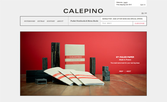
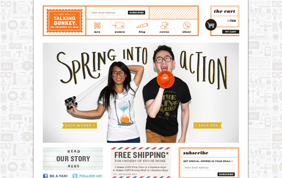
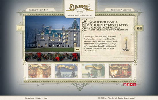
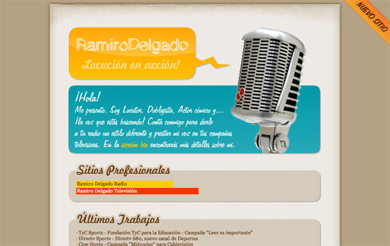
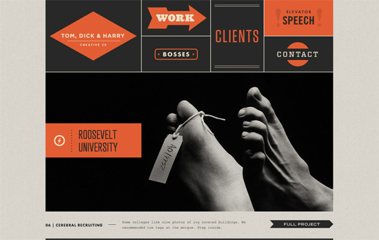
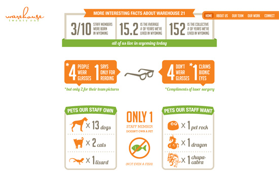
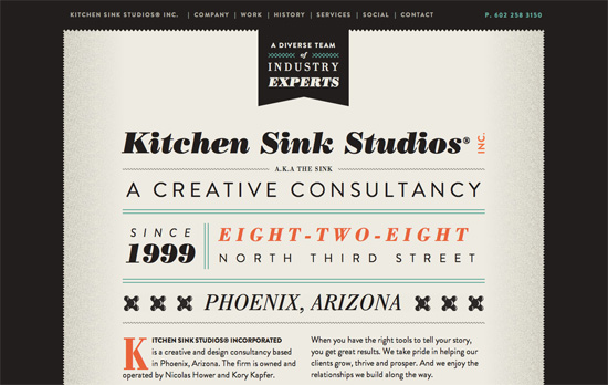
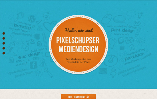
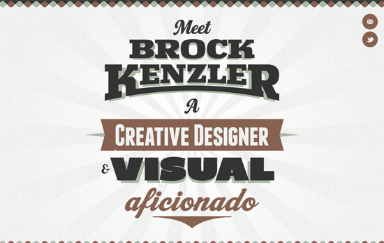
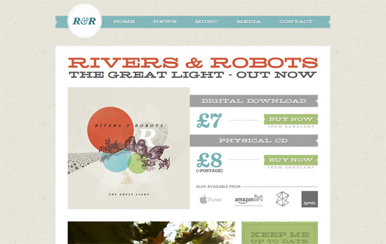
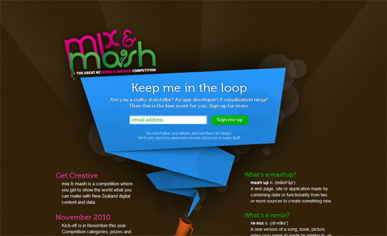
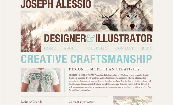
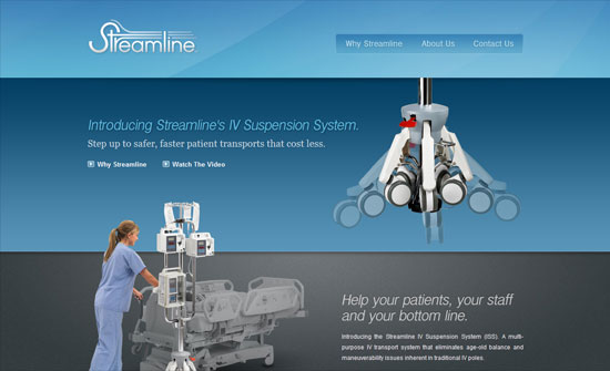
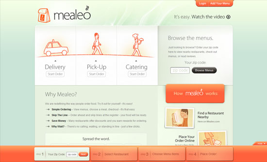
This Friday we’re featuring an interesting typographic trend: designs with a union, vintage feel, featuring lots of blacks and grays, textures, thick borders, uppercase, and letter spacing.
Designs of the Week
Get solid WordPress themes, plugins, and web design training from iThemes.
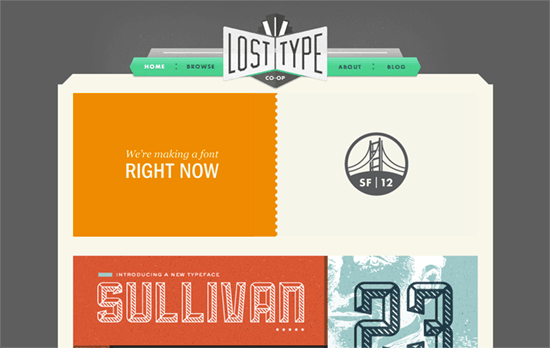
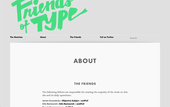
The shade of green in the menu is a tad surprising given the surrounding grungy look, but it gives a bright and cheery touch. I love the font classification card on the top right of each font page, as well as the Directory of typeface designers on the about page—perfect example of the vintage look being applied today while still retaining its utility.
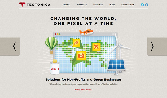
I like the use of the browser window as the backdrop for each scene in the slider, plus the 3D block treatment on containers (including the map illustrations on the contact page).
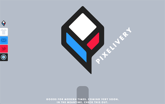
Love the almost equal parts usage of bright blue, bright red, gray and black. Everything’s done big and bold here, especially the newsletter subscription button, the Twitter follow section, and the bullseye animation at the footer.
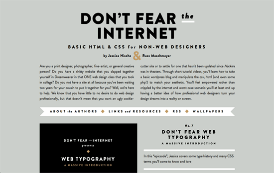
I feel a little uncomfortable with the kind of spacing I see everywhere, or maybe Futura designs really just have to be like that. Or maybe it’s the amount of black that makes it feel so stark.
Love the huge images, the cut-off painted-style logo (also minty green!), and the hidden top navigation that appears only on hover. It’s also great when you have banners/ads that typographically blend in with your design.
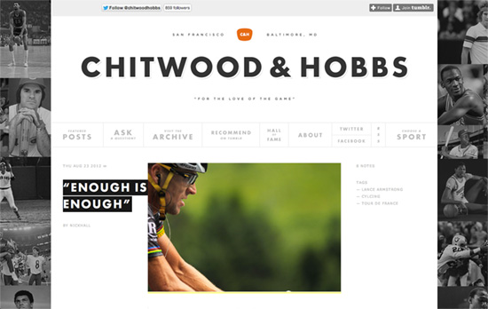
Also a popular feature with this retro Futura look: bento navigation, featured here in a very subdued hue. The post titles are reminiscent of label-maker tags with their white on black look and going over the post images like that.
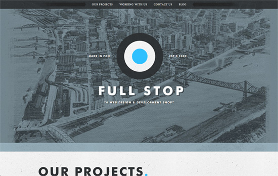
Very interesting trick: put a link to your contact form right on the logo. Another tiny detail: the thick divider between each section falls right under the menu when you scroll to it, almost like a color-coded thing. Lastly: the blue period (full stop) at the end of each header, to reinforce their branding of course.
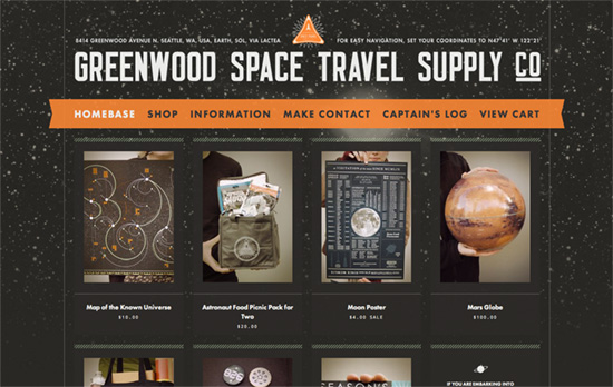
I like the subtle parallax and translucency, the mix-and-match fonts, and the little bits of illustration & copy that reinforce the space theme of the site.
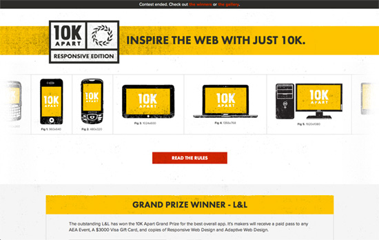
Love the grunged-up device illustrations presented like textbook captioned figures. Simple design choices here, and it’s the use of yellow and illustrations that make things pop.
Social Media Weekly
Ready to go out and design your next website? Try building with the Catalyst Framework.
User Interface Design – Thinking of interfaces as sets of jobs
“Shifting our focus from visual concerns like pixels and proportions to the jobs an interface should do helps us articulate the function of each element on screen.”
CSS – Don’t Overthink It Grids
“Here’s how I build grids. It’s not hard or complicated. Even making them flexible is no big deal.”
User Interface Design – Visually Reinforce Your Credit Card Fields (89% Get it Wrong)
“Only 11% visually reinforced their sensitive fields to some degree by either visually encapsulating the fields, or by positioning security badges in close proximity. Let’s take a look at those sites and see what they did right.”
