In the spirit of Valentine’s Day, let’s try our hand at wedding planning with these nicely designed websites. Whether your status is “single”, “in a relationship”, or “it’s complicated”, there’s no hurt in dreaming up the perfect wedding just like the kids used to do in their notebooks, and what better season than now? Have a lovely Friday Focus, everyone!
Designs of the Week
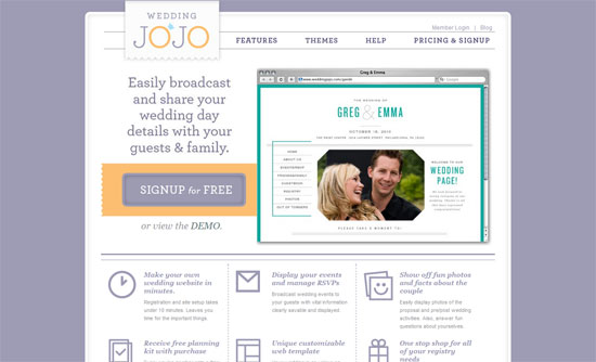
Wedding sites tend to be filled with flowers and scripty type. This look is a sort of middle ground that doesn’t overwhelm: a more delicate slab serif and purple hues instead of pink.
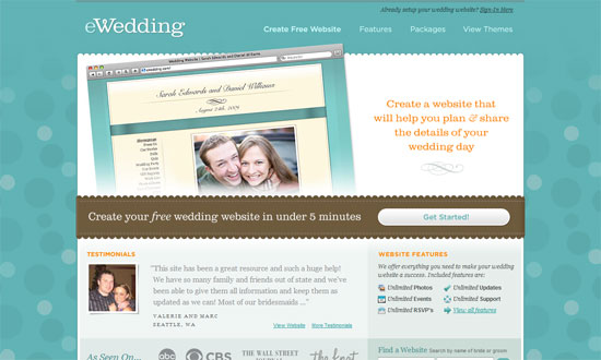
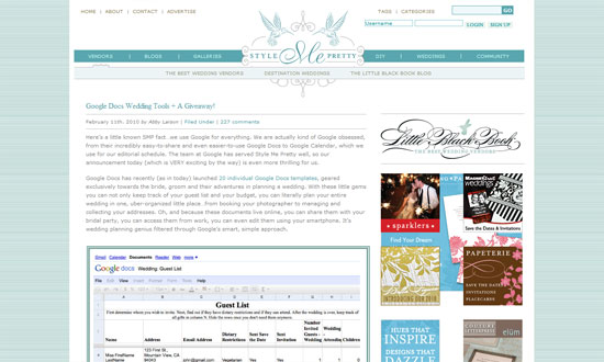
Here’s a similar look, this time with a shade of Tiffany blue, often associated with weddings. The scalloped edges also seem to be a popular touch for that cozy and romantic feel. And when in doubt, serifs also seem to up the romance factor a bit!
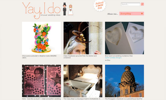
The design gets out of the way, but doesn’t forget to make the browsing experience better with the drop-down menu and the share buttons.
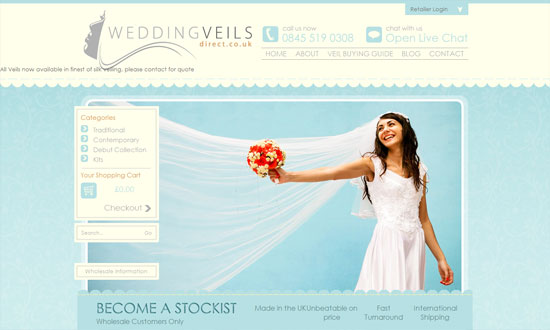
Despite a positioning problem for one line of text in the header, this site looks pretty good. And it needs a bit more contrast with the smaller text below.
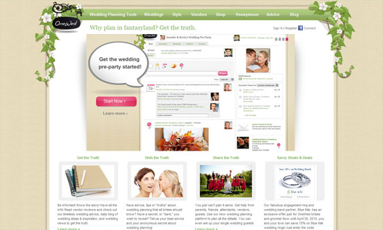
Interesting how the header area isn’t very big but attracts attention nonetheless with the floral vines, which is pretty much the only decoration on the site. And by the looks of the screenshot for registered users, the UI looks well done.
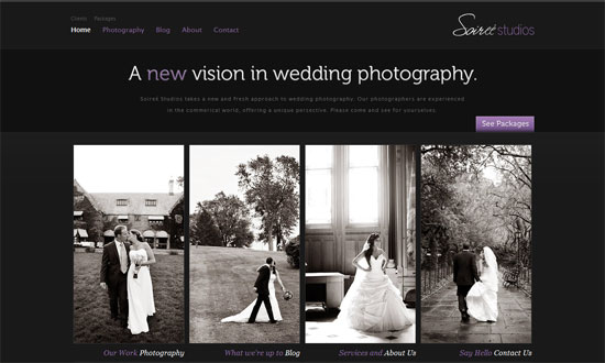
Here’s another typical scenario: if it’s a wedding photography site, it’s probably dark. That usually makes the photos pop. You’ll want the design minimal as well.
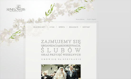
Or you can go light, remembering to stay neutral. The flowers used here are really pretty; they look almost as transparent as the main box. Love the whitespace.
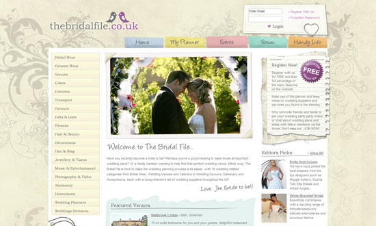
I think the paragraph text should be darker and bigger. Other than that, I like that lots of elements on the site carry the scrapbook theme well, even the forum icons and calendar dates.
Has the feel of wedding invitation, but doesn’t go overboard. I love the second-level menu.
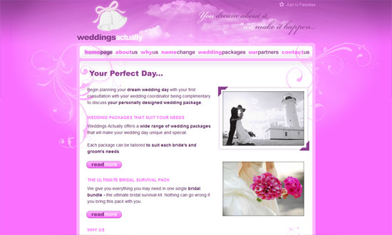
This one’s definitely a girly look. My problem with this site is it looks somewhat juvenile instead of elegant. Perhaps too sugary?
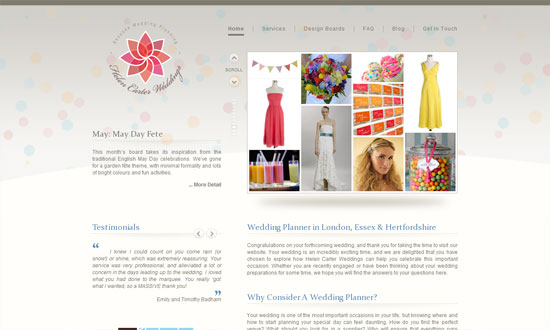
It looks almost underdesigned. But the fantastic part of this site is this: clicking on the arrows scrolls two panes (one for the images and one for the description) and changes the background to match what’s in the panes. Subtle but brilliant! (Tiny issue though: when you change pages, the default background flashes before it is replaced by the contextual one.)
Love the 3D effect going on below the blurbs, although it looks a little too light.
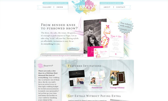
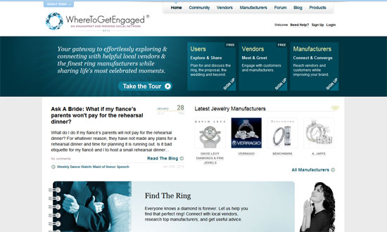
The odd one out of the group, with a completely different look that doesn’t really scream “wedding”. Looks quite savvy though, which does seem to match the feel of luxurious jewelry. I like how the buttons have a subtle background pattern to them. Then the logo reappears as a large watermark background in the bottom navigation, another nice touch.
Social Media Weekly
Design – Overcoming Creative Block
Accessibility – Social Inclusion for the Web
Programming – Explaining what YQL is to non-technical people
