• Home
  • About
  • Contact
  • Advertise

Devlounge

Design, Develop, and Grow

  • Home
  • Code
  • Design
  • Design Focus
  • Interviews
  • Publishing
  • Strategy
  • Webapps
  • Extras

Quick and Easy Web Development Tactics to Boost SEO

August 25, 2017 By Hermann Jay

As you probably already know, developing a website can present some challenges, especially if the owner requires a website that is overcomplicated. When developing a website there are a large variety of components you need to remember to ensure the site is properly functioning. With all these parts you have to remember, it is easy to forget about SEO.

You may be thinking that you are a web developer; you don’t need to be thinking about SEO. But actually, SEO is an important section of web development. There are two distinct segments to SEO; on page and off page. [Read more…]
Design Decisions That Will Influence Your Site’s Performance in Search Engines

November 7, 2016 By Hermann Jay

When creating a captivating web design you also need to look at the big picture. Your site’s performance in search engines is critical to gaining healthy amounts of traffic. Search engine optimization is considered mainly a tech job that has little to do with design. Turns out, if you want to launch an SEO optimized website you need to take a closer look at how your web design is laid out and performed. [Read more…]

Schema: Using Structured Data Markup to Improve Your Site’s SEO

June 1, 2015 By Devlounge

schema-org-markup

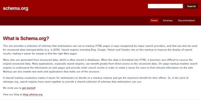
A beautifully developed website doesn’t matter if no one ever sees it. Incorporating structured data markup, according to standards from the Schema.org project, makes it easier for search engines to crawl your site.

Although there’s no hard evidence that structured data markup directly improves search rankings, it can increase the number of referrals from search engines to your site, and it can help your search rankings by working hand-in-hand with Knowledge Graph. [Read more…]

Friday Focus 10/08/10: Event Websites

October 8, 2010 By Sophia Lucero

Possibly one of the most exciting website genres out there, we’re focusing on event sites this week on Friday Focus.

Designs of the Week

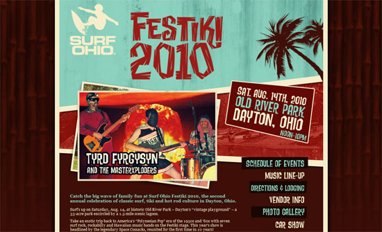
Festiki

The photo slideshow effect here works really well. The background bamboo pattern is also a nice idea.

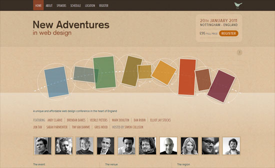
New Adventures in Web Design conference

The highlight of this design are the interactive shapes that are not only built with CSS3 effects, but tell stories about the different principles of design.

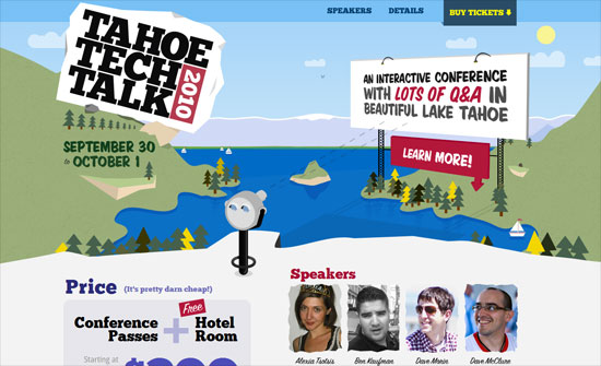
Tahoe Tech Talk 2010

Another site that has subtle animations, but also time-sensitive design. When implementing a one-page site it’s important to remember that scrolling from one section to another is important, so a back to top button that appears only when you’ve left the top section gives a more striking notice than a button that’s constantly there. The large headings and and photos are great as well.

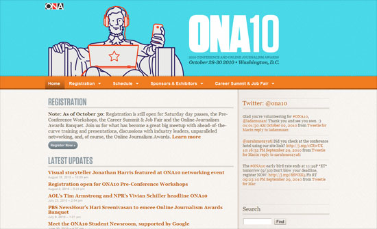
2010 Online News Association Conference

This one’s a little modest compared to the others we’ve seen, but still nicely organized and even cheerful (read: not boring). Always a good idea to format dates calendar-style and have an “important dates” to remember section.

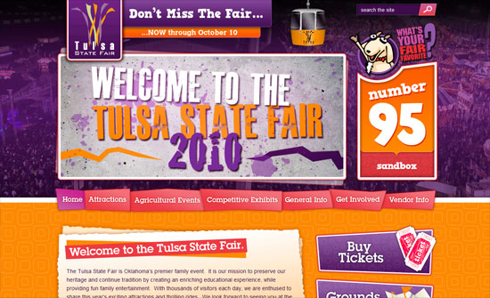
Tulsa State Fair

Love the irregularly shaped menu items and other buttons. I wish the large banner switched to show different attractions at the state fair though, and not just have them appear in the footer.

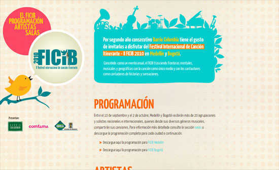
Festival Internacional de Canción Itinerante

I love how the introductory text is styled, not to mention the colors. Relatively simple design but no detail was missed here.

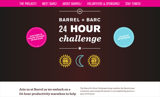
Barrel + BARC | 24 Hour Challenge

A little bit of the split and centered approach here. The date stamps are a nice touch, and the details of the project/event are nicely mapped out in one table.

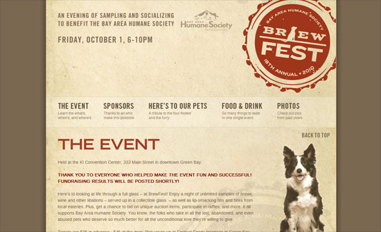
BrewFest Green Bay 2010

Great idea to hide the tall header and keep the menu as you scroll down (it doesn’t have to be all or nothing). Some sections are a little too text heavy, but it’s the toasts section that could have been styled to be more meaningful looking.

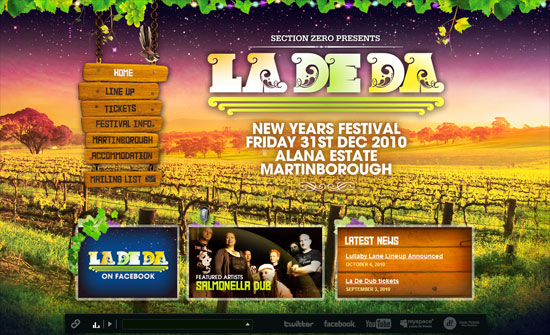
La De Da New Years Festival

Very nicely designed website. Every button and heading has its own little icon too. Good idea to include sample tracks of the artists playing at the festival.

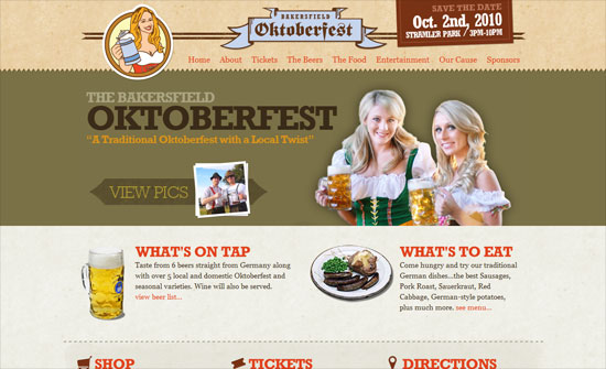
Bakersfield Oktoberfest

The intro blurb below the header isn’t quite perfect, but everything’s easy to find and read.

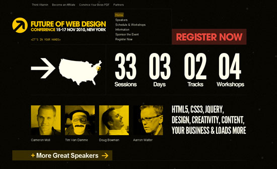
Future of Web Design

This year’s FOWD conference website keeps the bold look with a little realignment. The information link is a simple graphic right alongside a summary by the numbers. Not sure what the list of years in the footer is doing in the timeline, but using images from NASA is a great move.

Social Media Weekly

SEO – SEO for the Average Joe
“From about 10 lists I found, I gathered only the points that we would need and would make sense to the average person looking to ensure their SEO is up to snuff.”

CSS – Hardboiled CSS3 Media Queries
“Since I started using Media Queries extensively over the last few months, I’ve revised the queries several times for each project, so it made sense to build a boilerplate to use as a starting point. These hardboiled CSS3 Media Queries are empty placeholders for targeting the devices and attributes I’m interesting in making responsive designs for right now.”

Friday Focus 07/02/10: Rocketships

July 2, 2010 By Sophia Lucero

This week on Friday Focus: a bunch of sites that use rocketships in their designs. Unfortunately not all of them take the metaphor as far as one would like, but carry interesting designs nonetheless. Ready of take off?

Designs of the Week

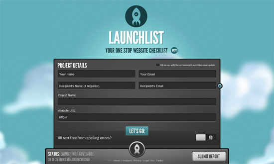
Launchlist

No doubt about it, this design is slick, and customizing form elements is no walk in the park. I just wish the narrow font wasn’t so narrow, and the submit button were blue.

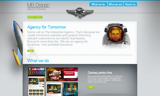
MB Dragan

I want the green buttons to have bigger padding (Fitts’s Law), and the portfolio info text in the carousel isn’t so readable, but I quite like this site. Putting the designer’s face into an astronaut suit is clever, and what I meant by taking the metaphor to the next level.

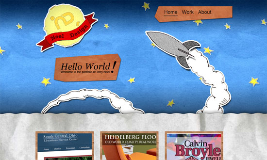
Noel Design

I enjoy the mixed textures and playfulness here, but I think it could stand to be more playful. The footer looks completely different from the rest of the site.

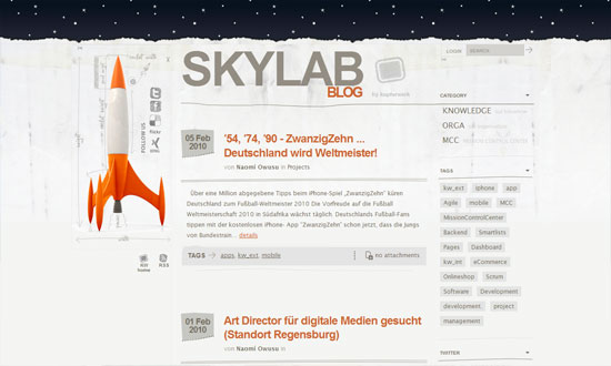
Kupferwerk Blog

Love the scribbled-on-paper touches but I feel they blend into the background too much and one wouldn’t think to look or click there.

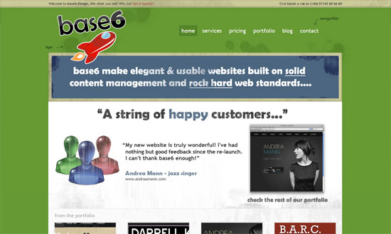
base6 Design

Applying a grunge texture to originally glossy illustrations? Not a very good idea.

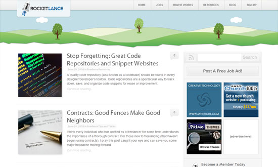
Rocketlance

I like the overall look and feel of this site, but if you look more closely it needs polishing. It’s an 8.5, but not a 10.

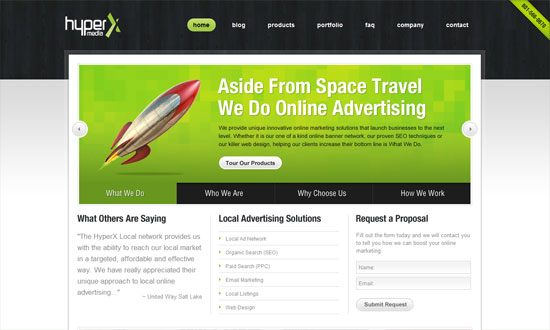
HyperX Local

Lovely details, go check out the icons and other illustrations on the inside pages. My favorite part is the glass frame around the main content area.

Social Media Weekly

SEO – 5 Ways to Be an Ethical SEO Expert
“Today we’ll briefly look at how to engage in SEO in an ethical manner by pointing out five key techniques to avoid.”

Programming – Using Firefox’s Geolocation API
“One interesting aspect of web development is Geolocation; where is your user viewing your website from? You can base your language locale on that data or show certain products in your store based on the user’s location.”

UX – UX Myths
“Debunking user experience misconceptions”

Information Architecture – Card sorting: a definitive guide
“Card sorting is a great, reliable, inexpensive method for finding patterns in how users would expect to find content or functionality.”

Next Page »

Code & Tutorials

Which Front-End Development Languages Will Grow in 2017?

Your Guide to Leveraging APIs as a Developer

Bitcoin Processing Website Integration For Web Developers

Website Security For 2016 That All Developers Need To Know

5 Reasons You Need to Be Using jQuery

About Devlounge

Want to read more about Devlounge, or maybe you want to contact us, or even advertise? Oh, and don't forget to subscribe to updates!

The Best of Devlounge

Sass x Class = Lea Alcantara

Search