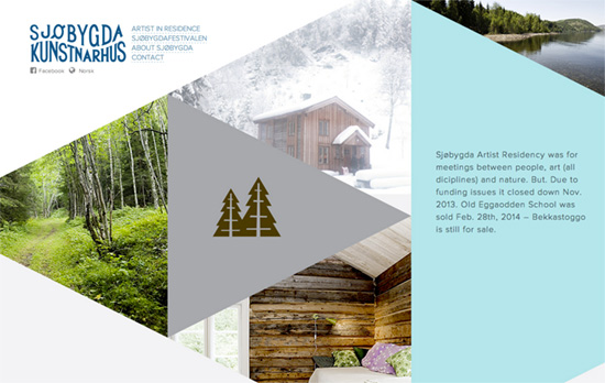
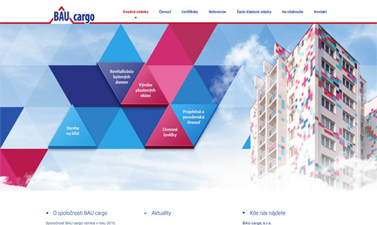
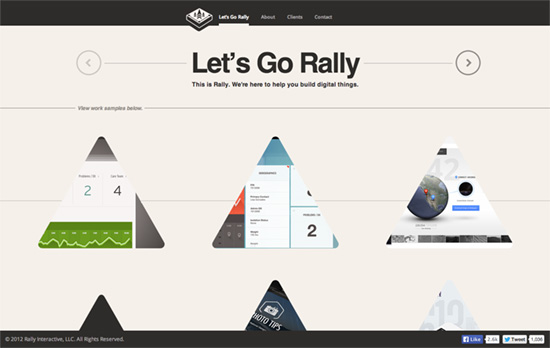
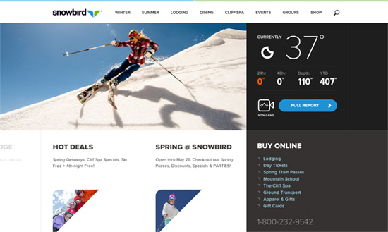
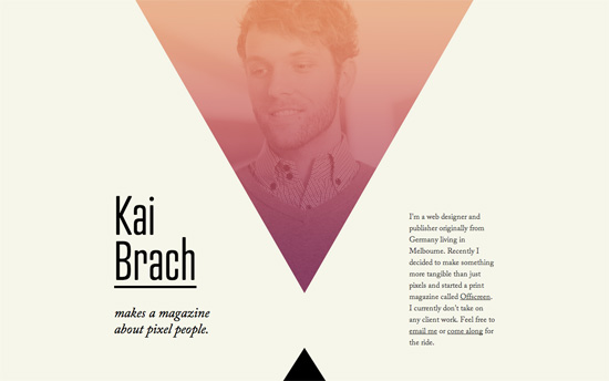
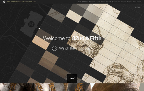
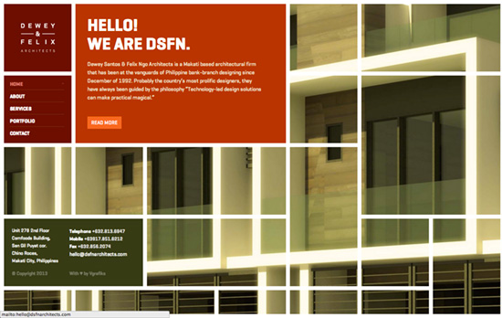
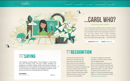
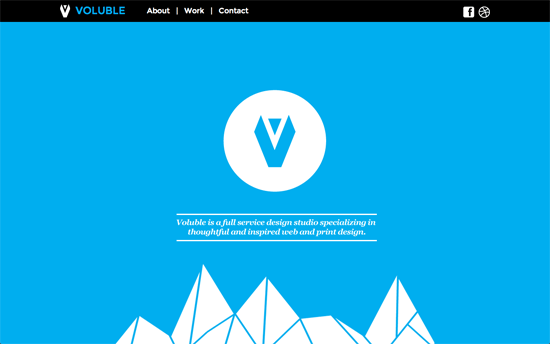
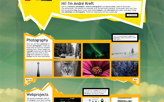
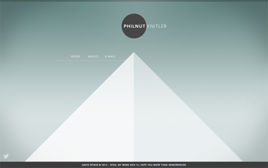
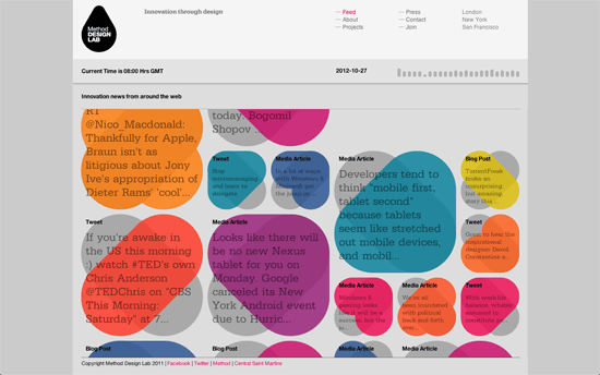
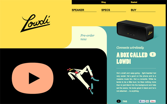
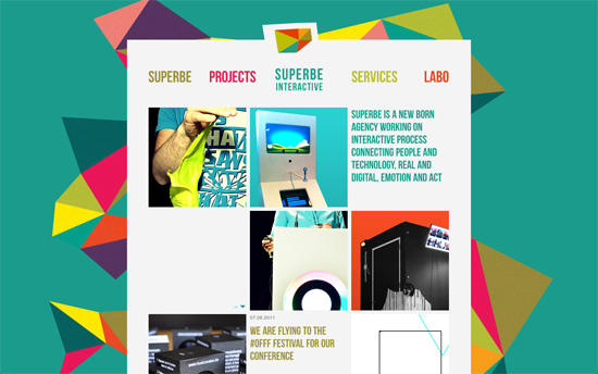
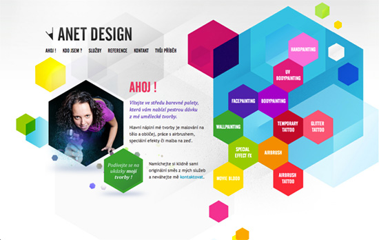
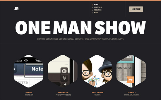
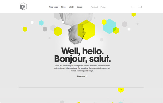
Here’s a collection of website designs that display excellent use of shapes to style and present content, ranging from the quirky to the stunning.
Designs of the Week
Create unique, extraordinary websites with Squarespace. No experience necessary!
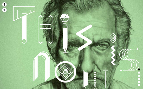
The mix of drawn portraits, bright colors, and shapes is a very interesting combination (parallaxed, of course), although in some places the text (which are all italics) is difficult to read on top of all of that.
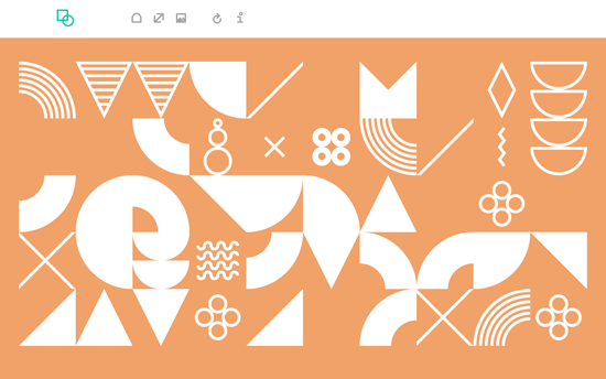
This color-changing site is dedicated to the very same topic of exploring shapes. No text except for the about modal and tooltips.

Like the previous site, it’s an array of icons which happen to be features in the product. Clicking on each reveals an animated verison on the watch and the description in the opposite column, hiding the icons found in that location. The concept seems so simple for a site design, but perhaps the best way too.
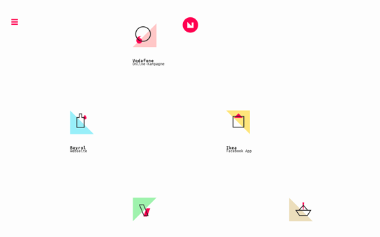
This design shows scattered icons which look to be deconstructed logos of the companies they represent (and similar icons for those who use wordmarks) and has a lot of subtle animation effects, moving both text and icons as you hover and scroll.
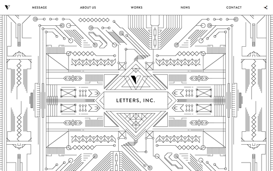
Love the intricacy of these patterns, which also connect to other designs as you scroll down and they draw themselves along the way.
Social Media Weekly
Pagelines lets you build WordPress websites and it’s as easy as drag and drop, go check it out!
User Experience – UX Thought of the Day
“Five UX thoughts a week to inspire you to do something differently in your design work.”
Design – Stop asking design candidates to redesign your product. It’s unfair and (even worse) it’s ineffective.
“You’re not hiring a designer who goes off into a corner to magically create perfect solutions like she can read your mind. You are hiring someone who can work with a team to identify the right problems, create the best solutions, and test the real-world effectiveness of those choices.”
