• Home
  • About
  • Contact
  • Advertise

Devlounge

Design, Develop, and Grow

ateşli sevgilisi fantezisini yaşamak istediğini söyler porno ona arkadaşları varken onunla gizli saklı seks yapmak istediğini sikiş söyleyen kız hafta sonu için gelen arkadaşının görmediği bir sikiş açıdan sakso çekmeye başlayınca adamın yarağını bu altyazılı porno şekilde indiremez ve açık şekilde salonda sikişimeye sex izle başladıklarında misafir kızı da bu sekslerine rokettube konuk ederler seks yapacağını düşünmeyerek onun sex izle oyun oynadığını zanneder sabah olur ve herkes uyanır hd porno bu sırada yanında şişme mankenini de getiren sapık erotik hikayeler genç sınav haftası ders çalışan genç adam üvey annesinin sikiş eve gelmesiyle hayatının şokunu yaşar

  • Home
  • Code
  • Design
  • Design Focus
  • Interviews
  • Publishing
  • Strategy
  • Webapps
  • Extras

Design Focus: Deconstructed Sliders

August 17, 2012 By Sophia Lucero

Our featured designs for the week contain slideshows that don’t just animate a page of content at a time, but breaks down each into their components, then animate them into the viewport one at a time.

Designs of the Week

Want your site to be as good-looking and inspirational as these? Start by choosing a well-designed theme from ThemeForest.

Reputation Radar website
Reputation Radar

Not only does this slider animation technique takes the excitement up a notch with objects flying in from all directions, but adding in a bit of perspective also goes a long way. I also like the uneven borders, section dividers, and flyout menus.
Lift Interactive website
Lift Interactive

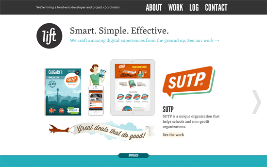
Love the way their portfolio items are presented in the slider: logo, full site screenshot, mobile site screenshot, icons, and other related objects all arranged neatly. I also find it very interesting that while there’s a fixed menu, their logo isn’t located there, but on the scrolling part of the page. Instead, the top left area is reserved for announcements, e.g. hiring info. Another cool component on the site: each downloadable article from their blog has a “book cover” for an image, and animates 3-dimensionally on hover. The rest are in colorful blocks below.
Webdesign Weblounge website
Webdesign Weblounge

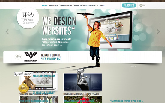
I like how the background in the slideshow changes per slide. I also like how their portfolio items have pics that go beyond their containers.

Social Media Weekly

Pagelines lets you build WordPress websites and it’s as easy as drag and drop, go check it out!

Web Design – Useful Print And Online Magazines For Web Designers
“In this overview of useful magazines you’ll find everything from purely online publications to monthly, glossy print editions, where all subjects relevant to art and design are being investigated in colorful, eloquent detail.”

Usability, User Experience – The Zen of Usability Testing
“If we only designed sites for people in our industry, the results would be quite predictable. On the other hand, trying to design things to work in a way which is logical to someone who doesn’t know the limitations of our software is an enormous challenge. This is when we are pushed to make really clever stuff happen.”

CSS – Tags in CSS files
“What if I want to find any section that handles images, or perhaps I need to know what CSS is available for use on lists? I need a way of searching within sections, not just their titles. Enter CSS tags…”
Friday Focus 03/16/12: Wide Slides

March 16, 2012 By Sophia Lucero

Slideshows are a staple in websites but the possibilities for them never end. This week’s Friday Focus features designs that revolve around its full-width sliders, making for an engaging conversation with the audience.

Designs of the Week

Get solid WordPress themes, plugins, and web design training from iThemes.

Breezi website
Breezi

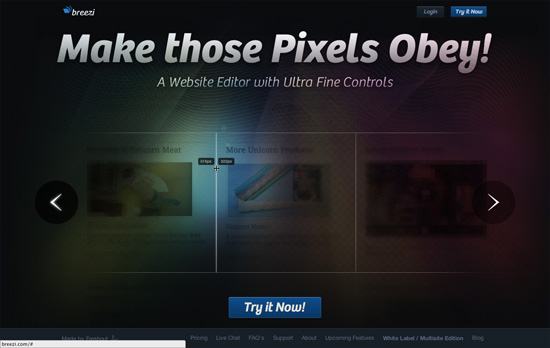
Several interesting things going on here: first there’s a decidedly dimly-lit feel to the slides and only portions of the image are highlighted, and even those areas aren’t completely bright. There’s also a mix of rainbow gradients, texture, and guilloché going on. The same whimsical look carries on below in the way the icons and illustrations have glows and reflections on them, all while sliding in as you scroll past.

Maaemo Restaurant website
Maaemo Restaurant

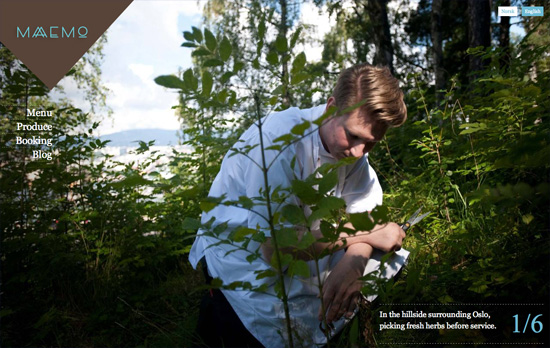
It’s quite convenient, although a little unusual behavior, that the controls for the sliders follow the mouse cursor. Since the photographs cover the whole screen, though, it makes sense. For a site like this it’s really the images that do the talking, and it’s a good idea that there are different sets of pictures on each page. The text in the inner pages disappears once you click right or left, and you have to select it from the left side menu to read it again. It’s quite disappointing though that the blog is offsite and nowhere as immersive.

Blind Barber website
Blind Barber

Cute idea to use an animated version of the barber’s pole/barber shop lamp as the loading gif. I also noticed that although there’s content below it, the slider area makes it a point to fill the whole browser screen first (although it doesn’t adjust if you resize or go fullscreen). I also like how the navigation tabs below the slides, also occupying the full width of the browser, are designed. Most of the inner pages have their own sets of slideshows as well (including video).

Ready to go out and design your next website? Try building with the Catalyst Framework.

Social Media Weekly

Design, User Experience – Style Tiles
“Style Tiles are similar to the paint chips and fabric swatches an interior designer gets approval on before designing a room. 
An interior designer doesn’t design three different rooms for a client at the first kick-off meeting, so why do Web designers design three different webpage mockups?”

CSS – Negative Proximity
“There’s a subtle aspect of CSS descendant selectors that most people won’t have noticed because it rarely comes up: selectors have no notion of element proximity.”

CSS, JavaScript – CSSrefresh
“CSSrefresh is a small, unobstructive javascript file that monitors the CSS-files included in your webpage. As soon as you save a CSS-file, the changes are directly implemented, without having to refresh your browser.”

Semantics, Optimization – About HTML semantics and front-end architecture
“A collection of thoughts, experiences, ideas that I like, and ideas that I have been experimenting with over the last year. It covers HTML semantics, components and approaches to front-end architecture, class naming patterns, and HTTP compression.”

CSS – Why You Should Use Inline-Block when Positioning Elements
“Inline-block isn’t a magic fix, but as long as you are aware of its quirks, you can work around them.”

User Experience, Responsive Web Design – A Simple Device Diagram for Responsive Design Planning
“There are an ever-increasing number of devices with different screen resolutions to take into account with a responsive design, so we put together a simple but handy diagram that lists the most common device widths as of the present, along with overlays for potential device width ranges.”

Pagelines lets you build WordPress websites and it’s as easy as drag and drop, go check it out!

Friday Focus 01/06/12: Look Alive!

January 6, 2012 By Sophia Lucero

Our first Friday Focus for the New Year is all about animated designs, a bit on the subtle side but sure to pique your interest nonetheless.

Designs of the Week

WEAREEMPIRE website
WEAREEMPIRE

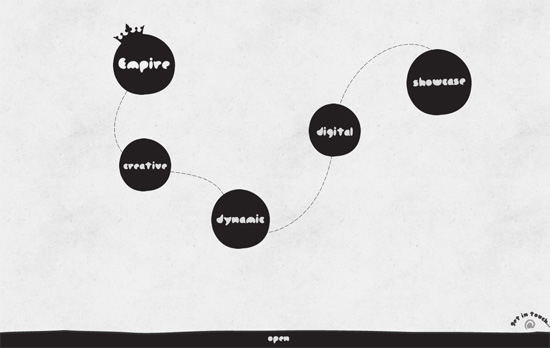
The page first loads the logo, then clicking on it displays a trail of circular navigation items for each section of the site. Hovering on each runs a vertically scrolling animation in the background, each unique to the item. Clicking then loads the content area either in the huge half-circle background sliding out from the top, or another slide-out area from the bottom. Nothing too crazy, but lots of fun, casual touches from the heading font choice to the scarcity in straight edges. There’s also a nice little bounce/delay effect in the portfolio slider, where the MBP screenshot “stops” before the iMac one.

RainyDay Interactive website
RainyDay Interactive

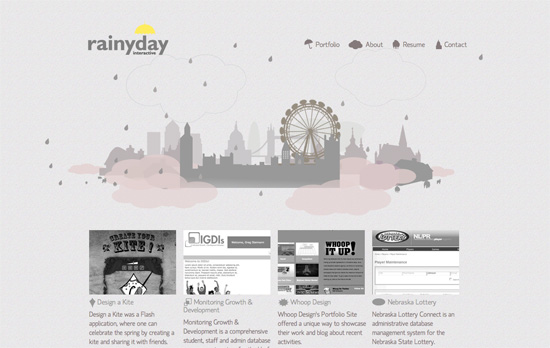
The gray droplets of rain appear to stagger diagonally downward, just as slowly as the ferris wheel turns—it’s not my usual expected behavior for rainfall and almost seems to be creeping instead of falling. Clicking around the area (wait to see your cursor change) reveals people holding black umbrellas appearing out of thin air and floating away. You might even chance upon a dinosaur. The portfolio items are arranged one after the other so it’s a tall website, and scrolling past the first screenful reveals a cloud menu affixed to the left, replacing the original one.

Reverend Danger website
Reverend Danger

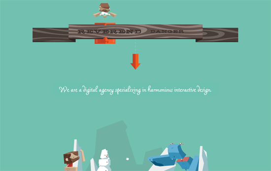
This site plays two different animation modes in each section, which you can select by dragging the slider at the top: the pleasant “Reverend” and the more violent “Danger”. Also featured are tree stumps that pop up as you scroll past, and a slider with an added bouncing effect. All areas use simple animations—slides, flips, easing—but it’s the story and visuals that make them special.

Colin Grist's website
Colin Grist

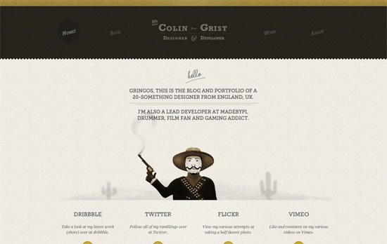
There’s only one small animation here and it’s the smoke coming out of the cowboy’s gun. I like how it looks random or unpredictable enough although it does look just a little pixelated at some points. The slanting text in the top navigation gives a small, old-style touch, while the four circles repeat in the social icons at the bottom.

Harrison Pensa LLP - Season's Greetings website
Harrison Pensa LLP - Season's Greetings

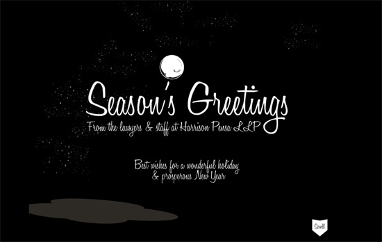
Here’s another on a very short list of sites with the scroll-to-zoom effect, and in this case it’s zooming out instead of zooming in. But that’s only half the story, below it is a shooting game of snowmen and snowballs. I think I only gripe is the two things kind of handicap the scrolling so once you’ve gone down you won’t be able to go up unless you use the “Top” link, which actually reloads the page instead of jumping upwards with an anchor.

Create Digital Media website
Create Digital Media

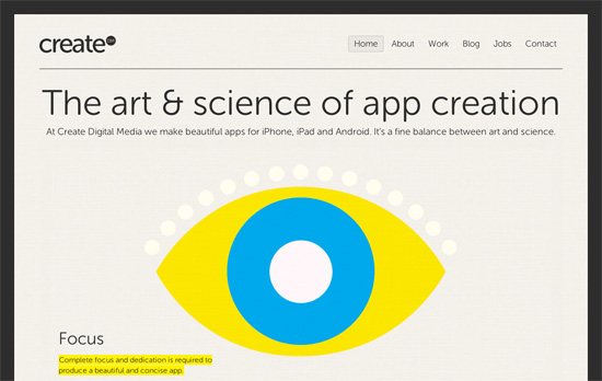
Here the animations occur in the slider, albeit one you can’t control (at least a pause on hover would be nice). I like the concept of using CMYK colors for each graphic (also on other pages), tying everything together. Other sections remain warm and neutral.

Social Media Weekly

Design – Ketchup Bottles & The Physicality Of Design
“You may not immediately notice these little details, but they make digital interfaces appear more valuable, like little hand-crafted executive paperweights: expensive, heavy and solid.”

CSS – Seven things still missing from CSS
“CSS has come a long way but it’s not perfect (yet). Molly Holzschlag, passionate standardista and open web evangelist, quizzed her peers to find out what they see as the most frustrating aspects of CSS.”

User Experience – A plea for progressive enhancement
“For this ubiquity to truly benefit all of us (not just those of us with a high income, or the latest phone) we have to start building sites using solid, future friendly principles such as progressive enhancement…not just when it’s handy or simple, but all the time.”

CSS, Optimization – Profiling CSS for fun and profit. Optimization notes.
“As our pages/apps become more interactive, the complexity of CSS increases, and browsers start to support more and more “advanced” CSS features, CSS performance will probably become even more important.”

Tools, HTML, CSS – Animatable
“Create, serve and track HTML5/CSS3 animations for desktop, Android, Blackberry QNX, iOS and WebOS mobile devices.”

Mobile – Test on Real Mobile Devices without Breaking the Bank
“Mobile is the future of the web, so it’s time to start investing in some mobile devices. “

Friday Focus 03/25/11: Sassy Sliders

March 25, 2011 By Sophia Lucero

This week’s Friday Focus features designs that use smart, stunning slideshow techniques that are sure to inspire you. Take some notes!

Designs of the Week

Get Satisfaction

The circus theme combined with the sketchy, painted feel looks great. Everything’s bright and cheerful.

Büro Maisengasse

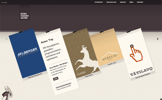
Minimal but packs a punch with the clothesline effect. Nice integration of Google Translate for language localization, and the header matches each project color/pattern.

Grunnarbeid

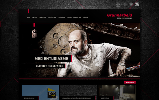
Nice little thumbnail tabs to the right for navigating through the slides, and a nice dark overlay to the left for blending into the background.
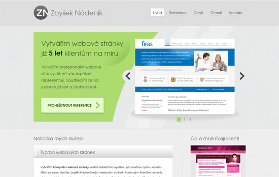
Zbyšek Nádeník

A more conventional look, but I like how the text and image areas are separated with a nice curvy cut, breaking the typical rectangular silhouette of carousels.

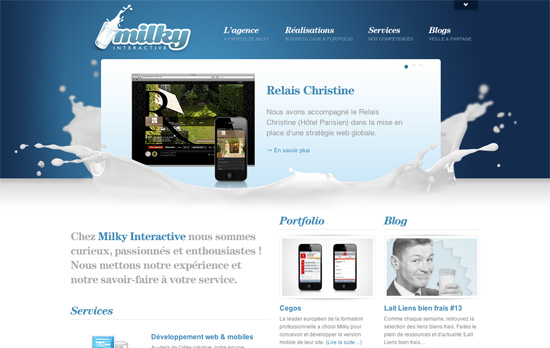
Milky Interactive

The splash of milk makes all the difference. This site’s filled with content but it still feels light and nicely organized.

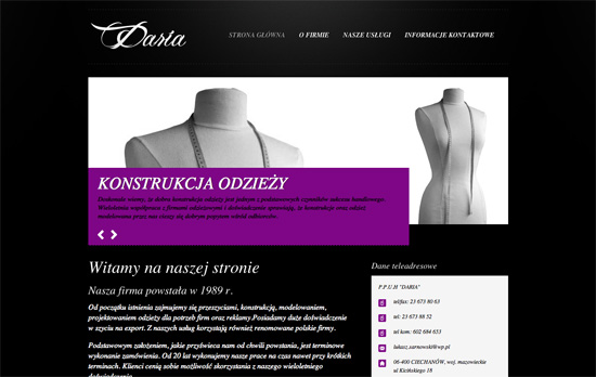
Daria Zakład Krawiecki w Ciechanowie

Keeping the color scheme in grayscale to let the purple pop is an interesting technique. Although using black text on it isn’t very readable. So is using italics for majority of the site.

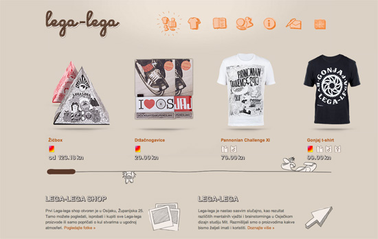
Lega-lega

Fun sketchy illustrations everywhere—even the icons for meta information are custom. It also helps that there are tooltips in case they look a little vague. I like the treatment to the scrollbar although maybe some arrows or a change in cursor type would help more.

Bluecadet Interactive

Love or hate the vintage, classical look, the details on this site are to die for. But really, it’s the main slideshow that’s the best part, which comes together in such a pleasant way.

Social Media Weekly

Accessibility – Web Accessibility Toolbar
“In honour of Jim Thatchers important and continuing contribution to making the web a more accessible medium, I have worked on an update to the Web Accessibility Toolbar for Internet Explorer, which includes new features that he has developed.”

HTML – New HTML elements and surrogate <div>s
“What else can we do to move forward without polluting our documents with non semantic wrappers?”

User Experience – Effective Developer Experience
“Platform product owners must be concerned with assisting developers in accomplishing this if end users are to have a good user experience overall. Attention to these details is called developer experience (DX), and enabling app developers to be successful through better DX will create a more successful UX for the platform product.”

The Top: 12 Best jQuery Image Galleries

May 6, 2010 By Hyde

There are countless of jQuery image galleries out there, here we gathered the best ones for you.

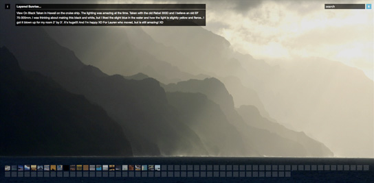
Full screen image gallery using jQuery and Flickr

A gallery based on the Flickr API, using full browser.

jQuery Gallery

Features

  • Flickr search using jQuery and JSON
  • Full screen with kept ratio using CSS only
  • A png raster to even out up-scaled jpegs
  • Thumbnails with loader indicator and a nice hover effect that shows a bigger thumb (or description)
  • A preloader loads the large images one by one for super-fast viewing
  • Fetches the biggest image from flickr using their API
  • Caption that can be turned on or off
  • Navigate by clicking on either half of the image, or use the thumbnails.

View Demo

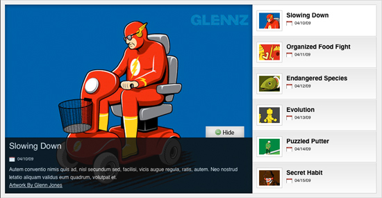
Image Rotator with Description (CSS/jQuery)

An image rotator is one great way to display portfolio pieces, eCommerce product images, or even as an image gallery.

jQuery Gallery

View Demo

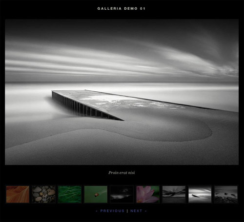
Galleria

Galleria is a Javascript image gallery written in jQuery. It loads the images one by one from an unordered list and displays thumbnails when each image is loaded. It will create thumbnails for you if you choose so, scaled or unscaled, centered and cropped inside a fixed thumbnail box defined by CSS.

jQuery Gallery

Features

  • Unobtrusive javascript
  • Degrades gracefully if the browser doesn’t support javascript or CSS
  • Lightweight (4k packed)
  • Displays the thumbnail when the actual image is loaded
  • CSS powered – create your own gallery style
  • Super fast image browsing since the images are preloaded one at a time in the background
  • Can scale thumbnails and crop to fit in thumbnail container
  • Can be used with custom thumbnails
  • Stylable caption from image or anchor title
  • jQuery plugin – takes one line to implement
  • Browserproof
  • Can adjust the history object and enable the back button in your browser
  • Can fire events so you can customize the images behaviour onLoad

View Demo

Supersized: A Full Screen Background/Slideshow jQuery Plugin


Features

  • Resizes images to fill browser while maintaining image dimension ratio
  • Cycles Images/backgrounds via slideshow with transitions and preloading
  • Navigation controls allow for pause/play and forward/back

jQuery Gallery

View Demo

A ‘Pro’ jQuery Image Slider Built On A Single Unordered List

slideViewerPro is a fully customizable jQuery image gallery engine wich allows to create outstanding sliding image galleries for your projects and/or interactive galleries within blog posts.

jQuery Gallery

View Demo

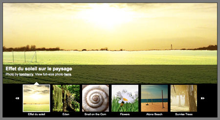
GalleryView: A jQuery Content Gallery Plugin

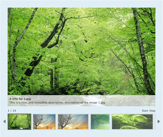
GalleryView aims to provide jQuery users with a flexible, attractive content gallery that is both easy to implement and a snap to customize.

jQuery Gallery

View Demo

AD Gallery – a jQuery gallery plugin

jQuery Gallery

Features

  • Choose effect, should the image slide in, or fade in?
  • Show fifth image by adding #ad-image4 to the url, this takes precedence over over settings.start_at_index
  • jQuery call returns gallery instances, which enables you to change settings on the fly like the “Change to fade effect” link above
  • Keyboard arrows to move back and forth
  • Click on the edge of the big image to go to the next/previous
  • Images are preloaded, and if the aren’t finished loading when they are supposed to be displayed, a loading image will appear
  • Slideshow count down only begins when the image has loaded and is visible
  • Image title, can either be set in the title attribute, or in elm.data(‘ad-title’, ‘My title here’). $.data takes precedence over the title attribute
  • Image descriptions, can either be set in the longdesc attribute, or in elm.data(‘ad-desc’, ‘My description here’). $.data takes precedence over the longdesc attribute
  • Callbacks on different events that has access to the internal object, which means that you can access all internal methods, etc
  • Takes the dimensions of the image container div and scales down images that are larger than it
  • Image is positioned in the middle if it’s smaller than the container div
  • Images that are larger than the container are scaled down to fit inside the container

View Demo

Galleriffic

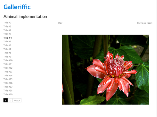
Galleriffic is a jQuery plugin that provides a rich, post-back free experience optimized to handle high volumes of photos while conserving bandwidth.

jQuery Gallery

Features

  • Smart image preloading after the page is loaded
  • Thumbnail navigation (with pagination)
  • jQuery.history plugin integration to support bookmark-friendly URLs per-image
  • Slideshow (with optional auto-updating url bookmarks)
  • Keyboard navigation
  • Events that allow for adding your own custom transition effects
  • API for controlling the gallery with custom controls
  • Support for image captions
  • Flexible configuration
  • Graceful degradation when javascript is not available
  • Support for multiple galleries per page

View Demo

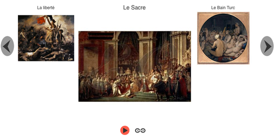
s3Slider jQuery Plugin

jQuery Gallery

View Demo

EOGallery

EOGallery is XHTML 1.0 strict valid and almost CSS valid, it has been tested on Firefox, Safari, Internet Explorer 6 and works even with non-javascript and/or non-css browsers.

jQuery Gallery

View Demo

Nivo Slider

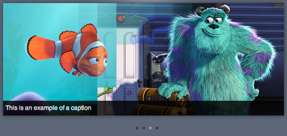
The Nivo slider script excels in its size. Size as in ‘too small too even mention’, we are speaking 7kb. SBut size shouldn’t mean featureless or ugly. Instead the Nivo Slider is on top there with larger libraries when it comes to transition grace and looks. Lightweight as it may be, this should be one of the first addresses to look at if you need a sliding gallery for your design.

Features

  • 9 unique transition effects
  • Simple clean & valid markup
  • Loads of settings to tweak
  • Built in directional and control navigation
  • Packed version only weighs 7kb
  • Supports linking images
  • Keyboard Navigation
  • Free to use and abuse under the MIT license

Demo and instructions.

Smooth Gallery

John Design’s Smooth Gallery was probably one of the first, and smoothest, image rotators available. Based on MooTools it is complete standards compliant and comes with as many options as you think of: from transition speed to captions, image titles and linking images. Additionally, it’s only 24kb in size and the first image will display already while the others load in the background, thanks to the implementation of a preloader. This gallery doesn’t slow down the content load times. You can even link to a particular place in the rotating gallery.
For jQuery users there is also a name-spaced version available.

Demo (There are several different demos in the showcase).


Code & Tutorials

Which Front-End Development Languages Will Grow in 2017?

Your Guide to Leveraging APIs as a Developer

Bitcoin Processing Website Integration For Web Developers

Website Security For 2016 That All Developers Need To Know

5 Reasons You Need to Be Using jQuery

About Devlounge

Want to read more about Devlounge, or maybe you want to contact us, or even advertise? Oh, and don't forget to subscribe to updates!

The Best of Devlounge

5 Reasons To Reconsider Hiring A Web Designer

Search