In my last post, I talked about the different types of templates and what they’re used for. Now that we have a feel for what our templates do, let’s take a closer look at one and see what’s going on inside. [Read more…]
Jazz Up Your Web Images With Fancy Borders
Are you sick and tired of the old square or rectangle that your beautiful web images are surrounded by? It’s easy to make your square edged old jpgs and gifs look exciting and new if you’ll just follow these quick instructions for creating fancy borders around your photos in no time at all! You can use this easy Photoshop technique to spiff up your graphics for your own home page or blog, or for an outstanding banner or intro photograph. There are so many uses for doing this to your images, and you will come up with many yourselves after just trying this once! It is so easy! Okay, ready?
Fancy Borders Using Photoshop
Save this new version of your image as something else, that way you still have your “untouched” original intact.
Open any one of your images in Photoshop and resize the original image to something manageable. Save this new version of your image as something else, that way you still have your “untouched” original intact. My rule of thumb on sizing graphics is as follows: If I plan to use the photo on my web sites or blogs, I usually size them down to about 450 pixels wide by 338 pixels tall. For web, make your image resolution 72 ppi. If I you are not using your image for the web, then I suggest you make your image 200 to 300 ppi in size so it can be used in print media or whatever else. Anyway, enough of this resizing – that’s a whole other blog subject!
Once you have saved this new version of your image in Photoshop, immediately move over to the right of your screen with your mouse pointer and locate the Layers palette that is usually docked in the right side of your Photoshop work space. You will see the little icon that represents your open photo, which is usually named “background.” Put your mouse on that little square representation of your photo and drag it down over the New Layer icon at the bottom of the layers palette (it is the little square next to the trash bin). This will duplicate your background layer and create a new one called “background copy.”
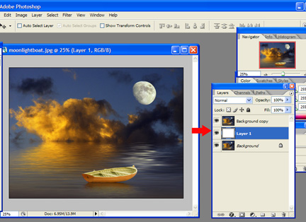
Next, move your mouse pointer down to the New Layer icon again and just click on it once. It will create a new blank layer. Click on the new blank layer and drag it between the other two background layers. Make sure your default color picker colors are set to black and white (type the letter “d” to reset to your default color scheme in Photoshop). With the new blank layer active (it will show as highlighted), click Alt+Backspace (on Windows), this fills that empty new layer with the color white. Your layers palette should look like the example below if you’ve done these steps correctly:
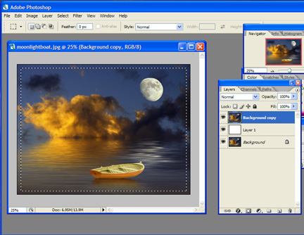
Now, while you are still in the layers palette, click on the background copy layer to target that layer and make it “active”. Click the rectangle marquee tool (the tool on your vertical toolbar that is at the very top left) and click and drag a selection area that is just inside the edge of your image, probably around 1/8″ in size thereabouts. See example:
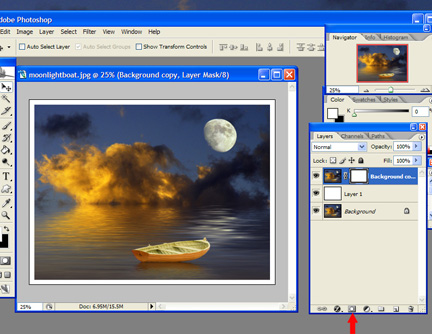
Click on the Layer Mask button at the bottom of the layer palette menu (third button from the left – a grey square with a white circle in the center). If you have done this correctly, you should now see a little white border appear all around your photo as in the example below:
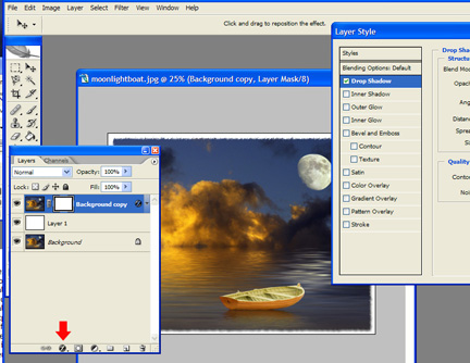
Next, click the Filter menu at the top of your document work space, then click Brush Strokes from the drop down menu that appears, and choose Sprayed Strokes from that menu. The filter gallery will open up and show you a blank, white photo image area with that particular effect you just chose applied to it as a black, jagged looking border. To adjust the effect in the filter gallery, make the stroke length about 6 and the spray radius around 15, this looks really neat. Experiment with what amount of effect you like best. Next, just click OK to approve of the effect and close the filter gallery. Voila, looks cool doesn’t it? Also, while you are being creative, go to the Layer Palette again and click on the effects icon (black circle with a script ‘f’ in the center of it) and choose Drop Shadow just for fun! That’s what I did in my example here:
To finish out your border, just click the Image menu and choose Flatten Image (or Save For Web in the File menu) so that you can save your file as a .jpg, and you are ready to go! Easy wasn’t it? Experiment on your own by using a black background fill next time, or some other color… it’s all up to you and your own creativity!
Finished image example:

Pulling XML into Flash
When developers and designers start really utilizing the power of flash and the potential it can bring to applications and creative content, a question that frequently arises is how to load data in from a xml page and use it in Flash. This is a quick tutorial to show how easy the process is and once you have these basics the possibilities are endless.
First we will create a simple xml document called images.xml. Here is the code:
<images>

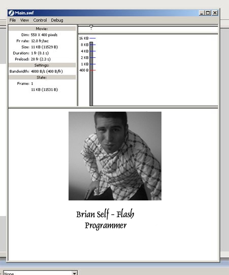
 <image image="img/img1.jpg" caption="Brian Self- Flash Programmer"/>

</images>
We are only going to use one simple xml node to keep it simple. Save this file in a directory called xml.
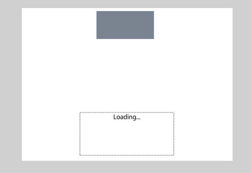
Then create an FLA and call it “Main.” Put a dyncamic text field on the stage with an instance name of myText and be sure to embed the font, uppercase, lowercase and punctuation. Then draw a rectangle and hit F8 to make it a movieClip and give it an instance name of myImageHolder.
Then create an AS layer and paste in this code:
// create the XML variable
var xml:XML = new XML();
// you must ignore whitespace
xml.ignoreWhite = true;
// the function that is called when the xml is loaded
xml.onLoad = function() {
// tells you the number of child nodes
 var nodes = this.firstChild.childNodes;
// tells you how many items you have
 numOfItems = nodes.length;
 // attach icons
 for (var i = 0; i<numOfItems; i++) {
  // attach image to the myImageHolder MovieClip
  myImageHolder.loadMovie(nodes[i].attributes.image);
  // set the text
  myText.text = nodes[i].attributes.caption;
 }
};

// load the xml
xml.load("xml/images.xml");
If you run this you will see that the content is now populated from the xml page.
Simple as that! Remember, in coding and designing there is always an increasingly difficult way of doing things and a elequently simple way. Keeping it simple makes debugging a quick and painless process and always assume you will have to debug at some point in your designing life.
WordPress Theme: Log In On The Front Page
While there have been many people customizing the login page of WordPress, and others trying to put it in a page, I haven’t seen too many blogs that allow you to log in to WordPress via the blog’s front page. The log in form on wp-login.php is a simple form that you can pull from the page, and put just about anywhere.
Recently, for a client, I had to put that form on their WordPress theme, so they could bypass the wp-login.php page, and go right from the blog to the administration panel, and it is easier than you might think.
*Note: Doing this can cause issues later on as WordPress is a constantly evolving piece of software. This may not work on future versions.
Getting the Code
The first thing we need to do is to get the form’s code from wp-login.php. In the folder you installed WordPress in, you will see the file named wp-login.php in the root folder. Download the file, and open it up in your text editor of choice. I am using Mac OS X, and Smultron.
Around line 347 you will find the log in form we will need.
[php]
