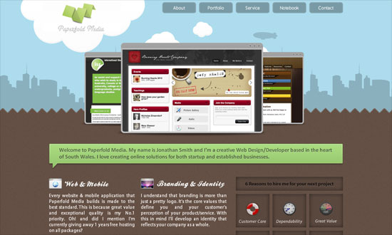
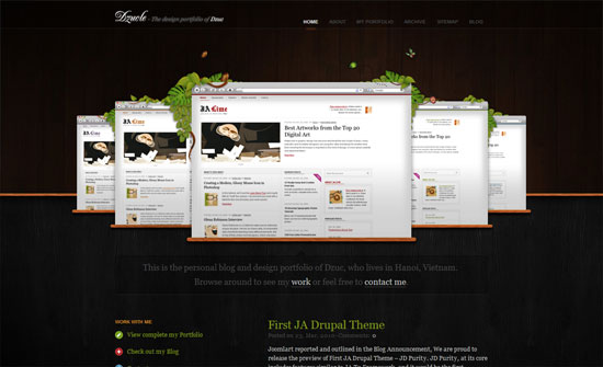
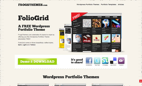
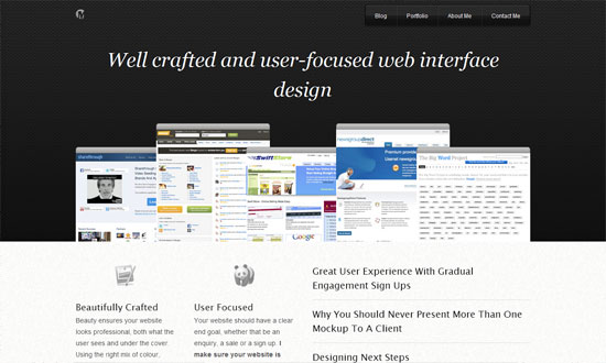
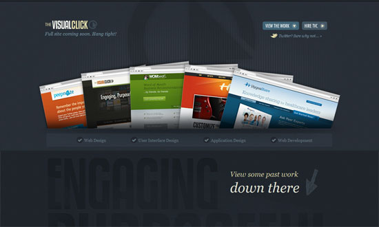
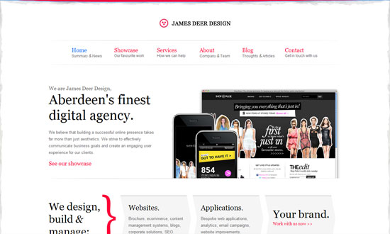
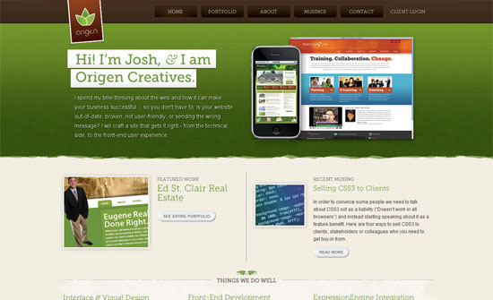
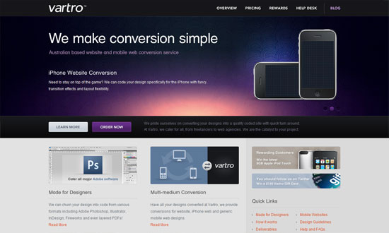
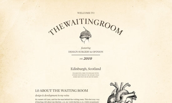
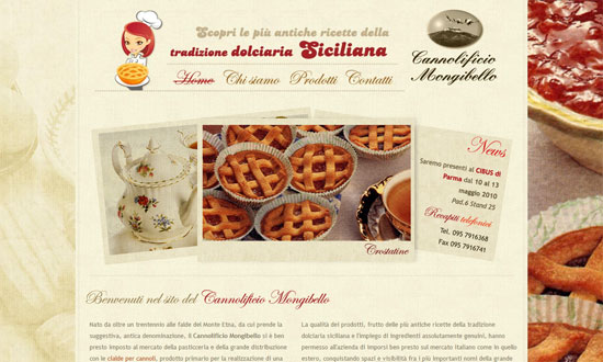
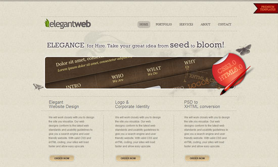
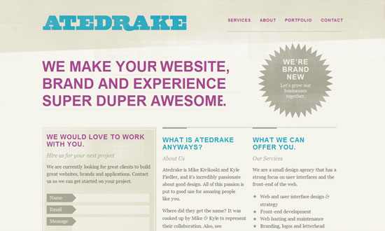
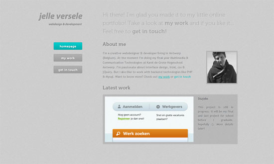
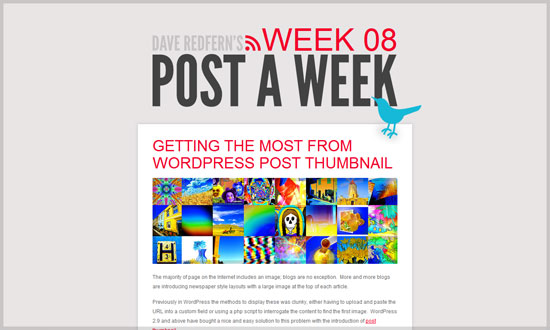
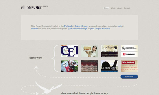
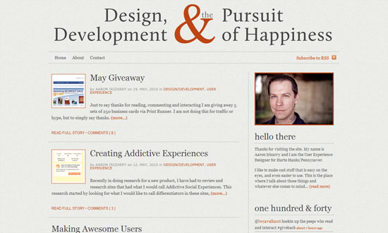
This week on Friday Focus: designs adorned with the timeless patterns of scalloping and sheared edges.
Designs of the Week
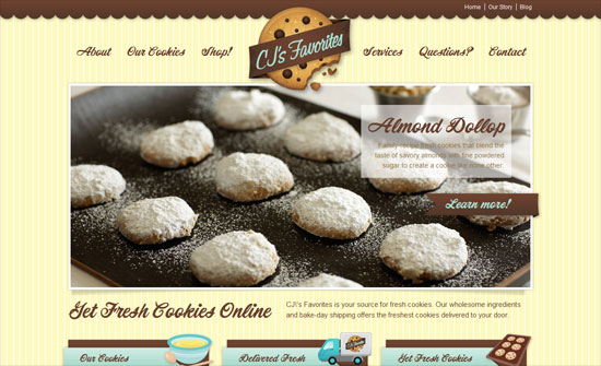
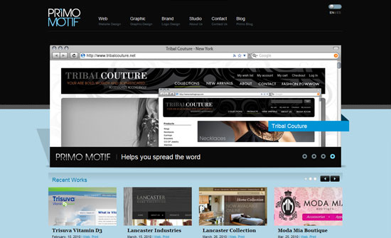
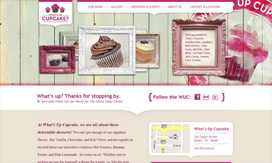
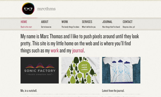
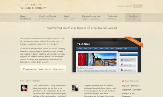
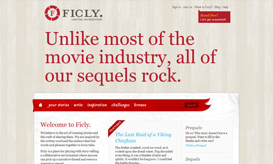
The hover effect with the ribbons in the top navigation is a little weird, but overall this is an appetizing design.
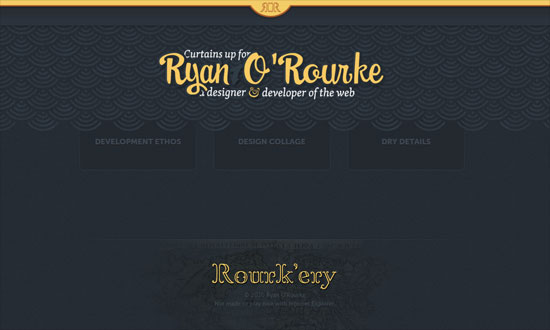
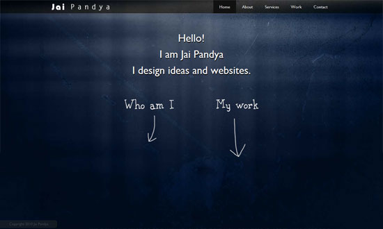
I wish the links could light up on hover since the design is a light on dark one. Check out the Ethos page for a nice list of web design tips.
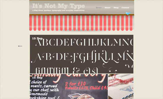
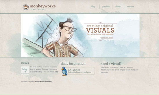
Compared to the detail of red and white striped border, other portions of the design feels lack. Being a gallery-type site shouldn’t take away from that.
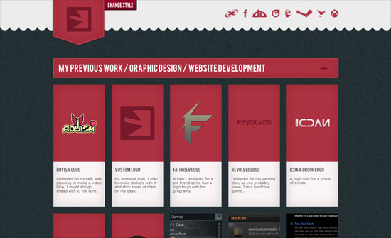
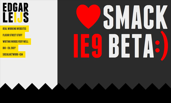
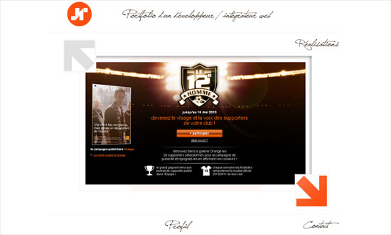
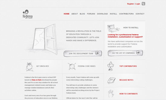
I like how the portfolio boxes are taller and leaner than usual. The design is held together by the red and the ever-popular narrow-uppercase-sans serif type.
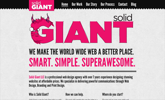
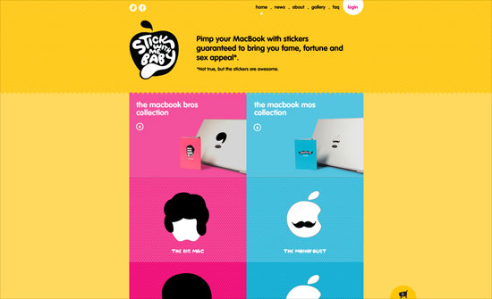
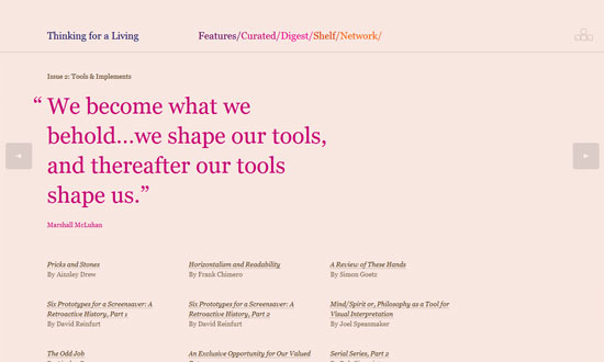
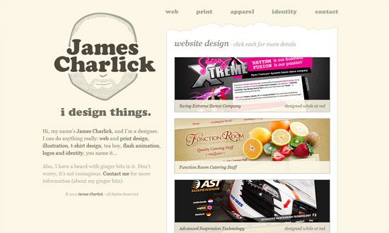
A solid, put-together design, save for two concerns of mine: the type is too small (again with Garamond) and white on shocking pink isn’t the most enjoyable thing to read.
Excellently designed online store, from the drag-and-drop interface to the fully integrated share buttons. The animations are snappy and fit with the attitude of the brand.
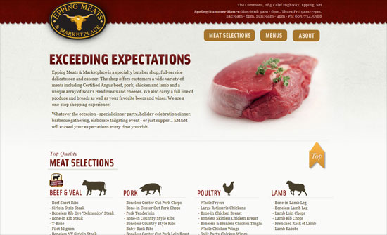
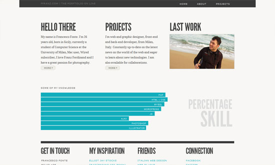
The columns of lists could be more attractive like the rest of the site.
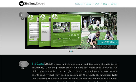
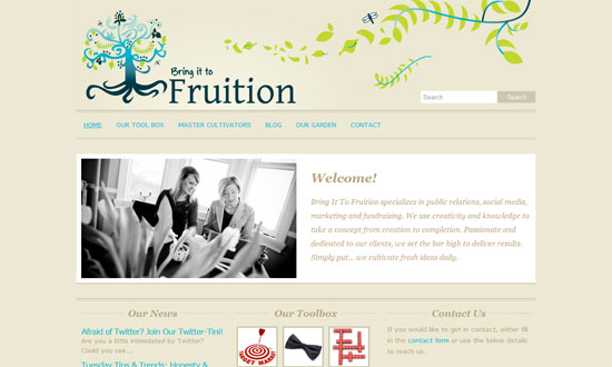
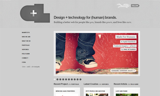
I think the gradients are a little to bright for what I usually see, and this is built on an existing WordPress theme, but the concept is sound.
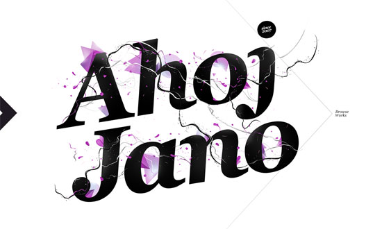
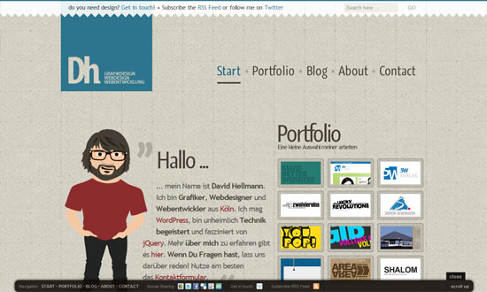
Bold and chunky not only in shapes but in type and colors The portfolio section is works well.
Social Media Weekly
Design – Design pixels aren’t frontend pixels
“Something I’ve observed is frontenders and designers often sound like they’re talking about the same thing, while actually talking about different things.”
Design – Good Designers Learn From History
“I foolishly thought of history as dusty facts and faded images. And only the foolish child thinks history doesn’t matter, that it’s irrelevant and inessential to growth.”
Microformats – Simple Semantics With Microformats, Part 1
“At the highest level, microformats are a way to add meaning (semantics) to common web content. At their foundation, microformats are simply sets of HTML attributes (most often rel and class) and values applied to markup in order to describe the content.”
User Interface Design – The Man Who Destroyed the Boring
Interface and Lived
“From the earliest graphical user interfaces, to the latest pixel perfect work seen in apps, the most basic elements of the interface have remained pretty much the same.”
