Showing screenshots of websites on websites isn’t terribly exciting in theory, but let’s see how these designs dealt with it.
Designs of the Week
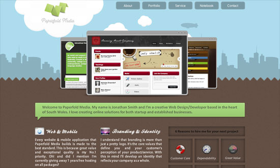
Amusing logo. I find it interesting that the designer went for an abstract rendering of a program window instead of the usual Safari. The body text in the inside pages could be bigger.
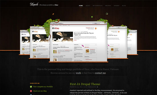
Love the addition of the foliage as well as the wooden textures, but repeating grass and soil in the lower part isn’t so seamless, so that needs work.
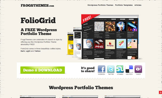
The corner ribbon (more like a cover) on the screen is a good idea, and so is the subtle ruler pattern in the background.
The screens need more distinction from one another, like shadows or thicker borders, but I like the difference in heights.
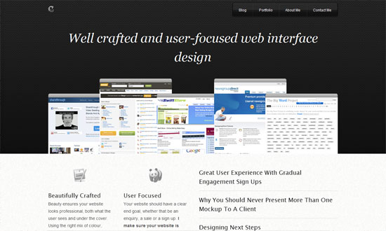
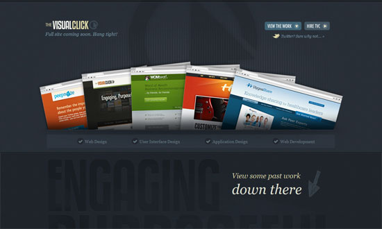
Not sure if this is “cheating” because the screens are bunched up as one image and you can’t interact with them, but the rotated, peeking through effect looks great.
Again on the “cheating”, the two polaroids in the background don’t change when you click on the arrows, but blurring it out of focus is another technique to consider.
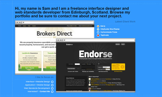
Bigger is definitely better when it comes to screenshots.
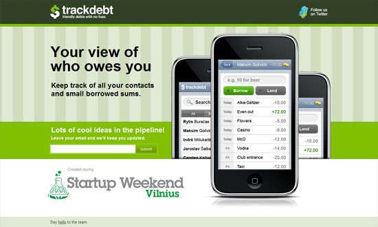
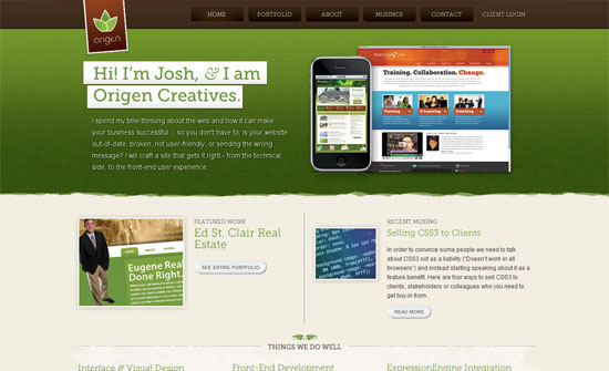
Aside from program windows, mobile devices such as the iPhone are popular containers too. I think the stripes and the bright green make for a perky look.
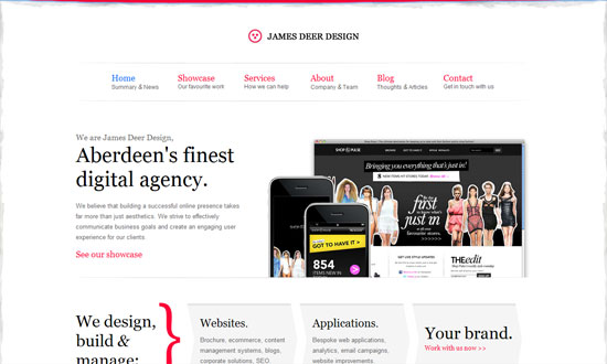
Love the subtle watercolor texture on the edges of the page, as well as the hot pink combined with elegant typography.
As with the previous design, you can mix and match mobile devices with desktop browsers too.
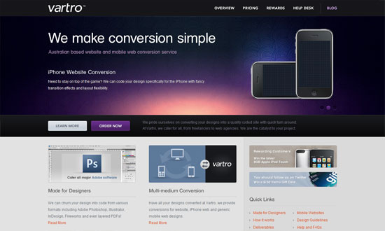
Another interesting technique: opting not to include any real screenshots, just the hardware that will display them.
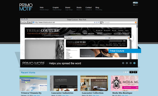
Not sure if there’s any benefit to this type of layering as, again, there’s not enough distinction between the two especially since they look almost exactly the same. I think the smaller screenshot could have zoomed in on one area of the website.
This may look a little cheesy for some, but since the company built its brand on the word phantasmagoria, I’ll take it. Now the question is, are the sparkly stuff mixed into the screenshots a welcome decoration, or too much of a distraction? I think the ribbon balances it out.
Social Media Weekly
Design – The Tangible Web: Thoughts on Designing Websites for Touchscreens
“Below, I’ve jotted down a few thoughts on design practices that we’ll likely be seeing a lot more of as site owners begin reorganizing and redesigning to welcome our touchy-feely visitors.”
CSS – Be a CSS Team Player: CSS Best Practices for Team-Based Development
“How many times have you picked up a project that someone else started, only to discover that the creator’s original code is a mess? Or you work with several team members, each of whom has their own way writing code? Or you revisit a project you created years ago, and you don’t remember what you were thinking?”
Usability – 9 Usability And UX Pitfalls: Learn How To Avoid Them
“If we want to be ahead of the design curve: get more satisfied clients, and happier users, we need to make sure that both we and our clients understand what these points are, and how to solve them.”
