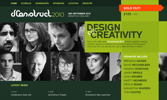
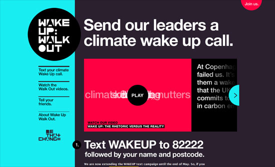
This week’s designs on Friday Focus are skewed to the side, making for an edgier experience. Check it out!
Designs of the Week
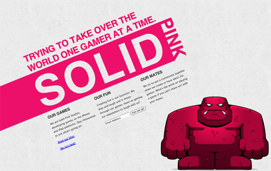
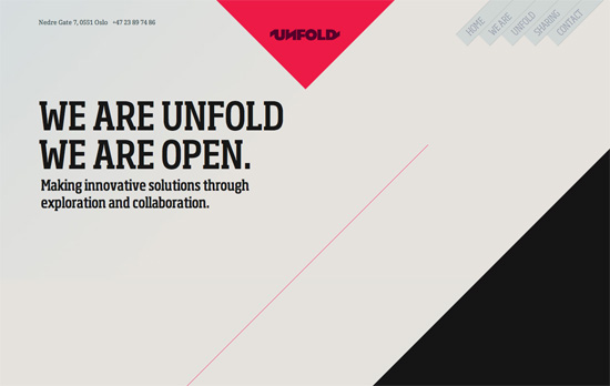
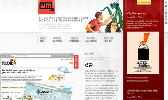
Extremely simple, but look what a world of difference the CSS3 2D transforms module and a bright shade of pink make.
This would be a lot better if the markup were more semantic. Wrapping titles in span and div tags instead of heading tags for a web design portfolio should be taboo!
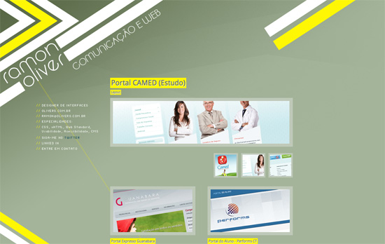
One drawback of using slanting graphic elements is the jagged edges. Here it’s not so bad but still a little obvious. I like that irregular shapes are used everywhere though and everything feels light.
Great idea to have a changing triangular graphic for each section located at the bottom left, with the logo matching it. I also like the big V as a loading graphic for the homepage—wish it appeared everywhere as a transition between pages.
Stunning layout and interactions for each section. Parallax, masks, bold color and typography—all a real treat.
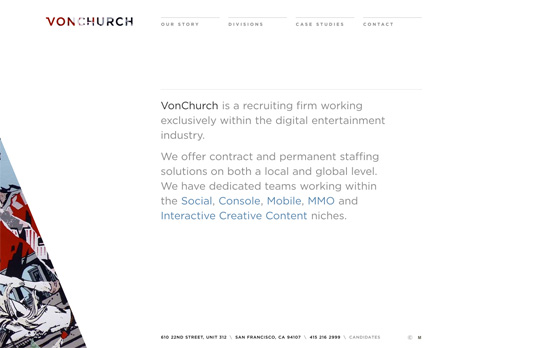
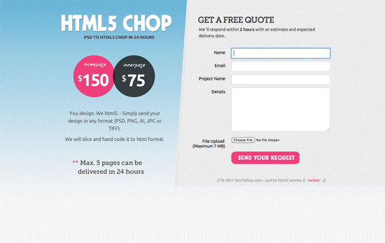
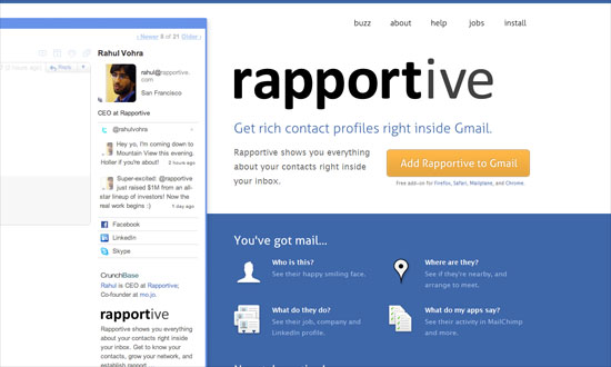
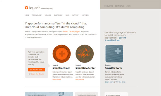
I like the cleanliness of this look but unfortunately the graphic isn’t tall enough for larger screens. That’s another disadvantage to diagonal designs—they aren’t as flexible as horizonal or vertical ones that make repeating patterns easier.
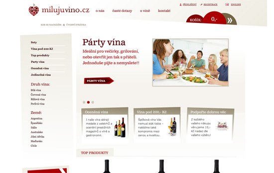
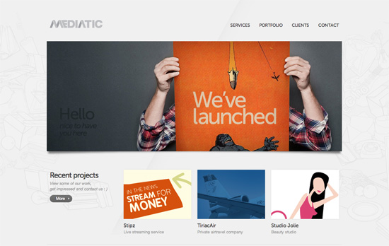
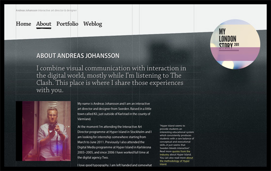
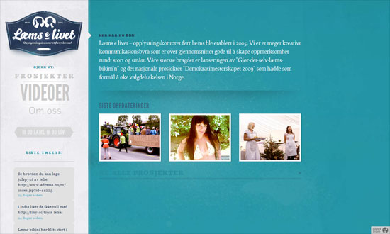
There’s only one slanting element on here, but it’s worth mentioning. I like the effect of a subtle, slanting background shadow on the navigation, which actually extends all the way to the third row of content. So it’s an interesting moving background technique.
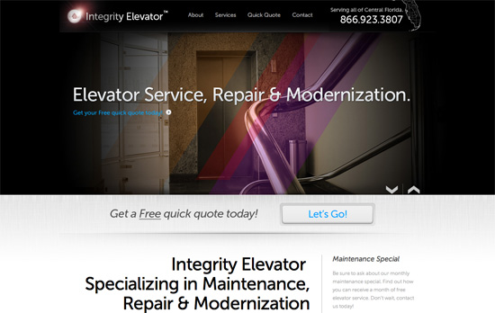
Another minor use at work here, but I quite like the effect of the colorful streaks on an otherwise conventional slideshow of photos. I have to wonder though why texts aren’t clickable when there are even arrows next to them (don’t lead someone on like that!).
Beautiful shapes, colors, and type. Has that almost magazine layout feel to it.
I like the textured black background mixed with the grid lines, making the skeletal structure of the design show through. Mixed with the handwritten underline in the menu, it gives the site this blueprint-meets-chalkboard feel.
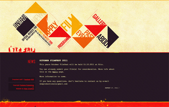
Not fond of the monospace font but I am fond of combining triangles, squares and grunge in this way.
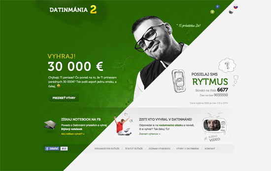
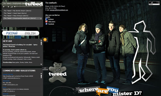
This site makes me think diagonal designs can actually be space-conscious too. I just wonder if there are a tad too many moving things at once.
Social Media Weekly
User Experience – Good Idea: “What is this charge on my credit card?” Page
“Now you might think, yeah sure, for big fancy companies with thousands of users being charged every month, this is good, but I’m just a small guy, it’s not worth the effort. Not true.”
Design – The 50 Things Every Graphic Design Student Should Know
“A condensed primer for students and graduates-to-be.”
HTML5, User Interface Design – Maqetta
“Maqetta is an open source project that provides WYSIWYG visual authoring of HTML5 user interfaces. The Maqetta application itself is authored in HTML, and therefore runs in the browser without requiring additional plugins or downloads.”
Web Browsers – The Browser Performance Pickle
“We give earlier versions of IE tons of junk that they handle quite poorly, and we give nice clean and optimized code to the toughest and most stable browsers.”
Design – Clean Up Your Mess – A Guide to Visual Design for Everyone
“If you’re like most people, you feel like a baby when it comes to visual design. You sometimes have a vague sense of what you want, but can’t articulate it or make it come about. All you can do is point and cry. This guide will help you communicate with conscious skill. It will show you how to create designs that are easy to understand and attractive.”
