• Home
  • About
  • Contact
  • Advertise

Devlounge

Design, Develop, and Grow

ateşli sevgilisi fantezisini yaşamak istediğini söyler porno ona arkadaşları varken onunla gizli saklı seks yapmak istediğini sikiş söyleyen kız hafta sonu için gelen arkadaşının görmediği bir sikiş açıdan sakso çekmeye başlayınca adamın yarağını bu altyazılı porno şekilde indiremez ve açık şekilde salonda sikişimeye sex izle başladıklarında misafir kızı da bu sekslerine rokettube konuk ederler seks yapacağını düşünmeyerek onun sex izle oyun oynadığını zanneder sabah olur ve herkes uyanır hd porno bu sırada yanında şişme mankenini de getiren sapık erotik hikayeler genç sınav haftası ders çalışan genç adam üvey annesinin sikiş eve gelmesiyle hayatının şokunu yaşar

  • Home
  • Code
  • Design
  • Design Focus
  • Interviews
  • Publishing
  • Strategy
  • Webapps
  • Extras

Friday Focus 06/03/11: North East South West

June 3, 2011 By Sophia Lucero

Here’s an interesting technique to try out in this week’s Friday Focus: designs that have four main navigational items arranged at right angles to each other, much like the four main directions on a compass.

Designs of the Week

Prince Street International Films

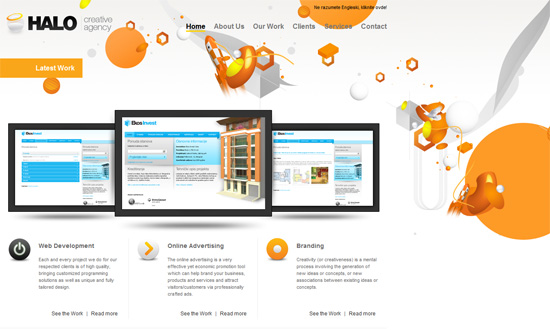
I like how each section content is perfectly contained in the boxes. It makes me wish the whole site fit into the height of the browser window so I can see the wide view of the whole site.

ap-o.com

There’s a running pixelated theme in the design, as well as blocks of black for the headers. There’s also an interesting peekaboo effect with fixed backgrounds that’s also growing popular these days. I like the idea of placing the navigation at the four corners of the site, but it makes moving back and forth between each screenful of content a hassle—better if there were keyboard navigation too. And for the millionth time, I wish we had a way for Twitter tweet and Facebook like buttons to blend in better with the design.

Kiki Kaloudi

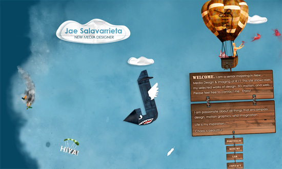
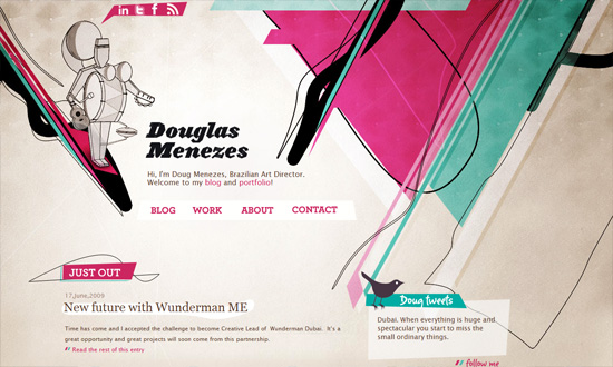
I never really enjoy the look of Courier or any other fixed-width font on a site, but I do like the hand-drawn touches here, and splashes of red there.

Conway Cowork

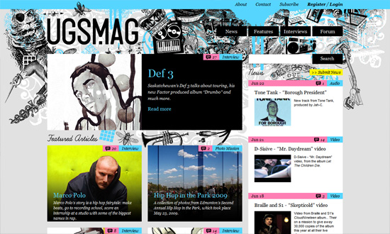
What’s a little surprising with these sites is that they don’t really use the 4 cardinal directions to their advantage and, say, animate the page to scroll to that particular direction. Instead they all still scroll vertically. Here’s another graphing paper pattern meets hand-drawn graphic elements design, with the wildly popular yellow and black combo.

Social Media Weekly

Design – Design Professionalism
“The designer’s guide to taking back your profession.”

Programming – Lost Type
“The Lost Type Co-Op is a Pay-What-You-Want Type foundry, the first of its kind.”

Optimization – zbugs
“Merge, Minify, and GZip Compress JS & CSS”

Accessibility – HTML5 and Accessibility
“HTML5 is not the accessibility disaster that some would have you believe. It tries to build accessibility in by design rather than bolt it on afterwards, and this is A Good Thing; if something is left to authors to add, they won’t. Just look at how many images have no alternate text, or useless alternate text.”

JavaScript – Byte-saving Techniques
“This is a collection of JavaScript wizardry that can shave bytes off of your code. It’s mainly intended as a reference for those creating entries for 140byt.es.”

User Interface Design – The Gap Theory of UI Design

Friday Focus 02/25/11: Yellow & Black

February 25, 2011 By Sophia Lucero

Here’s another popular color combination making the rounds: it’s yellow and black on this week’s Friday Focus.

Designs of the Week

Postmark

I don’t know if the average user can handle using a web app with a yellow background but it seems to be used relatively sparingly. The scrolling list of customers in the footer isn’t a groundbreaking idea but a nice touch.

Jess King

The line spacing is a little too tight. I would also say that the qualifications profile is one huge wall of text that could be broken up into more digestible chunks. I really like the helper text in the contact form section.

Nathan Gonzales

Simple but makes quite the impact. My only concern is using images for text, which is almost a non-issue with the prevalence of font embedding.

push retail

Old-school web techniques here, post-tables / pre-sprites era. Interesting choice to put the client login at the bottom instead of the usual top of the page, but the eye does wanter over there as well.

Subtotal

A little too fluid, monospace, and animated. The last one is interesting though: you don’t see GIFs used to display portfolios too often, and this method becomes a live exhibition of sorts,

Christian Swinnen

I may be turning into an old fart but the text is a bit small. I do like the youthful illustrations and paper texture.

unProtector

The logo is real text except for the second letter “o”—good idea!

Bosworth & Co

Two things. This agency website puts the spotlight on their blog, while their particulars are tucked away in the header. Second, there’s surprisingly no footer. The question is, does it need one?

Giuseppe Scappaticcio

Now the use of yellow against black here is more subtle and only with the illustrations. The black on pink tooltips are a little too bold but I like how they’re styled.

Social Media Weekly

Design – Five and a Half Habits of Highly Effective Designers
“This article is about practice. It’s about five and a half — yes, half — habits that highly effective designers tend to share and which I’ve observed first-hand in the complicated, non-theoretical, absolutely real world. If practice is your thing, keep reading.”

Programming – Case Study: Page Flip Effect from 20thingsilearned.com
“Since the contents of the book is very much about open web technologies we felt it was important to stay true to that by making the container itself an example of what these technologies allow us to accomplish today.”

Accessibility – HTML5 Accessibility Chops: the placeholder attribute
“The HTML5 specification says “placeholder should not be used as an alternative to a label.” But it stops short of saying it MUST NOT be used, so it is conforming to use it as an alternative in HTML5 and will be used as a label.”

Friday Focus 05/14/10: Icon Parade

May 14, 2010 By Sophia Lucero

This week’s Friday Focus will tackle websites for a designer’s best friend: icons. Icon sites have been around for the longest time but we’re seeing a lot of sites pushing the envelope in interface innovation, both with their offerings and the website designs they’re found in. The latest trend so far? Websites created for a single icon set—now that’s a great way to promote work.

Designs of the Week

iconSweets

Excellent one page site with the letterpressed look. I wish the bottom gray area had its text a little more readable.

Goo-EE Icon Set

I really like how wide and open this design is. And custom typefaces are more rampant than ever.

Pictos

A subtle noise effect in Photoshop is popular for a textured effect. So is uppercase text—note the letter spacing for readability.

Glyphish

Even more subtle noise texture here, combined with a touch of woodgrain for extra elegance. I feel the text on the left sidebar is a little cramped compared to the amount of whitespace in the header. And the icon preview, which occupies a large amount of real estate, could be clickable.

Helveticons

Love the folded paper effect combined with a bit of blueprint. I don’t need to tell you how strong the grid is on this layout and the excellent Swiss design sensibilities at play here.

Android Icons

I’m enjoying the hand-drawn, torn effects from top to bottom. Even the arrows in the Services area aren’t overlooked. And scribbled down Android robots—what could be more fun than that?

We Love Icons

Sometimes a narrow layout just works better. Excellent integration of all the navigation tools from the search to the pagination. If the icons won’t make you lick your screen, the wooden panel probably will.

IconDock

Lots of content on the front page compared to the other sites listed here, but it’s not busy at all. Of course the drag-and-drop feature on this site is one of the best interface goodies out there.

Icon Drawer

I like how as you scroll down, it’s one major area, then two, then three.

Iconlicious

Really simple but it’s the details (typography, color, boxes) that stay out of the way that make the design work.

Icon Eden

There’s something compelling about the choice of fonts on this site but I have to say that the bottom half isn’t so refined. The blog post titles could use bullet icons and the sitemap seems to need a bit of serifs.

IconShoppe

We always enjoy Dan Cederholm and his impeccable work as we’ve featured at least one other iteration of this site’s design before. The current one? It just feels so harmonious even with various splashes of color from the different icon sets. I also appreciate a site that lets you scroll, scroll, scroll.

Feed Icons

I feel saddened by the ad placement here. Ads can look beautiful if you can help it, but here they just stick awkwardly out of place.

IconBuffet

I just have to include this site on the list, because no matter how long this design has been around, it still feels current.

Social Media Weekly

Design – Create Seamless Web Background Textures in Minutes
“Ever wondered how some web designers come up with such great background textures? It’s actually way easier than you might think.”

CSS – Sexy Interactions with CSS Transitions
“With all browsers except for IE being slated to have Transitions support in the coming months, more and more web designers are turning to this powerful technique as a means to enhance their website’s user experience.”

Optimization – Optimizing Your Website For Speed
“In the world of the Internet, you have mere seconds to capture a visitor’s interest before they leave and find your competitors. Can you afford to have them leave just because of your websites speed?”

Friday Focus 03/05/10: Narrow

March 5, 2010 By Sophia Lucero

Just because monitors have gotten bigger doesn’t mean we should jump into wide layouts all the time. See how these designs make use of narrower widths effectively.

Designs of the Week

Only2Designers

Even several years ago this could be one of the narrowest sites out there, and it stands out because of that. Yet the content isn’t sacrificed.

't Creahuys

Needs a bit more refined type, but the overall look is quite pleasant.

Lise Marie og Tobias

This one, on the other hand, mixes a lot of different typefaces and shades of yellow to brown. It may be a bit glaring to some but the detalis are lovely.

Marvin Y. Thomas

This business card-type site looks almost underdesigned but still looks crisp and clean. Again, it’s all in the custom type.

Trendwolves

A narrow layout lets striking photo backgrounds define the look of the site. I like that the menu on the left shows the subpages for each link, not just the top-level navigation: instant sitemap.

A Casa do Canto

Same photo background treatment, except it doesn’t change per page.

Tenth Time

Great graphic details everywhere, and a very restrained use of color.

Web Designer Notes

Narrow designs seem to have minimalist tendencies too. This one hides away the clutter with a sliding box for the navigation.

Thomas Maier

A narrow layout can also influence you to do a one-column, one-page site that makes reading and browsing more convenient.

Social Media Weekly

Design – 4 Pixels or Less
“Having too much choice is one of the main obstacles for 21st century designers. With virtually unlimited tools and possibilities at our fingertips in the digital age, our creativity can become clouded very easily. Being inundated with thousands of photoshop brushes or fonts can push the very concept of a design from the forefront of your mind.”

Typography – The Future Of CSS Typography
“In this article, we’ll look at some useful techniques and clever effects that use the power of style sheets and some features of the upcoming CSS Text Level 3 specification, which should give Web designers finer control over text.”

CSS – !important is Actually Useful (in Print Style Sheets)
“So what you need is a way of specifying print styles that can override the inline styles. There’s only one way to do that: !important.”

CSS – Flexible Color Schemes in Layouts with RGBa
“This will be an experiment in transparency. CSS has come a long way over the years, and one of the biggest advancements is the integrated use of transparency.”

Friday Focus 07/03/09: Chaotic & Whimsical

July 3, 2009 By Sophia Lucero

Design usually means arranging things in an orderly, meaningful manner, but this week we’re throwing that out of the window and going for chaotic and whimsical sites. Happy 4th of July weekend, everyone, and welcome to this week’s Friday Focus!

Designs of the Week

HALO Creative Agency

The left-aligned layout works well here. I love that in the inner pages, the background changes, but remains “chaotic”.

Creative Spaces

I’m not sure what this design style is called, but it always catches my eye. Another left-aligned design with a touch of opacity and great use of repetitive graphical elements.

UGSMAG

I love the header. And the custom illustrations for for each featured artist. And the bright color scheme—light blue, pink, and yellow for a hip-hop magazine? With a perfect-cursive font for the headers? Now that’s what you call adventurous!

Jae Salvarietta

Here’s a one-page portfolio designed like it was a storybook. I particularly like the use of textures on the illustrations.

The Museum of Science and Industry

Now this site takes a similar approach, with the airborne objects found all over the place. It’s not quite as grand and playful as I would have liked, but a great look for a serious institution.

Douglas Menezes

I love the crazy lines and color combination. It’s not a complicated layout, when you look at it closely, but it certainly looks extraordinary.

Fritz Quadrata

I’m not sure if this design is a result of cramming everything above the fold, but it works! It showcases the artist’s versatility and his portfolio’s diversity at one glance. And given that all the illustrations look whimsical and fantastical, it gives a very interesting personality to the website. What I’m not sure about is the big default image in the center, and whether it’s competing fiercely with the already strong background.

Darjan Panic

Another foreground-background competition here. I’m not sure if this design will sit well with everyone, especially since it’s already dark, but the background looks pretty interesting and it’s a quick way to add interest to your site.

Social Media Weekly

Programming – Maintainability Guide (Beta)
An interesting guide on how to write maintanable code.

Usability – Keep Users Updated During Long Load Times
Tips so they won’t just go away.

CSS – CSS cascade – a simple step-by-step presentation
A great tutorial on mastering the CSS cascade.

Code & Tutorials

Which Front-End Development Languages Will Grow in 2017?

Your Guide to Leveraging APIs as a Developer

Bitcoin Processing Website Integration For Web Developers

Website Security For 2016 That All Developers Need To Know

5 Reasons You Need to Be Using jQuery

About Devlounge

Want to read more about Devlounge, or maybe you want to contact us, or even advertise? Oh, and don't forget to subscribe to updates!

The Best of Devlounge

Cool Tools for Creative Blog Content

Search