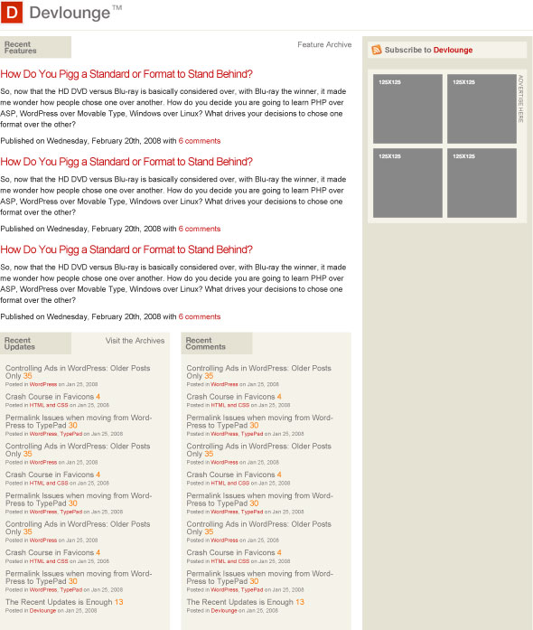
As promised, we’re inviting our dear readers to share their minds on the next Devlounge design. This is the first of several posts detailing the development of the next version of Devlounge, be it design decisions or how to better sort the content.
Some thoughts on Mockup #1
You’ll find Mockup #1 below. It’s not a far step from today’s Devlounge, for several reasons, one being recognition. The main thing to notice is the way the content is divided, with features at the top, and then a stream of updates. The sidebar will be utilized for more static content, such as downloads and extras, and perhaps some other things.
Anyway, there’s not too much to say about this first mockup, called Mockup #1. It’s not complete, and everything will look slightly different in code.
Here goes!

What do you think? Speak up in the comments, your opinions will help make the next Devlounge a prettier, and more organized, place!
