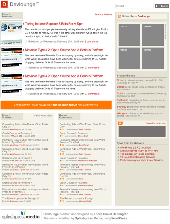
It’s time for another mockup of the next Devlounge, a wee bit later than planned due to me moving house, and everything being as messy as humanly possible of course. Since they’re cutting the power at the office any minute now, I’ll just get this new mockup up there, and let you guys say what you think!
The Second Mockup
Some notes about the second mockups:
- It’s still the front page.
- I’m not too fond of the three top feature listings, due to dragging too many images around and changing too much. To put a long story short, it should look better than it does…
- Editorial info should be added to the sidebar.
- The footer isn’t done! I just took the one from the next Wisdump for now.
Here we go!

There you have it. Do compare with the previous mockup, which this one is built directly upon. Have I tackled the problems like you wanted? Please let me know what you think in the comments!
